
Written by Mo Kahn on
April 13, 2026


A monochrome shoot feels simple on the surface, but that simplicity is exactly what makes it powerful. When color is reduced or removed, the viewer pays more attention to light, structure, fabric, expression, and shape. That is why monochrome content often feels more intentional than louder, more saturated visuals. It strips away distractions and makes the image feel controlled. As a fuller blog topic, monochrome shoot should not stay at the level of a thin tool description. The more useful angle is explaining why monochrome works, what makes it look editorial instead of flat, and how starryai users can upload an existing portrait into Edit and guide it toward a cleaner black-and-white or one-tone result.
A monochrome shoot is any photo concept where the palette is intentionally limited. That can mean:
The key is that color is no longer the main source of impact. Tone and composition take over.
Color can create excitement, but it can also create noise. Monochrome often feels more elevated because it forces the image to succeed on structure. A strong monochrome image depends on:
That is why even a simple portrait can suddenly feel more serious and more artistic once it is rebuilt around monochrome values.
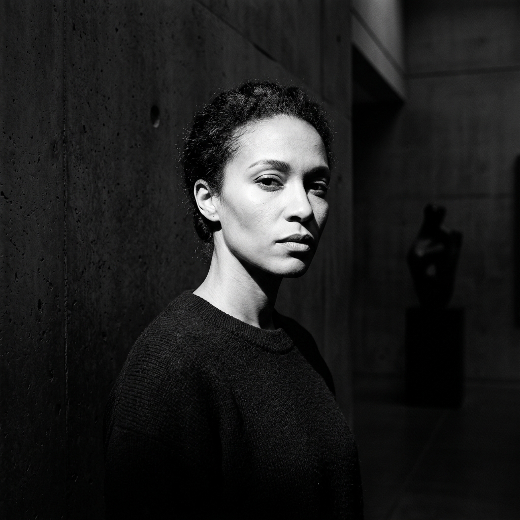
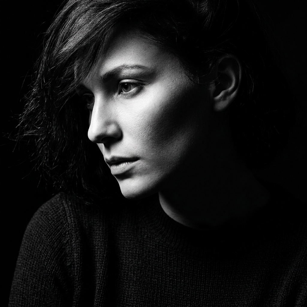
High-contrast black-and-white
This is strong, graphic, and dramatic.
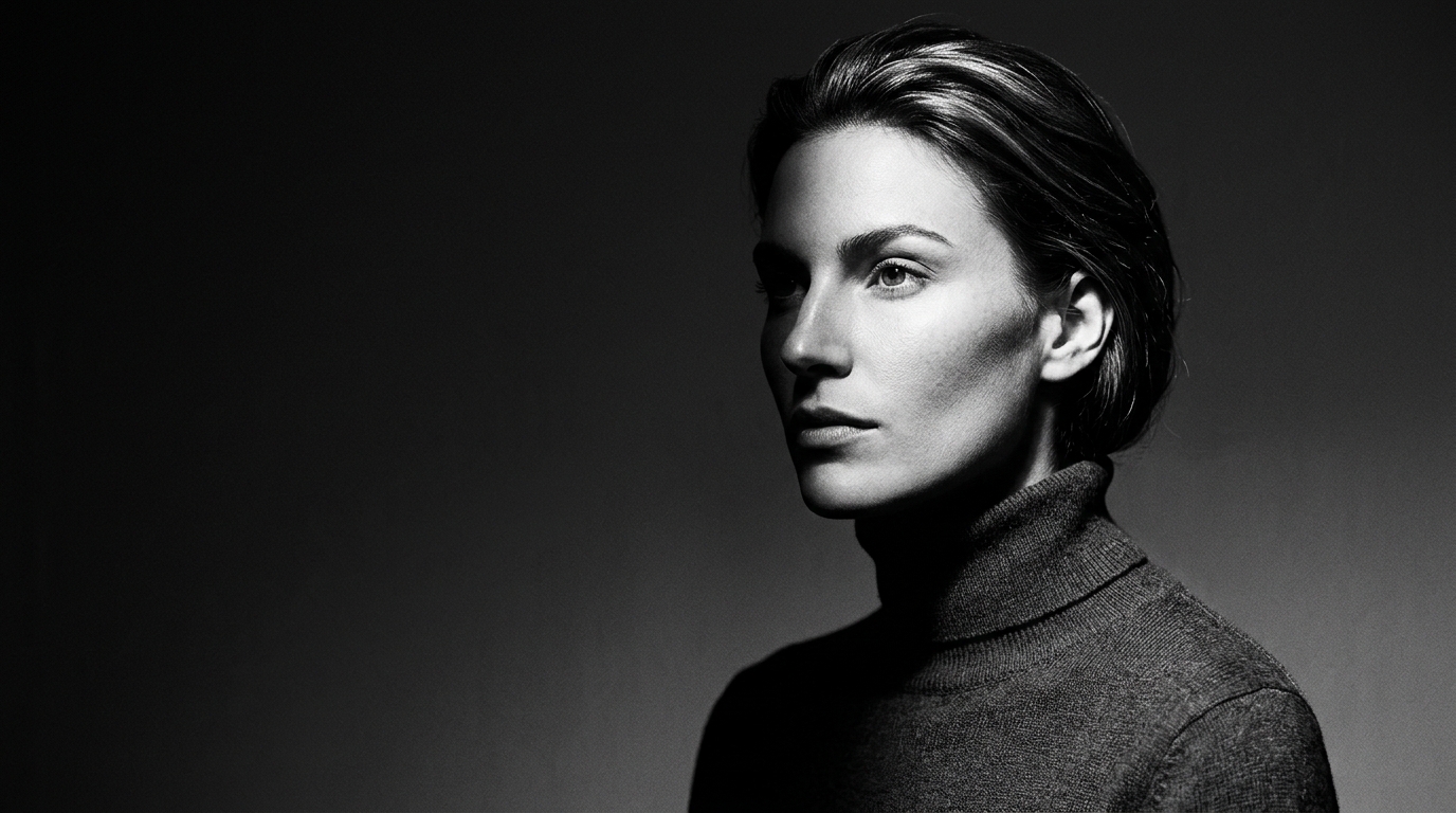
Soft grayscale beauty portrait
This direction feels calmer and more refined.
One-tone fashion image
Useful when the goal is a narrow palette rather than true black-and-white.
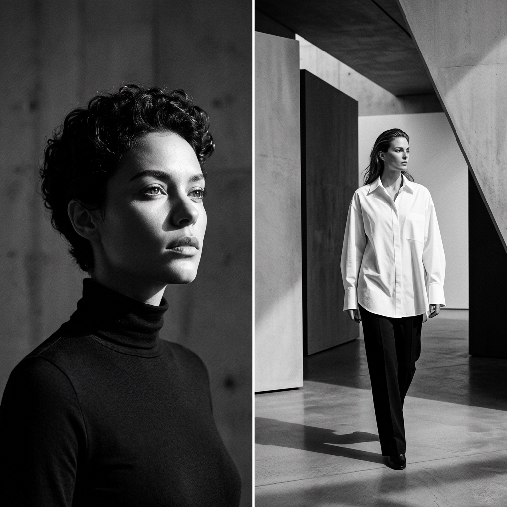
Minimal studio portrait
A clean commercial option with editorial energy.
Musician or creator monochrome branding
Good for artists, podcasters, speakers, and personal brand pages.
Lighting matters more than ever
In monochrome, light becomes one of the main storytelling tools. Side lighting, directional light, and shadow shape can define the image.
Wardrobe texture becomes more visible
A black blazer, soft knit, silk fabric, or leather jacket each reads differently when color is removed.
Expression carries more weight
Without color cues, the face and posture do more emotional work.
Background simplicity helps
Clean backgrounds allow the subject to hold the attention.
1. Decide whether you want drama or softness
High contrast and soft grayscale create very different moods.
2. Think about what should stand out
Should it be the jawline, the eyes, the tailoring, the hair shape, the shoulders, or the pose?
3. Remove unnecessary clutter
Monochrome works best when the image feels disciplined.
4. Match the styling to the tone
Minimal clothing usually works well, but strong texture can also be powerful.
This is a very practical edit workflow because people often already have a photo that could work.
Step 1: Upload a clear portrait
Choose a photo with readable lighting and good facial detail.
Step 2: Define the monochrome style
Tell starryai whether you want black-and-white editorial, soft grayscale beauty, or one-tone fashion minimalism.
Step 3: Add the actual visual cues
Helpful prompts include:
Step 4: Generate several variations
Small differences in contrast and crop can change the image a lot.
Step 5: Choose the version that best matches the use case
Profile photo, album art, branding, and editorial content all benefit from slightly different monochrome treatments.
Flattening the image too much
Not all monochrome should look washed out. Tone still needs structure.
Ignoring texture
Without color, texture becomes one of the main ways the image stays interesting.
Overcomplicating the background
Monochrome usually gets stronger when the scene is simpler.
Forgetting the intended mood
A moody artist portrait and a commercial monochrome headshot should not be treated the same way.
Using monochrome as a shortcut instead of a style decision
The best images feel intentionally built for this look.
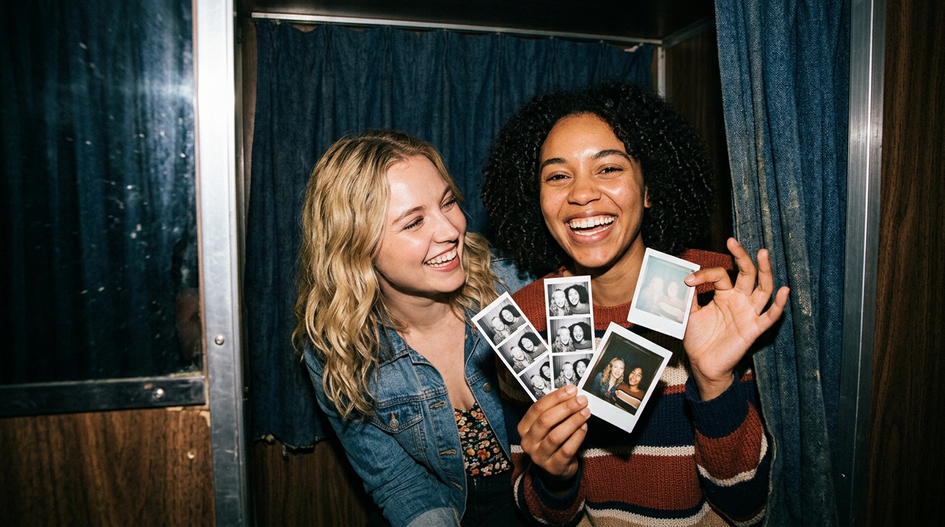
Monochrome shoot content is useful for:
Monochrome content stands out on TikTok because it feels more intentional than the average trend post. In a feed full of loud colors and busy visuals, a black-and-white or one-tone image can feel instantly sharper and more editorial. It also works well for creator rebrands, music-adjacent content, and moody transformation posts.
Some strong angles for this topic:
A fuller blog on monochrome shoot should explain that the style is not about removing color for the sake of it. It is about redirecting attention toward composition, contrast, and identity. For starryai users, the workflow is direct: upload a strong portrait, open Edit, choose the monochrome direction, prompt the lighting and tone clearly, and compare a few variations until the image feels purposeful. That is what turns a simple photo into a real monochrome editorial.