

Written by Mo Kahn on
August 3, 2026


You've got the selfie. You've got the idea. You open a photo-to-anime tool, hit generate, and the first render comes back with softened eyes, a slightly wrong jawline, and a face that feels like your cousin, not you. That's the moment many people give up too early. The fix usually isn't luck, it's input prep, style choice, and a prompt that tells the model what to protect.
A good selfie goes into a photo-to-anime tool, and the result still misses. The eyes look generic. The skin gets waxy. The mouth keeps your expression but loses your identity. That's not a software problem in the abstract, it's the expected outcome when the input photo and style choice don't give the model enough clean facial information to work with.
The core mechanic is straightforward. A neural network analyzes the face, then redraws the same person with anime-like outlines, color treatment, and styling, while keeping identity cues intact enough to read as the original person, not a random character. That means the tool isn't applying a simple filter, it's making judgment calls about what to keep and what to stylize, which is why busy photos and awkward angles produce weaker results. An ELI5-style explanation of the process describes the flow as input, analysis, transformation, and output, which matches what creators see in practice on the first render (how photo-to-anime processing works).
Practical rule: if the photo doesn't clearly show the face, the model starts guessing.
The consumer tools that made this workflow mainstream are built for speed, not heavy retouching. As of 2024, multiple tools had reduced the process to upload, choose a style, and generate in seconds, with some advertising output in about 10 seconds or within minutes (consumer photo-to-anime workflow overview). That speed is useful, but it also encourages lazy inputs. If you upload the first selfie in your camera roll, you're basically asking for a generic render.
A lot of people think the prompt alone will rescue a weak photo. It won't. The style choice changes how the model interprets eyes, line weight, and color blocking, so a soft watercolor anime render will behave very differently from a sharp manga look or a chibi version of the same portrait.
That's why the right question isn't, “Which button gives anime?” It's, “Which style preserves this face with the least damage?” Once you start asking that, the process gets much more predictable.
Before you touch starryai, fix the photo. That decision usually determines whether the render reads like a polished character portrait or a warped souvenir. Start with clear, front-facing portraits that show the facial features cleanly and have good lighting, because most tools in this category handle those inputs far better than messy snapshots, and common formats like JPG, JPEG, and PNG are usually supported (photo format and portrait guidance).
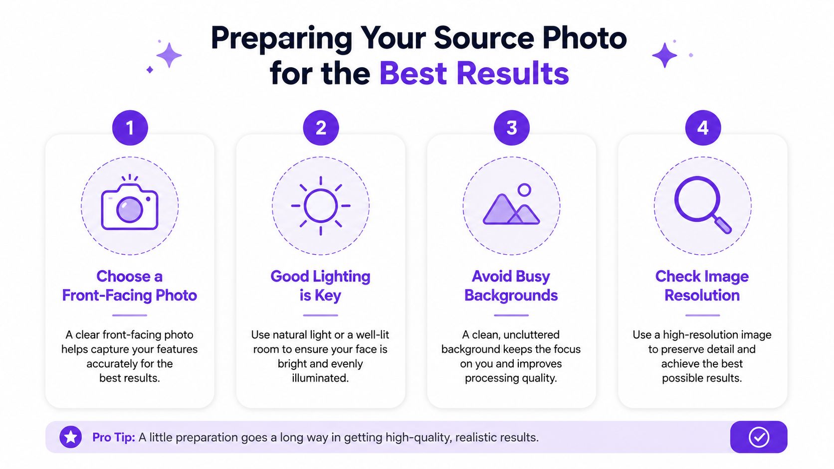
Use a portrait where the face fills most of the frame, the head is not cut off, and the eyes are visible. Clear, high-resolution selfies or portraits usually convert more cleanly, and guidance on photo conversion keeps coming back to the same point, good lighting and a visible subject separate a sharp result from a muddy one (image quality and subject clarity). If the photo is a group shot, a side profile, or taken in dim light, crop tighter or choose a different image.
A face the model can read gives you a usable anime portrait. A face it has to guess at gives you bad eyes, broken proportions, and a result you will not want to keep.
Busy backgrounds compete with the face. A cluttered bedroom, bright signage, or motion blur pulls detail away from the subject and pushes the model toward over-simplified output. Crop out distractions, center the face, and remove anything that does not support the portrait.
A quick rescue workflow is simple. Brighten the image slightly if the lighting is flat, crop closer if the face is too small, and avoid over-editing with beauty filters before conversion. Too much pre-processing makes the AI chase artifacts instead of features.
Most mainstream converters support JPG, JPEG, and PNG, and some accept WebP too. A product spec in the set also accepts up to 10 MB, which makes the point clear, image clarity matters more than raw file weight (throughput and file handling details). If your image is sharp and well lit, do not waste time compressing it to death.
Use the strongest source you have, not the smallest file. If the portrait already looks clean on your screen, the converter has enough to work with.
The image gets set up for the render, and the rules are plain. Pick one subject, keep the face visible, and do not stack extra edits on top of a weak photo. If you want the model to preserve likeness, the input has to make likeness easy to detect.
If the image already looks crowded, fix that first. Strip away extra people, crop out empty space that adds nothing, and avoid filters that flatten skin tone or distort facial structure. The cleaner the source, the less the model has to invent.
Open the editor with a portrait that already reads clearly. If the face is blurred, cropped awkwardly, or buried in clutter, the conversion wastes time trying to recover what should have been fixed first.
A clean workflow starts with upload, then style selection, then a prompt that steers the output, followed by generate, review, and download. starryai's AI Anime Generator and AI Style Transfer Tool are built for that kind of photo-to-anime transformation, where you upload a selfie or other photo and turn it into anime-style art in a few moves. If you want the interface flow in order, use the quick start guide for the starryai app as your reference.
Use the strongest portrait you have, then commit to one anime direction that fits the face and the final use. A clean headshot handles stylization better than a candid shot with distractions, odd angles, or extra visual noise.
Pick one subject and keep the face visible. If the image already feels busy, strip out anything that fights the portrait before you convert it. That includes extra people, empty space that adds nothing, and filters that flatten skin tone or warp facial structure. If you need a faster path to giftable output for fans or collectors, the same portrait logic also works well before you discover cartoon jewelry designs, because the image still has to read cleanly at small size.
Burning credits on the same weak setup is the fastest way to get nowhere. After the first result, inspect the face shape, eye placement, and how much of the original expression survived. If the portrait still feels like the same person, the style is close. If it misses the likeness, change one variable only.
The tools in this category are built for fast generation and reruns, so iteration is part of the process rather than a sign that the first pass failed (throughput and rerun behavior). Use that speed to test a small number of focused directions, not a pile of random ones.
If a result is almost right, do not restart from scratch. Tighten the crop, simplify the style, or adjust the prompt, then generate again.
A finished anime portrait works well as a profile picture, a character portrait, or a social post visual. starryai's broader creative suite is built around quick image generation, so the same output can become a simple avatar, a creator visual, or a stylized concept image without forcing you into heavy manual editing.
Keep the final image clean and readable if you want it to hold up outside the app. The face should stay the main subject, and the background should support it instead of competing with it.
Anime isn't one look. A polished avatar, a book-cover character, and a merch-ready graphic all need different treatment. The best choice depends on what you want the image to do, not which style sounds coolest in the prompt.
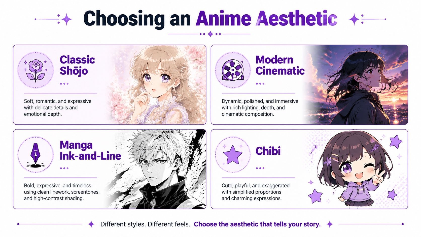
Classic shōjo usually leans soft, expressive, and emotionally friendly. It works when you want a gentle portrait for a profile, a fandom-friendly character, or something that feels romantic without being overloaded.
Modern cinematic pushes stronger contrast, sharper lighting, and a more dramatic frame. Use it for book covers, poster-style visuals, or any image that needs presence at thumbnail size.
Manga ink-and-line strips the image down to bolder contours and a more graphic feel. It's the right move for black-and-white art, editorial-style illustrations, or designs that need to print cleanly.
Chibi compresses the face into a cuter, exaggerated format. That's a good fit for stickers, reaction art, and playful avatars, but it can flatten likeness fast if the source photo is already tricky.
If you're making a TikTok avatar, you want the face readable at a tiny size. If you're making a book character, you want the pose and mood to support the story. If you're building merch, you want a style that still looks good on a tote, shirt, or print after the background gets simplified.
For brand-adjacent or giftable visuals, style consistency matters more than novelty. That's also why it helps to look at adjacent product aesthetics, like discover cartoon jewelry designs from JewelryBuyDirect, and think about how illustration choices change the feel of a visual product.
Practical rule: choose the style that survives the smallest screen or the roughest print, not the style that sounds fanciest in the prompt.
A weak prompt gives you a generic anime face. A better prompt tells the model what to protect and what to exaggerate. Keep it short, specific, and clean.
Start with the face. If you want sharper eyes, say sharp detailed eyes. If you want a softer skin treatment, say smooth skin tones or clean skin shading. If you want the image to feel more animated, add bold linework, bright anime colors, or cinematic lighting.
Good prompt structure looks like this in spirit, not as a script:
Don't stack conflicting ideas like soft watercolor, hard cyberpunk, realistic portrait, chibi, and dark noir in one prompt. That's how you get a flat compromise image. Also skip the empty phrase anime style by itself. The tool already knows you want anime, so the prompt has to do more work than that.
A better version names the visual behavior you want. For example, you might ask for a clean portrait with defined eyes, soft blush, and a simple pastel background. That gives the model a path instead of a cloud of contradictory signals.
The strongest prompt writing habit is subtraction. Remove everything that doesn't help the face.
The conversion process usually works best when the prompt reinforces the chosen style rather than fighting it. If the first output looks too busy, simplify. If it looks too plain, add a stronger lighting cue or a clearer palette. That's the same reason good prompt writing matters across generative tools, including the broader guidance in the starryai prompt writing guide.
This is the part most guides ignore, and it's the part creators need most. If you're using your own face for a social avatar, the risk is low. If you're using a client, a child, a friend, or a stranger, you need to think about permission before you post, sell, or advertise the result.
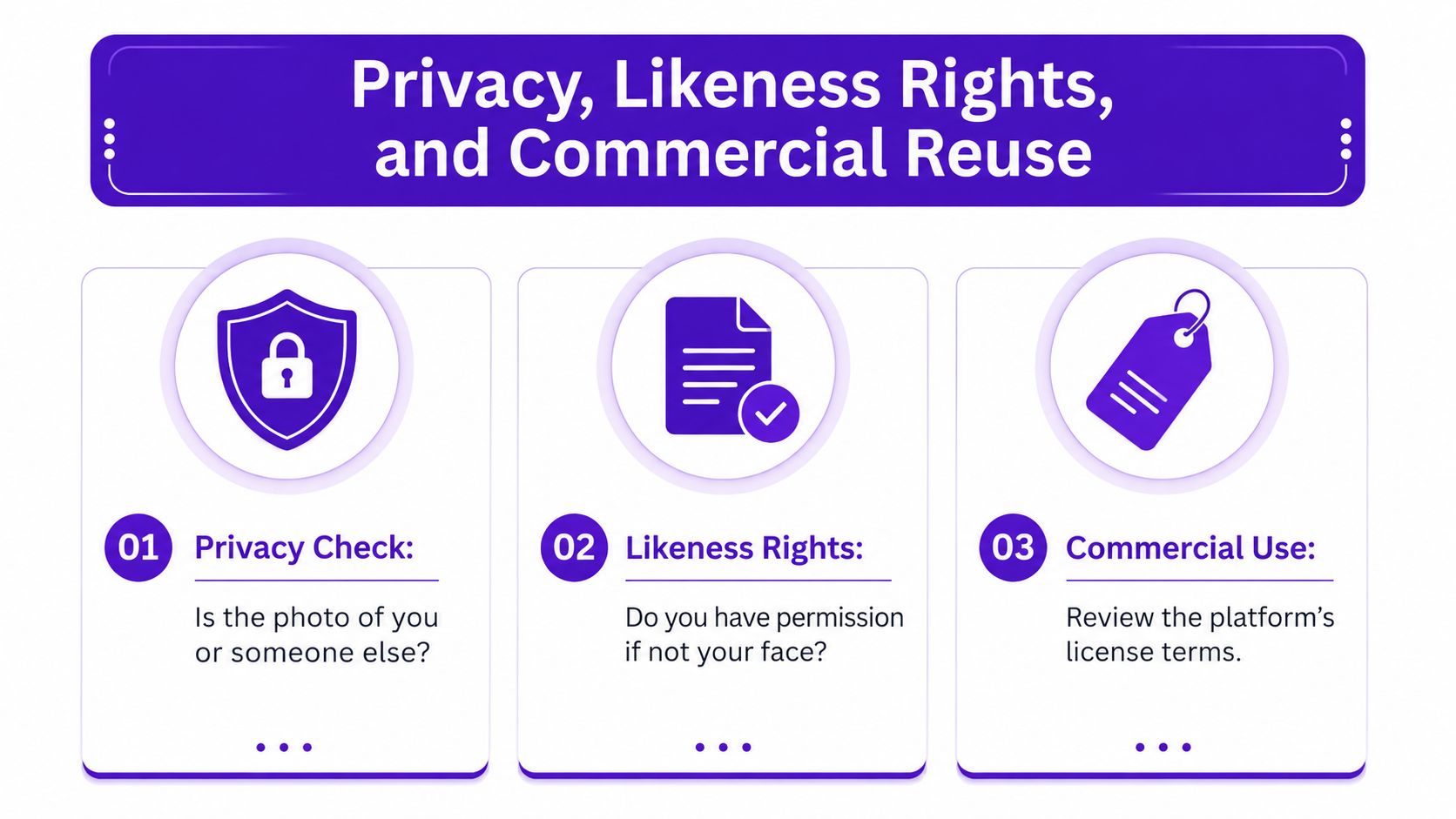
A lot of mainstream guides stop at upload instructions. The stronger question is whether the photo belongs to you, whether you have permission to use someone else's likeness, and whether the platform retains uploaded images or uses them beyond your session. That matters because the use cases people care about include ads, storefronts, merch, and social promotion, not just casual avatar fun (commercial use and output download context).
If you're using a client portrait, get written permission. If you're using a stranger's face, don't. If you're using the image in paid work, read the license terms before you publish anything.
The most neutral thing you can do is read the license page and stop guessing. For starryai-specific usage terms, review the license information before you put an output into commercial circulation. That's the cleanest way to avoid a nasty surprise after a design is already in a campaign.
A fast due-diligence routine is simple:
A fun conversion becomes a business asset only when the rights question is settled first.
When a render fails, users often reroll blindly. That wastes time and credits. The better move is to diagnose the failure mode and change the smallest thing that fixes it.
If the likeness slips, the crop is usually too loose or the subject is too small in frame. Tighten the portrait so the face dominates the image, then rerun. If the head was already centered and the result still drifted, simplify the background before trying again.
When the skin looks plastic, the prompt is often overloaded with style words. Strip it back. Keep the face, lighting, and palette cues, and delete contradictory descriptors that force the model to smooth everything into one texture.
If the subject looks fine but the background fights the face, switch to a simpler anime aesthetic. A busy cinematic scene can drown a portrait that needs more breathing room. The right background should frame the face, not compete with it.
When one generation looks good and the next one doesn't, generate a small batch and compare the outputs. The practical benchmark is repeatable selection, not a fake success-rate number. Use the cleanest render, then refine the background or lighting separately if needed.
The best creators don't chase a single perfect render. They make the input cleaner, the prompt shorter, and the style choice sharper until the result stops fighting them.
If you want to turn photos into anime without wasting time on soft, off-model results, start with a cleaner portrait and a tighter prompt, then let starryai do the stylization work. Visit starryai and use it to test a few style directions on the same photo until you get a face worth keeping.


.svg)