


Written by Mo Kahn on
July 22, 2026


You've probably got a photo sitting in your camera roll right now that deserves better than another app filter. It might be a sharp portrait, a sleepy dog shot in afternoon light, or a travel photo with just enough mood to feel special. The problem starts when you search for a way to turn my pic into a painting and end up with the same flat effect over and over. Smooth skin, fake brush texture, no depth, no sense that anyone actually made art from it.
That gap matters because the appeal isn't novelty anymore. People want something they'd post, frame, gift, or print. They want a result that feels painterly, not processed. The good news is that you can get much closer to that look if you approach the process like a creative edit instead of a one-tap gimmick.
This process isn't started for a novelty effect. Rather, users begin it because they already like the photo and want to push it into something more expressive. A selfie becomes a moody portrait. A cat photo becomes a textured oil painting. A family snapshot turns into something that feels closer to wall art than social content.
That's where the frustration kicks in. A lot of free tools apply style on top of the image without really transforming it. The pose, lighting, and facial detail stay almost untouched, and the app just lays a painted surface over everything. The result looks edited, not interpreted.
People overwhelmingly ask for “realistic, textured oil paintings” with actual brush strokes and depth, not just “cheesy filters,” yet most free online tools produce flat, stylized results that lack genuine painterly texture, as seen in this discussion about high-quality AI painting tools.
A good painting conversion usually does three things at once:
If one of those is missing, the result usually feels off. Too much simplification and your face stops looking like you. Too little and it still reads like a phone photo wearing a costume.
Accessible apps work best when you use them with intention. Instead of expecting one automatic perfect output, treat the first generation as a sketch. Then judge it like you would a real painting study. Does the light still feel believable? Does the background help the subject? Does the style add mood or just noise?
Practical rule: If your first result looks like your original photo with a surface effect pasted on top, change the style direction or the prompt before you try to “fix” it later.
That mindset changes the whole experience. You stop chasing a magic button and start curating toward an image that looks designed.
The source image does more work than is commonly understood. If the photo is dim, blurry, cluttered, or badly cropped, the AI has to guess too much. That's usually when hands get weird, backgrounds smear together, and painted textures land in the wrong places.
In 2026, over 150 million people are actively using AI image generators monthly to produce approximately 80 million images daily, showing how normal it's become to turn personal photos into stylized art, according to these AI image generation statistics for 2026. Volume, though, doesn't guarantee quality. Better inputs still produce better outputs.

Photos that convert well usually have one obvious focal point. That could be a face, a pet, a bouquet, or a building with strong shape. If the frame contains too many competing elements, the painting effect often scatters attention instead of strengthening it.
A few reliable choices:
Cropping is one of the easiest upgrades. If the subject is tiny in the frame, the painting may feel generic because the app has to invent too much texture around the edges. Crop tighter and give the subject visual priority.
You can also make small edits before upload:
A clear, well-lit image gives the model something solid to interpret. A muddy source photo usually produces a muddy painting.
If your original file already looks soft, running it through a photo enhancer before generation can help clean up edges and preserve facial features. That won't invent artistry on its own, but it can give the painting step a much better starting canvas.
The first generation should be fast. Don't overthink it. Start with one prepared photo, choose a painting direction that fits the mood, and generate a few variations so you can compare what the tool is doing with your image.
Use a light-touch process for your first attempt:
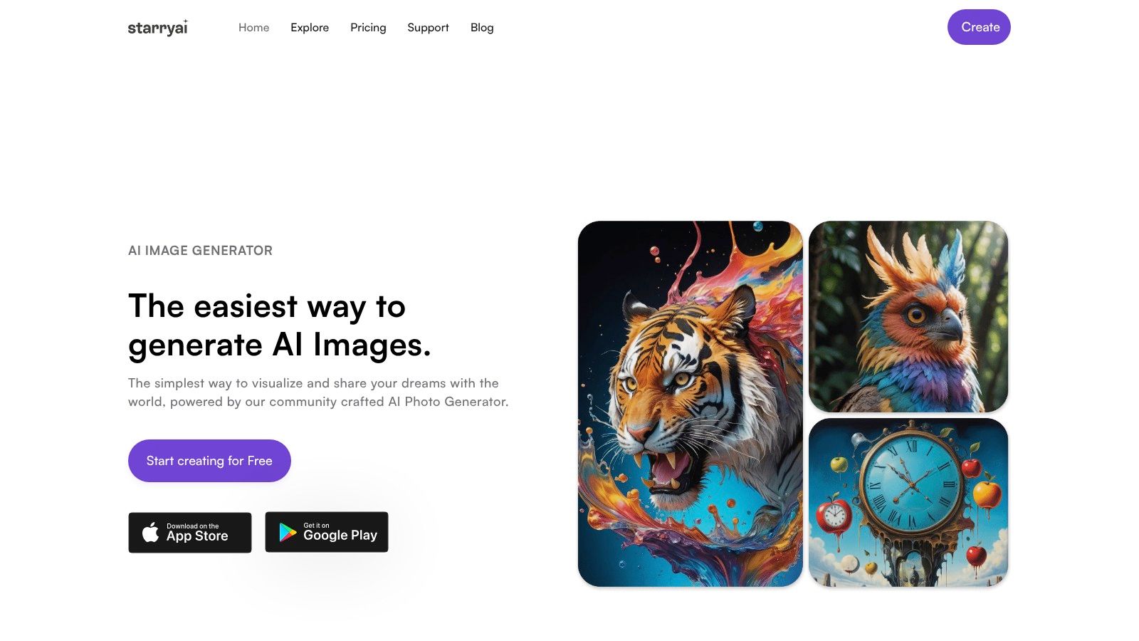
The useful thing about starryai is that it keeps the creation flow accessible for people who want results without a complicated production setup. That matters if your goal is quick iteration on a selfie, character portrait, or product-friendly art concept instead of spending an hour inside pro design software.
There's also a practical limit worth knowing. starryai allows users to create up to 25 images daily with its free AI art generator, which gives non-paying users a clear daily ceiling for experimentation, according to this overview of starryai's free AI art generator. That's enough to test direction, but not enough to waste on random generations.
A better rhythm is to work in rounds.
That approach avoids the common mistake of burning through credits on tiny variations before you know what visual direction suits the image.
Here's a quick demo format if you want to see the kind of workflow this process supports:
Working standard: Don't ask whether the result is “good for AI.” Ask whether you'd keep it if you saw it in your own photo library.
That question usually tells you what to regenerate next.
Style choice is where most results either become artful or collapse into cliché. A strong source image can still come out looking synthetic if the selected style fights the subject. A delicate portrait pushed into a harsh comic look may lose emotional detail. A cityscape forced into a soft watercolor may lose structure.
According to Fotor GoArt's style overview, AI platforms offer over 50 unique artistic styles including oil painting, watercolor, and sketch, but quality depends on clear images, testing multiple effects, and adjusting composition. The same source also notes that many tools struggle with true neural style transfer and often mimic style over structure. That's why the style menu isn't the answer by itself. Your pairing of image, style, and prompt matters more.

A few combinations tend to work well:
| Subject | Style direction | Prompt language that helps |
|---|---|---|
| Close-up portrait | Oil painting | textured brush strokes, soft shadow, painterly skin tones |
| Pet photo | Storybook watercolor | soft edges, warm light, expressive fur texture |
| Landscape | Impressionist painting | layered color, atmospheric depth, visible brushwork |
| Architecture | Sketch or painted realism | ink detail, structured lines, textured surface |
The trick is to describe what a painter would emphasize, not what a camera already captured.
Weak prompt:
Better prompt:
Better still if the image calls for it:
If you want more direction on phrasing, this guide on how to write AI prompts is useful because it helps you think in visual attributes instead of vague requests.
Avoid words that only describe quality, like “amazing” or “beautiful.” Use words that describe appearance, like “textured,” “muted,” “soft edge,” or “brush-stroked.”
That same logic carries into other design use cases too. If you've ever tried to visualize kitchen designs instantly, you've seen how much the final output depends on precise visual direction rather than broad taste words. The same principle applies here. Specific prompts produce more coherent images.
Prompts go sideways when they ask for too many aesthetics at once. “Oil painting, anime, hyper-real, fantasy, watercolor, cinematic” usually creates confusion rather than texture. Keep the visual brief narrow.
Another common miss is trying to fix a weak composition with prompt language. Prompts can steer mood and finish. They can't fully rescue a badly framed photo.
A painting can look great on a phone preview and fall apart the second you try to post it full-screen or print it. Fine texture turns soft. Edges break up. What looked painterly at small size starts to look low-resolution.
That's where finishing matters. Upscaling isn't just about making the file larger. It's about preserving the detail that makes the image feel intentional.
Use enhancement after you've chosen the version worth keeping. Don't upscale everything. Pick the image with the strongest face, background, and texture balance first, then finish that one.
According to starryai's Enhance feature guide, the Enhance feature increases image resolution and detail, but enhanced images are automatically stored for only 7 days before deletion. That means downloading your finished file isn't optional.
Use a simple checklist:
If you want a dedicated finishing step, an AI image upscaler can help prepare your selected artwork for larger displays or print-oriented use.
The fastest way to lose good AI art is to treat the final export as an afterthought. Save the finished version as soon as you know it's the keeper.
That habit saves a lot of frustration later.
The creative part doesn't end when the image looks done. Once you post it, sell it, or use it on a cover, people start asking a different set of questions. Not just whether it looks good, but what it is and who made it.
That question is becoming more visible in public conversations around AI-generated artwork. In a LinkedIn post about turning a photo into a watercolor painting, Stefan Lindeberg said the top questions were “Who is the artist?” and “How were they made?” Those questions matter for indie authors, Etsy sellers, marketers, and anyone using AI-assisted visuals in public.
If you chose the original photo, decided the visual direction, wrote the prompts, rejected weak outputs, enhanced the final image, and prepared it for use, you directed the work. That doesn't erase the role of the tool. It does mean the result came from a human-led process rather than a random automated event.
A clear description helps:
That's a stronger and more honest story than pretending the image appeared fully formed.
If you plan to use AI-generated art for prints, book covers, avatars, or social posts, keep your workflow documented. Save the original photo, a few prompt versions, and the exported final. That record helps you explain how the work was made if a client, customer, or collaborator asks.
It also improves trust. People are often comfortable with AI-assisted art when the creator is transparent about the process and thoughtful about the final presentation.
The image feels more legitimate when you can explain your decisions, not just the tool you clicked.
That's the standard worth aiming for. Make something attractive, but also make something you can stand behind.
If you want a fast way to turn a favorite photo into shareable painted artwork, starryai gives you a practical starting point for generating, refining, and exporting AI-assisted images without a complicated editing workflow.


.svg)