

Written by Mo Kahn on
July 28, 2026


You've got a photo you like, but it still feels like a photo. Maybe it needs to look softer for a TikTok post, cleaner for an Etsy listing, more stylized for a character concept, or just less like a phone snapshot and more like something you'd hang, print, or sell. That's the job here, and it's bigger than pressing a one-click filter.
A workable photo-to-illustration result usually comes from one of three paths. Fast AI tools handle speed and style variation well, mobile shortcuts solve the “I need this now” problem, and manual Photoshop or Procreate work gives you the kind of control that keeps a line from wobbling or a face from melting into mush. If you're starting from a product shot, a practical reference like product photography for Amazon can help you think about source quality before you stylize anything.
The hard part isn't finding a tool. It's matching the tool to the job, because a TikTok glow-up, a book-cover character, and a brand-ready batch all want different levels of control and cleanup.
A client sends a headshot, or you dig up a favorite travel photo, and the image is good but flat. The face is clear, the composition works, but it needs a second life that feels more designed than documented. That's where the decision starts, because turning a picture into an illustration can mean a quick stylized redraw, a more polished AI interpretation, or a manual build that holds up in print.
The three practical paths are easy to separate once you look at the end use. AI workflows are the fastest way to explore style, mobile shortcuts are useful when you're away from a desktop, and manual Photoshop or Procreate work is what you reach for when you care about line quality, editability, or a consistent brand system. Adobe Illustrator's long-standing vector pipeline helped make this kind of work practical back in 1987, and later Image Trace improvements in 2019 kept that workflow useful for modern creative production. Adobe's vector approach still matters because it scales cleanly without pixelation, which is exactly why logos, merchandise, and publishing workflows still depend on it PicMonkey's overview of the photo-to-illustration pipeline.
A good source photo matters more than people want to admit. Clear edges, decent lighting, and a subject that already reads well at thumbnail size usually survive conversion better than a noisy, low-resolution snap. If the final output is meant for a social post, a character concept, or a print piece, decide that upfront, because the best method changes with the destination.
Practical rule: if the photo can't hold up on its own, no stylization trick will save it.
The final choice is less about the flashiest app and more about whether you need speed, control, or scale. That trade-off is the thread running through everything else.

A fast result starts before you upload anything. Pick a photo with one clear subject, a simple background, and strong shape separation, because AI keeps what it can read cleanly and turns the rest into visual noise. Portraits and product shots are especially unforgiving here. If the source is cluttered, the output usually comes back muddy instead of crisp.
Use starryai when the job calls for quick photo-to-illustration conversion with some control over style. Its image editing flow supports uploads and text prompts, and its photo style filter can turn a photo into a stylized image while still responding to prompt direction. Start with the photo, open the edit or style filter path, and keep the prompt tight so the subject stays in charge. The quick-start guide for starryai is the clearest place to see that flow from setup to output.
Write for the output you want, not a long list of adjectives. The prompt should tell the model what the illustration needs to be used for and what visual traits matter most.
If the app gives style controls, use the cleaner presets for faces and products. A style that preserves edges is safer than a heavy painterly preset when the subject has to stay recognizable. That matters for profile photos, merch art, and any image with text or labels that should not warp.
Run several generations, keep the strongest one, then do a cleanup pass if the result still needs work. Hold the subject-centered prompt steady and change only one variable at a time, such as “flat vector” to “editorial ink” or “soft pastel” to “retro print.” That makes it easier to see which choice fixed the image and which one pushed it toward generic mush.
Mobile tools are useful when you need speed more than precision. They're strongest on clean selfies, simple portraits, and flat product photos, because those subjects survive automated stylization better than busy group shots or messy backgrounds. If the photo already has a clear silhouette, a phone app can get you to a presentable illustration with very little friction.
The most common mobile route is a selfie or style app that turns a photo into a stylized avatar or portrait, then lets you export a social-ready image. A second route is using a mobile editor with built-in illustration or sketch effects, which is faster but usually less nuanced. A third route is uploading to an AI app on your phone and choosing a style filter, which gives you a bit more control without forcing you onto a desktop.
Mobile shortcuts usually break down in the same places. Fine hair details get simplified too aggressively, product edges can warp, and free tiers often leave you with lower-quality output or a watermark. That's fine for a mood test or a quick post, but it's not ideal if you're making sellable art or a polished brand asset.
Use the highest export setting the app offers, and crop before you stylize if the frame is already crowded. On a phone, a messy source image is harder to rescue because the screen hides small mistakes until the end. If the app output still looks blurry or overprocessed after one or two tries, switch to a desktop workflow rather than spending an hour fighting the phone.
For selfie-specific quick fixes, the AI selfie generator guide is useful if your goal is fast personal content rather than production-grade illustration.
Clean input on mobile beats clever editing later.
The mobile shortcuts that are genuinely useful are the ones that help you test style quickly. The ones that promise a perfect final image with no cleanup usually fall apart as soon as you zoom in.
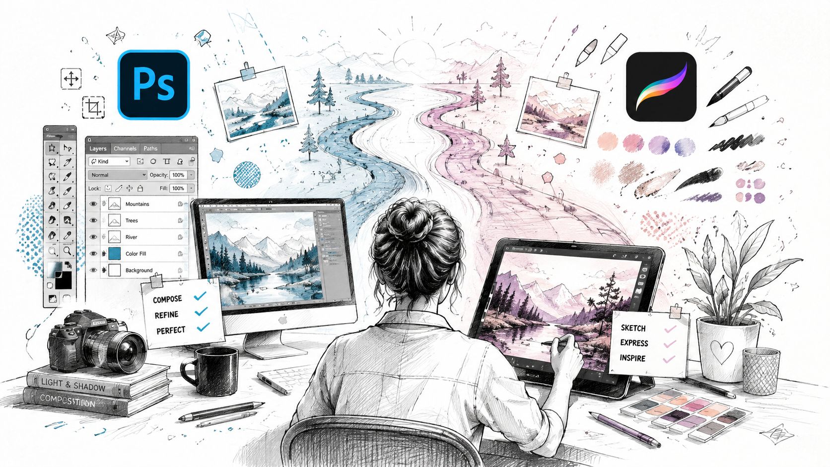
A phone filter can get you a quick style pass. Photoshop or Procreate gives you control over what stays sharp, what gets simplified, and where the illustration should keep its character. That matters when the file has to hold up in branding, merch, character art, or any other use case where a generic conversion falls apart fast.
Manual work also gives you a clearer way to compare process choices. If you are deciding between a guided trace and a more automated route, a comparison of AI tools versus Photoshop helps frame the trade-offs before you commit to a file. The point is not to make the workflow slower for its own sake. The point is to keep control over the outline, the color blocks, and the texture so the final piece looks chosen, not filtered.
Start by placing the photo on a base layer, then lower its opacity to about 30 to 40 percent so it acts like a guide instead of a competing image MotionLaps' guided trace workflow. Trace the main contours on a new layer, block in flat color underneath, then add shadows and highlights with clipping masks. Finish with a paper or canvas texture set to Overlay or Soft Light so the surface feels intentional without getting muddy.
That workflow works because it keeps the proportions intact while you decide how much detail deserves to survive. You are not trying to redraw the entire photo in one pass. You are simplifying in layers, which helps the face, object, or pose stay readable while the style changes around it.
Photoshop-specific steps help when the source needs to become cleaner line art. One practical route is to use Levels to push contrast, then use channel-based selection and Work Path generation to turn tonal regions into editable paths this Photoshop path-building tutorial. In Illustrator, the related route is Image Trace or the older Live Trace, followed by Expand, which converts the trace into vector outlines Adobe's Image Trace tutorial.
If the output needs to print cleanly, stay editable, or sit inside a set that has to match from one image to the next, manual tracing earns its keep. It is slower, and that is the trade-off. The source photo still has to be simplified first, because too much tonal detail creates noisy paths that are tedious to recolor, scale, or clean up later.
Practical rule: simplify before you trace, or you will spend the rest of the session undoing clutter.
Some illustrators still use an older paper-first process. They print the photo in black and white, trace it on paper or a light box, then scan it back in before finishing in Illustrator Mavenart's guide to photo illustration. That extra step sounds slow, but for certain compositions it gives the cleanest control over line rhythm, especially when the original image is crowded or hard to separate into simple shapes.
The right method depends on what the image has to do, not on which tool sounds exciting. If speed matters most, AI or mobile wins. If you need a file that can scale cleanly or fit into a brand system, manual vector or trace-based work is safer. If you're aiming for character art or a one-off social image, a hybrid approach often gives the best balance.
| Method | Speed | Control | Best For | Watch Out For |
|---|---|---|---|---|
| AI workflow | Fast | Medium | Social visuals, character concepts, quick style tests | Can distort details and needs prompt iteration |
| Mobile shortcut | Fastest | Low to medium | Selfies, simple posts, quick mood pieces | Lower resolution, watermarks, limited cleanup |
| Photoshop or Procreate | Slower | High | Print, merch, brand sets, editable illustration | More time, more manual cleanup |
| Illustrator trace workflow | Moderate | High | Vector-style logos, scalable line art, merchandise | Overcomplicated traces if the source is too detailed |
For Etsy sellers and side-hustlers, the key question is whether the image needs to be consistent across a set. For social managers, the question is whether the output is on-brand and fast enough to publish on time. For indie authors, the question is whether the illustration can support a character or cover system without looking like a different artist made it each time.
If you want speed, choose AI or mobile.
If you want editable line quality, choose Photoshop, Procreate, or Illustrator.
If you want batch consistency, choose a manual or hybrid workflow and keep the source photos tightly matched.
starryai fits into the speed-first group because it can take a text prompt, image, or sketch and generate a new illustration from that input, which makes it useful when you want a stylized starting point before any heavier cleanup. If the job has print constraints or a strict brand system, don't stop at the first pass. Use the tool that gets you closest, then finish where the control is.
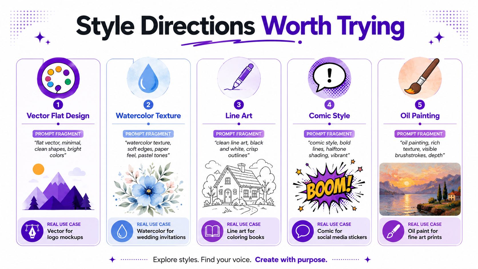
The easiest way to keep results from feeling generic is to commit to a style lane before you generate anything. Editorial portrait, anime character, sticker art, painterly scene, flat vector, and retro print each solve a different problem, and each one needs slightly different language. A prompt that says “beautiful illustration” usually produces forgettable output because it doesn't tell the model what kind of structure to build.
Keep a short prompt bank and save the versions that give you the strongest subject clarity. If one style is close but not quite right, mix two directions intentionally, like vector flat design plus subtle paper texture or comic line art plus muted retro colors. That combination often feels more specific than a single preset.
For batch work, keep the language consistent across the set and only vary the subject details. A character sheet, Etsy collection, or content series looks more coherent when the style grammar stays stable. The same prompt twice can still give you two useful but different images, which is why prompt language is a tool, not a spell.
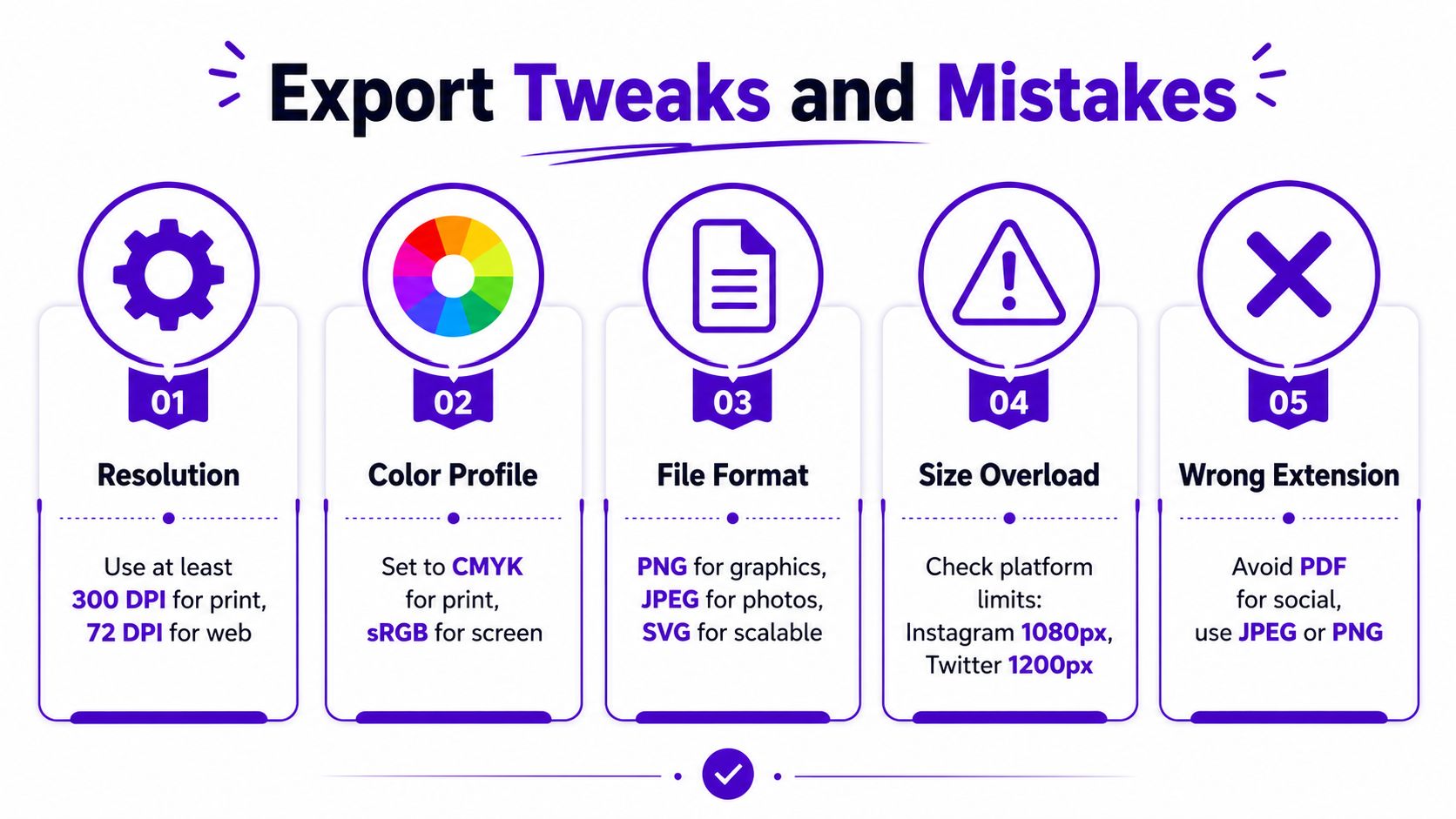
A stylized image only counts as finished when it exports cleanly for the place it's going. Transparent PNGs work well for graphics and layered layouts, flattened JPGs are fine for many social posts, and vector-style SVG or Illustrator output matters when the image has to scale without losing crispness. If the output is for print, keep the file prepared for that use instead of sending a social-friendly version into a production file.
Too much detail in the source photo creates muddy edges. Prompts that fight the subject produce awkward faces or broken proportions. Stray artifacts stick around when you skip cleanup. Batch inconsistency makes a commercial set feel random instead of branded.
The biggest mistake is exporting too early. A clean illustration usually needs one more pass than the first version you like, especially if the goal is merch, Etsy, or a repeatable content style. Use the highest quality export the tool allows, then check the image at full size before you post or print.
A simple preflight check helps:
A good photo-to-illustration workflow ends with something usable, not just something pretty. That difference is what separates a fun experiment from a file you can post, print, or sell.
If you want a faster way to turn a photo into an illustration without getting lost in cleanup, try starryai for prompt-driven style exploration and image editing from a photo, prompt, or sketch. Visit starryai to test a few looks, compare the outputs, and see which style direction fits your next post, character concept, or product graphic.


.svg)