


Written by Mo Kahn on
July 31, 2026


You've got the reference image pinned, a half-working prompt in starryai, and a result that keeps drifting toward generic Halloween art. The face is close, the palette is close, but the character still doesn't read as Tim Burton style characters because the shape language, contrast, and outsider mood aren't stacked together yet.
That's the gap most prompts miss. Burton's look was built across films like Pee-wee's Big Adventure (1985), Beetlejuice (1988), Batman (1989), Edward Scissorhands (1990), and The Nightmare Before Christmas (1993), with a consistent mix of exaggerated anatomy, gothic silhouettes, and outcast protagonists that became a recognizable visual signature over decades of mainstream releases. The useful part for creators is simpler than the mythology around it, because starryai responds better to concrete shape, color, and composition tokens than to a vague style label.
The usual workflow goes like this. You type Tim Burton character into starryai, hit generate, and get something that feels oddly flat, too familiar, or accidentally stitched together from every haunted-carnival image on the internet. The face might be pale, the eyes might be large, but the result still misses the mark because the model got only a label, not a design system.
That's where most creators lose the thread. Burton-style characters aren't built from a single visual trick, they're built from a stack of signals, and the strongest ones are shape language, color contrast, gothic silhouette, and outsider framing. Burton's long-running film output made that stack easy to recognize in popular culture, and the style became a repeatable authorial signature rather than a one-off look, which is why the phrase now carries so much visual baggage. The most useful way to work with it is to stop asking for the brand name first and start describing the parts starryai can pattern-match.
Practical rule: if the prompt doesn't say how the body is built, what the palette does, and how the character stands in the world, the model fills the gaps with clichés.
The first signal is exaggerated anatomy, especially long limbs, narrow torsos, and faces that lean toward triangles or circles instead of realistic proportions. The second is the gothic silhouette, which gives the figure a sharp, almost cut-paper outline. The third is muted base color with bright contrast, because Burton-inspired characters often live in dark, desaturated scenes punctuated by small color pops. The fourth is the outcast mood, which makes the character feel separate from the room instead of just dressed for a costume party.
These cues show up across Burton's milestone films, but they don't all need equal weight in every prompt. Shape and silhouette tend to land first. Mood needs a little more help, especially in AI tools that default to decorative rather than narrative output.

A clean prompt starts with those layers in mind, not with a pile of style adjectives. If you want a general prompt-writing refresher, the structure in starryai's prompt guide is a useful companion when you're deciding what to lead with and what to leave out.
Burton-style figures read fast when the silhouette does the heavy lifting. The LACMA teaching material recommends blocking the head as a circle-to-triangle silhouette, placing facial feature guide lines before details, and exaggerating asymmetry early, because over-detailing too soon weakens the simplified but expressive look that these characters rely on. That logic maps cleanly to starryai prompts, where concrete shape tokens usually outperform vague style labels.
A strong base phrase often looks more like design language than art criticism. Geometric face, narrow shoulders, oversized hands, long legs, tilted posture gives the model something to build. Add large circular eyes or small pointed chin only when those features support the silhouette, not when you're stacking descriptors for the sake of it.
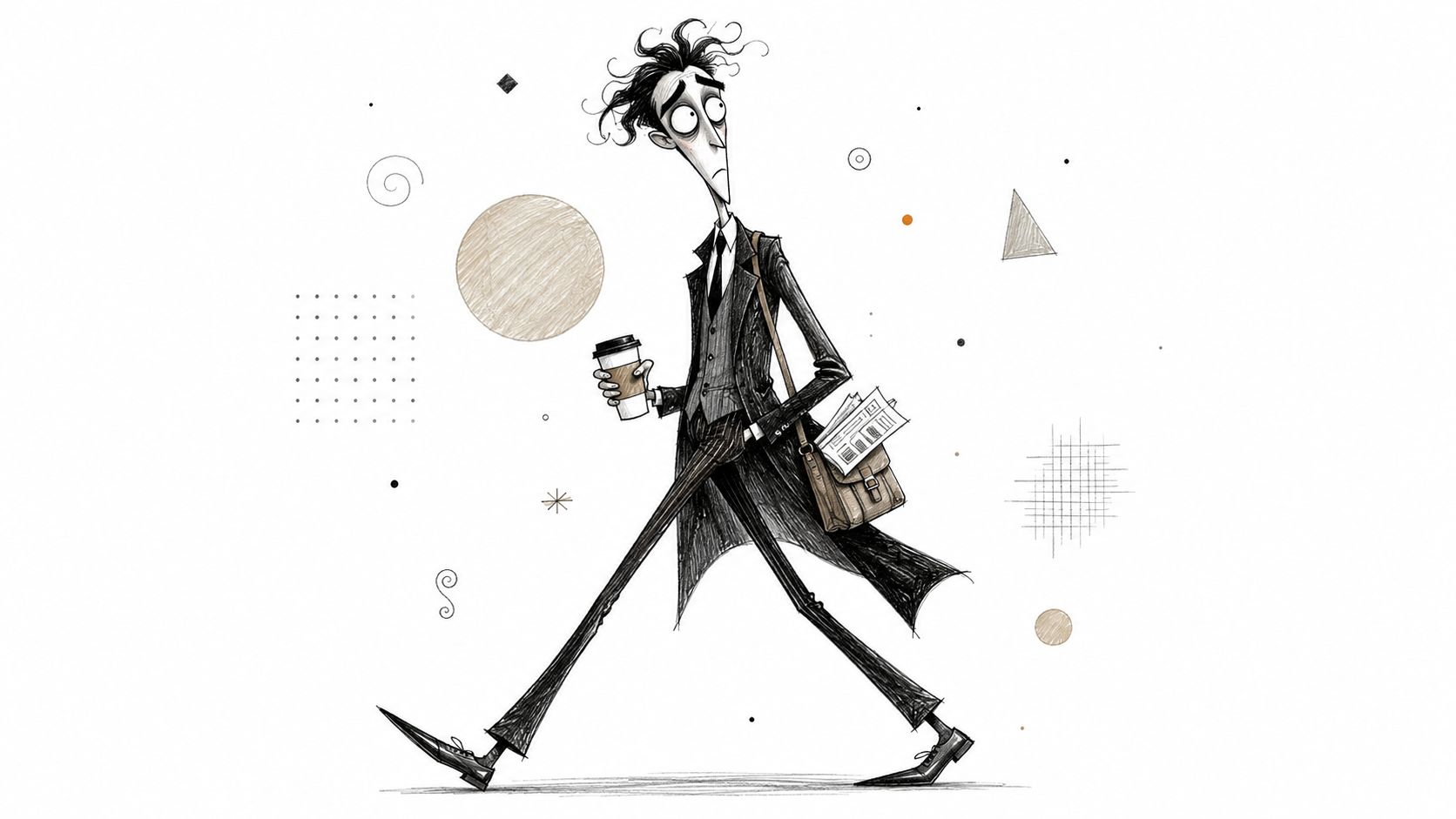
Here's the part that tends to work in practice. Build the prompt from four blocks, subject, shape, clothing, mood. A useful base template is:
[subject], elongated body, narrow shoulders, oversized hands, angular face, circular eyes, gothic silhouette, asymmetrical pose, pale muted palette, moody lighting
If you're making a character for a poster, book cover, or avatar, keep the subject specific. “Young inventor,” “sleepy ghost groom,” or “serious undertaker” gives the model a role to dress, which tends to produce cleaner results than a generic figure description alone. For more background on character construction choices, starryai's character design guide is worth comparing against your own prompt habits.
For a visual reference beyond the AI tool itself, the Famous Movie Posters selection is useful because it shows how theatrical framing and character exaggeration can carry the whole composition even when the design stays simple.
Burton-inspired color often fails in AI because people ask for dark and moody, then wonder why the image looks muddy. The stronger move is to request a muted base and a single bright pop. In practice, that means blues, greys, and purples carry the body and background, while a yellow, red, or orange accent pulls the eye to one focal point.
| Base palette | Accent color | Mood it produces |
|---|---|---|
| Desaturated blue and grey | Warm yellow | Quiet, uneasy, theatrical |
| Purple and slate | Red | Strange, dramatic, slightly dangerous |
| Cool grey and black | Orange | Haunted, playful, high-contrast |
The goal is contrast, not darkness for its own sake. One source notes Burton's compositions often pair saturated color with monochrome values, letting blues, greys, and purples sit beside brighter yellows, reds, and oranges, so the color system becomes a structural rule rather than a vague atmosphere cue. That's the kind of prompt detail starryai tends to hold onto when the rest of the scene starts getting busy.
A practical palette token set looks like this:
desaturated blues, greys, and purples, black-and-white contrast, small bright accent in red or yellow, matte costume textures, eerie but elegant lighting
That phrasing works better than “Halloween palette” because it tells the model what the colors are doing. If you want to stay inside Burton's visual lane without collapsing into costume-shop imagery, starryai's style overview can help you decide whether the palette should read as illustration, poster art, or character concept art.
Burton-style characters don't just look unusual, they often feel socially apart from the scene around them. The PDF source on Burton's characters describes them as outsiders, misunderstood, outcast, lonely, and searching for belonging, which is why the mood layer matters as much as anatomy. If the prompt only describes appearance, the result can look like a stylized mannequin instead of a character with a narrative position.
Tilted framing helps because it makes the world feel unstable. Low-angle composition does something different, it puts the character inside a bigger, more imposing environment without needing to say that directly. Prompt phrases like framed from below, dutch angle, lonely protagonist, and small figure in a vast gothic street push starryai toward that feeling.
That's especially useful for social-media-ready portraits, where you may not want a full scene crowding the image. A single figure can still read as Burton-esque if the lighting and camera language signal separation. A character standing alone under a streetlamp, with a pale face and a crooked skyline, will usually feel more Burton-like than a busy scene packed with decorative Halloween elements.
The mood isn't decoration. It's the difference between a themed character and a recognizable point of view.
Use combinations that preserve the outsider tone without over-explaining it:
The key trade-off is simple. More mood tokens can make the image stronger, but too many can also slow the model into a static pose. Keep the emotional language clear and spare, then let the clothing and silhouette do the rest.
A lot of creators want a single “magic” prompt, but Burton-style work gets better when you pick a character role first. A melancholic hero needs different emphasis than a trickster or sidekick, even if the shape language stays consistent. For RPG avatars and character art workflows, that role-first method also lines up well with tips for AI-generated RPG characters, because the subject stays specific instead of drifting into generic goth fashion.
Young outsider hero, elongated body, narrow shoulders, oversized hands, angular face, large circular eyes, pale muted skin tones, desaturated blue and grey clothing, single red accent, low-angle framing, dutch angle, lonely expression, gothic-victorian street, cinematic character concept art
This version works because it keeps the character sympathetic. The red accent adds focus without turning the design into a costume.
Mischievous trickster character, sharp triangular silhouette, asymmetrical grin, long arms, slim torso, black coat with purple lining, muted background, yellow highlight detail, crooked posture, theatrical shadows, framed from below, Burton-inspired storybook illustration
This one needs a little restraint. If you make the smile too wide or the outfit too noisy, the image tilts into cartoon parody instead of Burton-like mischief.
Silent sidekick with oversized boots, small shoulders, round eyes, pale face, layered grey outfit, orange accent scarf, slightly hunched stance, isolated in a misty street, soft contrast, gothic silhouette, character design portrait
This version benefits from simplicity. The sidekick read comes from understatement, not from adding extra props. A lot of AI outputs overcomplicate secondary characters, and the result stops feeling like a companion and starts feeling like clutter.
A useful template to remix is:
[role], [body shape], [face shape], [clothing texture], [one accent color], [camera angle], [mood], [setting], [art style]
That structure keeps the prompt flexible enough for TikTok transformations, indie book covers, and tabletop avatars without forcing every character into the same visual mold.
The cliché trap is easy to spot. Pale figure, striped sweater, deadpan stare, and maybe one too many stitches or spirals. That look appears because the keyword pulls hard toward the most overused Burton-adjacent training patterns, especially the Edward Scissorhands association, so the model reaches for the same visual shorthand again and again.
The fix is to make the Burton rules work on unfamiliar subjects. Put the style onto a Victorian librarian, a space mechanic, or a medieval messenger, then keep the silhouette and mood while changing the cultural cues. Negative prompts help too, especially when you want to pull back on the most obvious tokens.

The safest commercial mindset is to use the vocabulary of the style, not the identity of a specific Burton character. That means you can borrow silhouette logic, contrast, and outsider framing without copying a recognizable design. The strongest results usually come from mixing Burton's rules with an unexpected subject instead of trying to recreate a known icon.
When a prompt misses, it usually misses in one of five predictable ways.
A quick commercial-use check helps too. If the image looks like a specific Burton character, it's too close. If it reads as a Burton-like worldview built from shape, color, and framing, it's much safer to publish, especially for covers, avatars, or merch concepts. The point is to make the style legible without making the source obvious.
The strongest prompt pattern across this guide is still the same one, subject plus shape plus palette plus mood plus composition. That combination gives starryai enough structure to do real work without collapsing into the same pale, striped, overfamiliar figure every time. Burton's rules are a toolkit, not a template, and the most interesting characters come from bending them just enough to feel new.
If you want to test these prompt patterns quickly, open starryai and build one character at a time from shape, palette, and mood instead of relying on the style name alone. That's the fastest way to see which details hold, which ones drift, and which Burton-like combinations still feel original enough to use.


.svg)