

Written by Mo Kahn on
July 22, 2026


You've got a launch date, a blank canvas, and a visual you can already see in your head. Maybe it's a moody fantasy portrait for a Kindle cover, a punchy square graphic for Instagram, or a clean t-shirt concept for your Etsy shop. The hard part usually isn't having an idea. It's turning that idea into something polished before the momentum disappears.
That's where text to image online tools become useful. They collapse the distance between concept and first draft. Instead of waiting on a full illustration process, you can test moods, compositions, and directions fast, then keep only the versions that earn their place.
The trick is knowing how to steer the tool so the output matches the job. A social post needs different choices than a book cover. A merch graphic needs different constraints than a character portrait. Good results come from making those choices on purpose, not from typing a vague sentence and hoping the AI reads your mind.
A lot of creative work starts with pressure. You need three product mockups by tonight. Your book cover concept still feels generic. Your TikTok post needs a visual that stops the scroll. In those moments, text to image online tools work less like a novelty and more like a fast sketch partner.
The basic move is simple. You describe what you want in words, the model translates that prompt into visual form, and you review the result like an art director reviewing first-round concepts. That speed matters because early creative decisions are easier to change than late ones. It's much cheaper to rewrite a prompt than to rebuild a finished campaign asset.
The space is growing because more people now use these tools inside real workflows, not just for experimentation. The global text-to-image generation market reached approximately USD 1.8 billion in 2025 and is projected to reach USD 12.4 billion by 2033, a projected 28.3% CAGR, according to DataHorizzon Research on the text-to-image generation market. That kind of growth tells you this skill is moving into everyday creative work.
If you sell products, publish fiction, manage social content, or build gaming characters, the value is practical:
Practical rule: Use AI image generation first for exploration, second for refinement. It's strongest when you're deciding what the piece should become.
New users often ask the model for a finished masterpiece on the first try. That's backwards. Start with a narrow outcome. “Poster-style fantasy cover with a lone rider and cold blue lighting” is a usable direction. “Make something epic and magical and beautiful” isn't.
Think like a creative director, not a slot machine player. Decide the asset's job, then shape the image around that job. A square promo visual needs a simple focal point. A merch design needs readable shapes. A book cover needs clear hierarchy and room for title placement.
Once you approach AI art that way, the tool stops feeling random. It starts feeling useful.
Not every project wants the same visual language. Some pieces need softness, texture, and dream logic. Others need cleaner edges, stronger form, and detail that holds up when you crop or enlarge. That's why your model choice matters before you even start tweaking the prompt.
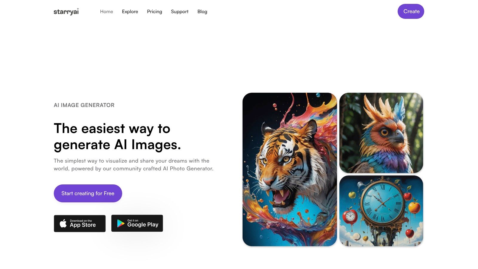
One practical option for text to image online work is starryai, especially if you want a straightforward interface and fast experimentation without turning the process into a technical hobby. If you want a broader model overview before choosing a direction, this guide to text-to-image model comparisons is a useful starting point.
The most important decision inside the tool is the engine selection. According to Techshark's overview of starryai, starryai operates on a dual AI model architecture using Altair (VQGAN-CLIP) for abstract, dream-like imagery and Orion (CLIP-guided diffusion) for detailed, diffusion-based art.
That distinction is more useful than it sounds.
A good creative workflow starts with the asset type, then picks the engine that supports it.
| Project type | Better starting engine | Why |
|---|---|---|
| Indie book cover concept | Orion | Cleaner focal subject and stronger readable detail |
| Dreamy tarot-style print | Altair | Better for symbolic, painterly, less literal visuals |
| Social media portrait edit | Orion | Holds facial structure and contrast more reliably |
| Abstract wall art | Altair | Unexpected textures can become the appeal |
| Fantasy character mood board | Either, depending on goal | Altair for mood, Orion for costume and feature detail |
Start by asking one question. Do I need precision or poetry? That answer usually tells you which engine to try first.
If you're unsure, generate one version in each. Don't compare them as if one is universally better. Compare them against the brief. The “right” result is the one that solves the visual problem in front of you.
Prompting gets easier the moment you stop treating it like magic. A prompt is just creative direction in compact form. The model needs to know what to draw, how it should look, and which details matter enough to prioritize.

The cleanest structure for beginners is Subject + Style + Modifiers.
Subject is the core thing in the image.
Style tells the model what visual language to use.
Modifiers handle the details that control mood, composition, lighting, color, or finish.
Here's what that looks like in practice:
Put together, the prompt becomes a direct instruction instead of a vague wish.
For an Etsy seller creating a shirt graphic, keep the concept bold and readable.
retro black cat, vintage screen print style, limited color palette, centered composition, clean silhouette, playful occult theme
For an indie author developing a protagonist concept, describe what affects recognition first.
young sea captain with silver hair and weathered coat, dramatic fantasy portrait, stormy sky, stern expression, detailed face, painterly realism
For a gamer or tabletop player making a custom avatar, focus on visual identity.
armored desert mage with glowing blue runes, stylized character art, warm sand tones, sharp facial features, ornate shoulder armor, confident stance
Notice what these prompts don't do. They don't ramble. They don't stack abstract adjectives forever. They describe visible choices.
A deeper library of examples helps when you hit that “I know what I want, I just don't know how to phrase it” wall. This collection of AI image generator prompt ideas is helpful for that stage.
One useful thing to watch before your next prompt session:
Good prompts are visual instructions. If a detail can't be seen, it probably doesn't belong in the first draft of your prompt.
When a result misses, diagnose it like a director giving notes. If the pose is wrong, rewrite the subject. If the mood is off, rewrite the style. If the image is close but sloppy, tighten the modifiers. Don't rewrite everything at once unless the whole concept is broken.
A good prompt can still produce the wrong asset if the frame and style don't match the job. I see this a lot with first projects on starryai. Someone generates a strong character portrait, then realizes it needs to become a book cover, a hoodie graphic, and a vertical story post. One image rarely handles all three well without planning for the final use first.
Aspect ratio controls composition, subject size, and negative space. Those three decisions affect whether the image feels finished or awkward before you touch any advanced setting.
Models usually behave better in common formats. In practice, extreme crops are more likely to stretch backgrounds, crowd the subject, or create strange anatomy near the edges. Start with the format that matches the deliverable.
For social media visuals, I usually protect the center of the frame so the subject still reads on a phone screen. For book covers, I leave breathing room at the top and bottom before I generate anything worth refining. For merchandise, I keep the silhouette simple and avoid tiny edge details that look accidental once printed.
If you want a dramatic crop, get the balanced version first. Then crop, extend, or regenerate around that approved composition.
Style presets work best when the concept is already clear. They help you commit to a look. They do not fix a vague idea.
Here's the practical way to choose one. Ask what the image needs to do, not what sounds interesting in a menu.
| Goal | Better style direction |
|---|---|
| Book cover concept | Cinematic, painterly, dark fantasy, editorial |
| Merchandise graphic | Bold graphic, retro print, simplified illustration |
| Social media visual | Clean portrait, vibrant editorial, high contrast |
| Decorative art print | Dreamlike, abstract, ethereal, watercolor |
Trade-offs matter here. A cinematic style can give a cover concept drama and lighting depth, but it may also introduce extra texture that fights with title text. A bold graphic style reads better on merch and small thumbnails, but it can flatten subtle mood. Clean portrait styles are often safer for promotional visuals because the subject stays readable at smaller sizes.
One rule saves time. If the prompt already contains heavy aesthetic language, use a lighter style preset. If the prompt is short and functional, let the style do more of the visual work.
If the image feels muddy, cut competing visual instructions before adding more settings.
Resolution comes later. Sharp pixels won't rescue a weak crop, a confused style choice, or a subject with no hierarchy. Pick the version worth keeping, then upscale and prep it for publishing. Before you put that final file into paid or public use, review the starryai license terms for commercial use.
A finished image still needs a job description. Is it going on a mug, a landing page, a paperback cover, or a product listing? The answer changes how you prepare the file, how carefully you review it, and what usage terms you need to confirm before publishing.
If you plan to sell or publish the output, check the platform's terms before the image leaves your draft folder. Don't treat licensing as admin work you'll “figure out later.” It affects whether the asset is safe to use on merch, in ads, or on a commercial cover.
For projects created on this platform, review the current starryai license terms before using the image commercially. That's the fastest way to answer the practical question that matters most. Can this file go live in the context you're planning?
Then prep the asset for the actual channel:
Accessibility is where most AI art guides go thin. That's a mistake. The current problem isn't that creators don't care. It's that there is no widely accepted, platform-specific standard for when AI-generated images require alt-text, which creates an accessibility gap for creators using AI visuals, as noted in this discussion of the AI art accessibility paradox.
So use a simple rule. If the image communicates meaning, sellable information, mood essential to the post, or content someone would miss by not seeing it, write alt text.
A practical framework:
Examples:
The purpose of alt text isn't to prove you added it. It's to give someone access to the same useful information the image delivers visually.
You have the first good image. Now the job shifts from generation to direction. This is the stage where a rough AI concept turns into something you can post, print, or pitch with confidence.

Start with the issue that wastes the most time. The model adds things you never asked for. Extra fingers, floating objects, muddy backgrounds, fake lettering, props that pull attention from the main subject. A negative prompt helps clean that up by telling the model what to leave out.
Use it like a production note, not a rant. Short exclusions work better than a long list of complaints.
Prompt length matters too. In practice, image models respond better to clear visual instructions than to poetic paragraphs. If the result feels confused, trim the prompt until the subject, style, lighting, and composition are obvious at a glance.
Aspect ratio is another common trap. Wide banners, tall posters, and other extreme formats are useful for final delivery, but they often make the first generation harder to control. For a book cover, merch graphic, or social visual, I usually get approval on a more stable frame first, then adapt the winner for the final crop. That saves credits and protects the composition.
The most useful advanced controls are straightforward:
Clear priorities beat crowded prompts.
| Use Case | Prompt Template |
|---|---|
| TikTok background visual | [subject], vertical social media artwork, [mood], bold lighting, clean focal point, high contrast, minimal background clutter |
| Indie book cover concept | [character or object], cinematic cover illustration, [genre] mood, dramatic lighting, centered composition, room for title text |
| Etsy merch design | [main icon or phrase concept], printable graphic style, limited color palette, bold silhouette, clean edges, simple background |
| RPG character portrait | [character class and traits], detailed fantasy portrait, [color palette], expressive face, costume detail, stylized realism |
| Instagram promo post | [product or theme], square editorial visual, polished composition, brand-friendly colors, clear subject separation |
| Art print concept | [subject], decorative illustration, [style reference], textured finish, balanced composition, strong visual mood |
These templates work because they start from the final use case, not just the model settings. A social post needs a clear focal point that reads fast on a phone. A book cover needs space for title treatment. A merch graphic needs clean shapes and fewer tiny details so it still works when printed.
Use one template at a time. Replace the brackets with concrete choices, generate a few options, then develop the strongest direction. If all four outputs feel weak, rewrite the brief instead of polishing a bad concept.
If you want a fast place to test this workflow, starryai gives you a direct way to turn prompts into usable visuals for social posts, character art, cover concepts, and merchandise drafts without a long setup process.


.svg)