

Written by Mo Kahn on


You've just made an avatar you love on your phone, uploaded it everywhere, and watched it fall apart in three different ways. On one app the circle crop cuts off your hair, on another it shrinks into a blurry smudge, and on the platform where you sell work it looks far too playful. That's not a taste problem. It's a sizing, context, and testing problem, and it's fixable before you post. Treat your social media avatar as a small identity asset. Build it at the right size, style it for the room it's entering, test it with real viewers, and disclose clearly when it's AI made.
A square master can work across platforms, but the displayed size, crop, and file limit differ. Match each export to its destination, and keep the important details inside the crop.
| Platform | Display or upload size | File format and limit | Crop or safe-zone note |
|---|---|---|---|
| TikTok in-feed ads | 98 × 98 px, 1:1 | JPG, JPEG or PNG, under 50 KB | Key element inside 66 × 66 px center zone |
| LinkedIn personal profile | 400 × 400 px minimum, up to 7,680 × 4,320 px | PNG or JPG, up to 8 MB | Use an image that needs little cropping |
| Instagram profile | 1080 × 1080 px square master | JPG or PNG, export at the platform's displayed size | Keep the face centered for circle crop |
| X profile | 1080 × 1080 px square master | JPG or PNG, export at the platform's displayed size | Keep key features away from the edges |
The 98 × 98 px image size, 66 × 66 px centered zone, and under 50 KB limit in TikTok reservation in-feed advertising specifications apply to in-feed ad images, not profile photos. Keep key content near the center when adapting an image to a small square. Compress the file and check that it meets the stated ad limit before using it in that placement.
LinkedIn allows a larger upload, but a centered subject still makes cropping easier. The LinkedIn profile photo help page gives a 400 × 400 pixel minimum and an 8 MB ceiling for PNG or JPG files, and recommends an image that needs little cropping. A wide group shot may be harder to frame cleanly in a profile crop, even when the file fits the upload requirements.
For Instagram and X, start with the same square master, then export each version at the size shown by the platform. Check the crop in the app, since a square file can still lose edge details when displayed as a circle. The profile photo sizing tips from SuperX offer a further reference for keeping key features clear of the edges. For other placements, aspect ratios for social media explains how square images adapt to different formats.
Working rule: Keep a 1080 × 1080 master and make smaller exports from it. This avoids enlarging a small file and keeps every version tied to one clean source.
Before publishing, view each export at its displayed size inside a circle on your phone. If the face or logo is hard to recognize at a glance, adjust the crop or simplify the image.
You've got three inputs, and each one trades control for speed differently. A selfie keeps your real face recognizable. A text prompt builds a persona from scratch with no photo needed. A short emoji string works as a theme shorthand, handy when you want a mood or character idea fast and don't need likeness at all.
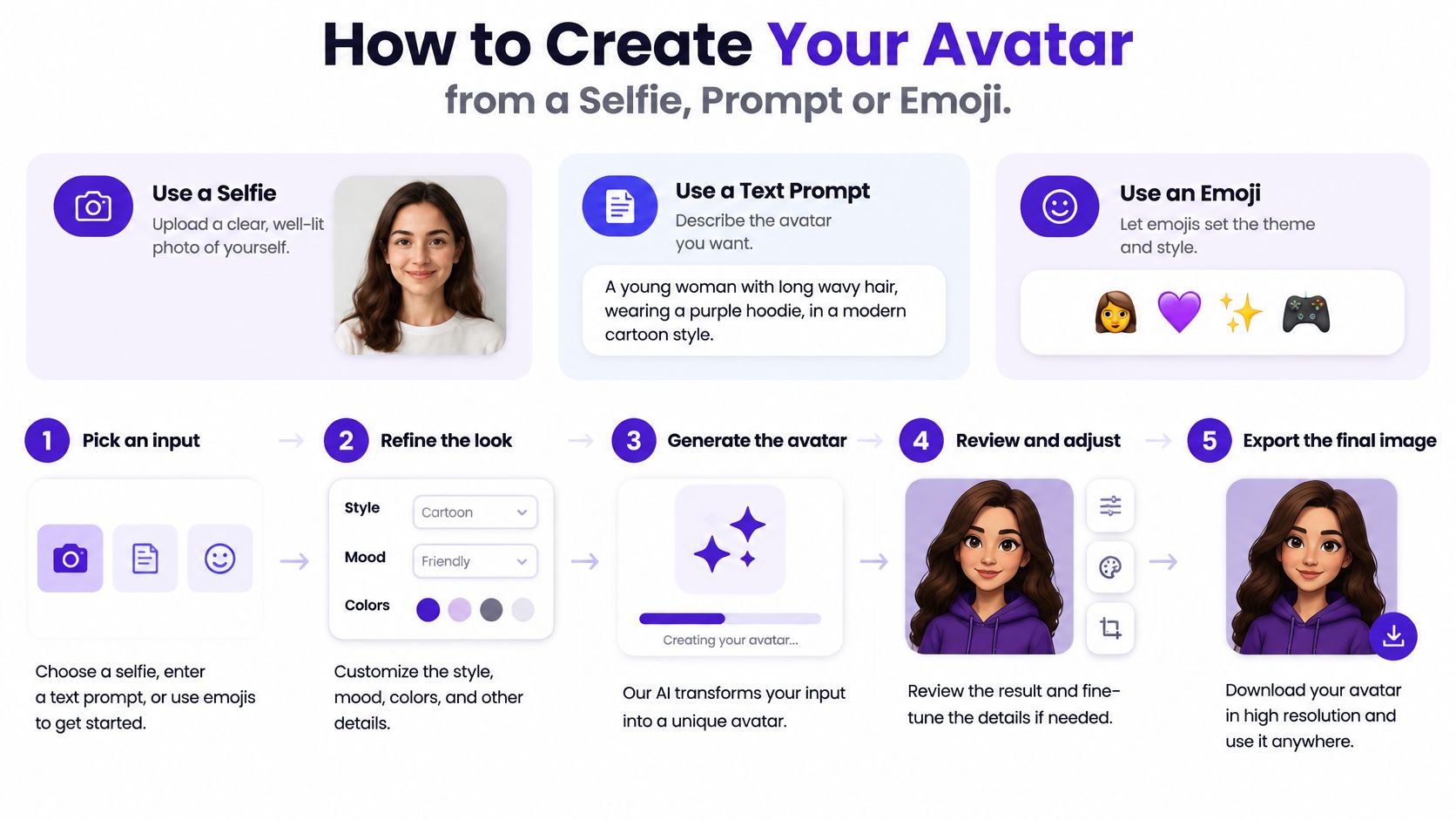
Pick your input. If recognizability matters, start with a selfie that's centered, evenly lit, and shot against a plain background. Harsh side light and sunglasses give the generator less facial information to work with, and the output drifts away from you. If you're building a character, skip the photo and let a prompt or emoji string set the theme instead.
Describe the idea in detail. Type a detailed description that includes colors, theme, and mood, plus hair, clothing style, and background. Vague prompts produce generic faces because the model fills every gap with averages. The guide on how to write AI prompts shows how specific nouns and lighting words change the result.
Choose a style that matches your persona. Pick a visual direction and stay with it across the whole set, so your variants look like one family rather than six strangers. A beauty creator and a tabletop RPG streamer shouldn't end up with the same finish. Consistency here is what makes the avatar feel like a brand mark instead of a one-off experiment.
Set the canvas size for the destination platform. Select the canvas size for the platform where you'll share the image before you generate, so the subject lands in the center from the start. This is a step that often gets skipped, and it's the one that prevents the classic failure where a late crop shoves the face off-center. Cropping after generation is a repair job. Generating on the right canvas is the actual fix.
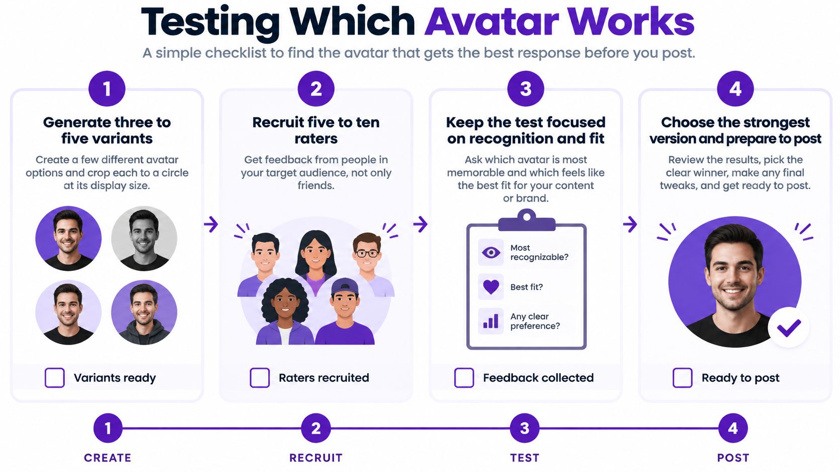
Click Generate and make at least three variants. One generation is a coin flip on eyes, hands, and accessories. Three or more variants give you real choices and expose which details the style handles badly. If every variant mangles the same earring or headset, simplify the prompt rather than regenerating forever.
Compare at thumbnail size, then download. Shrink every candidate to the size it'll appear in a comment thread and compare them side by side. The winner is the one you can still read, not the one with the prettiest detail at full size. Generated images can be downloaded instantly in high resolution or shared directly on social media, so export the large file even if your first use is small.
Don't judge any candidate at full-screen size. Nobody meets your avatar that way. They meet it next to your name, at the size of a fingernail.
A strong result keeps the face or main shape clear when shrunk, uses a simple background that separates cleanly from skin and hair, and keeps accessories away from the edges where the circle crop bites. Fine patterns, busy jewelry, and text almost always dissolve at small sizes. Bold shapes survive.
One caution before you build from a selfie. Under the Meta avatars terms of service, avatars are public content that may be viewed, interacted with, and shared across Meta products. Treat any selfie-based avatar as public from the moment you create it, and don't feed in a photo you wouldn't want circulating.
Profile images follow platform norms, so one identical avatar may not suit every context. An arXiv study of social media avatars examined 116,998 users on About.me matched to their Facebook, Twitter, LinkedIn, and Instagram accounts. It found that profile images differed by platform. On LinkedIn, approximately 90% showed a portrait of one person. On Facebook and Instagram, fewer than 60% were single-person portraits, while up to 40% were non-face images such as cartoons, nature scenes, and symbols.
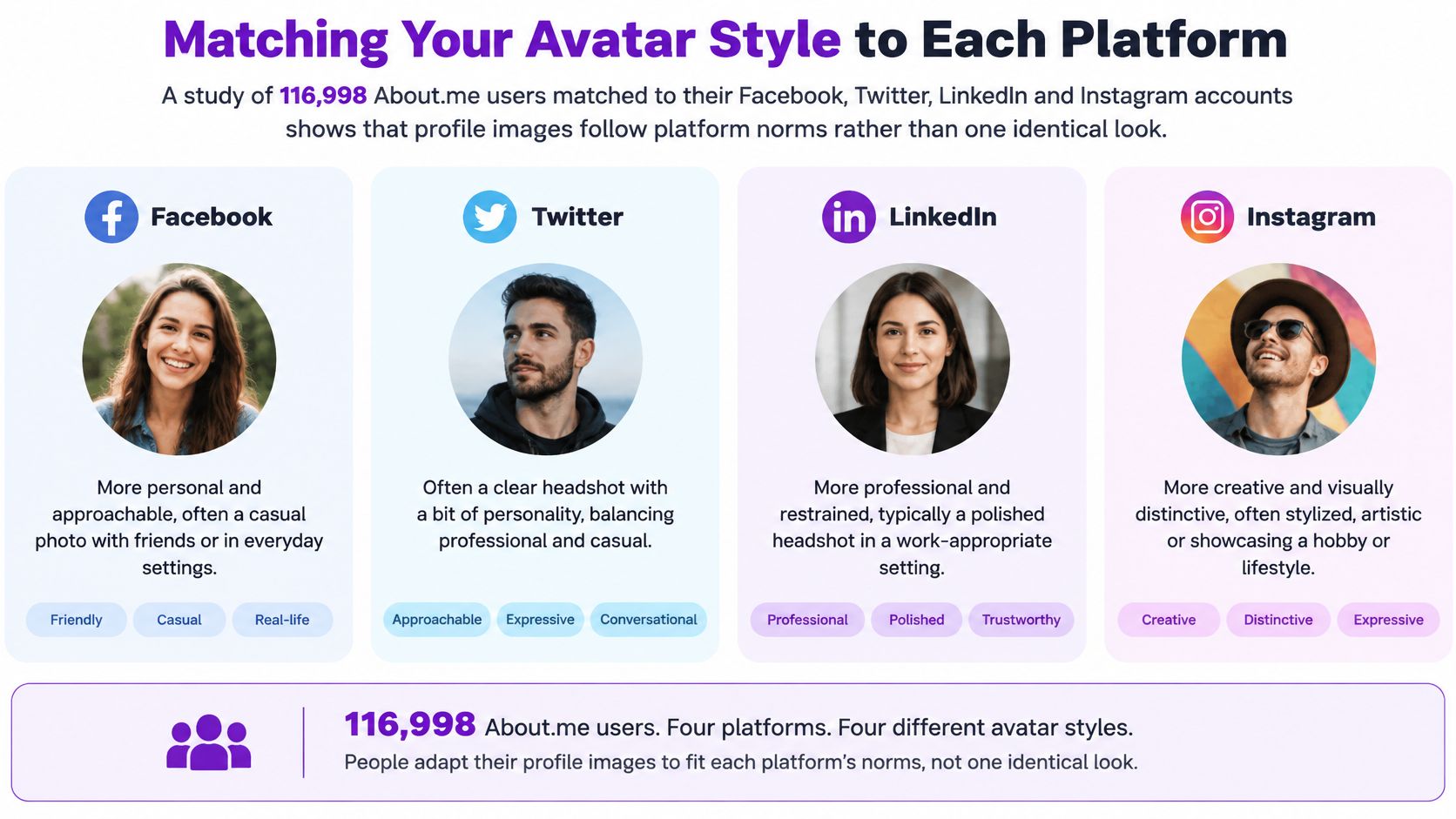
The study's machine-learning models identified the platform associated with an image with an area under the curve of 0.657 to 0.829. That result shows recognizable differences in image styles, not that an identical avatar performs worse. In practice, consider whether the image fits its setting: a cartoon mascot may feel out of place in a hiring context, while a corporate headshot may not fit a fandom account.
Set the primary context for each account before choosing a style. Then create a consistent variant family for that use, rather than changing your identity with every post. Keep the avatar representative of you or your brand, and disclose AI involvement where the platform or audience expects it.
Your favorite variant is a biased sample of one. A short blinded test costs an afternoon and routinely overturns the creator's first pick. Context is exactly why. In a controlled study of profile image selection using 1,224 Facebook profile images from 102 participants, context significantly affected which images people chose, with the strongest effect in professional-network scenarios at η²p = 0.155; p < 0.001.
Say a tabletop RPG streamer tests three character-style avatars with six regular viewers. Her favorite has the most elaborate armor, but at chat size it turns into gray noise, and the median picks the simpler version with one bold hood shape. That outcome is common enough that I would budget for your favorite to lose.
The pitfall that wastes a test is optimizing for visual novelty alone. An avatar built for a trend clip can win on memorability and still be wrong for an author page, a shop, or a professional account.
Rerun the test whenever the context changes, a new platform, a rebrand, a shift from hobby to paid work. The image didn't change, but the question viewers ask of it did.
Quality and honesty pull in opposite directions less than most creators fear. A factorial study comparing AI-generated and professional headshots found AI images were rated higher in perceived image quality, but disclosure that an image was AI-generated reduced perceived quality. Neither the generation method nor disclosure significantly changed perceived social attractiveness or trustworthiness.
Read small gaps cautiously. That study reported statistical power of approximately 30% for detecting effects of 0.1, rising to 75%, 98%, and 99% for effects of 0.2, 0.3, and 0.4. So treat a small score difference between two of your variants as a hint, not proof. It also means an AI avatar doesn't automatically buy you credibility. It buys you a clean image, and credibility still comes from how you present it.
Run every candidate through these four checks in sequence, because a failure early makes the later checks pointless.
Disclose the synthetic origin when platform rules, audience expectations, or your brand policy require it, and whenever the avatar could pass for a real photo of you at a real event. Never let an avatar imply credentials, awards, uniforms, or events you don't have. A stylized portrait that's obviously illustrated rarely misleads anyone. A photorealistic one of you shaking hands somewhere you never went is a different matter.
If disclosure lowers perceived quality with your audience, change the framing rather than hiding the origin. A plain bio line like AI-stylized portrait, paired with a recognizably illustrated style, reads as a creative choice. Silence reads as a risk someone else will eventually point out for you.
Hiding the origin to protect a quality score trades a small, temporary gain for a trust problem you can't schedule.
| Symptom | Likely cause | Fix |
|---|---|---|
| Face cut off in the circle | Subject framed too wide or off-center | Regenerate with the platform canvas and a centered crop (one regeneration) |
| Skin looks waxy or plastic | Over-smoothing from a strong style setting | Lower style strength or choose a style with visible texture (one regeneration) |
| Eyes or ears look uneven | Asymmetry in generated facial geometry | Generate more variants and pick one with symmetric features (new variant family) |
| Hands or accessories look distorted | Complex details near the edges | Remove busy props or crop them out of the frame (one regeneration) |
| Blurry in the feed | Export too small or upscaled | Export from a 1080 × 1080 master at the target size (export only) |
| Disappears in dark mode | Light background blends into the app theme | Add a darker background or a thin contrasting edge (one regeneration) |
| Clear at full size, unreadable as a thumbnail | Details too fine for small sizes | Simplify to one bold shape or symbol (new variant family) |
Sort fixes by cost before you start. Crop and export problems take minutes. Geometry, style, and identity problems need a fresh round of variants and another pass through your rater test. Whatever you change, check the fixed version at actual display size one more time, because fixes routinely introduce a new flaw at thumbnail scale.
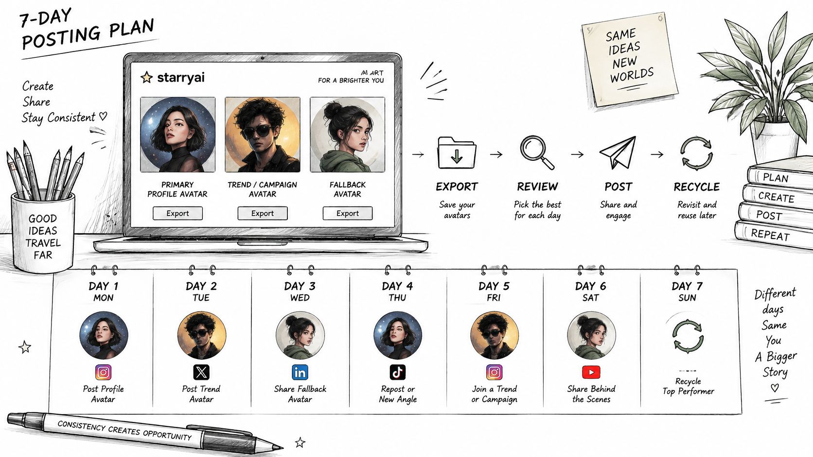
Day one: Generate a final set of three avatars in starryai, one for your primary context, one for trend or campaign use, and one conservative fallback. We offer daily free AI images without watermarks, so the set costs you nothing to build.
Day two: Export each at its platform size and check it in a circle at actual size. Day three: Run a blinded rating with at least five audience members and keep the highest median. Day four: Write your disclosure line and add it to your bio or caption where your context requires it, then review the sharing options for posting each version.
Day five: Post the primary avatar on your main account and schedule the campaign variant. Day six: Check the live avatar on a phone in light and dark modes. Day seven: Read how people respond in comments and rerun the test if they're reading it differently than you intended.
The best avatar isn't the most glamorous one. It's the one your audience reads correctly at thumbnail size and trusts.
Build your three-avatar set in starryai, starting from a selfie, a detailed prompt, or an emoji theme, then export each version at the size its platform needs. Run the blinded test, add your disclosure line, and post the winner this week while the variants are still fresh.


