

Written by Mo Kahn on


You've uploaded the manuscript, chosen a trim size, and finally reached the part that looked easy when you started: the cover. Then the practical questions arrive. Will the title remain readable as a retailer thumbnail? Does the illustration have enough room for the spine? Can the image be used commercially, and what happens if a printer rejects the PDF?
Self publishing book covers sit at the intersection of marketing, design, production, accessibility, and rights management. A front-facing image can be attractive and still fail as a print file. An AI-generated illustration can be commercially permitted and still offer limited copyright protection. The reliable workflow moves from concept to composition, then from composition to a validated, platform-specific PDF.
A reader finds your book in a crowded retailer grid, where every cover is competing at thumbnail size. If your title is set in a thin serif over a textured photo, the words can vanish at around 100 pixels, and the cover starts looking like a muddy rectangle. The practical fix is simple. Increase the title weight, raise contrast, or remove background detail behind the text so the book still reads in a split second.

That is why a cover has to pass two tests. Full size, it should feel deliberate and emotionally precise. As a thumbnail, readers should still catch the title, author name, genre signal, and main focal point without squinting or guessing.
The pressure is real because self-publishing puts more books into the same visual marketplace. Bowker reported that U.S. self-published books rose 287%, from 60,000 titles in 2006 to 235,625 in 2012, with e-books representing 37% of the 2012 total. The same historical account notes later growth to more than 1 million self-published titles in 2017, after the Kindle launch and the expansion of Kindle Direct Publishing. Publishers Weekly's history of self-publishing shows how the cover became part packaging, part storefront ad, and part product identifier.
Series branding makes this even more obvious.
Before a reader studies your description, the cover has already told them whether this book belongs to the one they bought last month. Repeated typography, color logic, title placement, and image treatment help build recognition across a series. The books do not need matching layouts, but they do need a clear family resemblance.
Cost also changes the decision. A custom cover can take a meaningful share of the total publishing budget, especially if you are releasing several books close together. Shopify's self-publishing cost guide summarizes broader self-publishing spending between $2,940 and $5,660, depending on the services purchased. That makes cover mistakes expensive twice. First in the original spend, then again in lost clicks, weak series recognition, or a redesign after you discover the file does not hold up in print.
My rule is practical. Judge the cover at its smallest realistic display first, then refine the larger version.
That mindset also keeps the whole pipeline connected. A striking concept still has to survive spine width calculations, bleed, DPI, and commercial-use rights before it becomes a print-ready PDF you can upload with confidence.
Professional covers communicate one clear idea quickly. They don't ask the reader to inspect every object before understanding the book's promise. The title, author name, image, and supporting elements should have a deliberate order of importance.
Start with the title. It usually needs the strongest contrast and one of the clearest type treatments. The author name should be prominent enough to support recognition, especially for an established series, but it shouldn't compete with the title unless the author's name is itself a major sales signal.
Then test the image. A romance cover may use a couple, a symbolic object, or an atmospheric setting, but the typography still needs to survive over the image. A business or self-help cover may use a restrained background, a strong headline, and a benefit-oriented subtitle. The genre changes the visual language, not the underlying requirement for clarity.
Color should reinforce the reading order. A pale title over a busy sky may disappear, while a darker text treatment or a controlled area of negative space can restore legibility. Decorative details should support the focal point rather than create several competing focal points.
Readers develop expectations about tone and category through repeated exposure. Mystery, fantasy, romance, horror, and nonfiction each have recognizable visual patterns. Ignoring those patterns can make a cover look original but commercially confusing.
The useful distinction is between convention and imitation. A fantasy cover can suggest scale through scenery, lighting, costume, or a symbolic artifact without copying a competitor's composition. A nonfiction cover can use restrained typography and a clear promise without becoming visually anonymous.
Preview the design in realistic contexts:
AI image tools are useful for visual concepts, but title lettering should normally be added as editable text during assembly. Generated lettering often contains distorted characters, inconsistent spacing, or accidental marks that become obvious when enlarged.
Use a limited font system. One display face paired with a restrained supporting face is usually easier to control than a collection of decorative fonts. Keep essential wording out of the illustration itself, and make sure the title remains legible without relying on texture, glow, or excessive effects.
A professional result isn't necessarily elaborate. It's intentional, genre-aware, readable, and technically prepared.
A cover choice usually gets made under pressure. Release date is close, the manuscript is finally clean, and the first option that looks affordable starts to feel "good enough." That is how authors end up paying twice, once for the cover, then again to fix weak typography, missing print files, or licensing terms they did not read closely enough.
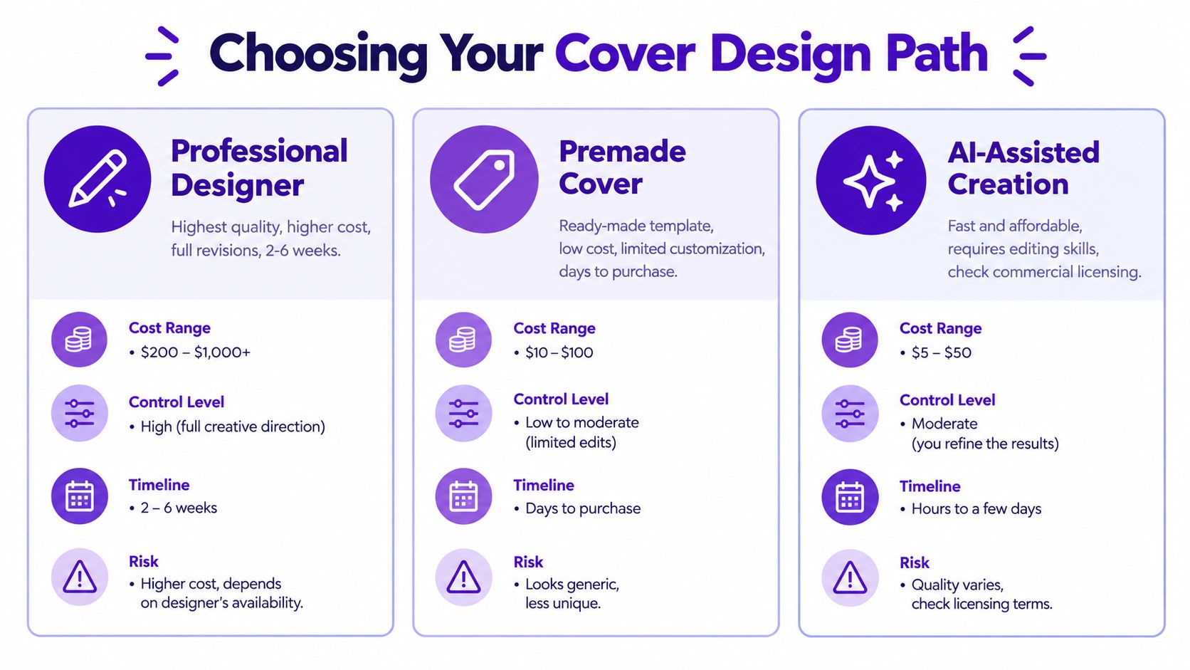
A strong cover designer brings more than taste. You are hiring genre judgment, typography, and production experience. That matters when the book has a tricky premise, the series needs a stable visual identity, or the cover has to sell the tone without giving away the story.
This path gives the most control. A designer can refine hierarchy, shift focal points, keep type consistent across a series, and prepare files that are usable for both ebook and print. If you know you will publish multiple books with matched branding, this is usually the safest choice.
The trade-off is cost and process. You need clear feedback, revision discipline, and enough lead time to do the work properly.
Premades are fast, practical, and often better than a rushed custom job. They work best in genre categories with clear visual conventions, especially when the concept does not require a one-of-a-kind scene. For a test release, a novella, or a first book where budget is tight, a good premade can be the right call.
Read the license before paying. Check whether the sale is exclusive, whether it is licensed for a single book only, and whether editable files are included. "No source files" means future changes may require rebuilding the cover from scratch. "Single-book use" can also become a problem if you later want a workbook edition, large print edition, or boxed set branding.
Premades save time. They do not give much flexibility.
AI-assisted tools are useful for concept generation and rough visual direction. They can help you test character ideas, atmosphere, color palettes, and symbolic imagery before you commit to final assembly. starryai is one option for generating artwork from text prompts, then upscaling and downloading the result.
That speed is real, but so are the limits. Generated lettering often fails under close inspection, so title and author text should still be added separately as editable type. You also need to judge whether the image matches the genre, whether the composition leaves room for typography, and whether the result can be turned into a print-ready file.
AI is the wrong choice when consistency matters more than variation. If your series needs pixel-identical typography across six titles, commission the series identity from one designer instead of regenerating each cover. It is also a weak fit when you need exclusive visual ownership or when the platform's commercial-use terms are too narrow for your publishing plans.
The smart question is not which path is cheapest. It is which path gives you the file quality, rights position, and repeatable workflow your book actually needs.
A digital front cover and a paperback cover are different deliverables. The digital file may be a single front image. A print cover must usually be a single wraparound PDF containing the back cover, spine, and front cover.
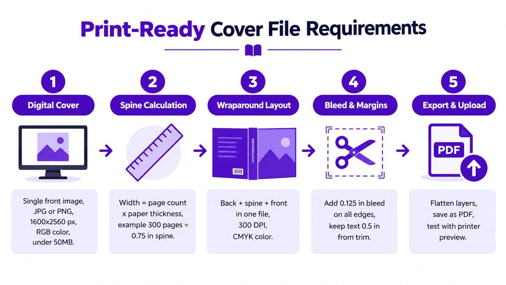
For a paperback, the total width is:
back-cover width + spine width + front-cover width + two bleed allowances
The height is:
trim height + two bleed allowances
Amazon KDP requires 0.125 inches, or 3.2 mm, of bleed at the top, bottom, and outside edges. It also requires a minimum effective resolution of 300 DPI, placement at 100% size, a single flattened layer, at least 0.25 inches, or 6.4 mm, of clearance for content that must not be trimmed, and embedded fonts. These requirements are listed in KDP's paperback cover specifications.
The spine width depends on the final page count and selected paper stock. Don't estimate it from the front cover or reuse a previous template without checking the new book's specifications. An incorrect spine value can shift the title toward a hinge or create visible front and back alignment problems.
Keep critical typography and logos inside the safety area. Background color and artwork should extend through the bleed, but essential text shouldn't sit in the trim or bleed zone.
IngramSpark's production guidance adds important spine constraints. Perfect-bound books below 48 pages shouldn't carry spine text. For a spine at least 0.35 inches wide, spine text should remain 0.0625 inches, or 2 mm, from both edges. Narrower spines require 0.03125 inches, or 1 mm, of clearance. The same guide recommends checking the final PDF at 100% and inspecting a physical proof before a larger print commitment. IngramSpark's file-creation guide explains these tolerances in detail.
IngramSpark also requires a barcode area. The barcode should be 100% black, specified as 0/0/0/100 in CMYK, on a white background or white box. Reserve that space on the back cover before arranging the artwork. Authors preparing other branded graphics can also compare general export principles in this hat logo file requirements guide, particularly the distinction between an attractive image and a production-ready asset.
Generate or select the illustration separately, then assemble the full wraparound cover in a layout application. Place the title and author name as real text, calculate the spine from the selected template, add the barcode area, embed fonts, flatten where the platform requires it, and export at 100% scale.
For image quality decisions, use this image resolution guide for printing as a supporting reference. High resolution alone won't fix a poor composition or an incorrect canvas. The final PDF must be checked for trim, bleed, color, typography, and alignment.
“Commercial use allowed” answers only one question. It may tell you that a platform permits selling an output, but it doesn't automatically establish that the image is exclusive, copyright-protected, or safe from every possible dispute.
The U.S. Copyright Office states that copyright protects material resulting from human creativity. Its guidance requires applicants to disclose AI-generated material, briefly explain the human author's contributions, and exclude AI-generated content that is more than de minimis from the copyright claim. The Copyright Office's AI policy guidance is the appropriate place to verify the current position rather than relying on old screenshots or forum summaries.
Before publishing, ask:
A cover with an AI-generated background and carefully authored typography is not the same claim as a wholly automatic image used without alteration. The more the final design depends on your selection, arrangement, editing, and compositing, the clearer your creative record becomes.
Don't prompt for a recognizable living artist's style. Avoid celebrity likenesses, protected logos, and visual elements you can't explain or license. Add an original title treatment rather than trusting generated lettering. Preserve the source files even after delivery, because a flattened PDF shows the result but not the decisions behind it.
Review the commercial use rights guidance for AI images before you publish. Terms can change, and a general statement about commercial permission may not answer questions about exclusivity, attribution, disclosure, or copyright registration.
The defensible position is practical rather than absolute. Use tools according to their current terms, make substantial human design decisions, document those decisions, and avoid claiming that an automatically generated image is entirely your own human-authored work.
Start with the book, not the tool. Write a compact creative brief containing the genre, audience, emotional tone, central symbol, title, author name, series position, and elements that would spoil the story. A good prompt conveys mood and composition without forcing the image to illustrate every plot detail.
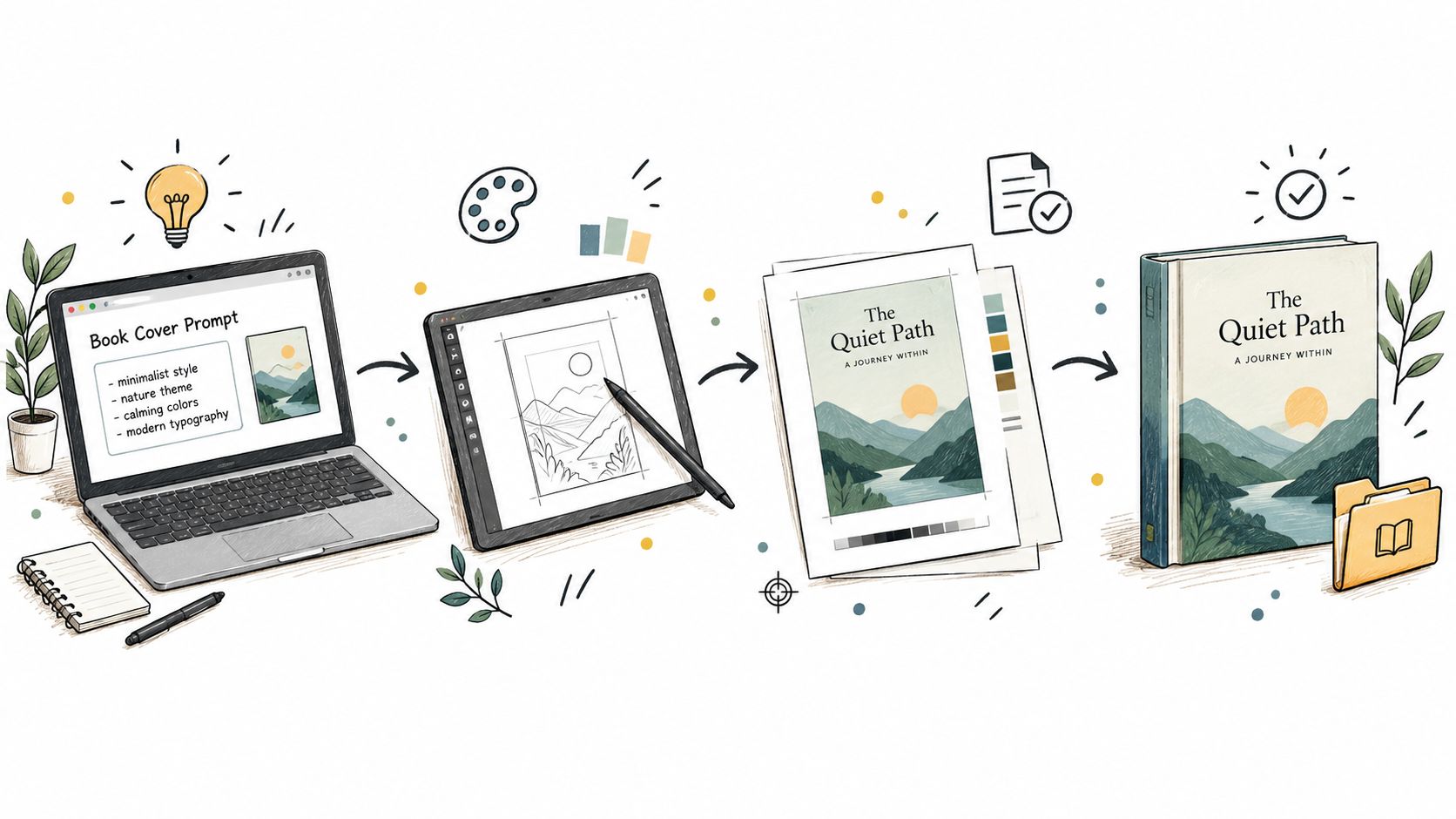
Use an image generator to explore several directions, then choose based on thumbnail strength, genre fit, and available negative space. Don't keep generating indefinitely. Once the composition has a viable focal point, move into manual assembly.
Place the selected illustration into a document built from the printer's template. Add the title, author name, subtitle, and series information as editable text. Adjust the image rather than shrinking the type until it disappears. For print, calculate the spine after the page count and paper stock are final, then place the back cover, spine, and front cover on one canvas.
The AI book-cover design workflow can help organize the creative stage, but it doesn't replace platform-specific preflight. KDP and IngramSpark each require their own checks, and a file that works for one service may still need adjustment for another.
Use the following sequence for every title:
Accessibility belongs in the same workflow. Write meaningful alt text for the digital cover, involve the author in describing the image, and don't accept an automatic description without review. Amazon's e-book guidance recommends alternative text for meaningful images, limiting it to 140 characters, marking decorative images as null, and using real text rather than embedding essential words in an image. Check the EPUB with a screen reader so the cover, title, and author information aren't trapped inside an inaccessible picture.
A short visual demonstration can reinforce the sequence, especially for authors who learn by watching the assembly process.
A strong cover can still fail if the file is wrong. Before uploading, make one final pass that treats the design as both a sales asset and a manufactured object.
This is the same principle used in disciplined production work: define acceptance criteria before delivery, then verify each item rather than trusting appearance alone. For a broader perspective on documented review systems, see this Approved Lux quality control approach.
Self publishing book covers become manageable when you stop treating them as a single image. The complete job includes concept judgment, genre communication, human editing, rights awareness, accessible digital structure, and a technically correct PDF.
starryai can help you explore cover artwork from text prompts, develop visual directions, and create image assets for a larger design workflow. Visit starryai to start testing concepts, then assemble and validate the final cover against your chosen publishing platform's requirements.


.svg)