

Written by Mo Kahn on
September 1, 2026


You've generated the perfect sci fi character design. The face is memorable, the armor has just the right amount of damage, and the lighting makes the whole render feel like a cover reveal. Then the project expands. The client needs a different pose, the store needs a product graphic, the avatar needs a square crop, and the book cover needs the same character facing the other direction tomorrow.
That's where many otherwise strong designs fall apart. A successful workflow doesn't treat the character as one lucky image. It treats the character as a maintainable visual asset, with identity rules that survive new poses, platforms, resolutions, and products.
A creator scrolls through a generation history and finds one striking character buried under near-misses. The original image works because the lighting hides a weak side of the face, the three-quarter pose creates a convincing costume shape, and a dramatic background supplies much of the personality. The next request removes those supports. Suddenly, the character's face changes, the helmet loses its profile, and the costume looks like unrelated equipment.
A reusable character needs more than visual appeal. It needs a silhouette that reads at thumbnail size, a palette that remains legible on merchandise, personality cues that communicate without dialogue, and enough construction logic to support more than one angle. Deborah Chester's character-design framework emphasizes considering appearance, name, personality, background, and motivation before choosing how a character is introduced, while also treating contradiction between surface traits and inner truth as a source of complexity (character design research based on Deborah Chester's framework).
The most common failure is lighting-dependent identity. A face looks distinctive only because a bright rim light cuts across the cheek or a visor hides the eyes. Change the setup and the design loses its anchor.
Costume-dependent identity creates a similar problem. A long coat may produce an excellent three-quarter silhouette, but it can obscure the legs from the side or become an unreadable block from behind. Small technical details can create another trap. A design may contain believable cables, vents, panels, and surface scratches, yet all of them collapse into noise when the character appears in a small social thumbnail.
Color fails differently. A palette that looks rich in a large render can become muddy on a phone screen or disappear when converted into a limited-color print. The problem isn't a lack of detail. It's a lack of hierarchy.
Practical rule: If the character can't be recognized without the original crop, lighting, and pose, you've designed an image, not an asset.
The workflow that follows solves each breakdown separately. Research creates a stable identity block. Silhouette and proportion establish recognition. Material and light create fast visual communication. Prompt refinement protects continuity, while platform adaptation decides which features deserve to survive.
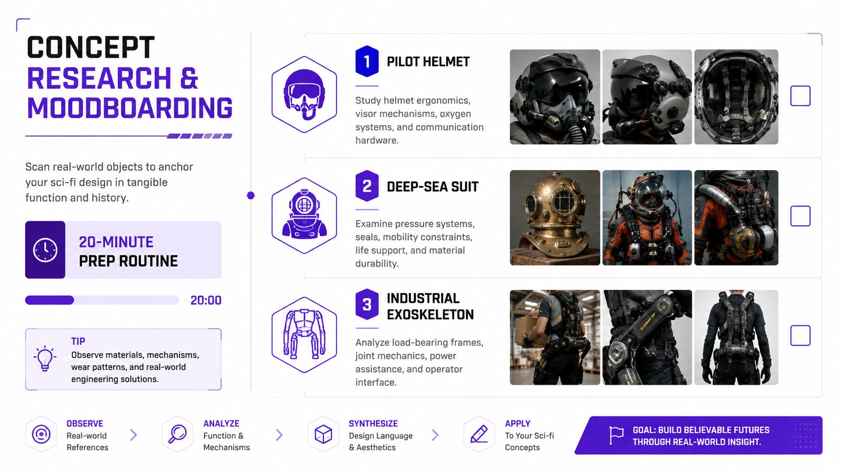
Start research with a timer, not an open-ended moodboard. A focused 20-minute sweep can include three real-world anchors, a pilot helmet, a deep-sea drone, and a piece of vintage tech, followed by two sci-fi references from different eras and one unrelated outlier. The outlier matters because it interrupts automatic pattern matching. A salvage runner influenced only by spacecraft references often looks like familiar spacecraft art. A salvage runner influenced by industrial diving equipment, old field radios, and racing harnesses has more functional tension.
Collect references for decisions, not admiration. Ask what each object contributes. A pilot helmet might provide a compact facial frame. A deep-sea suit may suggest pressure seals and restricted movement. Vintage technology can supply tactile controls, asymmetrical wear, or a repair culture that polished futuristic design often lacks.
Convert the research into six short fields. This is your identity block, a compact character brief that can be pasted into future prompts without rebuilding the concept from memory.
Each line constrains a later decision. The role tells you why the character carries tools rather than ceremonial weapons. The silhouette cue tells you which shapes must remain visible in a front, side, or action pose. The palette anchor limits color drift. The prop gives the character a repeated storytelling object. The backstory hook helps expression and wear feel intentional, while the platform target prevents you from designing a figure that only works in a cinematic scene.
This block should stay short. Long biographies encourage prompts to prioritize prose over visual hierarchy. The useful version names the elements that must remain stable, not every detail of the character's life.
For a practical companion to this process, see how to make a good character design. Keep the identity block beside your generation notes, and treat it as the most reusable artifact in the workflow. Every later render should either preserve a line from it or document a deliberate change.
Begin with the outline. Squint at a reference or reduce it until surface detail disappears, then ask whether the pose still communicates the character. A strong sci fi character design should remain distinctive as a simple shape before armor seams, facial texture, decals, and glowing circuitry enter the discussion. This thumbnail principle is also central to practical sci-fi character workflows that use silhouettes to test pose, mass, and readability before detail (sci-fi character silhouette guidance).
The body plan carries narrative information before the costume does. A standard adult figure is commonly drawn at about 7 to 7.5 head-heights, while an exaggerated superhero figure often reaches about 8.5 head-heights, according to a figure-drawing reference from Wiley (figure proportion reference). The same source places shoulder width around 2 to 2.5 head-widths and hip width around 1.5 to 2 head-widths. These are construction guides, not laws, but they help you choose a readable archetype before the costume starts making decisions for you.
For a stylized sci-fi workflow, proportion shorthand can be useful:
Choose one dominant silhouette cue and protect it. It might be a high collar, an oversized gauntlet, a trailing coat, or a helmet profile. Don't let every generation reinterpret that cue. Variation should happen around the anchor, not through it.
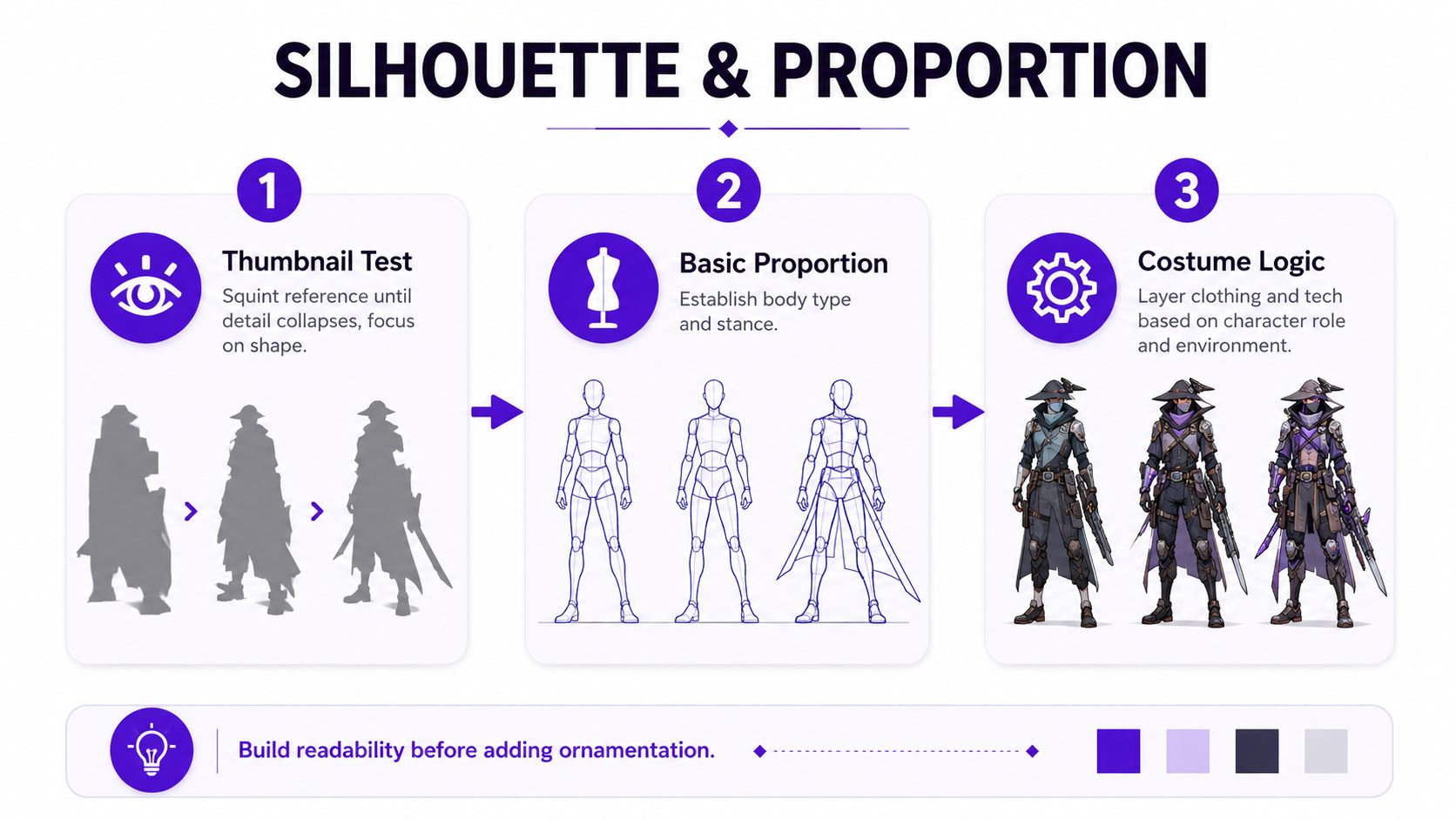
Costume logic makes technology believable. Place hard-surface breaks at joints so the character can bend. Let soft fabric respond to the body's gesture and implied wind. Make cables travel toward a plausible power source, tool, or control point rather than appearing as decorative lines. If the character works in salvage, protective wear should show where abrasion occurs, while flexible areas should remain visually distinct from rigid armor.
Adding detail before solving the silhouette is one of the most expensive mistakes in AI character generation. The render may contain impressive components, but none of them owns the viewer's attention. A viewer sees a noisy outline, not a person with a role.
Before approving a costume pass, check three things:
Use character concept art generator guidance when you need to test several construction directions quickly, but keep the silhouette decision in your hands. More generations won't rescue an unresolved body plan.
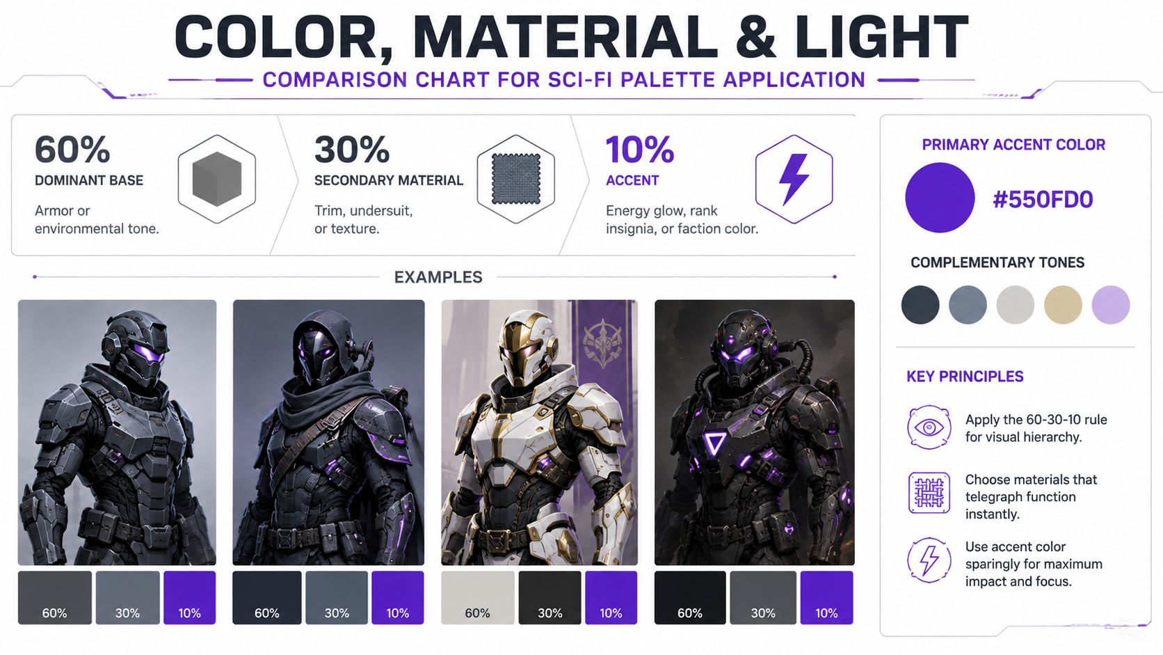
Color should establish hierarchy before it establishes atmosphere. A widely used character-design approach divides the palette into 60% dominant color, 30% secondary color, and 10% accent color, with guides often recommending no more than 3 to 5 colors total for readability (character silhouette and palette guidance). For sci-fi work, the dominant color can belong to armor or environment, the secondary color can identify fabric and trim, and the accent can mark energy, rank, faction, or a recurring interface.
A salvage runner might use charcoal composite as the dominant base, muted copper for secondary surfaces, and electric violet only on signal lights and a wrist display. That distribution tells the eye where to look. If violet spreads across the entire suit, it stops functioning as a signal and becomes background decoration.
Choose materials by how they read when compressed, not by how impressive they look in a large render.
Photoreal surface texture often performs poorly at small sizes because fine variation collapses into gray noise. Broad material differences are more useful. A clean change between soft undersuit, rigid plate, and luminous interface gives the viewer a fast explanation of the costume.
Light must follow the same logic. Top-down lighting supports a heroic posture by clarifying shoulders and upper planes. Rim light can separate a villainous or mysterious silhouette from a dark environment. Under-glow works for tech-heavy roles, but it can flatten the face if every lower surface emits the same intensity.
A light source earns its place when it clarifies form, role, or mood. If it only makes the render look expensive, it's probably competing with the character.
Test the palette at thumbnail size, in grayscale, and against the background where the design will appear. If you're studying how established sci-fi imagery handles hierarchy and print presentation, resources such as where to buy authentic sci-fi posters can help you compare how color, contrast, and silhouette survive outside a digital canvas.
A prompt should preserve the identity block, not replace it. In starryai, I keep the stable character description at the beginning of every prompt and change only the variable needed for the next pass. The tool can turn a written character description into generated character art, which makes it useful for testing direction, pose, costume, and mood before a final illustration pass.
Use a consistent field order. It makes prompts easier to audit when a generation drifts.
Subject: salvage runner from an abandoned orbital station.
Silhouette: narrow torso, oversized left gauntlet, high helmet collar.
Costume: charcoal composite armor, faded copper utility trim, flexible undersuit.
Tech: folding magnetic pry tool on the right hip, compact wrist display.
Lighting: controlled top-down key light with a restrained violet signal glow.
Mood: resourceful, wary, observant.
Aspect: vertical book-cover composition, full body, clear negative space.
Subject: the same orbital salvage runner, no facial redesign.
Silhouette: narrow torso, oversized left gauntlet, high helmet collar, readable profile.
Costume: simplified solid shapes, no surface texture, no small accessories.
Tech: pry tool represented as one clear hip shape.
Lighting: flat neutral lighting.
Mood: graphic, readable, production design study.
Aspect: character turnaround exploration, plain background.
Subject: the same orbital salvage runner, preserve helmet profile and copper trim.
Silhouette: cropped upper body with the oversized left gauntlet visible.
Costume: layered composite plate, flexible joint sections, repaired seams.
Tech: magnetic pry tool mechanism and wrist display shown clearly.
Lighting: soft directional light separating matte composite from brushed alloy.
Mood: functional, worn, believable.
Aspect: close-up concept sheet, clean presentation.
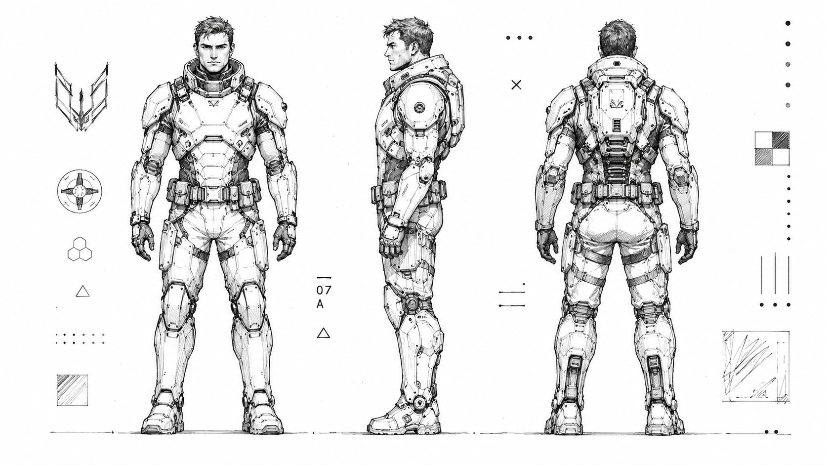
Subject: the same orbital salvage runner, identical face, helmet, palette, and signature prop.
Silhouette: front, side, back, and three-quarter views with matching proportions.
Costume: charcoal composite, faded copper trim, flexible undersuit.
Tech: oversized left gauntlet, right-hip magnetic pry tool, wrist display.
Lighting: even studio light for construction clarity.
Mood: neutral design documentation.
Aspect: character turnaround sheet with separated views.
After the first batch, generate a 4-up grid and select the strongest read rather than the prettiest individual detail. Lock your seed or descriptive anchors where the tool allows it, then alter one variable per iteration. Change the pose without changing the face. Adjust the accent color without redesigning the helmet. Test a new expression while preserving the silhouette phrase word for word.
Iteration rule: Repeat the identity phrase verbatim, then isolate the change to a pose, expression, camera, or environment tag.
Prompt hygiene matters more than prompt length. Contradictory adjectives such as “minimalist maximalist armor” create competing instructions. Keep one lighting setup per session while you solve form, and save successful prompt strings as named presets such as salvage_runner_hero, salvage_runner_profile, and salvage_runner_merch.
For more systematic prompt cleanup, use AI prompt optimization. When you compare candidate outputs, judge them like designed assets rather than isolated pictures. A useful reference for how to evaluate limited-edition art can sharpen your eye for authorship, finish, and what makes a visual feel intentional instead of merely polished.
The video below is useful when you want to observe the creation interface and pacing in context.
A cover, avatar, shirt, enamel pin, TikTok post, and tabletop miniature don't reward the same image. They reward different cuts of the same identity. The mistake is starting a fresh prompt for each channel, which invites the face, palette, and costume logic to drift.
For a cover thumbnail, protect a high-contrast silhouette and one clear facial cue. An avatar usually benefits from a frontal composition and simplified headgear because the available crop is tight. A shirt or enamel pin may reduce the character to two flat colors and a strong outline, while a tabletop miniature needs armor planes that remain distinct at 28mm scale.
Create a small export kit rather than a pile of unrelated renders:
The trade-off is unavoidable. Not every costume detail can survive every surface, so decide which anchors have priority. The helmet profile may matter more than the shoulder vents. The copper trim may matter more than individual fasteners. The magnetic pry tool may be essential to the story, even if it becomes one simple shape in a logo.
For creators preparing a physical product, PledgeBox action figure Kickstarter tips offers useful context for thinking about product presentation, audience expectations, and the gap between a concept image and a manufacturable object. The same discipline applies to sci-fi character design. A beautiful render is evidence of direction, not proof that the design is ready for every output.
Consistency doesn't mean repeating the same pose. It means keeping a stable identity block while allowing controlled variation around it. The silhouette anchors, signature palette, recurring prop, and fixed facial features should remain recognizable, while expression, gesture, setting, and camera distance can change.
The fastest way to lose continuity is to rewrite the prompt from scratch every time. Other anti-patterns include swapping gender cues randomly, changing the core color ratios, redesigning the helmet or mask, and adding or removing the signature prop without recording the decision. Each change may look harmless in isolation, but together they produce a cast of near-relatives instead of one character.
Before each generation, run a short checkpoint:
A 2025 study on inclusive and posthuman future characters argues that design-fiction characters have often reflected Western-centric viewpoints while marginalizing Global South and minority perspectives, and it frames character tools as a way to develop more inclusive future personas (research on inclusive and posthuman future characters). That belongs in the identity block too. Cultural perspective isn't a decorative afterthought. It influences the character's body language, equipment, symbolism, and assumptions about the future.
The practical test is simple. Generate a new pose, remove the dramatic lighting, reduce the image, and ask whether the same person remains. If the answer is yes, you've built a system that can support covers, avatars, merch, and serialized work.
starryai turns text prompts into generated character visuals, making it useful for testing sci-fi identity blocks, poses, costume variants, and platform-specific cuts. Visit starryai to start building a reusable character asset instead of relying on one lucky render.


.svg)