
Written by Mo Kahn on
July 1, 2026


You take the photo, check the lighting, make sure your face looks good, and still end up with an image that feels flat. Nothing is technically wrong. It's sharp enough. The colors are fine. But it doesn't have that clean, intentional look you see in photos that seem effortless.
That usually isn't a camera problem. It's a composition problem.
A lot of people assume better photos come from expensive gear, editing tricks, or luck. Usually, the bigger difference is where you place the subject inside the frame. A tiny shift can make a selfie feel more natural, a portrait feel more polished, and even an AI-generated image feel less random.
If you've ever wondered why you look better in some photos than others, composition is a big part of the answer. Alongside expression, angle, and lens distance, framing changes how a photo reads. If you want a practical breakdown of those other factors too, this guide to better dating photos is a useful companion.
The good news is that one of the most helpful composition tools is also one of the simplest. It's called the Rule of Thirds Explained in many beginner guides, but the idea itself is much easier than the name makes it sound. Once you see it, you'll start noticing it everywhere, from selfies to travel photos to movie scenes to AI art.
Most disappointing photos share the same problem. The subject is there, but the frame doesn't help the viewer look at it in an interesting way.
That's why a perfectly fine selfie can still feel awkward. You might be standing in good light with a decent expression, but if your face is planted in the middle with no thought about the rest of the frame, the image can feel stiff. It looks more like a record of a moment than a shaped picture.
Good composition fixes that. It gives the eye somewhere to go and creates a relationship between the subject and the empty space around it. That relationship is what makes an image feel balanced instead of accidental.
A strong photo doesn't just show a subject. It organizes attention.
Beginners often get confused because the change seems small. Move a face slightly left. Raise the eyes a bit higher. Leave open space on one side. Those shifts don't sound dramatic, yet the result often feels much more polished.
That's why the rule of thirds lasts. It's simple enough to use immediately and strong enough to improve everyday pictures fast. You don't need to memorize technical jargon or buy anything. You just need to stop treating the center of the frame as the default.
Once that clicks, you start composing on purpose. Selfies look less cramped. Travel photos feel less random. AI images stop looking like the subject was dropped into the middle without thought.
The easiest way to understand the rule of thirds is to picture a tic-tac-toe board laid over your image.
According to Wikipedia's explanation of the rule of thirds, the frame is divided into a 3×3 grid with 9 equal sections made by 2 horizontal and 2 vertical lines. That means the image is split into 33.3% / 33.3% / 33.3% bands across both directions. The four points where the lines cross are often treated as the strongest places to put important elements like a subject, horizon, or a person's eyes.
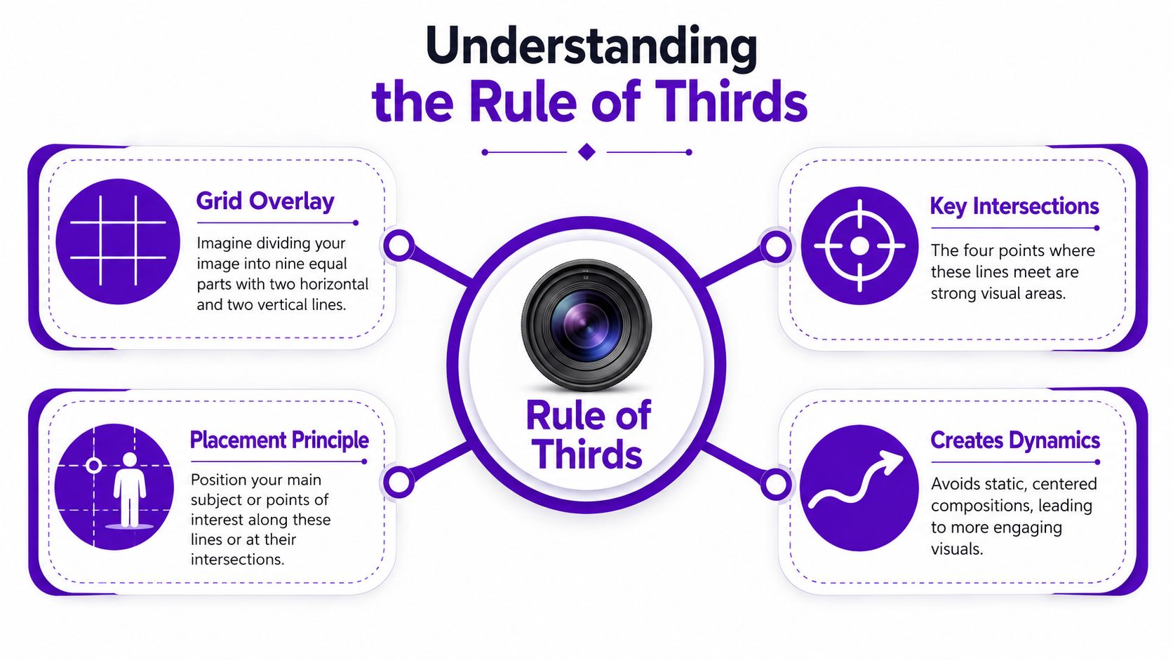
Instead of placing your subject dead center, you place it near one of the lines or one of the four intersections.
If you're taking a portrait, the face might sit on the left vertical third. If you're capturing an expansive view, the horizon might align with one horizontal third instead of cutting straight through the middle. If you're framing a selfie, your eyes often look stronger near the upper area of the grid rather than halfway down the image.
Many people misinterpret the rule. They think the rule means the subject must be glued exactly onto one point. It doesn't. The grid is a guide for balance, not a precision exam.
Those crossing points are sometimes called power points because they tend to feel visually active. A centered subject can feel formal and still. An off-center subject often feels more alive.
Practical rule: If the center feels dull, shift the subject toward a third and see what happens.
That small move creates a conversation between the subject and the rest of the frame. The empty area stops being leftover space and starts helping the image.
A centered composition makes one clear statement: look here. Sometimes that's useful. Often it's blunt.
Off-center composition works differently. It invites the eye into the frame, then gives it room to travel. The result feels less like a mugshot and more like a scene.

Think of centered framing like standing in front of someone and speaking directly at them. It's clear, firm, and sometimes intense.
Framing a subject on a third feels more like conversation. There's a subject, but there's also context. The surrounding space helps shape mood, direction, and emphasis.
That's why off-center portraits often feel more natural. The image has visual weight on one side and breathing room on the other. Your eye registers both, and that tension creates interest.
Here's a simple comparison:
| Composition choice | How it tends to feel |
|---|---|
| Dead center subject | Stable, direct, formal, sometimes static |
| Subject on a third | Balanced, dynamic, intentional, more open |
A lot of the magic comes from negative space, which just means the quieter area around the subject.
When you place a person off-center, the empty side can suggest mood, movement, or environment. It can make a selfie feel less crowded. It can make a portrait feel cinematic. It can make a travel shot feel like a moment happening in a place, not just a face in front of a background.
Readers often ask, “Won't empty space waste part of the frame?” Not if it supports the subject.
Empty space isn't empty if it helps the subject stand out.
Used well, that open area gives the image rhythm. It tells the viewer where to start and where to rest.
The rule now becomes practical. You don't need to imagine the grid anymore because most cameras already show it.
The Interaction Design Foundation notes that modern phones and digital cameras commonly include a 3×3 grid overlay, and common portrait advice places the subject's eyes on the upper horizontal third while leaving space in front of movement or gaze in the frame, as explained in this rule of thirds examples guide.
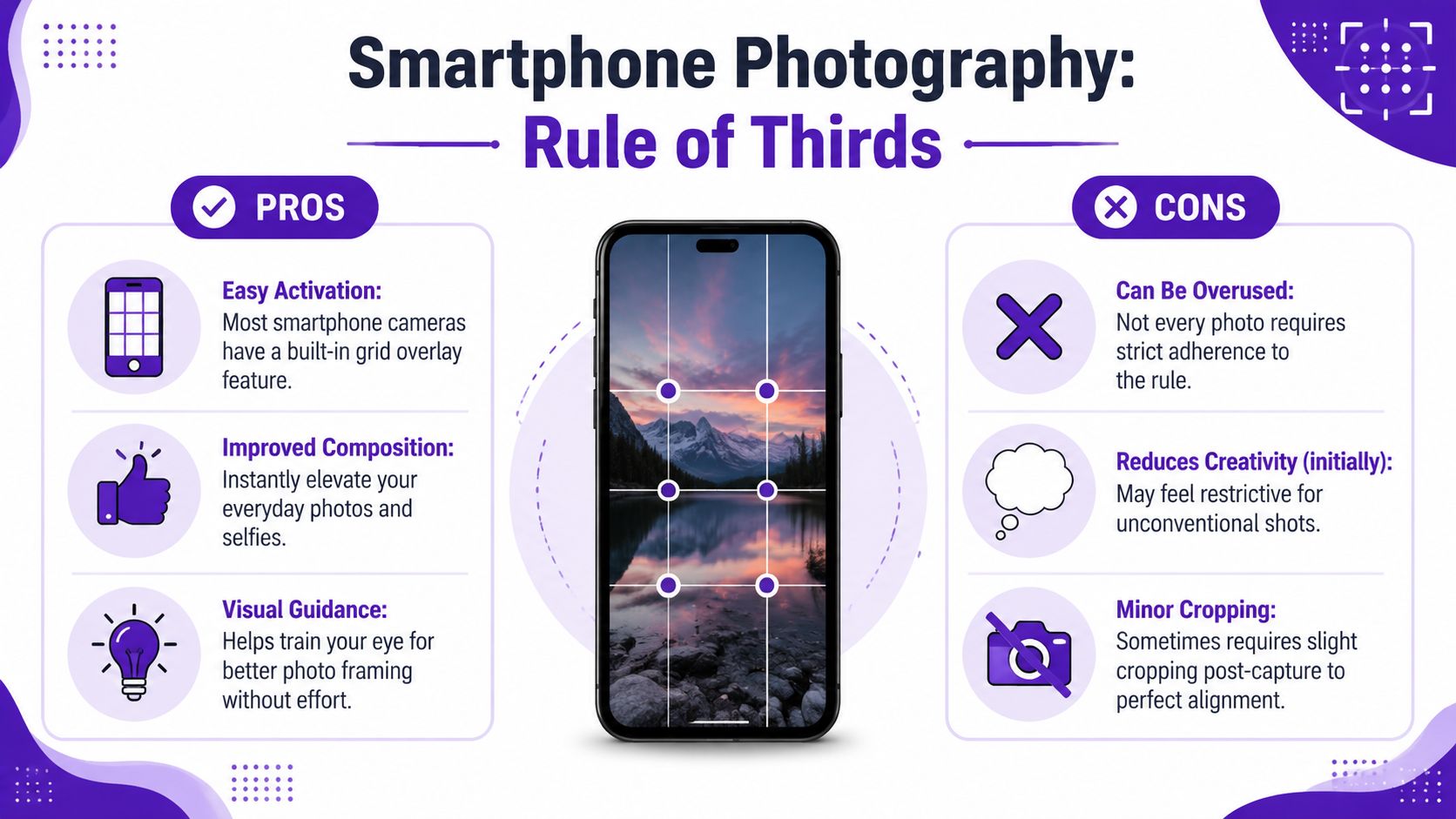
Open your camera settings and look for the grid option. On most phones, it's easy to enable. Once it's on, you'll start seeing the frame as sections instead of one blank rectangle.
That alone helps. The grid trains your eye even when you stop looking for it later.
A few habits make an immediate difference:
Here's a useful visual walkthrough before you try it yourself.
The biggest wins usually come from familiar situations.
A selfie at a café
Don't center your face and crop the top of your hairline awkwardly. Shift yourself slightly left or right, keep your eyes higher in the frame, and let the background breathe on the opposite side.
A beach or skyline photo
Don't split the image in half unless symmetry is the point. If the sky is the star, give it more room. If the foreground matters more, lower the horizon.
A walking shot
If someone is moving across the frame, don't place them at the edge they're walking toward. Give them space in front. That makes the motion feel natural.
You don't always need to reshoot. Cropping can fix weak framing.
A simple edit can move your face off the center and create stronger balance. If you like experimenting with portraits and quick transformations, the selfie editing tools from starryai are one way to refine framing and presentation after capture.
A good test is simple. After cropping, ask yourself whether the image feels calmer, clearer, or more intentional. If it does, the composition improved.
AI image tools can generate striking visuals, but composition often gets less attention than style. People spend time describing lighting, aesthetic, color, and mood, then forget to tell the model where the subject should sit.
That's why many AI images feel slightly off. The subject may be beautiful, but the framing feels generic.

Composition prompts work best when they use direct placement language.
Instead of writing only “portrait of a woman in golden hour,” add instructions like:
Those words give the model a layout, not just a theme.
If you're getting started, the quick start guide for using the AI art app starryai is a helpful place to learn the basics of prompting and generation flow.
Here are a few prompt patterns that tend to produce stronger framing.
Portrait selfie, soft natural light, subject on the right third of the frame, eyes near the upper third, looking left, blurred city background, calm mood
Futuristic traveler standing on the left third, facing into open desert space, cinematic lighting, wide shot, strong negative space on the right
Fantasy warrior at the upper left intersection, low angle view, storm clouds filling the rest of the frame, dramatic scale
Notice what these prompts do. They don't just describe who or what. They describe position, direction, and available space.
Sometimes the generation is already good. The costume works. The mood works. The background works. Only the placement feels clumsy.
That's a cropping problem, not a failed image.
Try trimming the frame so the subject lands closer to a third. Move the horizon away from the center. Create room in the direction of gaze. Those changes can make an AI image feel designed instead of accidental.
A good rule is to prompt for composition first, then crop for refinement if needed.
The rule of thirds helps because it teaches placement. It stops beginners from centering everything without thinking. But it isn't a law.
Adobe explicitly notes that photographers should sometimes break the rule, especially when centering works better for emphasis, symmetry, minimalism, or tiny subjects, as described in Adobe's rule of thirds photography guide.
A symmetrical hallway, a face staring straight into the camera, or a lone subject made deliberately small in a wide frame can all work better when you ignore the grid.
Centering can create power. It can create stillness. It can make a portrait feel confrontational in a good way. It can also make architecture feel orderly and precise.
Use the rule until you understand what it's solving. Then break it when another choice says more.
For creators working on stronger visual judgment across styles, the AI art tips and tricks from starryai offer good creative prompts for thinking beyond defaults.
If every image follows the same grid placement, your work starts to feel formulaic.
That's the graduation point. First you learn the pattern. Then you start making decisions.
Ask these questions instead of obeying the grid automatically:
When you can answer those on purpose, you're no longer just following a photography rule. You're composing.
If you want to turn better framing into better visuals fast, try starryai. You can generate images from prompts, transform selfies into stylized art, and experiment with composition ideas without needing a full editing workflow.