
Written by Mo Kahn on
July 1, 2026


You generate a set of images for a book cover, a merch drop, or a social campaign. One looks perfect. The next one is close, but the lighting shifts. Another nails the mood but sneaks in odd typography. A fourth has a hand that looks almost right until you count the fingers.
That's the moment when quality assurance processes stop sounding like corporate jargon and start feeling useful.
For creative work, QA isn't about draining the fun out of making things. It's about giving your work a reliable shape. The same way a novelist proofreads for tone, continuity, and typos before publishing, creative teams need a system that checks consistency, catches mistakes early, and protects the final experience.
An indie author creates a striking character portrait. The face feels right, the palette fits the story, and the mood lands. Then they generate the rest of the cast, and suddenly the visual world starts wobbling. One character looks painted, another looks glossy, and a third seems to belong in a different genre entirely.
That's a quality problem. Not because the images are “bad,” but because they don't work together.
Quality assurance processes are the repeatable habits and checks that keep creative output aligned with your intent. They help you move from “I hope the next result matches” to “I know what we're checking for every time.”
QA sounds modern, but the idea is old. The history of quality documented by ASQ traces the quality movement back to 13th-century guilds, where craftsmanship standards mattered. Later, the ISO 9000 family in the late 20th century helped shift QA from simple defect detection into a prevention-oriented system built throughout production.
That shift matters for creative teams.
If you only review the final image, final print, or final post, you're doing a late check. Useful, but limited. QA asks a different question: how do we build a process that reduces avoidable mistakes before they spread?
Quality gets easier to manage when you stop treating it like a final gate and start treating it like part of the workflow.
In design terms, QA is closer to a brand system than a bug hunt. It might include:
It's similar to preparing files for print. You don't just hope the colors will look right on paper. You review profiles, proofs, and layout details because small mismatches become expensive or embarrassing later.
Creative chaos can produce sparks. But if you want a body of work that feels intentional, QA is what turns scattered good outputs into a coherent collection.
A useful QA process looks a lot like a well-run photoshoot. You don't show up with a camera and hope for magic. You decide the look, set the conditions, shoot with intention, and review the results against the brief.
That same rhythm works for creative AI, design production, content pipelines, and approval workflows.
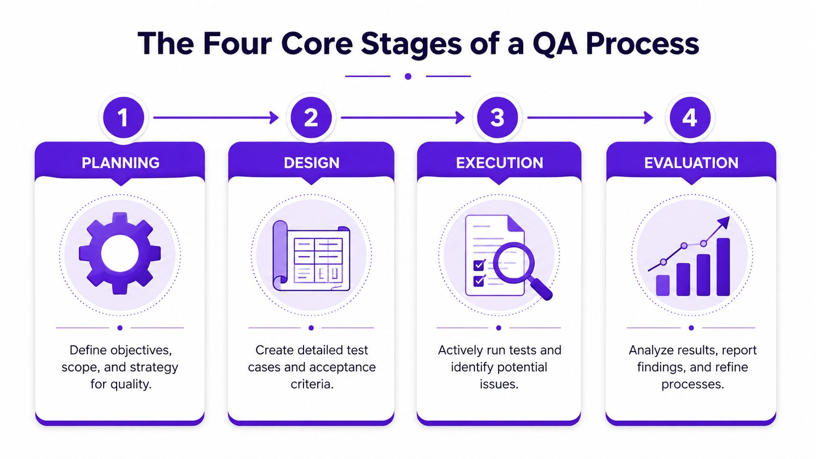
Planning is where many teams cut corners. Then they wonder why review rounds feel messy.
In QA, planning means defining the target before production begins. For a creative project, that could mean writing down the intended mood, audience, platform, visual references, brand constraints, and deal-breakers. If you're making character art, planning also means deciding what must stay stable from image to image.
A weak plan sounds like this: “Make it feel cinematic.”
A better one sounds like this:
That doesn't limit creativity. It gives it a frame.
Design is where you convert subjective preferences into checks people can use.
This is the equivalent of setting the lights and camera settings before the first shot. In QA terms, you define the acceptance criteria. What counts as passable? What counts as a revision? What gets rejected immediately?
A strong design stage often includes:
Execution is the active review stage. You generate, inspect, compare, and test.
Teams often confuse “made something” with “finished something.” Execution QA means checking the work while it's being created, not only after a deadline is staring at you.
For creative assets, that might include a mix of machine checks and human checks:
| Check type | What you look for |
|---|---|
| Functional check | Does the tool export the right format and resolution? |
| Visual check | Are anatomy, text, edges, and composition clean? |
| Consistency check | Does this match previous approved assets? |
| Context check | Will this still work on the final platform or product? |
Practical rule: If a mistake will be expensive to fix later, check for it earlier.
Evaluation is where a team learns from what happened. Which prompts produced strong results? Which review comments kept repeating? Which kinds of failures slipped through?
This stage matters because QA isn't static. The process gets sharper when you update it based on actual outcomes.
A simple evaluation habit can be enough:
That's how a creative workflow becomes more reliable over time. You're not just making outputs. You're building taste into a repeatable system.
People mix up QA and QC all the time. The confusion makes sense because both are trying to improve quality. But they do different jobs.
The easiest way to separate them is to think like a baker.
Quality assurance is the recipe, the oven temperature, the prep routine, and the checklist that helps you bake the cake right every time.
Quality control is tasting the finished cake and deciding whether it's good enough to serve.
Here's the quick comparison:
| Aspect | Quality Assurance (QA) | Quality Control (QC) |
|---|---|---|
| Focus | Process and prevention | Output and detection |
| Timing | Before and during production | During and after production |
| Main question | Are we working in a way that supports quality? | Does this final result meet the standard? |
| Example in creative work | Style guides, review rules, prompt libraries | Final image inspection, proof review, export check |
A strong team uses both. QA gives you a better chance of getting a solid result. QC catches what still slips through.
Creative teams often assume testing is only for software engineers. It isn't. If you use generation tools, editing tools, export workflows, content systems, or asset libraries, testing already affects your work.
A robust QA setup also works in layers. The data quality guidance from Acceldata describes a mature process as one that combines data profiling, schema validation, cleansing, and continuous monitoring rather than relying on a one-time inspection. The idea transfers well to creative operations. Don't just inspect the final image. Check the inputs, the transformation steps, and the outputs.
Here are the testing types that tend to matter most for creative teams.
This is the plainest kind of test. Does the thing work?
If you click Generate, does the tool generate? If you export a PNG with transparency, is the background transparent? If you duplicate a project, does it preserve the prompt history and settings?
Functional testing sounds basic, but when it fails, every other quality conversation becomes pointless.
A tool can work and still be frustrating. Usability testing asks whether people can use it smoothly.
For a creative app, that might mean checking whether prompt controls are understandable, whether image variations are easy to compare, or whether new users can find the save and export options without guessing. Bad usability doesn't just annoy people. It creates quality drift because people start skipping steps.
This one is especially relevant in image tools and design systems. Visual regression testing checks whether an update changed the look of something that was supposed to stay stable.
Say your team relies on a “vintage film” look. After an update, shadows become sharper and skin tones shift cooler. Nothing is technically broken, but the visual identity moved. That's a quality issue.
If you're trying to improve consistency from one generation to the next, looking at iteration images in this guide can help turn that review process into something more deliberate.
Creative teams don't always think in pipelines, but they have them. Prompt goes in. Variations get generated. Selections get edited. Assets get exported. Files get uploaded. Posts go live.
QA at the pipeline level means checking each handoff point:
A lot of confusion disappears once you separate process quality from output quality. QA helps you build a better kitchen. QC helps you judge what came out of the oven.
Automation can tell you that a file exported successfully. It can compare dimensions. It can flag missing values or broken formatting. But it still struggles with the kinds of problems creatives notice instantly.
A portrait may be technically sharp and still feel off. A product mockup may be clean and still clash with the brand. A fantasy cover may look dramatic and still break character continuity.

The strongest argument for human review is simple. Creative quality isn't only technical.
The verified data for this topic states that 78% of AI-generated art failures require human intervention to resolve, and that the National Institute of Standards and Technology says human engagement is essential for high-stakes creative outputs. That rings true for anyone who has reviewed AI images closely. You can automate checks for some defects, but not for judgment.
A reviewer catches things like:
That's why serious creative QA needs a hybrid model. Machines handle repeatable checks. Humans handle meaning.
A six-fingered hand is easy to laugh at. A subtle brand mismatch is harder to spot, and often more damaging.
If your work eventually goes to print, product, or client delivery, it helps to pair digital review with the sort of practical mindset used in physical quality control for production work, where finish, consistency, and output standards all matter.
You don't need a giant studio to do human-in-the-loop QA. A small team or solo creator can use a lightweight system.
Try this sequence:
The important part is treating your judgment as part of the system, not as an afterthought.
That also changes how you think about authorship. The most useful frame isn't “AI versus people.” It's creative direction plus review plus refinement. This perspective aligns well with the discussion in this piece on AI art vs human art, where the central question becomes how humans shape the final standard.
Many teams track what's easy to count instead of what matters.
File size. Export success. Render completion. Those are useful, but they don't tell you whether the work feels cohesive, fits the moment, or supports the brand. For creative projects, technical quality is the baseline. It's not the finish line.
A polished image can still fail if it looks like it belongs to a different campaign, trend, or character world.
That's where creative QA needs a broader lens. The verified data for this article notes that a 2025 report from the Social Media Industry Association identified algorithmic aesthetic drift as a leading cause of content rejection by platforms, with 65% of underperforming viral posts failing due to inconsistent visual styles rather than technical errors. Traditional QA metrics miss that because they're measuring correctness, not coherence.
For creative teams, this is a familiar pain point. One post feels dreamy and soft. The next feels harsh and glossy. Both are “good,” but together they weaken the feed.
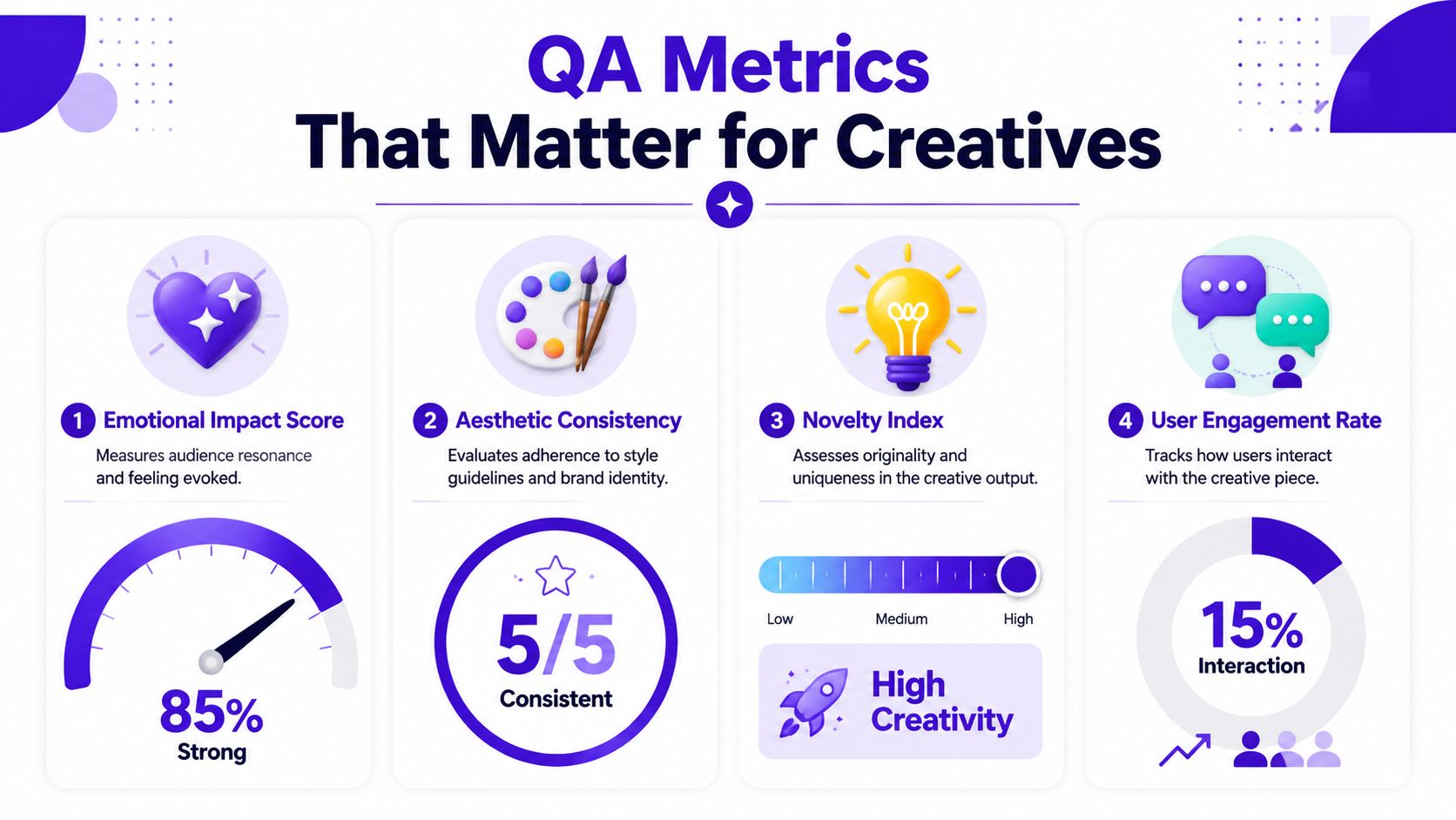
You won't always assign a hard number to these, and that's okay. The goal is consistency in evaluation, not fake precision.
Use a scorecard or review rubric around a few creative metrics:
A social team might care a lot about trend alignment. An indie author may care more about character continuity across a series. A merch seller may focus on print-readiness and motif stability.
Here's a simple creative QA matrix:
| Metric | What to ask |
|---|---|
| Aesthetic consistency | Would this sit comfortably beside our approved examples? |
| Prompt fidelity | Did the output keep the subject, mood, and composition requested? |
| Brand alignment | Does this feel like us, not just like “good AI art”? |
| Trend alignment | Would this look natural in the platform context we chose? |
Creative check: If two assets are both strong on their own but look wrong together, your metric problem is consistency, not craftsmanship.
One more helpful distinction. Some metrics are hard checks, like wrong dimensions or unreadable text. Others are soft checks, like emotional impact or style fit. Mature quality assurance processes use both.
That mix is what keeps creative work from becoming sterile. You still leave room for surprise, but you review surprise against intention.
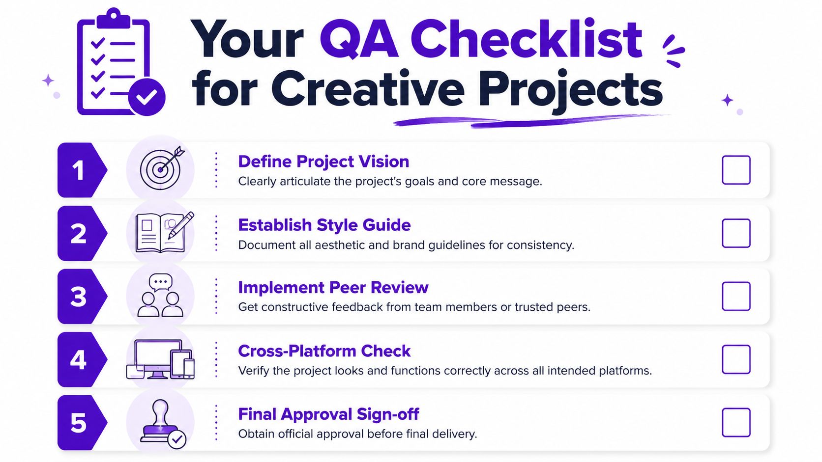
Teams often don't require a complicated QA department. They need a repeatable checklist they'll use.
A good checklist acts like a preflight sheet before printing a poster or sending a novel to press. It protects the work from preventable mistakes and makes review faster because everyone is looking for the same things.
The strongest checklists also improve over time. The verified data on historical QA analysis says that historical test data can improve defect prediction accuracy by up to 80%, reduce testing effort by 25% to 40%, and boost productivity by 20% to 30% through smarter resource allocation and pattern-based test selection. For creatives, the principle is simple. Your past misses can teach your future process.
Start here:
This step prevents vague review comments later. “It feels off” usually means nobody agreed on the target up front.
During production, use habits that make drift visible:
If you're solo, this can be a weekly review. If you're on a team, it can be a short checkpoint in your production cycle.
The last pass should be practical, not philosophical.
Use a final checklist like this:
Consistency check
Compare the piece against approved references.
Context check
Review it in the actual destination, such as thumbnail, feed, mockup, listing image, or print layout.
Craft check
Look for anatomy issues, awkward edges, warped text, and export mistakes.
Ownership check
Make sure any edits, removals, or replacements are documented if your workflow requires traceability.
Sign-off check
One person gives the final yes. Shared ownership sounds nice, but unclear ownership creates missed problems.
A checklist isn't bureaucracy. It's memory support. It helps a creative team avoid relying on mood, fatigue, or luck.
Quality assurance processes work best when they feel normal, not ceremonial.
If you build them into briefs, review habits, asset folders, and approval steps, they stop being a separate task. They become how the work gets made. That shift matters for creative teams because quality problems usually don't come from a lack of talent. They come from inconsistency, rushed review, and fuzzy standards.
The good news is that your process doesn't need to be heavy. A short style guide, a few clear acceptance criteria, a review pass for human judgment, and a checklist based on past mistakes can do a lot of work.
Creative tools move fast. Your standards should move with them. If you want a practical next step for making AI part of a stronger creative routine, this guide on using AI to enhance your creative practice is a useful place to continue.
If you want to put these ideas into practice, starryai gives you a simple way to create visuals fast while keeping your creative direction in your hands. Use it as the engine, then apply the QA habits in this guide to keep your outputs consistent, polished, and ready for real-world use.