
Written by Mo Kahn on
July 1, 2026


You've probably hit this point already. Your videos are improving, your ideas are solid, but your channel still looks pieced together. The profile picture was cropped from an old headshot. The banner was made quickly in a template. Thumbnails change style every upload, so nothing feels connected.
That's usually where growth starts leaking. On YouTube, viewers don't encounter your channel as a neat portfolio. They see fragments. A tiny icon in comments, a thumbnail in search, a banner when deciding whether to subscribe. If those pictures don't work together, your channel feels harder to trust and easier to skip.
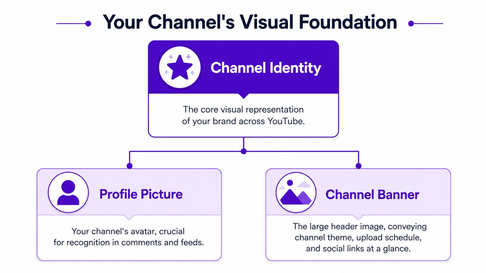
Good pictures for YouTube channel branding come from one workflow, not three separate tasks. You need a system that starts with identity, moves through platform specs, and ends with repeatable assets you can produce quickly. That's where creators usually get traction. Not because the art is flashy, but because every visual cue says the same thing.
Most creators think of visuals after the content is finished. That's backwards. On YouTube, the picture often does the first job. It gets the stop, earns the click, and signals whether the channel feels worth exploring further.
That matters because the platform is massive. More than 216 million U.S. adults use YouTube, about 82.4% of all U.S. adults, and the platform sees 32.7 billion monthly visits worldwide according to Hootsuite's YouTube statistics roundup. At that scale, your thumbnail, banner, and icon aren't decoration. They are your packaging in one of the busiest attention markets online.
A practical way to think about it is this. Your thumbnail acts like a headline for a single video. Your profile picture acts like a signature across comments, search, suggested videos, and your channel page. Your banner acts like your storefront sign. If any one of those pieces is weak, viewers feel friction before they've watched a second.
Recognition is the hidden layer behind clicks. When a viewer has seen your thumbnails before, or remembers your icon from comments or Shorts, they need less time to process what they're looking at. That doesn't guarantee a click, but it lowers confusion.
Practical rule: If a stranger can't identify your niche, tone, or level of professionalism from your pictures alone, your visual system isn't doing enough work.
This is why polished channels often feel bigger than they are. Their visuals create continuity. The viewer doesn't need to re-learn who they are on every upload.
Creators often ask whether better visuals are worth the effort when the videos themselves still need work. The answer is yes, because viewers use pictures to estimate quality before they commit time. A clean banner, legible icon, and coherent thumbnail style tell people that the creator has a point of view and publishes intentionally.
What doesn't work is random improvement. One strong thumbnail won't fix a weak channel identity. The channel grows faster when all image assets point in the same direction and make your content easier to recognize at a glance.
There are three core image assets every channel needs to get right. The profile picture identifies you across the platform. The channel banner explains what the channel is about when someone lands on your homepage. The thumbnail sells each individual video.
The technical specs matter because YouTube crops and scales aggressively across devices. Adobe recommends YouTube image sizes at 2560×1440 px for channel art with a 1546×423 px safe area, 1280×720 px for thumbnails, and 800×800 px for profile pictures. Adobe also notes that designing for the smallest display state first is essential.
| Image Type | Recommended Dimensions (Pixels) | Safe Area (for Banners) | Max File Size |
|---|---|---|---|
| Profile Picture | 800×800 | N/A | Not specified in the provided data |
| Channel Banner | 2560×1440 | 1546×423 | Not specified in the provided data |
| Thumbnail | 1280×720 | N/A | 2 MB |
A lot of bad YouTube branding comes from treating these assets as interchangeable. They aren't.
Profile picture
This is your smallest but most repeated asset. It appears in places where viewers make fast judgments. If the icon only works at full size, it won't work where it matters most.
Channel banner
This is your context layer. It should tell visitors what they'll get, not overwhelm them with design tricks. Too many creators turn the banner into a collage and lose clarity.
Thumbnail
This is a packaging asset for a specific promise. It shouldn't carry your entire brand by itself. It should borrow from the brand system and translate it into one clear video-level idea.
Most creators design pictures for YouTube channel branding at full resolution, then hope they survive downscaling. The better workflow is the opposite. Start with the smallest state, especially the icon and thumbnail. If the main shape, face, or text doesn't read when it's tiny, simplify.
A thumbnail can be high-resolution and still be visually low-clarity.
That distinction matters. Sharp pixels don't fix crowded composition.
A simple workflow helps:
Creators who do this consistently tend to produce cleaner assets faster, because they stop solving the wrong problem. The goal isn't to make big images look nice. The goal is to make small images unmistakable.
Your profile picture and banner establish the channel before a viewer watches anything. They don't need to explain every detail. They need to make the channel feel recognizable, coherent, and intentional.
The face-versus-logo decision is where many creators stall. YouTube's guidance says your profile picture is your signature image or logo, and the practical decision depends on what kind of channel you run. As explained in YouTube Help for profile pictures and banners, personality-led channels often benefit from a clear face shot, while business channels may need a logo to preserve consistency across Shorts, comments, and other platforms.
That lines up with what works in practice.
If the audience is subscribing to you, use a face. Keep it close, high-contrast, and simple. Avoid full-body shots, busy backgrounds, heavy props, or low-light portraits. Those choices usually collapse when the image shrinks.
If the audience is subscribing to a brand, use a mark that survives in a circle. Thin lines, long words, and intricate symbols usually fail here. A good logo-first channel icon relies on one shape, one dominant color relationship, and clean edges.
A hybrid can work for solo creators who want personality and portability. That might mean a face with a simple recurring symbol, or an illustrated avatar built around a limited palette.
The banner fails for a different reason. Creators try to fill all the available space, then discover that mobile crops out the only text that mattered. The fix is simple. Treat the safe area as the actual canvas and the outer area as supporting scenery.
For most channels, the banner needs to communicate only a few things:
Channel topic
Make the niche obvious. Viewers shouldn't have to decode what the channel covers.
Visual tone
Cinematic, educational, playful, technical, minimalist. Pick one and design accordingly.
Optional support text
A posting promise, topic cluster, or short descriptor can help, but keep it brief.
Your banner is not a mood board. It's a positioning tool.
If you crowd the banner with social handles, multiple taglines, tiny badges, and too many background elements, the whole thing becomes less useful. One strong statement and one clear visual direction usually works better than a dozen smaller messages.
Many creators save time with this approach. Instead of sourcing a profile image, banner background, and matching graphic style from three different places, generate the visual language first and then adapt it across assets. That's more reliable than trying to patch together unrelated stock images.
For creators who want to make an avatar or brand-aligned icon, an AI profile picture maker can be part of that process. starryai lets you generate visuals from prompts, then refine them into assets that fit your channel identity.
Useful prompt directions include:
Personal brand avatar
“Close-up creator portrait, high contrast lighting, clean background, confident expression, limited color palette, professional YouTube avatar, centered composition”
Logo-style icon
“Minimal geometric brand mark, bold silhouette, circular composition, flat background, clean edges, modern tech aesthetic”
Banner background
“Cinematic abstract scene in purple and charcoal tones, wide composition, soft texture, clean center space for headline and logo”
The important part isn't just generating an image. It's generating a repeatable style. If your icon uses soft gradients and moody purples, your banner shouldn't suddenly switch to flat neon graphics unless the contrast is intentional.
Thumbnails do sales work. They don't summarize the whole video. They make one idea feel worth clicking.

The strongest thumbnails are engineered for recognition at tiny sizes. Creator guidance also warns that inconsistent art weakens brand recall, so viewers are less likely to spot your content in search results and suggested rows. That guidance is covered in this YouTube creator branding video.
Most weak thumbnails don't fail because the art is ugly. They fail because the message is diluted.
Common problems include:
Too many focal points
A face, a product, three arrows, a background scene, and large text all compete for attention.
Tiny text doing heavy lifting
If the viewer must read a sentence to understand the idea, the image isn't doing enough.
Inconsistent style from video to video
One thumbnail looks documentary, the next looks meme-based, the third looks corporate. That hurts recognition.
Low contrast subject separation
If the subject blends into the background, the whole thumbnail disappears in the feed.
A useful outside reference is Klap's guide to boosting video CTR, which breaks down thumbnail choices in practical, creator-friendly terms. It's worth comparing your current approach against a checklist like that before redesigning everything.
Strong thumbnails usually center on one tension. A surprising result. A visible emotion. A dramatic before-and-after. A clear object of interest. They don't make the viewer solve a puzzle.
Good patterns to use:
| Thumbnail Element | Weak Version | Strong Version |
|---|---|---|
| Subject | Multiple small elements | One dominant subject |
| Text | Full phrase or sentence | Short phrase or no text |
| Color | Similar tones everywhere | Clear contrast between subject and background |
| Branding | Random treatment every upload | Repeating palette, framing, or typography |
| Emotion | Neutral or unclear | Obvious reaction or tension |
If the thumbnail needs explanation, the thumbnail isn't finished.
That applies across niches. Tutorial channels can use a problem-solution visual. Commentary channels can use a face and one symbolic object. Travel channels can use place plus reaction. Gaming channels can use one strong gameplay moment instead of a cluttered screenshot collage.
Here's a useful breakdown to watch if you want to study thumbnail thinking in action:
If you generate thumbnail bases with AI, keep the prompt focused on composition and mood, then add platform-specific text and overlays in your editor. For creators exploring this route, an AI thumbnail generator can help build custom scenes rather than relying on overused stock visuals.
Prompt ideas that tend to produce usable starting points:
Tech review
“Minimal studio product shot, dramatic edge lighting, dark clean background, centered device, premium tech review thumbnail style”
Gaming channel
“Cinematic action frame, neon glow, dynamic motion, high contrast character pose, dramatic environment, thumbnail composition”
Travel vlog
“Epic destination view, vibrant natural light, one foreground traveler reacting to landmark, strong depth, clean negative space”
Business education
“Professional workspace scene, bold focal object, clean background, modern editorial lighting, simple composition, authority-driven thumbnail”
The best workflow is not fully automated. Generate a base image, then refine manually. Increase contrast. Remove distractions. Add only the minimum text needed. If every upload follows the same decision logic, your click packaging gets stronger even before individual designs get prettier.
Creators usually piece together image assets from whatever is fastest. A stock background here, a screenshot there, a friend's photo, an icon pack, maybe an AI image. That can work, but only if you know what rights you have and whether those assets will look coherent together.

Different image sources solve different problems. They also create different risks.
Your own photos
These are the most distinctive when you can capture them well. They fit personal brands especially well, but they require time, lighting control, and consistency.
Free stock libraries
They're useful for placeholders and some banner backgrounds, but many images feel generic because many other creators use the same pool.
Premium stock
Quality is often higher and search is easier, but the visuals can still look borrowed rather than branded if you don't customize them.
Custom illustration or design
This gives you stronger ownership over the look, but it's slower and usually requires either design skill or outside help.
If your channel uses icons, stickers, or simplified graphic elements, Direct AI's overview of AI clip art tools is a useful reference for understanding how generated graphic assets can fit modern content workflows without defaulting to generic stock packs.
AI-generated pictures solve a specific problem well. They let you create visuals that are built for your brand instead of adapted from someone else's style. That's useful for banners, icon concepts, thumbnail backgrounds, symbolic objects, and repeated visual motifs.
The catch is that you still need process. Random prompting creates random branding. The better approach is to define a style kit first:
For commercial use, licensing matters. If you're generating assets that may appear on a monetized YouTube channel, check the platform terms before you build your system around it. starryai provides information about usage rights on its licensing page, which is the kind of page you should review with any AI image tool before publishing branded assets at scale.
A practical rule is simple. If you can't clearly answer where an image came from, what rights you have, and whether it matches your channel style, don't make it part of your core visual identity.
YouTube is crowded enough that recognition can't be left to chance. Over 113.9 million YouTube channels have been created, and more than 500 hours of video are uploaded every minute, according to Passport-Photo.Online's YouTube statistics roundup. In that environment, recognizable pictures help viewers distinguish one creator from millions of others.
That's why cohesion matters more than isolated design wins. A nice banner won't carry a weak thumbnail system. A good thumbnail style won't fully help if the profile picture looks unrelated. Viewers remember patterns, not one-off assets.
Open your channel page, your last dozen uploads, and a comment thread where your icon appears. Then check for alignment.
Color consistency
Do the same two or three main colors keep appearing, or does every asset introduce a new palette?
Image style
Are you using realistic photos, AI illustration, flat graphics, or cinematic composites? The answer shouldn't change at random.
Typography choices
If you use text on thumbnails or banners, it should feel like it belongs to one system.
Subject framing
Faces, objects, and focal points should follow similar composition logic across uploads.
Strong branding on YouTube usually looks disciplined, not complicated.
If the audit shows drift, don't redesign everything at once. Fix the reusable pieces first. Lock the icon. Simplify the banner. Build one thumbnail template logic you can repeat without making every upload look identical.
The best channel branding systems are operational. They don't rely on waiting for inspiration. You have a prompt library, a palette, a small set of thumbnail layouts, and clear rules for what belongs on the channel.
That turns visual branding into a publishing habit instead of a recurring reinvention. It also helps you move faster. When the system is clear, you're not asking “what should this look like?” every week. You're asking “how should this video express the brand we already built?”
The creators who stand out visually usually do one thing well. They make every picture feel like it came from the same channel.
If your channel visuals feel scattered, start smaller than a full rebrand. Build one coherent system for your icon, banner, and next three thumbnails, then iterate from there. If you want a tool for generating custom visuals from prompts, exploring styles, and turning rough ideas into usable channel assets, starryai is a practical place to start.