


Written by Mo Kahn on
July 30, 2026


You probably have that one photo sitting on your phone already, the one you keep reopening because it feels like it should be more than a snapshot. Maybe it's a portrait, a pet, or a travel shot with the right light, and you've had the same thought a few times, “What would this look like as an oil painting?” A picture to oil painting converter is the fastest way to answer that without opening a full manual editing workflow you don't have time to babysit.
The old route took patience. If you wanted a photo to feel painterly, you were once closer to a retoucher than a casual creator, and the medium itself has deep roots in that kind of transformation. Photography began with the daguerreotype in 1839, early hand-colored daguerreotypes were already appearing that same year, and patents for hand-coloring came later in 1842 in England and France. By 1851, Frederick Scott Archer's collodion-on-glass process had shifted the field enough that the daguerreotype's dominance faded by about 1860. That historical arc matters because today's AI oil-painting filters aren't a novelty so much as a digital continuation of an older appetite for turning photographs into art.
That's why the category now feels practical instead of magical. The workflow has settled into something creators can repeat without fuss, upload a photo, choose an oil-painting direction, generate, preview, and export. Mainstream tools describe that process as taking only seconds or a few moments, and they commonly support JPG, JPEG, PNG, and WEBP. Media.io's oil painting workflow shows the shape of the market clearly, fast conversion, social-ready output, and minimal friction.
You're not shopping for a miracle button. You're choosing a small workflow that can handle selfies, pets, product shots, or travel images without falling apart when the source photo isn't perfect.
Practical rule: if the tool can't make a decent result from a clean source photo, it won't rescue a bad one with fancy wording later.
That shift is the story. A picture to oil painting converter now behaves more like a compact creative pipeline than a novelty effect, which is why the best results come from knowing what to upload, what style to pick, and what to fix before you hit generate.
The cleanest way to use starryai's Edit flow is to treat it like a brief, not a blind upload. Start with a source photo that already has a clear subject, then open the Edit workflow, add the image, and direct the result with a short prompt that names the mood, lighting, and surface treatment you want. starryai's edit path also sits alongside a broader set of painting modes, and the platform's own ai oil painting page lays out the same conversion idea in a compact form.
Portraits usually do better with restraint. Keep the face readable, ask for visible brushwork, and avoid stacking too many style references into the same prompt.
Try this prompt:
“Turn this portrait into a refined oil painting, visible brushstrokes, warm natural skin tones, soft canvas texture, preserve facial structure, realistic eyes, subtle background blur.”
If the face starts drifting, simplify the request. Drop extra mood words first, then reduce any painterly descriptors if the tool keeps over-stylizing hair or lips.
Pets work better when the prompt respects fur texture and silhouette. If you describe the animal like a mascot, the output can get cute in the wrong way and flatten the natural shape.
Try this prompt:
“Convert this pet photo into an oil painting, rich brushwork, detailed fur texture, faithful color, clean outline, soft studio background, keep the eyes sharp and expressive.”
For pets, I usually retry if the fur collapses into a blur. The conversion holds up best when the subject is centered and the background does not compete for attention.
Scenes of nature can handle more stylization because the subject is less dependent on facial accuracy. Here, you can ask for richer paint texture and a stronger sense of atmosphere.
Try this prompt:
“Reimagine this scene as an oil painting, layered brushstrokes, textured sky, luminous color, balanced composition, preserve horizon line and major shapes, painterly but realistic.”
The main thing to watch is structure. If trees, buildings, or shorelines start bending, the prompt is too loose or the source photo is too busy.
starryai also offers other painting directions, including watercolor, impressionist, and acrylic. Stay with oil when you want weight, texture, and a classic painted feel. Branch out when the source image works better with a lighter surface or a softer, more illustrative look.
Speed is one of the strongest parts of this workflow, and prompt control matters just as much. It is quick enough for social-first work, but it still rewards a second pass if the first conversion smears edges or pushes colors too far.
Different tools solve different problems, and pretending they all do the same thing usually leads to disappointment. A one-tap consumer filter is great when you want a quick result for social posting, while a deeper editing path gives you more control when the output has to hold up in a book cover, print, or client piece. Neural style transfer sits somewhere in the middle because it can borrow the feel of a specific painting, while manual editing in Photoshop gives you the most control but also the most work.
| Method | Speed | Control | Best For |
|---|---|---|---|
| starryai prompt-driven Edit flow | Fast | High prompt control | Portraits, social posts, iterative style testing |
| App-based one-tap oil filters | Very fast | Low | Quick selfies, casual sharing, low-friction transformations |
| Neural style transfer tools | Moderate | Medium | Reference-based experiments, artistic reinterpretation |
| Photoshop and traditional filters | Slowest | Highest | Print-focused work, fine tuning, advanced compositing |
The big difference is not just output quality. It's how much you want to steer the result. A one-tap filter gives you convenience, but it can also overcook faces, flatten composition, or make every image feel the same. A more technical approach gives you knobs to turn, but you pay for that with setup time.
Good workflow: use a fast converter for first-pass exploration, then move to a deeper editor only when the image has a real downstream job.
That's how I'd use the options in practice. Quick social graphics can live happily inside a simple converter, experimental looks can come from a style-transfer tool, and print-minded assets usually deserve the slower, more deliberate route. The point isn't to crown a winner, it's to match the method to the deadline and the final use.
A convincing oil conversion does not happen because the software “adds paint.” It works because the pipeline protects the parts your eye reads as structure, then softens the rest. One published implementation starts with color anchoring in CIELAB space, moves into K-means clustering, uses Canny or Sobel edge detection, and then applies bilateral or Kuwahara filtering to preserve form while reducing harsh texture. It can go further with a directionally consistent, Gaussian-weighted stroke filter that mimics brush movement, which is a more serious method than a preset filter. The implementation details explain why some outputs feel like paint and others feel like a sticker.
A practical prompt can help steer that same pipeline. If you want the result to read as painted rather than filtered, ask for visible brushwork, softer transitions, and a hand-finished surface instead of repeating only “oil painting.” That does not give you direct control over the math, but it does shape how the model prioritizes texture, edges, and surface detail.
You do not control those algorithms directly in a consumer tool, but you do influence them through inputs and re-runs. A clean subject with strong edges gives the pipeline less work to do. A prompt that asks for brushwork instead of just “oil painting” often nudges the render toward texture that feels intentional, not sprayed on.
The source photo matters just as much. A clear portrait with stable lighting gives the converter more structure to preserve, while a cluttered frame or weak subject separation leaves it guessing where the paint treatment should land. If you want the underlying mechanics explained in plain terms, this overview of how AI artwork works helps connect prompt wording to image behavior without pretending the tool is magic.
Photoshop makes the same idea visible in a different way. Its workflow exposes tunable parameters like stylization, cleanliness, scale, bristle detail, angle, and shine, which is a useful reminder that good output comes from balancing several variables rather than clicking one universal preset. The parameter guidance also points to an important habit, choose a strong source image before you chase style.
If the faces are wrong, the edge handling is too aggressive. If the image looks waxy, texture preservation is too low. If the result feels decorative but thin, the brush simulation is not carrying enough weight.
That is why a picture to oil painting converter is better understood as a layered transformation. The strongest results preserve composition first, then add painterly texture, then decide how much edge softness the final image can tolerate without losing the subject. A quick upload can get you a passable effect, but convincing work usually comes from a cleaner source, a more specific prompt, and a realistic read on what the tool can and cannot keep intact.
Bad inputs fail in predictable ways. Low-contrast portraits turn into muddy skin tones, soft-focus photos melt faces, harsh backlighting creates halos around hair, compressed JPEGs break brush-like transitions, and crowded backgrounds steal the effect away from the subject. The fix is usually simple, but it has to happen before regeneration.
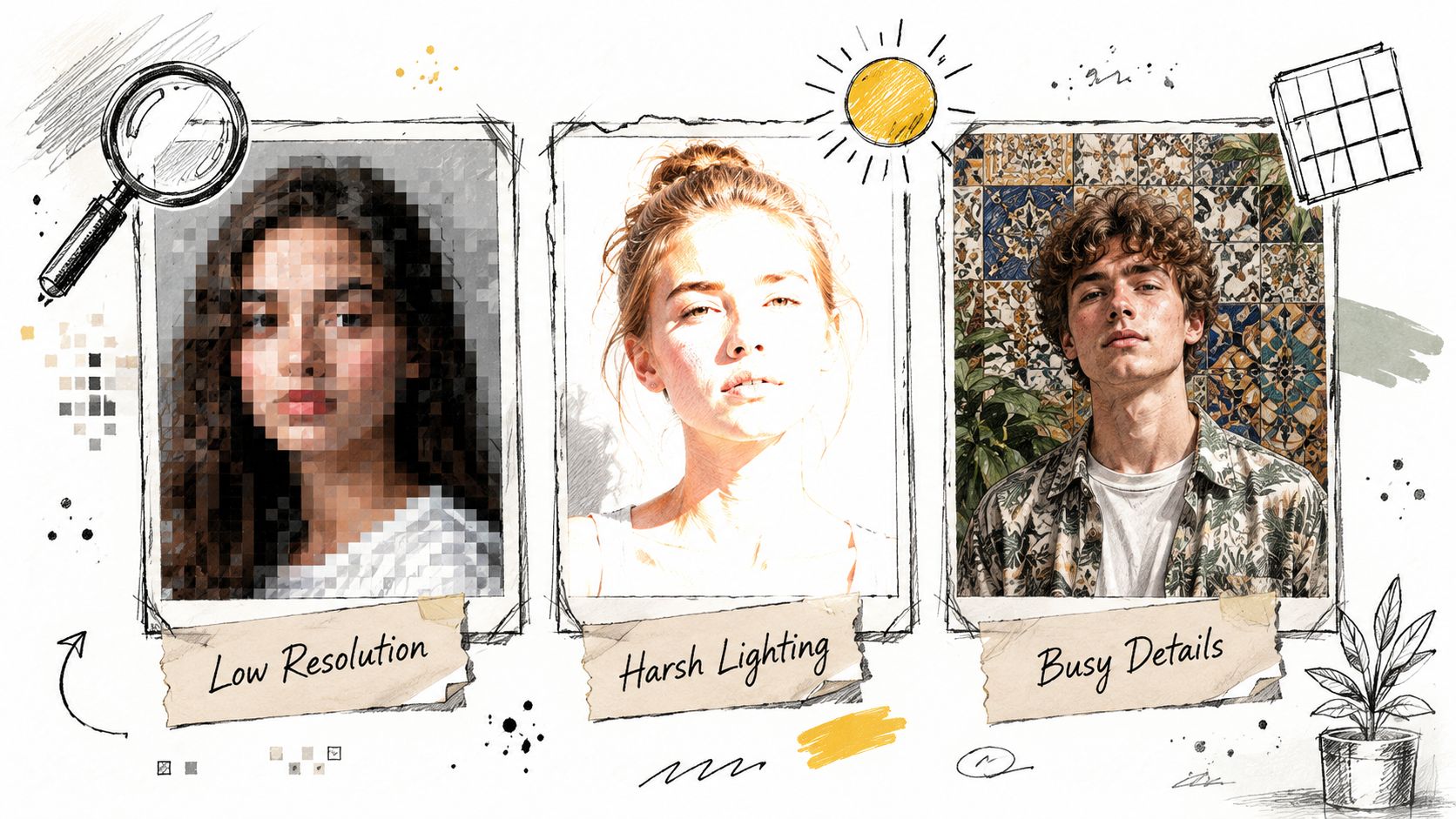
The source matters as much as the effect. Mainstream tool pages keep hinting that clear portraits, well-lit images, and high-quality source photos perform better, and that low-detail inputs or overly strong stylization can damage faces, edges, and backgrounds. That's the reason a converter sometimes disappoints, it isn't failing randomly, it's revealing the limits already present in the photo. Pixelbin's guidance points to those limits without dressing them up.
Crop tighter if the subject is too small. Simplify the background if the effect is getting lost. Re-shoot with softer light if the shadows are breaking the face. If the file feels rough, use a cleaner export format and try again.
The habit that saves the most time is simple, fix the photo before you blame the converter. That one move usually matters more than changing style settings three times in a row.
The converted image is only half the job. Once the artwork looks right, you still need to decide where it will live, on a feed, on a wall, or in a storefront listing. For web and social use, a lighter share file usually makes sense. For print, the output needs more care around resolution, format, and color handling. Starryai's detailed guide on image resolution for printing helps frame that choice, because the same image can behave very differently once it leaves the phone screen.

A few converters expose useful controls like brush density, canvas texture, and color mood, and those settings matter more than most users expect. If the image feels too digital, increase texture. If it starts to look busy, back off the brush density. If the palette feels cold or too loud, adjust color mood before you flatten and export. That balancing act is where the result starts to feel intentional instead of preset-heavy.
Keep a master file if the tool offers any kind of editable state, then make a flattened version for sharing. That gives you a safe base when you later need a different crop, a cleaner background, or a larger print layout.
The other decision is format. PNG is usually the safer choice when you want cleaner edges and less visible compression, while JPG can be fine for quick sharing if file size matters more than absolute fidelity. If you plan to print or resell, be stricter with the export than you would be for a story post.
A print file also needs enough detail to survive close viewing, and that is where source resolution matters more than the effect itself. High-resolution files give the brushwork room to hold up on paper, while low-resolution uploads can look fine on-screen and fall apart in print. That is why it helps to check output size against the final use before you commit to one version.
Most converter pages go quiet. They'll show the upload flow, show the finished image, and then stop before the part that matters to creators, what you own, what you can sell, and what happens when the source image belongs to someone else. The gap is real, because the product pages emphasize easy export, watermark-free output, and ready-to-share positioning, but they don't spell out licensing terms, training provenance, or downstream rights. The commercial-use gap is exactly where creators need clarity.
A converted pet portrait for Etsy feels low-risk if you own the source image, but you still want to confirm the platform's terms and keep the original file. A selfie turned into a book cover needs extra care, because the image may be usable creatively while still failing a publisher's rights checklist. A team photo posted on a brand channel is different again, since other people's likenesses can create approval issues even when the art effect itself looks great.
The practical habit is boring, but it saves headaches. Keep the original photo. Keep proof that you created or licensed it. Avoid third-party logos, branded products, or other people's images unless you already have permission to use them that way.
Useful rule of thumb: if you can't explain where the source image came from, you're not ready to sell the conversion.
Save the source file, the final export, and any permission notes in the same project folder. If you're using client work, treat the conversion like any other deliverable and confirm the rights before you post or print it. If you're using a selfie or a pet photo you shot yourself, the rights question is simpler, but it still pays to archive the source and the final artwork together.
A picture to oil painting converter can absolutely fit commercial work, but the rights check has to happen alongside the creative step, not after you've already listed the item for sale.
If you want a faster way to turn a photo into a painterly asset, starryai gives you an editing flow built for that kind of conversion, with prompt control and quick export. Try it on a portrait, a pet shot, or a nature scene, then compare the result against the source photo with the same eye you'd use for print or product work. Visit starryai and test the workflow on an image you already trust.


.svg)