


Written by Mo Kahn on
July 24, 2026


You've got the spark already. It's late, you're scrolling, and one image stops the thumb. Maybe it's a cottagecore floral, a Y2K chrome type treatment, or a soft coastal grandmother palette that suddenly feels like it belongs on a case instead of a mood board. That's the useful moment, because phone case design only gets profitable when the idea can survive a real print, a real cutout, and a real person holding it all day.
The gap between “looks good on screen” and “ships well” is where most sellers lose time. A strong concept still has to respect camera cutouts, button placement, safe zones, print resolution, and material behavior. The good news is that the workflow gets repeatable fast, and the first pass can stay light, fast, and creative.
The best case ideas usually start as a half-second reaction. You're scrolling, you pause on a vibe, and you already know whether it feels soft, ironic, glossy, romantic, or loud. That reaction is the raw material, but it needs a quick translation into something you can print.
A passing trend becomes usable when you pin it down into subject, palette, and composition. A midnight botanical case might become dark florals, a near-black background, and centered stems with room for a camera cutout. A Y2K chrome case might use reflective type, a high-contrast silver and lilac palette, and a layout that keeps the focal point away from the top edge.
Practical rule: if you can't describe the case in one sentence without using the word “aesthetic,” it's still too vague to print well.
A simple habit keeps the ideas from drifting. Make one screenshot folder, one Pinterest board, or one plain notes file, and only save images that answer a real decision. The point isn't to collect everything, it's to notice what keeps repeating across posts, sellers, and creators.
That repetition is your clue. If the same visual language shows up in different places, it's probably more durable than a one-off post that went viral because of timing. Then write a one-line creative brief before opening any image tool, something like “soft floral case, muted cream and olive, centered bouquet, clean negative space for camera cutout.”
The whole process can stay short. A focused twenty-minute scan is enough to move from inspiration to a brief that guides production instead of just feeding more scrolling.
A trend can look strong in a feed and still fail on a case because the surface area is small and the viewing distance is close. A phone case thumbnail sits around 2 by 3.5 inches, so anything too busy turns muddy fast. If the design doesn't read immediately, it'll disappear under product photos, listing grids, and daily handling.
The easiest way to sort ideas is to ask three questions before you spend time designing.
Those filters explain why certain themes keep coming back. Celestial skies, minimal line art, pet portraits, typography statements, and seasonal botanicals work because they stay legible, emotionally direct, and easy to personalize. They don't rely on tiny details to carry the concept.

The fastest way to waste production time is to chase a style that's already peaked everywhere you look. A stronger signal is when the same direction keeps appearing across distinct creators, not just one account. If major brands have already adopted the look, it may still sell, but you need a sharper angle.
For marketplace planning, it helps to compare your idea against broad merchandising thinking like the guidance in this merchandise design overview. The point isn't to copy other product categories, it's to notice how reusable symbols, strong silhouettes, and fast-recognition themes keep working.
A tight shortlist is the right end state here. Two or three directions is plenty. More than that usually means the concept stage is still too loose, and the artwork phase will turn into noise.
Once the direction is clear, the job is to turn it into art that prints cleanly. Text prompts are best when they describe the thing you want to hold in your hand, not just the style you saw on a feed. A case design needs shape, space, and a clear center of gravity.
A useful prompt usually names four things, the subject, style, palette, and layout. If you want a centered subject, say so. If you want room near the top for the camera area, say that too. For a wraparound design, ask for a composition that can continue at the edges without the focal point breaking apart.
That matters because print surfaces are unforgiving. A beautiful composition can fall apart if the top edge is crowded or if every detail competes with the cutout area. I've seen cases look perfect in a preview and awkward in hand because the art was too centered on the wrong part of the panel.
The Edit tool is useful when you already have a reference photo or sketch but want it simplified for print. A pet photo can become a cleaner illustrated portrait. A rough floral concept can be pushed into a flatter, more graphic style. The goal is not to preserve every source detail, it's to make the artwork easier to read at size.
The quickest loop is usually generate, compare, adjust, then regenerate only when the core idea is off. If the layout is right but the style is wrong, edit. If the composition is wrong, regenerate. That keeps the process moving without turning into endless prompt tuning.
A short demo can help you judge when a concept is ready to move forward.
One hero image and one or two alternates are enough for layout testing. More than that usually slows decision-making. If you're building several case ideas, save the variations that differ meaningfully in composition or contrast, not just tiny style shifts.
If you're also looking at other printed products with similar design logic, the same clean-image discipline shows up in durable decals for trucks and Jeeps, where clarity, contrast, and edge behavior matter just as much. Different product, same truth, weak artwork fails faster than strong artwork.
Most disappointing cases don't fail because the idea was bad. They fail because the file wasn't built for production. The mockup hid the problem, then the printed version exposed it immediately.
The first quality gate is file resolution. One industry guide recommends at least 300 dpi, a minimum of 1000 px by 1500 px, and a file size under 3 MB for the best outcome. Those basics matter because blurred artwork, fuzzy type, and weak edge definition become obvious on a physical product. The Dairy's first-time custom case guidance also calls out model-code matching and CAD-derived dimensional PDFs, which is the part many creators skip.
A practical file workflow also includes the right color setup for the printer you're using. Most print-on-demand services still expect clean, print-ready files, and a test on a lower-cost case model is cheaper than discovering a layout problem after a larger order lands.
Practical rule: build for the cutout, not around it. If the design crowds the camera area or side edges, it's already too risky.
The safest layout choice is to keep key content in the lower two-thirds of the case and leave a 3 mm inner border. That buffer protects faces, text, and focal points from print shift, trim variance, and cutout interference. It's also the easiest way to avoid that common pre-order failure where the art looks fine in the file but lands awkwardly on the product.
A few checks catch most bad layouts before you print:
For creators who want a deeper technical reference on file readiness, the resolution notes in this printing guide are useful as a companion to the layout stage.
The best habit here is boring but effective. Print one cheap sample, hold it, click the buttons, and look for misalignment before you commit to a bigger run.
A convincing mockup does more than show the art. It helps you judge whether the design feels like a real object, not a flat graphic pasted onto plastic. That matters for product pages, social previews, and your own confidence before spending money on inventory.
The fastest route is a smart-object PSD template, because it lets you drop the art into a realistic case shape with proper perspective. A second route is a lifestyle mockup, where the case sits in a hand or on a styled surface. A third, very practical option is to photograph a blank case with a paper insert for early testing. Each option is fine, but the lighting has to stay consistent.
Warped perspective kills trust immediately. So do shadows that point the wrong way or colors that look oversaturated compared with the actual print file. If the mockup is too glossy or too dramatic, buyers will think the case looks cheaper than it is.
A short looping mockup video can make a listing feel more alive than a static angle alone. On TikTok and Reels, a slow turn, a hand pickup, or a quick reveal usually does more work than a polished still. The point is not cinematic flair, it's believable movement.
For your own process, start simple. One polished static mockup is enough to judge composition, and one short clip is enough to test whether the design has visual pull in motion. If either one looks off, the art probably needs another pass before launch.
Where you launch changes how you frame the same design. A case that works as a searchable product on Etsy may need a different presentation than a case pushed through social content. The channel choice should match your strengths, not your mood that week.
Etsy makes sense when you're willing to work the listing like a product page. Search intent is already there, so keyword-rich titles, careful tags, and strong product photos matter more than hype. TikTok and Instagram fit creators who can post often and show personality, because the hook has to land fast and the design has to survive a scroll. Print-on-demand marketplaces suit people who want zero inventory and can live with a slower, broader approach.
That's why trying all three at once usually backfires. Each channel asks for a different rhythm. One wants SEO discipline, one wants momentum, and one wants patience.
A good listing on Etsy might lead with the design theme and device fit. A social post might lead with the making process or the aesthetic mood. A POD upload might need simpler naming and clearer niche tags so the platform can categorize it properly.
If you want a helpful analogy, look at branding work like NiKa Consulting Group logo design, where clarity and recognition matter more than decorative noise. A phone case has a similar problem, only smaller and more physical. The design needs to read fast, then hold up when someone uses it every day.
For a broader workflow lens on merch-style creative output, the thinking in this AI art guide for print-on-demand creators lines up with the same decision: choose one channel, then design for how that channel sells.
The repeatable path is simple once the moving parts are named. Trend scan, choose a direction, generate the artwork, adjust it for print specs, mock it up, then launch. The second design gets easier because you're no longer inventing the process from scratch.
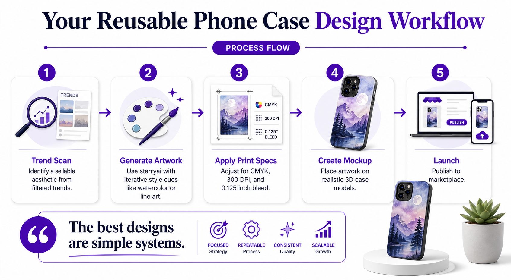
Keep the key content in the lower two-thirds and leave a 3 mm inner border. That one rule saves more pre-orders than any flashy prompt ever will.
The best designs are simple systems. A clean concept, a print-safe layout, and a believable mockup will beat a clever idea that breaks at production. By the tenth case, the workflow starts to feel less like a project and more like muscle memory.
If you want to turn your next idea into something printable without losing the creative spark, start building it with starryai.


.svg)