


Written by Mo Kahn on
July 22, 2026


You've probably done this already. You scroll past a custom creature on TikTok or YouTube, stop for a second, and think, “I could make my own Pokémon better than that.” Then you open an image generator, type something vague like “electric wolf pokemon,” and get back a busy, off-brand creature with too many spikes, too many colors, and no clear personality.
That gap between a fun idea and a convincing design is often where progress stalls.
The good news is the audience for original creature design is very real. Pokémon-related content has generated over 2.5 billion views on TikTok between 2020 and 2026, and “custom Pokémon creator” videos account for 15% of all Pokémon-related posts, averaging 450,000 views per video according to this Pokémon custom creator analysis. People want to see new monsters. They also want them to feel believable.
Making your own Pokémon well means handling the full creative lifecycle. Start with a concept that feels like it belongs in a creature roster. Generate with enough control that the output has shape and identity. Then decide whether you're posting it for fun, adding it to a game pitch, or exploring merch without wandering into trademark trouble.
A lot of creature design starts with imitation. That's normal. Fans grow up reading silhouettes before they read move sets. You recognize a fire lizard, a haunted candle, or a leafy owl in a split second because the strongest designs solve the same problem every mascot designer faces. They communicate fast.
The official Pokémon franchise gives fans a strong framework to borrow from. As of 2026, the franchise has released 1,025 distinct Pokémon species across 10 generations, with each generation beginning from a familiar starter structure and a predictable approach to evolution and stat balance, according to this custom Pokédex reference. That consistency is one reason fan-made creature design feels approachable. You're not inventing a genre from scratch. You're working inside a visual language people already understand.
A good custom creature doesn't need to be complicated. It needs to be legible in one glance and interesting on the second.
That's why “make your own Pokémon” works best as a design exercise, not just a prompt experiment. If the creature could fit on a card, in a party screen, or on a sticker sheet, you're on the right track. If it only works as a hyper-detailed splash image, you probably skipped the core design step.
There's also a practical reason to treat this seriously. A custom creature can do several jobs at once:
The fastest route to a strong design is combining two readable ideas. Think animal plus object, habitat plus emotion, or elemental type plus behavior. A moss-covered ram. A steel hummingbird with sewing needle wings. A ghost lantern koi.
That combination matters more than raw detail. Viewers forgive simple rendering if the concept clicks immediately. They rarely forgive a messy concept rendered beautifully.
Before you generate anything, ask four questions. What is it? What type pair fits it? What shape would a child doodle from memory? What one trait makes it different from the last ten creature designs in their feed?
If you can answer those cleanly, the rest of the process gets easier.
Strong AI creature art starts with a brief. Not a corporate brief. A tiny design brief you can hold in your head.
That usually means choosing one clear base animal, one defining twist, one emotional tone, and one function. The function is important. Is this a starter, a cute early-route creature, a boss monster, a fossil, or a legendary-style icon? Each one wants different proportions and attitude.

Use the official design language as a filter, not a cage. Many memorable creatures can be reduced to a compact sentence. “A shy grass fox with mushroom ears.” “A fire blacksmith lizard that stores heat in its tail.” “A ghost teacup raven that steals shiny buttons.”
A few inputs tend to work better than others:
If you need a brainstorming spark board before sketching, TattoosAI creature ideas can help you browse creature motifs and visual directions that translate well into monster concepts.
A lot of beginners make the same mistake. They pile on lore before they decide what the creature looks like from ten feet away. Reverse that. Shape first. Story second.
Practical rule: If the silhouette doesn't work in black, no amount of surface detail will save it.
Expert analysis of canonical Pokémon designs found that 95% use only two or three primary colors, and breaking that rule creates a 70% higher chance that the design will feel muddy or overly complex, based on this Pokémon design analysis. That's one of the easiest professional habits to borrow.
Use this before you touch a generator.
| Element | Question to Answer |
|---|---|
| Core species | What real creature is the base body built from? |
| Type concept | Which one or two elements define its behavior and look? |
| Signature feature | What single trait would someone mention first? |
| Silhouette | Could you recognize it if it were filled in solid black? |
| Color palette | Can you keep it to two or three primary colors? |
| Expression | Is it cute, threatening, aloof, goofy, or calm? |
| Habitat | Where would it live naturally? |
| Evolution role | Is it a first stage, middle stage, or final stage concept? |
Silhouette work doesn't need polished line art. In fact, rough shape blocking is often better. Paint a black blob, then carve the ears, tail, limbs, and accessory shapes until the creature reads. Rounded shapes usually feel friendly. Tall triangles feel aggressive. Wide low bodies feel sturdy.
For more character-design thinking, this guide to making a good character design is a useful companion when you're deciding what details are doing work.
A prompt should act like art direction. It should tell the model what the creature is, how it should feel, what style family it belongs to, and what to avoid. If it reads like a bag of keywords, expect mixed anatomy and random decoration.
A clean starter template looks like this:
[adjective] [animal or object hybrid] creature, [element] themed, mascot character design, clean silhouette, limited color palette, expressive eyes, simple background, illustrated style
Example:
playful moss-covered fox creature, grass and ghost themed, mascot character design, oversized ears shaped like leaves, clean silhouette, limited color palette, expressive eyes, simple pale background, illustrated style
That works because every phrase has a job.
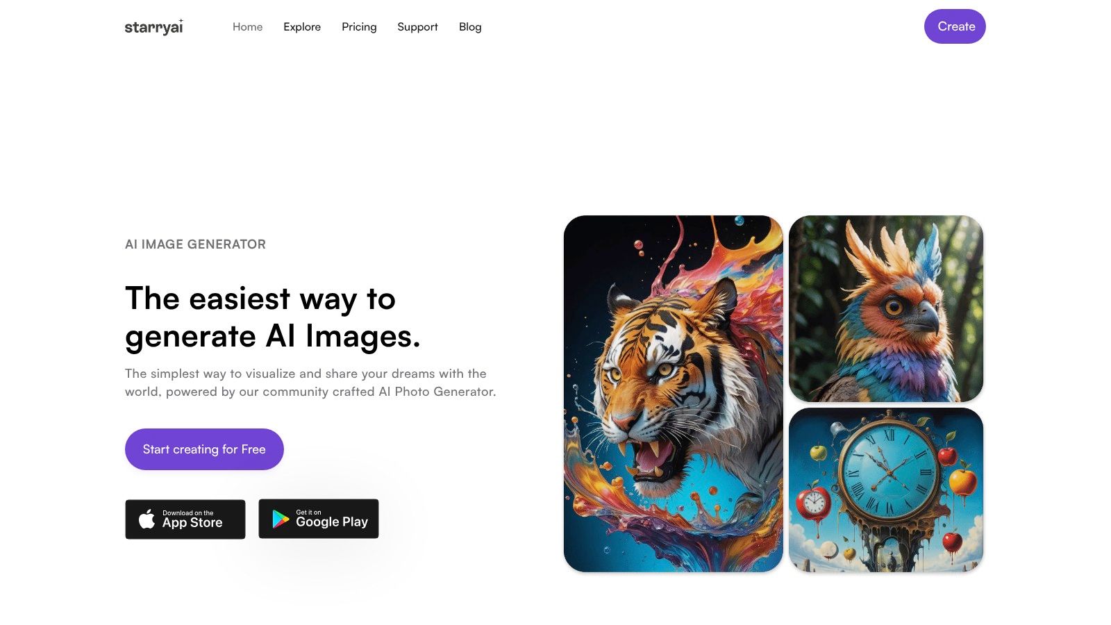
On this platform, more detailed text prompts yield higher fidelity outputs, and each generation returns four automatic image variations so you can choose the strongest direction before refining, as shown in this starryai prompt walkthrough.
A few prompt choices usually improve results:
What doesn't work well is vague style worship. “Make it look like a famous franchise monster” tends to produce generic mimicry. Describing form and mood is safer and usually cleaner.
Generate a small batch, then compare the four outputs like a creative director reviewing thumbnails. Don't ask, “Which image is perfect?” Ask, “Which one has the best bones?”
Look for these traits first:
For prompt writing practice, this AI prompt writing guide is worth keeping open in another tab while you iterate.
After your first pass, tighten only one or two variables. If the shape is great but the colors are off, revise the palette wording. If the face is strong but the body is too realistic, add “mascot proportions” or “stylized creature illustration.” If the output keeps adding unnecessary armor, remove material cues and simplify.
Here's a useful workflow for beginners:
A short demo helps when you want to see this kind of iteration in motion.
The main discipline is restraint. Add detail only after the creature already works. Designers who start with decoration usually end up deleting half of it later.
The first output is a draft. Treat it like a sketch pinned to the wall, not a final card illustration.
That mindset changes everything. Instead of judging the image as pass or fail, you start inspecting what's salvageable. Maybe one version nails the ears, another gets the stance right, and a third has the best facial expression. The point is to identify what deserves another round.

Choose the draft with the strongest shape and personality, even if the texture is rough. You can improve finish later. Fixing a weak silhouette is much harder.
When I review creature outputs, I usually reject images for three reasons:
A refinement pass should solve one design problem at a time. If you try to fix anatomy, palette, mood, and composition all at once, the image often drifts.
Use aspect ratio intentionally. This workflow supports square, portrait, and horizontal presets, and the flow is deliberately simple: choose style, enter prompt, generate, pick a variant, refine or upscale, then download, as outlined in this starryai workflow review. That matters because the right ratio can make the same creature feel like a sticker, a poster, or a trading-card hero shot.
Square usually works best for feeds and galleries. Portrait gives your creature more vertical drama if it has antlers, wings, or a long tail. A horizontal orientation is useful when the environment helps sell the idea, like a cave-dwelling crystal beast or a shoreline spirit.
You should also decide whether the creature is meant to feel like concept art or finished product art.
For concept art, keep some looseness. Let the brush texture and rough edges stay visible. For merch or posting, sharpen the image, simplify the background, and check whether the outline still reads against white or transparent placement.
A practical final pass often looks like this:
That's the difference between a fun AI output and a creature someone remembers.
A finished creature design still needs packaging. Posting the raw image is fine if you're experimenting, but presentation decides whether people pause, share, or imagine buying it.
The easiest mistake is showing only the final render. Viewers usually connect faster when they can see the decision-making. A simple carousel or short video with concept, rough version, and final art gives your creature a story.

For social media, build a compact content stack around the creature instead of one isolated image.
A strong post package often includes:
This works because creature fans love process almost as much as polish. It also helps if your design is subtle. A small lore note can make a simple creature feel richer without forcing extra visual complexity.
Studio habit: If the design only works with a long caption, it probably needs one stronger visual idea.
Keep text short on the image itself. Name, type, and one hook are enough. The rest belongs in the caption. If you crowd the graphic with stats, lore paragraphs, and badges, the art loses impact.
Merch doesn't need to start with manufacturing. Start with proof of concept. Drop the creature onto a clean sticker sheet, shirt chest print, mug wrap, notebook cover, or card-style frame. You can do that with standard mockup tools or simple layered templates in your image editor.
The best creature merch designs usually share three traits:
If you're testing market appeal, make one mascot-forward design and one cleaner emblem version. Some buyers want the full character. Others want something more wearable.
This is also where restraint pays off again. A creature that looked slightly simple on a full-screen render often performs better on physical products because it survives scaling, cropping, and printing with less loss.
This is the part most make-your-own-Pokémon tutorials skip. They'll help you design a creature, maybe even format it like a card, then disappear right before the obvious question. Can you sell this?
The fear is common for a reason. Data shows 68% of indie creators avoid Pokémon-inspired merch due to fear of IP infringement, which leaves a clear knowledge gap for artists who want a responsible path forward, according to this creator IP discussion.
If your creature uses the Pokémon name in a way that suggests official affiliation, copies iconic species too closely, or borrows franchise-specific branding, you're stepping into risky territory. That's especially true for product listings, packaging, and storefront SEO.
A fan-made creature for personal sharing is one thing. A commercial listing that trades directly on someone else's trademark is another.
Here's the practical distinction:
This doesn't mean you can't learn from the genre. You can. Creature collecting has broad conventions. Elemental affinities, evolution logic, regional ecology, and mascot-friendly silhouettes are design territory, not a single company's exclusive claim.
If you want to monetize, stop thinking “How close can I get?” and start thinking “What can only my world contain?”
Build separation deliberately:
That last point matters. A documented process helps show that you developed an original property instead of only remixing an existing one.
Commercial rights around AI-generated art raise their own questions too, so it's smart to read this guide on selling AI-generated art before you open a shop, print run, or digital download listing.
The smartest long-term move is to treat your best creature designs as seeds for a broader universe. Give them a home, a naming system, a visual language, and a reason to exist together. Once you do that, you're not just making a Fakemon. You're building a creature brand with its own identity.
If you want a simple place to start generating, refining, and exporting creature concepts for posts, prints, or commercial experiments, try starryai. It's a practical tool for moving from a rough monster idea to a polished visual you can use.


.svg)