
Written by Mo Kahn on
July 1, 2026


You're probably here because you want a tiny, expressive character that feels personal. Maybe it's for a profile photo, a Discord emote, a sticker pack, a Twitch panel, or a keychain you've been meaning to make for months. Chibi works so well for those jobs because it turns personality into a compact visual language. Big mood, small canvas.
The nice part is that you don't need to be “good at drawing” to make chibi characters. You can sketch them by hand with a few simple shapes, or you can use AI to explore poses, outfits, and expressions faster. The strongest results usually come from combining both. A little anatomy knowledge makes your prompts better, and AI mockups can help you spot what you want to draw next.
A full character illustration can be gorgeous, but it's often too detailed for how art is used online. Tiny circles on a profile page, sticker sets in chat apps, reaction images, merch tags, and thumbnail graphics all reward clarity. Chibi gives you that clarity without feeling plain.
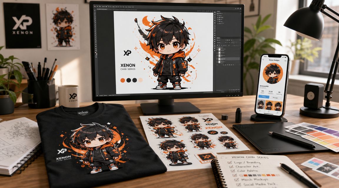
A good chibi can do a lot of jobs at once. The same character can become a social avatar, a reaction sticker, a print-on-demand charm, or the “mascot” version of a bigger original character. That flexibility is a big reason people keep coming back to the style.
For creators, the appeal is even simpler. Chibi lowers the intimidation barrier. You don't need perfect anatomy, realistic hands, or advanced rendering to make something charming. If your goal is a cute character fast, chibi is one of the most forgiving styles you can pick.
If you're still deciding what kind of character asset you want, this guide to AI avatars for online identity is a useful companion because it helps you think about where the final image will live, not just how it looks.
Chibi succeeds when the emotion reads before the details do.
That's why hand drawing and AI both fit this style so naturally. Drawing gives you control over shape and personality. AI gives you speed, variation, and quick concept testing. Used together, they make the process less precious and more playful.
Chibi isn't just “small anime.” It has its own structure, and if you miss that structure, the character starts reading as a child, a doll, or just a badly proportioned figure.
According to this overview of chibi origins and characteristics, chibi is generally defined by a head-to-body ratio of about 1:2 to 1:3, with the head taking up roughly one-third to one-half of the character's total height. The same source notes that the style is also known as super-deformed (SD), emerged in Japanese manga during the 1970s, and became especially popular in the 1980s and 1990s for comedic effect.
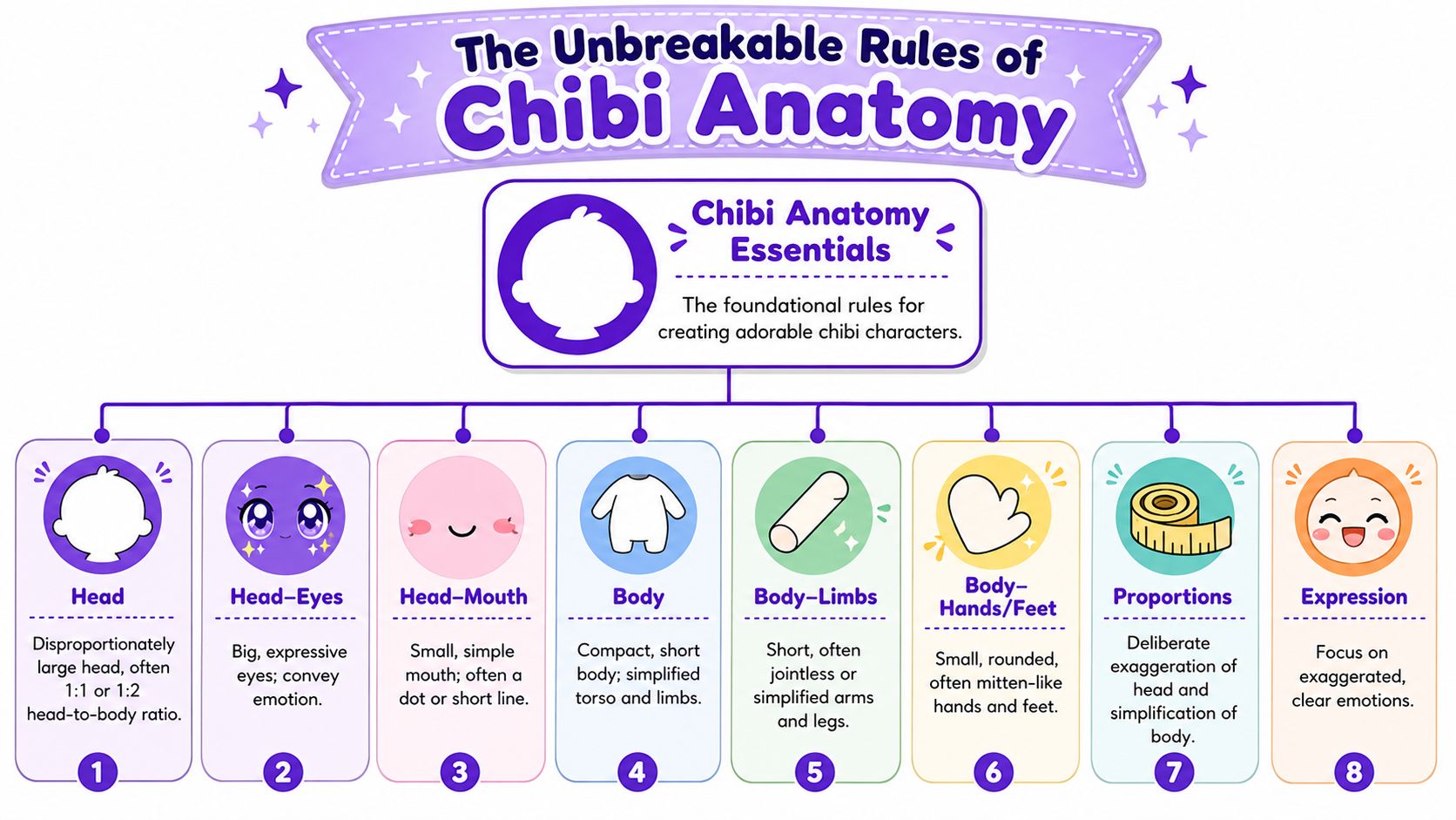
Start with height. In practice, many artists build chibi characters at 2 to 3 head-heights, and that benchmark matters because it keeps the silhouette compact and unmistakably stylized, as described in this chibi drawing workflow guide. A 3-head chibi tends to feel a bit more mature, while a 2-head chibi feels more childlike.
Then look at the face. Chibi faces carry most of the communication load, so the eyes are large, the nose and mouth are minimal, and the body is simplified. That same workflow guidance notes that eyes may occupy up to half of the face, which is one reason emotion reads so quickly even at small sizes.
The body should support that face, not compete with it.
The most common mistake is over-correcting toward realism. People think the drawing needs elbows, kneecaps, cheekbones, realistic neck width, or carefully rendered hair strands. It doesn't.
A stronger construction approach is outlined in this Clip Studio chibi tutorial: block the figure as a sphere-headed silhouette first, place facial features low on the head, and simplify the limbs into curved tubes or basic geometric forms. The same tutorial notes that the common failure mode is placing features too high or making the torso and limbs too anatomically detailed.
Practical rule: If your chibi looks “off,” check the face position before you redraw anything else.
That low-set face matters more than many beginners expect. Features placed too high create a forehead-heavy look that feels strange rather than cute. The same guidance also recommends keeping the eyes large and widely spaced enough to leave room for roughly a third-eye gap, while minimizing nose and mouth detail for readability at small sizes.
If you want a quick internal checklist before you start any sketch or prompt, use this:
If the answer is yes, you're on the right track.
The easiest way to fail at drawing chibi is to start with details. Don't begin with eyelashes, folds, bangs, or costume accessories. Start with a big shape and a tiny shape. That's enough to get moving.
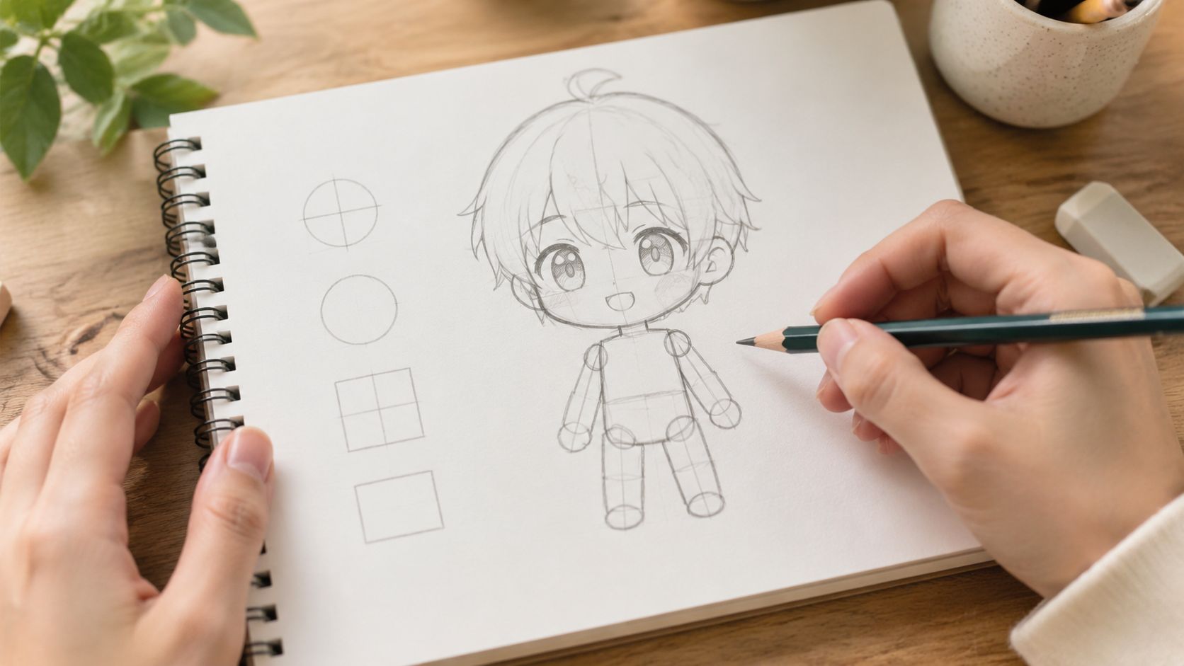
Draw a round head first. Then add a bean-shaped or pear-shaped torso under it. That simple block-in method matches a production-friendly workflow described in this Clip Studio how-to for chibi construction, which recommends separating the process into construction → line art → flats → simplified shading.
From there, add thick, short limbs. Think curved tubes, not muscles. The arms can be almost sleeve-like. The legs can be simple columns with slight taper. This stage should look a little toy-like, and that's good.
A beginner-friendly sequence looks like this:
The drawing starts to feel alive. Keep the eyes large and easy to read. Tiny highlights can help, but don't over-render them. A small mouth, a dot nose, or even no nose at all often works better than a realistic feature set.
Hair should also be grouped into big chunks. One of the quickest ways to age up a chibi is to draw too many thin hair spikes or a sharp jawline. Rounded shapes keep the design soft.
Use fewer lines than you think you need. Chibi gets stronger as you simplify.
When clothing enters the sketch, focus on identity cues. A hoodie, one hair clip, a scarf, oversized sleeves, cat ears, glasses, or a single prop can carry the character better than a full costume breakdown. If you draw every buckle and seam, the figure starts feeling crowded.
A video demo can help if you learn best by watching the process unfold:
Flat color is your friend. Fill the main shapes first. Then add very simple shading, not fully rendered lighting. The production workflow guidance above recommends using only one or at most two shadow values per region so the character stays readable in small formats.
That restraint matters more than fancy blending. If you plan to make chibi characters for social posts, stickers, or acrylic merch, high-detail shading often muddies the form. Rounded shadows used as form cues keep the drawing clean.
A good stopping point usually includes:
Hand drawing gives you the strongest understanding of what belongs in the design. Even rough sketches teach you what the character can lose without losing identity. That's valuable whether you stay traditional or move into AI after the sketch phase.
AI is useful for chibi when you treat it like a sketch partner, not a mind reader. If your prompt is vague, the result usually is too. If your prompt describes structure, emotion, and usage, the image gets much closer to something usable.
One challenge matters more than people expect. A character has to stay recognizable across poses and expressions, especially if you want a sticker pack or emote set. This chibi AI style overview notes that consistency across angles and expressions is a key difficulty, and that demand has grown for outputs with transparent backgrounds and flat colors suitable for digital use.
Start with a base prompt that describes the character in plain terms. Don't try to sound poetic. Be direct.
A workable base prompt might look like this:
chibi character, oversized head, large expressive eyes, compact body, rounded shapes, flat colors, simple shading, sticker style, transparent background, cheerful expression, blue hoodie, short brown hair, holding a game controller
Then layer details based on what you need.
| Factor | Hand-Drawing | AI Generation with starryai |
|---|---|---|
| Speed for first concept | Slower at first | Faster for variation |
| Control over exact shape | High | Medium, improves with better prompting |
| Expression exploration | Manual redraws | Quick iteration |
| Consistency across set | Strong if you can draw repeatedly | Needs careful prompt reuse |
| Merch prep mindset | Built in if you design simply | Requires active cleanup choices |
If you want to improve your prompting vocabulary, this guide to AI image creation techniques is helpful because it breaks down how prompt specificity changes output quality.
Here's a practical prompt layering method:
For setup basics and tool flow, the starryai quick start guide is the cleanest place to get oriented.
Consistency usually comes from reducing variables, not adding more. Keep the same core descriptor stack across generations, then swap only one thing at a time. If you change the pose, don't also change the outfit, mood, color palette, and camera angle.
Drawing knowledge gives you an advantage. If you know that the silhouette should stay compact and the face should remain dominant, you'll notice bad generations faster. You won't waste time polishing an image that already broke the chibi language.
Try this workflow for a sticker or emote pack:
AI gives you volume. Taste still decides what survives.
Negative prompts can also help remove clutter. If hands look odd, accessories multiply, or the body gets too realistic, explicitly ask for simpler forms and fewer details. Chibi benefits from restraint more than complexity, so pruning is part of the art direction.
Once the structure is working, personality takes over. Two chibis can share the same proportions and still feel like completely different characters based on pose, outfit, and palette.
A shy character doesn't need a paragraph of backstory. Tilt the feet inward, tuck the arms close, use a softer palette, and keep the mouth tiny. An energetic character can lean forward, lift one hand high, wear brighter contrast, and use a more open expression.
That speed of emotional reading fits chibi especially well. As noted in the earlier workflow source, the style's visual economy relies on short torsos, stubby limbs, and large eyes that can occupy up to half the face, which helps emotions read quickly in comics, stickers, and social content.
You can use that to your advantage in either workflow.
Many designs become memorable. You don't need more detail. You need better-selected detail.
A strong chibi often keeps only 1 to 3 strong design cues. That could be silver twin buns, a frog hoodie, and striped socks. Or a black bob haircut, yellow raincoat, and oversized boots. Those are the things a viewer remembers and the things you should preserve whether you're drawing or prompting.
Here's the trade-off artists run into all the time:
| Choice | What works | What usually doesn't |
|---|---|---|
| Accessories | One or two signature items | A pile of tiny props |
| Hair | Big readable clumps | Many thin spikes |
| Palette | Clear dominant colors | Too many equal accents |
| Expression | One strong mood | Mixed signals in brows and mouth |
If you can describe the character in one short sentence, the design is usually focused enough.
That's the sweet spot for practical use. The character still feels personal, but the image remains readable on a phone screen and adaptable for future poses.
A lot of otherwise cute work falls apart. A chibi can look great on a large canvas and still fail the moment it becomes a sticker, keychain insert, or profile icon. The missing step is production thinking.
A merch-ready chibi needs to survive shrinking. That's why production guidance matters so much. This article on chibi merchandising gaps points out that many tutorials skip the practical questions, including how to keep a character readable at sticker size and how to simplify accessories without losing core identity.
That should change how you finish the art.
If the final use is a small sticker, remove thin line details, reduce accessory clutter, and check whether the silhouette still reads at a glance. If the final use is a shirt print, you can allow a bit more internal detail because the image will live larger. Different formats ask different things from the same character.
For digital use, a PNG with transparency is usually the most flexible export because it drops cleanly onto profile banners, social graphics, and stream layouts. A JPG is fine for simple posting, but it locks in the background.
For merch, keep a clean master file before you flatten anything. That way you can make one version with an outline for stickers, one without for apparel, and one simplified version for tiny charms or icons. If you're exploring product logistics after the art is ready, this overview of choosing merch fulfillment models is useful because it frames the trade-offs between different fulfillment approaches.
A practical prep checklist looks like this:
If your goal includes print products, this guide on AI art for print-on-demand creators is worth reading because it focuses on turning generated art into usable product assets rather than leaving it as a one-off image.
Use the tool that feels frictionless to you. Procreate, Clip Studio Paint, Photoshop, Krita, and ibis Paint all work. For beginners, the best choice is usually the one that lets you sketch fast, use layers easily, and flip the canvas often.
You need less anatomy than you would for realism, but you still need proportion awareness. Even a heavily simplified style works better when you understand what you're simplifying. Basic shape thinking goes much further than advanced anatomy here.
The usual causes are features placed too high, a torso that's too long, limbs that are too thin, or too much facial detail. If the character feels awkward, simplify before you redraw. Most chibi problems come from adding realism back in.
Keep the core face consistent and change only a few levers at a time. Brows, eye shape, mouth shape, blush, and head tilt do most of the work. Make a small expression sheet with the same character instead of reinventing the face every time.
Commercial use depends on the platform's terms, your workflow, and whether your final design avoids infringing on other people's characters or brands. Check the tool's current usage terms, keep records of your prompts and edits, and don't sell fan art as original IP unless you have permission.
Then start with circles and beans. Seriously. Chibi is one of the friendliest places to begin because the style already invites simplification. You can also use AI for rough ideation, then trace your own cleaner version from the ideas you like.
If you want a fast way to explore ideas, expressions, and sticker-ready character concepts, starryai is a practical place to experiment. Use it to generate options, study what makes a design click, and turn rough character ideas into something you can refine by hand or prepare for social and merch use.