
Written by Mo Kahn on
July 1, 2026


You've probably got one of these on your desktop right now. A screenshot with the perfect quote, except the last line is mush. A product photo where the label looked fine on your phone but falls apart on a marketplace zoom. A book cover draft with strong composition and weak type. The image works. The text doesn't.
That's usually where people start hunting for an image text enhancer. They want sharper letters, cleaner edges, and something readable enough to publish. Fair. But the better workflow doesn't stop at “make it less blurry.” Once text is clear enough to trust visually, it can become part of the style system of the image itself, especially for social graphics, indie publishing assets, product mockups, and promo art.
The practical shift is simple. Treat text repair as the first pass, not the final one. Clean the source, enhance only what can be improved, then shape the finished visual so the text feels intentional instead of merely rescued.
A common failure point looks like this. You capture a strong visual moment, maybe a retro game screenshot, a moody book cover mockup, or a product flat lay. Then you zoom in and realize the headline is soft, the small text is broken by compression, or the letters have that crunchy halo that screams low quality.
The instinct is to sharpen everything. That usually makes it worse. Edges turn jagged, counters inside letters start filling in, and the text feels louder without becoming clearer. If the image is meant for a feed post or sales page, that kind of fake sharpness reads as amateur even when viewers can't explain why.
A better approach is to separate clarity from style. First, salvage the structure of the letters. Then decide how that text should feel in the final composition. A product label might need clean, restrained realism. A fantasy title on a cover concept might need depth, texture, and atmosphere.
Clean text isn't automatically good design. It becomes useful when it matches the mood and medium of the image around it.
That's the creative opening that's often overlooked. The same rescued text can support very different outcomes. One version might be a crisp marketplace mockup. Another might become a shareable promo visual with embossed lettering, softened glow, or poster-like contrast that feels native to the artwork.
When you work this way, an image text enhancer stops being a rescue button and becomes part of a visual development process. The repair matters. The finish matters more.
The fastest way to ruin text enhancement is to feed the model a weak file and expect magic. Most bad results come from sloppy prep, not from the enhancement tool itself.
If you're scanning paper, 300 DPI is the baseline recommended in OCR guidance on high-quality image-to-text workflows. The same guidance recommends PNG or TIFF when preserving detail matters, because text recognition quality is sensitive to compression artifacts, blur, lighting, and font variation.
That matters even if you're not running OCR yet. Text enhancement works on structure. If the strokes are already chewed up by repeated JPEG saves, the tool has less real information to work with.
Use this pre-flight checklist before you touch any AI setting:
A good manual prep pass is modest. You're not trying to create the final look. You're trying to remove obvious blockers.
Three adjustments usually do the most work:
Short version. AI can improve structure that exists. It can't reliably reverse damage you keep adding in your own file handling.
| Prep issue | What it causes later | Better move |
|---|---|---|
| Repeated JPEG saves | Blocky edges and dirty halos | Keep a PNG working file |
| Loose crop with lots of background | Enhancement spreads attention across the frame | Tighten around the text region |
| Skewed or tilted text | Uneven letter cleanup | Straighten before enhancement |
| Flat contrast | Weak separation between text and background | Adjust values gently first |
Practical rule: If the text looks worse every time you export it, stop enhancing and go back to the earliest cleaner file.
The most useful AI enhancement passes don't try to invent typography. They try to stabilize what's already present so letter edges, spacing, and stroke weight survive resizing, reposting, and printing.
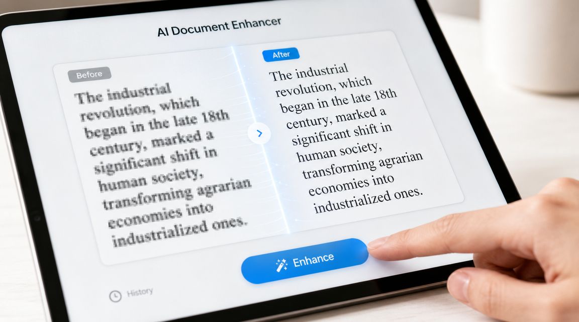
A lot of tools market this as one-click cleanup. That part is true only when the source is decent. Guidance on online text unblurring notes that many tools advertise 4x upscaling or 4K output, but the core limitation is still information loss. When the input lacks enough legible structure, the main failure mode is distorted or hallucinated glyphs.
Upscaling isn't a quality badge. It's a fit question.
A 2026 guide to enhancing text in images describes AI-based upscaling workflows ranging from 1x to 16x, with 2x to 4x usually sufficient for web and marketplace use, while print work may need dimensions matched to a target DPI of 300+. That same guide frames text enhancement as a routine production task across e-commerce, publishing, and content workflows.
For everyday decisions, this works well:
If your team also needs to streamline video content creation, it helps to think of image text cleanup the same way editors think about footage prep. Stabilize the asset before you build the final content around it.
With an editor that supports image enhancement, the workflow is straightforward. Upload the cleanest source, crop if needed, run a conservative upscale first, then inspect the result at full zoom. If the letters hold shape, continue. If they start bending, backing off usually beats pushing harder.
For a text-focused pass in a broader creative workflow, one option is the starryai AI image upscaler. The useful mindset is the same regardless of tool. Start small, check edges, and compare against the original instead of trusting the first “cleaner” version you see.
Look for these specific signs at review time:
This walkthrough shows the kind of inspection mindset that helps:
The key trade-off is honesty. If the source text is heavily smeared, the enhancer can produce something plausible-looking without producing something accurate. That's fine for a mood graphic. It's not fine for instructions, labels, evidence, or anything that must be exact.
Once the text is visually stable, you can stop treating it like damage control and start treating it like design material. That's where prompt-driven styling gets interesting.

A cleaned label can become part of a vintage package concept. A repaired title can become embossed, weathered, glossy, hand-painted, stitched, metallic, or screen-printed depending on the mood you need. For creators and indie publishers, that's often the difference between “readable” and “worth sharing.”
Prompting works better when you describe the text as an object with surface, depth, lighting, and context.
Instead of:
Use language like:
That shift does two things. It tells the model what kind of finish to generate, and it forces you to think about how the text should belong inside the scene.
Good prompt styling doesn't fight the repaired text. It gives the repaired text a believable surface and environment.
Here are three reliable creative routes for text-containing visuals:
| Use case | Prompt direction | What to watch |
|---|---|---|
| Indie book cover | Embossed foil, cloth, paper texture, moody lighting | Keep title contrast strong enough for thumbnail views |
| Product mockup | Printed label, matte packaging, realistic material response | Avoid decorative effects that distort product info |
| Social promo graphic | Poster ink, halftone texture, layered shadows, bold palette | Make sure stylization doesn't swallow small text |
One practical workflow for sellers is to clarify the product text first, then push the final asset toward merch-ready presentation. If you're testing how that graphic might sit on apparel or physical products, the FLYP AI merch platform is a useful companion for visualizing how stylized art translates into mockups.
For prompt writing, specificity beats volume. A short, controlled prompt with material cues usually outperforms a long pile of aesthetic buzzwords. If the result gets too ornamental, reduce the number of style instructions and keep one dominant texture plus one lighting cue.
A clean sequence looks like this:
That's the part many editors skip. An image text enhancer can rescue the letters. Prompt styling gives them character.
The export step decides whether your polished text stays crisp or gets chewed up by platform compression. For text-heavy visuals, format choice matters as much as the enhancement pass.
If the final image contains logos, titles, labels, UI text, or sharp graphic edges, export a PNG first. If the piece is mostly photographic and text is larger or less delicate, JPEG can be fine, but only after you've checked whether compression muddies the lettering. For a finishing pass on image quality before export, tools like the starryai photo enhancer can help preserve overall clarity in a social-ready asset.
| Platform | Recommended Dimensions (px) | File Format | Pro Tip |
|---|---|---|---|
| Instagram post | 1080 x 1350 | PNG | Best for quote cards, cover art teasers, and text-forward promos |
| Instagram story | 1080 x 1920 | PNG | Keep key text away from UI areas near top and bottom |
| TikTok cover or promo still | 1080 x 1920 | PNG | Favor larger headlines because mobile previews are unforgiving |
| Etsy listing image | 2000 px on the long side | PNG | Check small product text after upload, not just before |
| Personal blog header | 1600 to 2000 px wide | PNG or JPEG | Use PNG if the design leans graphic, JPEG if it's mostly photo-based |
Two habits save a lot of pain:
If text is the selling point, always preview on a phone. Desktop forgiveness hides a lot of export mistakes.
When enhancement fails, it usually fails in recognizable ways. That's good news, because you can often diagnose the issue quickly.
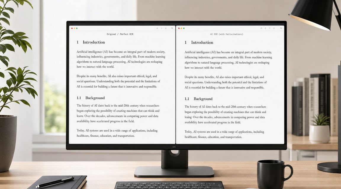
If a word looks sharper but suddenly reads differently, the model has started reconstructing rather than clarifying. Product guidance on text enhancement limits makes the distinction clearly. If characters are severely blurred or compressed, AI may reconstruct plausible letters rather than restore the originals.
That means the fix isn't “enhance harder.” Try one of these instead:
Sometimes the background improves and the text doesn't. That usually points to weak source structure.
Try this sequence:
If exact wording matters, compare every enhanced line against the source before you publish it.
Other common glitches include bright halos, melted serifs, and uneven stroke widths. Those are often signs that the model was pushed too far for the source quality. Conservative settings usually look less dramatic and read much better.
Yes, sometimes. Old photos and scans often benefit from restoration before text clarification, especially when the paper has stains, fading, or uneven shadows. A realistic expectation is visual improvement, not guaranteed recovery of every character. If the text is faint but still structurally present, you have a good chance of making it more readable.
Use a two-step workflow. Expert guidance on best image text enhancer workflows for OCR recommends applying a text-oriented enhancement model to a high-resolution source first, then running OCR. That sequence improves letter-shape fidelity and reduces recognition errors.
Yes. If you're enhancing someone else's image, you still need the right to use, edit, or publish it. Accuracy matters too. A stylized promo graphic can tolerate interpretive enhancement. Legal documents, evidence images, labels, and archival records usually can't. In those cases, preserve the original file, log what you changed, and avoid presenting reconstructed text as unquestionable fact.
Enhancement is most useful when you know which job you're doing. Clarifying for aesthetics, extracting for workflow, or stylizing for promotion each require a different standard of care.
If you want one place to generate, refine, and polish visuals for social posts, covers, mockups, and creative experiments, starryai is a practical place to start.