
Written by Mo Kahn on
July 1, 2026


You've got an image you love. Maybe it's a dreamy scene you made with AI, a polished book-cover concept, or a phone photo that finally looks the way you wanted. On screen, it feels finished. Then the printing question shows up and steals the fun.
Will it come out crisp, or soft and blocky?
That worry is common because screens are forgiving. A file can look excellent on a monitor and still disappoint on paper if the pixel count doesn't match the print size you want. The good news is that image resolution for printing isn't magic. It's a set of simple ideas and a few practical checks.
If you're also printing text-heavy files, proofs, or mixed creative documents alongside artwork, it helps to see how print shops frame file prep in real-world terms. Firacard's UK document printing advice is a useful example of the kind of practical guidance that helps you avoid common mistakes before you upload anything.
A student once showed me a beautiful digital painting on a tablet and then the print she'd ordered. The colors were close. The composition still worked. But the details in the eyes and hair had turned mushy. She thought the printer had messed it up.
The problem was simpler. She had a small digital file and asked it to become a much larger physical object.
That's the heart of image resolution for printing. You're taking a grid of pixels and stretching or fitting it onto paper, canvas, cardstock, or poster stock. If the pixel grid is dense enough for the print size, it looks clean. If it isn't, edges soften, textures smear, and fine detail disappears.
A print doesn't care how impressive your image looked on a screen. It cares how many pixels you can spread across the final physical size.
Once you understand that, a lot of the fear drops away. You don't need to memorize printer jargon or guess your way through export menus. You just need to answer a few practical questions. How big will the print be? How close will people stand to it? Is the file already large enough, or does it need careful upscaling first?
That shift in thinking turns printing from a gamble into a craft decision.
A lot of print frustration starts with two labels that sound interchangeable: PPI and DPI. They are related, but they describe different parts of the trip from screen to paper. Once you separate them, file prep gets much less mysterious, especially if you make digital art or AI images and want to print them cleanly.
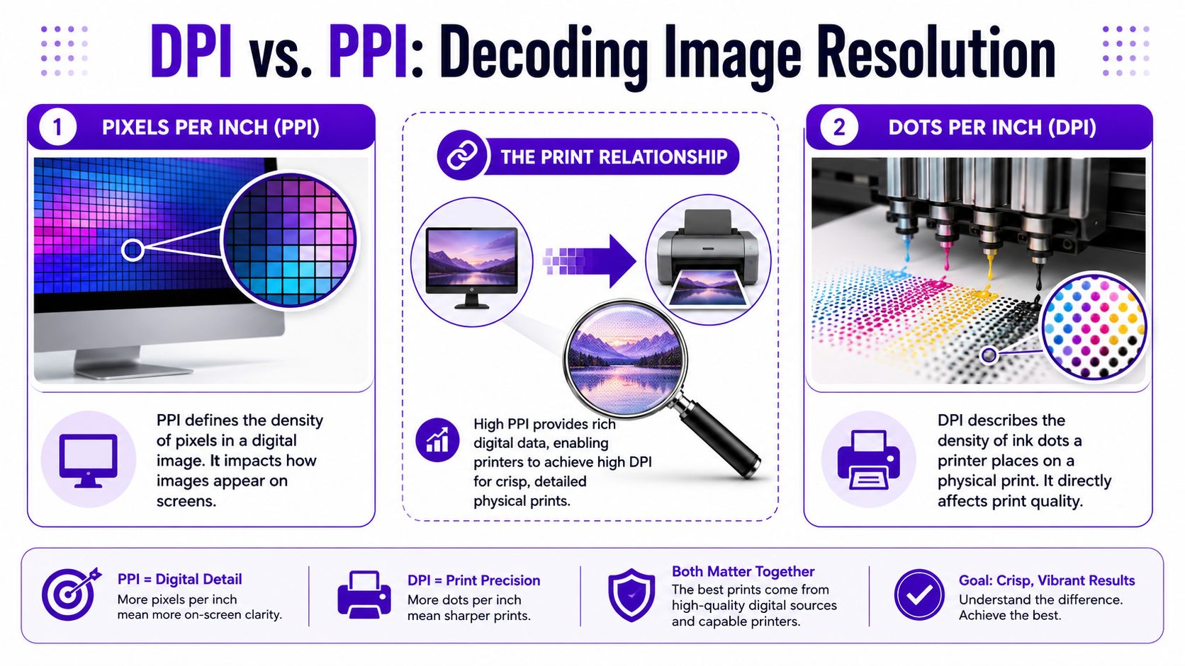
Your image file is made of tiny squares called pixels. If you have more pixels, you have more visual information to spread across the paper. If you have fewer pixels, each one has to cover more space in the final print.
A mosaic works as a good comparison. From a few feet away, the little tiles blend into detail. Make the same mosaic much larger without adding tiles, and the picture starts to look blocky or soft.
That is what PPI, or pixels per inch, describes. It tells you how densely your image pixels will sit on the printed page at a chosen size.
The key phrase is at a chosen size. The same 3000 × 3000 pixel file can look crisp as a small print and noticeably softer as a large poster. Nothing about the file changed. Only the amount of paper each pixel had to cover changed.
DPI, or dots per inch, refers to the printer's ink dots. Printers do not place whole pixels onto paper one by one. They build the image with many tiny dots of ink.
So here is the simplest way to keep the terms straight:
In everyday print conversations, many creators, labs, and online print forms still say “DPI” when they really mean “PPI.” That shorthand is common in the printing world. For your own file prep, though, pixel dimensions are the number to check first.
As ensure sharp printed photos and keepsakes explains, screen-ready and print-ready are not the same thing. A file can look beautiful on your phone, tablet, or laptop and still fall apart when you ask it to become a larger physical print.
Many editing apps show a resolution field, often labeled 72, 150, or 300. That number matters only alongside the image's pixel dimensions and intended print size. By itself, it does not magically create detail.
Here's the practical version:
That last point matters a lot for creators using tools like starryai. Many AI images start at sizes that look great on screen but need careful upscaling before they are ready for larger prints.
Practical rule: Check your pixel dimensions first. Then match them to your intended print size.
If you remember only one thing from this section, remember that. It clears up most of the jargon and gives you a solid starting point for sizing, upscaling, and export decisions.
You finish a digital piece, order a print, and then open the package wondering why it looks softer than it did on your screen. The usual advice is “use 300 DPI,” but that shortcut only helps if you know what kind of print you are making and how it will be viewed.
300 PPI at the final print size is a strong target for prints people inspect up close. A letter-size art print on a desk, a photo in a frame, or a book page with fine detail all benefit from that higher pixel density. For an 8×10 inch print, a file around 2400×3000 pixels is the classic benchmark often cited for sharp results.
That number has stuck around for a reason. Close-viewed prints reveal weak edges fast. Fine brush textures, delicate lines, and small text need enough pixel information to stay clean on paper.
A useful comparison is mosaic tile. A small mosaic viewed from a foot away needs many tiny tiles to look smooth. A mural across a room can use larger tiles and still read beautifully.
So when can you break the rule?
You can print below 300 PPI when the image will be seen from farther away, when the material itself softens detail, or when the artwork style does not depend on razor-sharp edges. A poster, canvas print, or large wall piece often looks very good at a lower effective resolution because the viewer is not pressing their nose to the surface.
Richard Photo Lab explains this well in its print resolution basics. Viewing distance changes what looks sharp. Smartpress makes a similar point in its image resolution guide for different print formats. Large-format pieces and canvas prints usually have more flexibility than brochures or small photo prints.
Here is the practical version:
| Print situation | Sensible target |
|---|---|
| Small print held in the hand | Aim near 300 PPI |
| Framed art viewed from a few feet away | Lower than 300 PPI can still work well |
| Large poster or wall art | Judge by normal room distance |
| Banner or display seen from far away | Overall clarity matters more than tiny detail |
This matters even more for modern digital and AI-made images. Many files from tools like starryai look polished on screen but start at sizes better suited to social posts than large prints. If the artwork style is painterly, dreamy, or softly blended, you often have more room to print at lower resolution without the result feeling “wrong.” If it includes faces, typography, crisp geometry, or intricate linework, you need to be more careful.
If your file is close but not quite there, resizing before export can help. A dedicated image resize tool for preparing print dimensions gives you a cleaner starting point than changing the DPI box alone and hoping the printer fixes it.
The modern rule is simple. Use 300 PPI for close viewing. Use lower targets on purpose for larger work, based on distance, surface, and subject detail. That approach saves time, avoids oversized files, and gives your digital art a better chance of becoming a print you are proud to hang.
This is the part that gives you control. Once you know your file's pixel dimensions, you can estimate how large it can print at different quality targets.
Use this formula:
Pixels ÷ target PPI = maximum print size in inches
You do the math separately for width and height.
If your file is 2400×3000 pixels, then at 300 PPI it prints at 8×10 inches. Same file, different print goal.
If you're making a larger wall piece and aiming for 150 PPI, the width and height can go farther because each inch uses fewer pixels.
That's why print size calculators are handy when you don't want to do the division yourself. If you're adjusting dimensions before export, starryai's image resize tool is one way to prepare a file for a target format before you send it to a printer.
Use this table as a quick planning guide. It won't replace checking your exact file, but it gives you a reliable starting point.
| Print Size (Inches) | High Quality (300 DPI) | Standard Quality (150 DPI) |
|---|---|---|
| 4×6 | 1200×1800 pixels | 600×900 pixels |
| 8×10 | 2400×3000 pixels | 1200×1500 pixels |
| 11×14 | 3300×4200 pixels | 1650×2100 pixels |
| 18×24 | 5400×7200 pixels | 2700×3600 pixels |
A few practical notes help this click faster:
Your file size in megabytes doesn't tell you much by itself. Pixel dimensions tell you what the image can become on paper.
If math makes your eyes glaze over, here's the simpler version. Decide how big you want the print. Choose a quality target based on viewing distance. Then check whether your file has enough pixels to support that size.
That's the whole game.
AI art adds a modern twist to an old print problem. Many generated images are designed first for screens, not walls. They can look rich and dramatic on a phone, then fall apart when you ask them to become a poster.
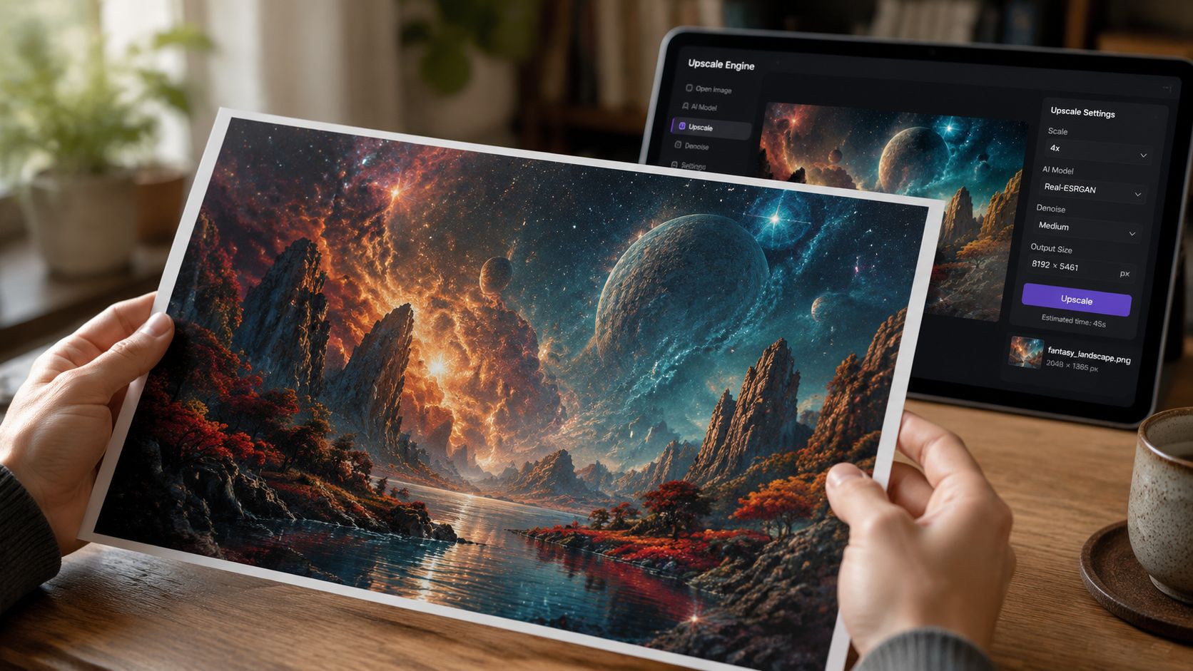
AI upscaling increases the pixel dimensions of an image. It doesn't travel back in time and recover detail that was never captured, but it can make a file more practical for print by adding believable structure and smoother transitions.
A useful example comes from an Adobe Super Resolution workflow demonstration. It shows a 1080×720 image becoming 2160×1440 after one enhancement, and 4320×2880 after a second. That kind of change can move a file from “too small to print comfortably” into “viable for a small print.”
That's real progress. It's also not magic.
Upscaling helps most when:
It helps less when the source file already has obvious problems. AI can smooth edges and invent texture, but it can also create waxy surfaces, odd halos, repeated patterns, or fake-looking details.
If you want a tool built for this workflow, starryai's AI image upscaler is one option for increasing resolution before print prep.
The smartest habit is a reality check at 100% zoom. Open the image so one image pixel maps closely to one screen pixel. Then inspect the areas viewers care about most.
Look at:
Upscaling can make a file print-ready in a practical sense. It can't guarantee authentic detail.
A short walkthrough can help if you want to see the process in action:
For AI art, I'd also suggest making peace with selective compromise. Maybe the image is perfect as an 8×10 but risky as a much larger close-viewed print. That isn't failure. It's good judgment.
Some images want to be intimate prints. Others can carry a wall beautifully. Your job is to match the file to the format instead of forcing every file to do every job.
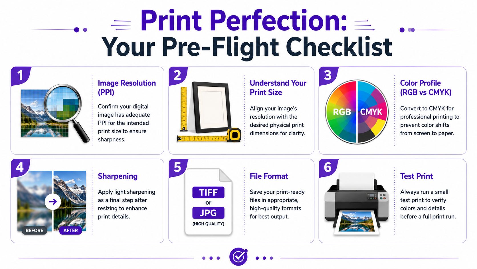
Resolution solves only part of the puzzle. The way you save the file affects how safely that detail reaches the printer.
For most creators, these are the main formats worth knowing:
If your print shop doesn't specify otherwise, a high-quality JPEG is often enough. If you're sending a portfolio piece, fine art reproduction, or something you may edit again later, TIFF gives you more breathing room.
Color space scares people more than it should.
You'll usually encounter RGB and CMYK. Screens use RGB. Traditional print workflows often refer to CMYK. Many modern online printers accept RGB files and handle conversion on their side, so you don't need to reflexively convert everything yourself.
A calm approach works best:
A few export habits matter more than overthinking color jargon:
| Setting | Sensible choice |
|---|---|
| Final dimensions | Match the intended print size and crop |
| Compression | Keep JPEG quality high |
| Sharpening | Apply lightly, after resizing |
| Transparency | Flatten unless the printer needs it |
| File naming | Use a clear version name so you don't upload the wrong file |
The cleanest workflow is usually the safest one. Export one final print-ready file, label it clearly, and avoid last-minute resaving.
If your art includes transparency, layered effects, or text, save an editable master too. That way you can adjust without rebuilding the whole piece from scratch.
The easiest way to avoid a disappointing print is to pause before uploading and run a short check. Much like inspecting a canvas before applying varnish, tiny issues are easy to fix now and annoying later.
For creators who want to clean up a file before that final check, starryai's photo enhancer is another option in the prep stage.
The goal isn't perfectionism. It's confidence. Once you know how to read your file, image resolution for printing stops being mysterious and starts feeling like any other creative choice. You're matching the artwork to the object you want to make.
If you create digital art, portraits, or stylized visuals and want to prep them for print, starryai offers tools for generating, enhancing, and upscaling images as part of a practical creative workflow.