
Written by Mo Kahn on
July 1, 2026


You type a prompt, wait a few seconds, and get back something almost right. The pose is off. The colors feel generic. The copy sounds like it came from a template. You tweak a few words, run it again, and somehow the result gets worse.
That usually isn't a model problem. It's a briefing problem.
Most creators were taught the wrong lesson about prompting. “Be specific” is true, but it's incomplete. Specificity only helps when you know which details control the result. For visual work, that means learning how to describe intent like a creative brief, not like a casual search query. Once you do that, AI stops feeling random and starts feeling directed.
You open an image tool, type “make a cool product ad,” and get back something polished, generic, and useless for the campaign you need. The problem usually starts before the model generates a single pixel. The brief is too loose for the result you want.
Bad outputs usually come from vague instructions, conflicting directions, or missing constraints. AI will fill empty space fast, and it usually fills it with safe, average choices. For visual work, that means default lighting, generic composition, muddled styling, and a subject that feels close to your idea without ever really landing it.
Prompt quality matters more than prompt cleverness.
In practice, creators run into this gap when they move from general AI advice to visual prompting. “Be specific” sounds helpful until you need to describe a beauty campaign, a moody editorial portrait, or a scroll-stopping social post for starryai. Specificity for image generation means naming the visual decisions a human art director would care about, such as framing, lens feel, color palette, texture, styling, background treatment, and what should stay out of frame.
Here's what breaks prompts in real projects:
A strong prompt gives the model a lane.
The shift that helps is simple. Treat prompting like creative direction. Clear prompts read like tight briefs. They tell the model what to make, what visual language to follow, what constraints to respect, and what success looks like. That applies to text, but it matters even more for images, where a single vague adjective can change styling, lighting, and composition all at once.
If you can brief a photographer, designer, or illustrator, you can learn to brief AI well. The difference is precision. Human collaborators can infer intent from context. AI needs the context written down.
The most reliable prompt framework is simple: persona, task, context, and format.
Major guidance from Atlassian and Microsoft converges on that structure in Atlassian's guide to writing AI prompts. That matters because it turns prompting from guesswork into a repeatable communication method.
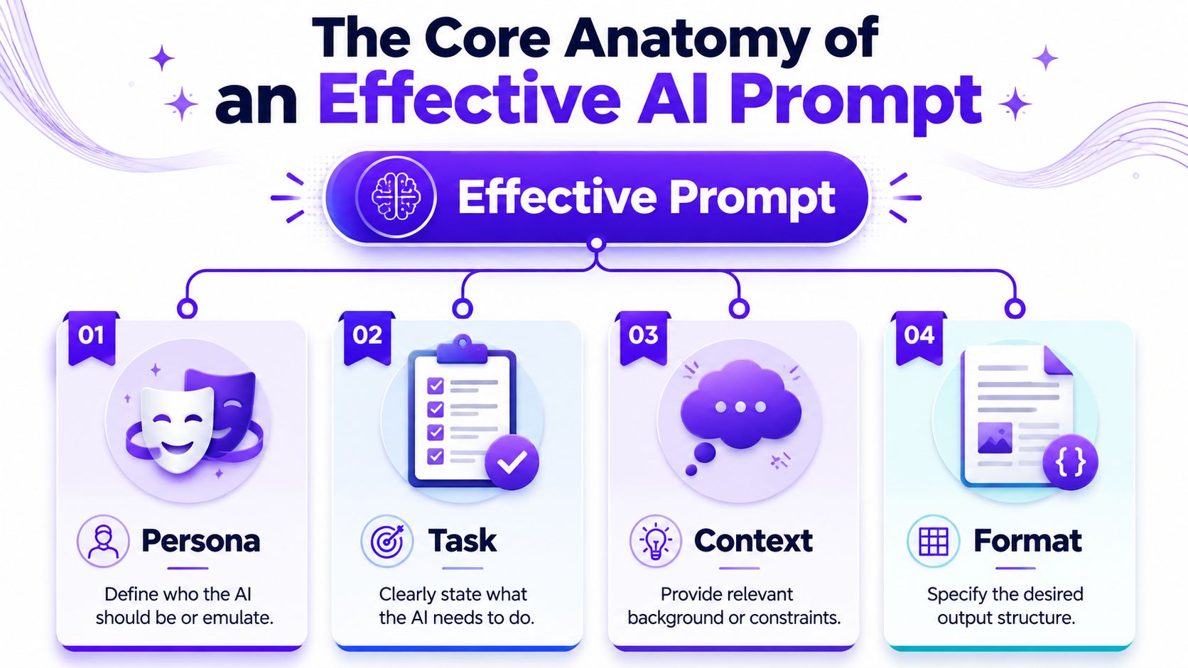
Persona tells the model who to act like.
For text, that might be “Act as a senior brand copywriter for a skincare company.” For visuals, think in creative roles: art director, fashion photographer, editorial illustrator, packaging designer. This doesn't magically make the output brilliant, but it nudges the model toward the right decision-making style.
A weak prompt says:
Make an ad for my candle.
A stronger prompt starts like this:
Act as a luxury lifestyle art director.
That one change helps because “luxury lifestyle art director” implies restraint, polish, and composition choices.
Task is the actual job.
Often, people get lazy with their prompts. “Help me with Instagram” isn't a task. “Write three short Instagram captions for a product launch” is. “Generate a portrait” isn't enough either. “Create a square editorial-style portrait concept for a beauty campaign” is much more usable.
The task should be specific enough that success is obvious.
Context carries the meaning the model can't guess.
This includes audience, brand tone, product details, style references, platform, purpose, and constraints. If you're creating merch, context might include print-readability and clean edges. If you're making avatar art, context might include genre, character age, wardrobe, and mood.
Here's the difference:
| Version | Prompt |
|---|---|
| Generic | Create a social media image for a coffee brand |
| Directed | Create a vertical social media image for a small-batch coffee brand targeting design-conscious young adults. Show a matte bag on a clean counter, soft morning light, muted earth tones, calm premium mood |
The second prompt gives the model something to aim at.
Format decides how the result should be delivered.
For writing, this could mean bullets, captions, headline options, or a structured outline. For image prompting, format also includes orientation, aspect ratio, composition priority, and whether you want a clean product shot, poster, thumbnail, or full scene.
Practical rule: If you don't specify format, the model chooses one for you. That's where a lot of “technically fine but wrong for the job” outputs come from.
A creator-friendly full prompt might look like this:
That same structure works for images too. Once you start building prompts this way, you stop hoping for a good result and start steering one.
Start with a basic template, then tighten it until the result has nowhere to hide.
A beginner prompt often works as a sketch. An advanced prompt works as a brief. The difference is control.

Use this when you need speed:
Create a [type of image or text] for [audience] about [subject] in a [tone/style] with [key details] and [output format].
Examples:
This is enough to get moving. It's rarely enough to finish.
Constraints stop the model from wandering.
A lot of creators think more words automatically means better prompts. Not true. Better prompts often come from narrower choices. If you want cleaner outputs, tell the model what it must stay inside.
Try constraints like these:
Prompt before:
Create a t-shirt design with a snake and flowers.
Prompt after:
Create a print-friendly t-shirt design featuring one coiled snake and a limited floral border. Use only black and cream. High contrast. Clean silhouette. No background scene.
The second prompt gives you something usable for merch, not just something interesting.
Significant quality gains often emerge at this point, especially for visuals.
Georgetown guidance emphasizes concise, logical prompts with explicit constraints and exclusions to reduce ambiguity and get cleaner visual outputs, as noted in this Georgetown-focused prompt guidance video. In plain terms, saying what you don't want is often as important as saying what you do want.
Examples of useful exclusions:
If you're writing social copy and want more voice control, studying resources on AI writing styles for X can help you think in terms of exclusions too. “No corporate tone,” “no filler,” and “no hype phrases” are prompt instructions, not just editing notes.
Cisco recommends decomposing complex requests into step-by-step instructions, and notes that few-shot prompting can improve coherence and accuracy in Cisco's article on advanced prompt engineering techniques.
That matters because many bad prompts try to do everything in one shot.
Instead of this:
Create a fantasy book cover with title space, character design, worldbuilding, mood, and back-cover blurb.
Do this:
If you know what “good” looks like but can't describe it well, give an example.
For text, that means providing a sample caption or paragraph and saying, “Match this rhythm and density, but don't copy phrasing.” For visuals, it can mean describing the pattern you want across outputs: sparse background, strong central subject, premium color palette, editorial crop.
For more image-specific examples and prompt ideas, starryai has a helpful guide on AI art prompts for different creative uses.
Visual prompting gets easier when you stop describing objects and start directing images.
A prompt like “woman in red dress in city” names ingredients. It doesn't direct composition, mood, lens feel, or use case. A stronger image prompt behaves more like a shot list.
When I'm shaping an image prompt, I stack details in this order:
That sequence works because it starts with the main thing and narrows toward finish quality.
Here's a rough idea:
A witch in a forest
Here's the same idea built into a visual brief:
Young forest witch standing slightly off-center in a misty pine clearing, three-quarter view, cloak moving in the wind, cinematic backlighting, muted green and charcoal palette, painterly fantasy illustration, detailed embroidery, subtle glowing runes, clean focal point, no extra characters, no text, no distorted hands
That version gives the model priorities.
Creators often know what they like when they see it, but they don't yet have the words for it. These are the words that tend to matter:
| Element | Useful prompt language |
|---|---|
| Composition | centered portrait, wide shot, close-up, negative space, rule of thirds, dynamic angle |
| Lighting | golden hour, soft studio light, cinematic backlight, rim light, moody shadows |
| Style | editorial, vaporwave, art deco, surrealist, minimal luxury, anime-inspired |
| Medium | digital painting, 35mm film photo, ink illustration, vector poster, collage |
| Finish | high contrast, matte texture, glossy surface, grain, soft focus, crisp edges |
A lot of visual creators jump straight to style words. Style helps, but it doesn't rescue a weak composition. If the framing is unclear, “cinematic” won't fix it.
Say you're creating character art for an indie novel.
Start broad:
A haunted queen
Add the story logic:
A haunted queen in a decaying palace, late thirties, silver crown, black velvet gown
Add visual direction:
Full-body portrait, central composition, cold moonlight through tall windows, solemn expression, dark gothic fantasy style
Then add quality control:
Fine fabric detail, pale skin, sharp silhouette, no extra limbs, no background crowd, no text
That process turns a concept into a usable prompt. If you're new to the workflow, the starryai team also walks through the basics in this quick-start guide to using the AI art generating app.
A quick walkthrough helps when you want to see the flow in action:
Now switch to a commercial use case. You need a vertical image for a beauty brand post.
Weak prompt:
Skincare product with pretty background
Directed prompt:
Vertical beauty campaign image featuring one frosted serum bottle on beige stone pedestal, soft morning light, creamy neutral palette, subtle botanical shadows, premium editorial photography style, clean negative space in upper half for headline, no extra products, no text, no messy reflections
That's the difference between “nice image” and “ready-to-design asset.”
Good visual prompts reduce ambiguity. They don't just add adjectives. They define priorities, remove distractions, and make the output easier to use.
Your first prompt doesn't need to be perfect. It needs to reveal what's missing.
That matters because users often need help turning vague intent into a workable brief. Nielsen Norman Group found that better results often come through interactive refinement, where the user adjusts the request based on the output and even asks the AI for more specific follow-up directions in NN/g's research on AI prompt structure.
The prompt probably names a topic, but not a point of view.
Try this instead:
Vague prompt:
Make a cool fantasy image
Better prompt:
Create a square fantasy avatar for a tabletop RPG player, close-up portrait, battle-worn elf ranger, earthy palette, moody side lighting, sharp facial detail, dark background
This usually happens when the prompt is overloaded or when the important instruction is buried.
Move the critical instruction earlier. Remove decorative filler. Split the request if needed.
For example, instead of:
Create a dreamy fashion portrait with lots of flowers, a soft magical atmosphere, a luxury mood, and also make sure the jacket is the hero product
Use:
Create a fashion portrait where the embroidered jacket is the clear hero product. Half-body composition, soft floral setting, dreamy luxury mood
The model now knows what matters most.
Generic outputs often come from generic style language.
Swap broad adjectives for art-direction terms:
Ask the model to propose three sharper directions before generating the final output. That often exposes better visual territory than forcing one weak prompt harder.
Reduce complexity and add exclusions.
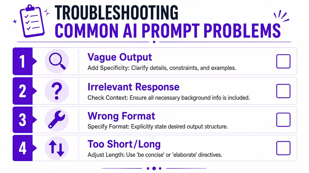
A lot of creators respond to bad outputs by piling on more detail. Sometimes that helps. Often it just adds noise. If the image is cluttered, simplify the scene and tell the model what to leave out.
Try these fixes:
| Problem | Better instruction |
|---|---|
| Too much happening | one subject only, simple background |
| Weird anatomy | hands out of frame, symmetrical face, no extra limbs |
| Busy commercial image | clean layout, centered product, no clutter |
| Muddy style | limited palette, high contrast, crisp edges |
If you want a workflow built around repeated refinement, this guide on using iteration images to improve your art is worth reviewing.
Don't guess. Ask the model to help build the brief.
Use prompts like:
That's one of the most practical ways to learn how to write AI prompts better. You stop treating prompting as a final exam and start using it as a collaborative draft process.
You can see the gap in one scroll. One creator types “make it look cool” and gets a generic image. Another gets a result that already feels art-directed because the prompt defines subject, framing, lighting, style reference, and what to avoid.
Prompting has become part of creative literacy.
The creators who get the best results are the ones who can think clearly about audience, format, composition, exclusions, and finish. They turn a loose idea into a usable brief, then tighten it until the output matches the intent. That skill carries across copy, images, motion concepts, social assets, merch, and brand systems.
For visual work, this matters even more than it does in plain text. “Be specific” is decent beginner advice, but creators need a sharper visual vocabulary than that. The useful shift is learning to describe what the camera sees, what the layout prioritizes, how the light behaves, what texture belongs in frame, and which details would ruin the piece. That is the difference between a prompt that describes an idea and a prompt that directs an image.
There is a career angle here too. Teams already value people who can move from concept to clear instruction fast, then judge the output with taste. Prompting sits somewhere between direction, editing, and visual decision-making.
The learning curve is friendly. Better prompts usually come from iteration, not from hunting for one magic sentence. In practice, the win comes from making stronger creative choices each round.
If you want a practical place to test that workflow, starryai lets you turn prompt ideas into visual outputs for selfies, social content, character art, and design concepts so you can iterate fast and learn which wording changes the result.