

Written by Mo Kahn on
August 14, 2026


You've got a photo that deserves more than another dead-looking filter. Maybe it's a portrait you want on a book cover, a wedding shot you're trying to turn into a gift, or a scene that would look better with paint texture than flat pixels. The hard part isn't making it look painterly on your phone, it's making sure the result still works when someone prints it, hangs it, or sells it.
That gap matters because photo-to-painting isn't a new trick. Its roots go back to the 1830s to 1850s, with photography introduced publicly in 1839, then gaining institutional visibility at the Great Exhibition of 1851 and the first dedicated photographic exhibition in 1852. Tate also notes that by the 1860s photographers were preparing enlargements that staff artists painted over in oils, which is why the core workflow we use now, a photo as the base layer for a painted transformation, already has more than 150 years of history behind it (Tate on painting and photography).
The first time you want to turn photographs into paintings is usually not because you need another app effect. It's because a good image already has mood, and paint gives that mood a different register. A portrait can feel more intimate with visible brushwork. A street scene can feel more like memory than documentation. That's why Etsy sellers, indie authors, social media managers, and gift buyers keep returning to this look even when they have endless filter options.
Standard photo editing tries to correct, sharpen, or polish. Painterly transformation changes the language of the image. It softens literal detail and pushes shape, color, and atmosphere to the front. That shift matters for covers, announcements, campaign art, and keepsakes, because the result feels authored rather than processed.
Practical rule: if the image only needs brightness or cropping, don't force a painting effect onto it. Use paint when you want interpretation, not repair.
The tradition also gives this workflow real credibility. Tate's history of Photorealism in the late 1960s shows that artists deliberately pursued photographic detail in paint, while the Smithsonian notes that by the 1870s photographers were already used to supplement direct observation and that artists such as Degas, Matisse, and Picasso used photographs to reshape composition and perspective in major works from the early 20th century (Tate on painting and photography). That arc matters because it proves the method isn't a digital novelty.
For practical creators, a useful resource like Wedding Studio can help frame how a transformed image might live in an actual client-facing product, especially when the goal is presentation rather than experimentation.
A lazy filter gives you a stylized snapshot. A thoughtful transformation gives you something closer to an illustration with intent, which is why it still works for viral posts, chapter art, product mockups, and wall pieces.
The final painting lives or dies on the source photo. If the original is weak, the transformation usually exaggerates the weakness instead of hiding it. That's why the most reliable workflow starts with sharp focus, correct exposure, and a clear sense of shadow structure, not with the effect itself. Artists and illustrators are blunt about this for a reason, a bad base image can't be rescued by style alone (Artists & Illustrators).
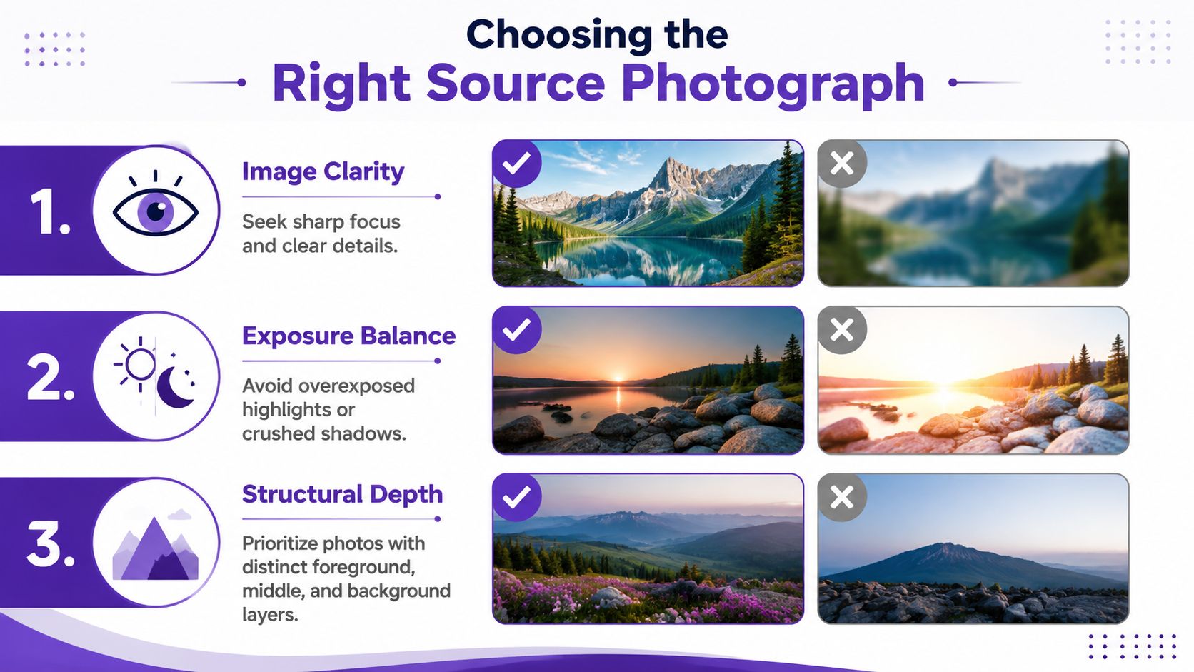
A strong painting base usually has clear foreground, middle ground, and background separation. That structure helps the image hold together after stylization because the AI or software can read depth instead of flattening everything into mush. It also gives you better cropping options when you want the composition to feel intentional rather than accidental.
Busy backgrounds cause trouble fast. Hair against clutter, trees behind a face, and street scenes packed with signage can all confuse edge treatment. Harsh lighting can do the same thing by blowing out highlights or crushing shadows into areas that need readable form. If the image already has muddy detail, the painted version often turns that mud into texture instead of clarity.
Portraits tend to work well for oil painting effects because faces, clothing folds, and skin tones benefit from brushstroke translation. Scenes featuring natural scenery are strong candidates for watercolor treatments when the horizon, sky, and land layers are easy to separate. Urban scenes can be excellent for impressionist looks if they contain repeating shapes, reflections, and directional lines.
Cropping matters more than people think. Use the photo as a reference, then simplify it before you start. A tighter crop around the focal subject usually beats trying to paint the whole scene. That's why composition tools like the rule of thirds explained can be useful when you're deciding what to keep and what to cut.
The best source image is rarely the most complicated one. It's the one that survives simplification without losing the story.
A phone screen can make almost any painted conversion look finished. Prints, merch, and client deliverables expose the weak spots fast. That is where the choice between an AI generator and traditional software stops being a style preference and becomes a production decision.
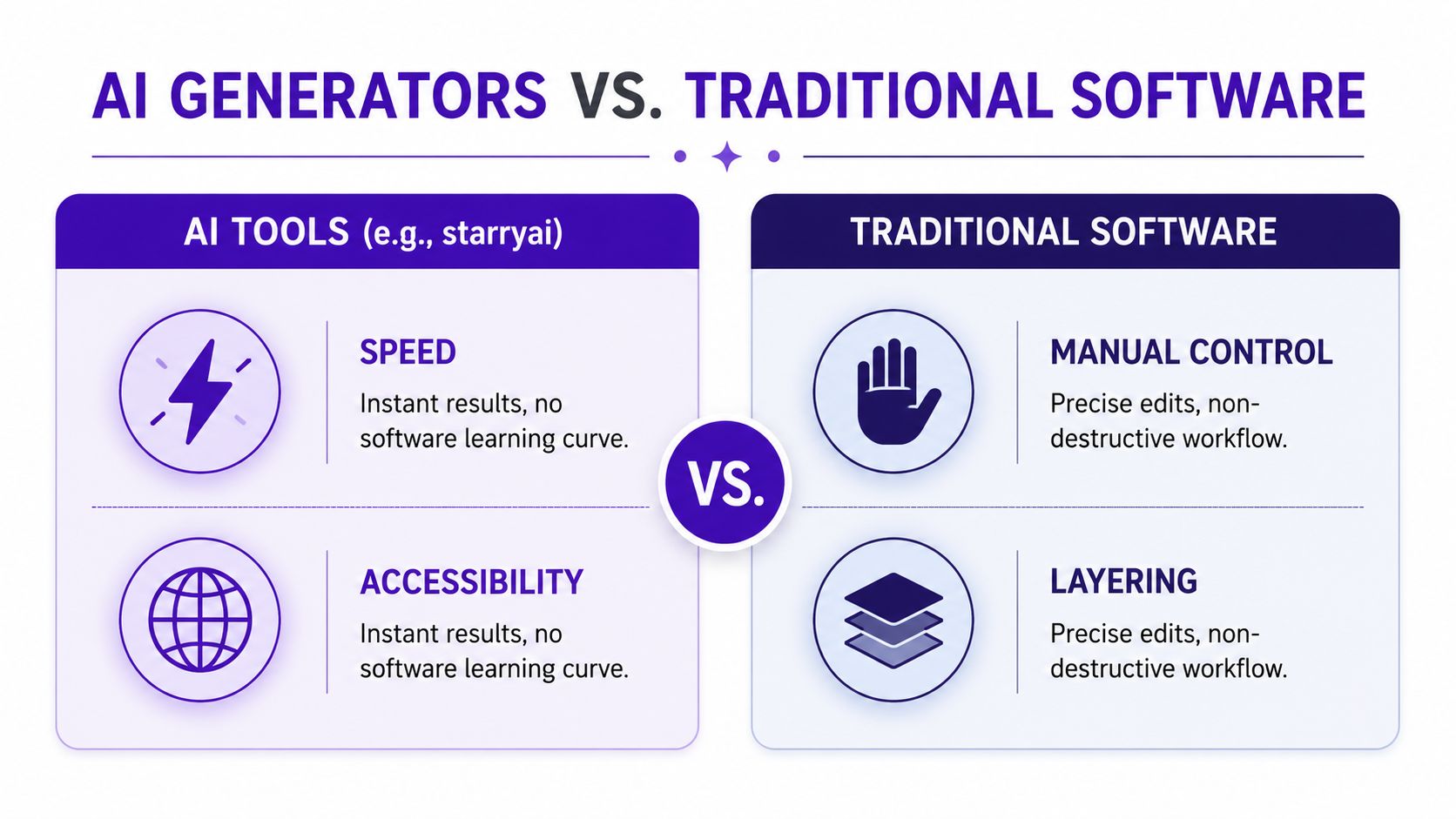
AI generators are strongest when you need speed and range. Upload a photo, test a direction, and move through several looks without building masks, adjustment stacks, or a full retouching workflow. That makes them useful for social posts, thumbnail concepts, character studies, mood boards, and early cover-art exploration.
starryai fits that use case. It offers a photo-to-painting workflow where you upload a photo, choose a direction or style, generate the result, preview it, and export it. It also includes an AI Oil Painting Generator, plus style filters and an Edit tool that lets you describe the style in text before generating a new image.
Traditional software wins when the image has to hold up under closer inspection. Adobe's documented photo-to-painting process uses a non-destructive layer stack. You duplicate the background, apply an artistic filter such as Watercolor or Oil Paint, tune parameters like Brush Detail, Shadow Intensity, Stylization, Cleanliness, Scale, Bristle Detail, and Lighting, then optionally add a Find Edges layer set to Multiply (Adobe Photoshop photo-to-painting). That approach takes longer, but it gives exact control over how each part of the image behaves.
The practical split is straightforward. Use AI when you want variation. Use Photoshop when you want governance. If the final image needs to survive a gallery print, a book jacket, or a product run, control matters more than convenience.
The trade-off shows up fast. AI can produce attractive texture, but it can also invent soft mush, strange hands, uneven facial detail, or paint-like noise that reads well on a phone and poorly on paper. Traditional tools demand more patience and technical skill, but they make it easier to keep edges, contrast, and texture consistent when the file has to live beyond a feed.
For production-minded creators, the same logic applies in other visual fields too, including print specs like a bass drum artwork specs guide, where the physical output matters as much as the image itself.
A lot of artists test both approaches for a reason. AI gets you to something interesting quickly. Traditional software gets you to something usable more reliably. That gap is what separates a fun transformation from a file you can send to a printer with confidence.
Good prompting is less about poetic language and more about steering. The AI needs three things from you, the style, the subject, and the mood. If any of those are vague, the result usually drifts toward generic painterly noise instead of a look you can reuse.
A prompt like “oil painting portrait, Rembrandt lighting, rich warm tones, visible brushstrokes” gives the model a concrete target. It names the medium, the lighting pattern, the palette, and the surface texture. A prompt like “watercolor scene, soft edges, pastel palette, loose brushwork” does the same thing for a gentler, airier result.
You can push toward impressionism with words like broken color, soft focus, light movement, and visible strokes. For a more abstract expressionist feel, use energetic gesture, dripping paint, high contrast, and expressive mark-making. Keep the description aligned with the source image, though. A portrait prompt that asks for both hyperreal skin detail and dissolved watercolor softness often confuses the generator.
Useful habit: write the prompt as a style brief, not a paragraph. Short, specific phrases usually outperform a crowded sentence full of contradictions.
In starryai, the practical advantage is that you can test style directions quickly, then refine what works. Aspect ratio should match the end use whenever possible, because a square crop meant for social media won't always work for a book cover or poster. If the interface gives you style strength or variation controls, start moderate, then move up or down based on how much of the photo you want preserved.
The biggest mistake is overloading the prompt. Too many adjectives, too many artist references, and too many style directions compete with each other. You get a result that has fragments of everything and a clear identity in nothing. If the image needs stronger realism, reduce stylistic pressure. If it feels too photographic, add more texture, medium language, and mood.
The AI prompt optimization guide is worth studying if you want a more disciplined prompting habit, because the same logic applies whether you're transforming selfies, outdoor scenery, or product shots.
What works best in practice is a loop. Generate, compare, adjust one variable, generate again. That's slower than hoping for a perfect first pass, but it produces images that feel chosen rather than accidental.
A transformation that looks strong on a phone screen can fall apart in print. Synthetic texture can smear when enlarged. Flat shadows can band. Color can shift from rich and painterly to muddy and dull. That's why the print question matters before you commit to canvases, posters, merch, or covers.
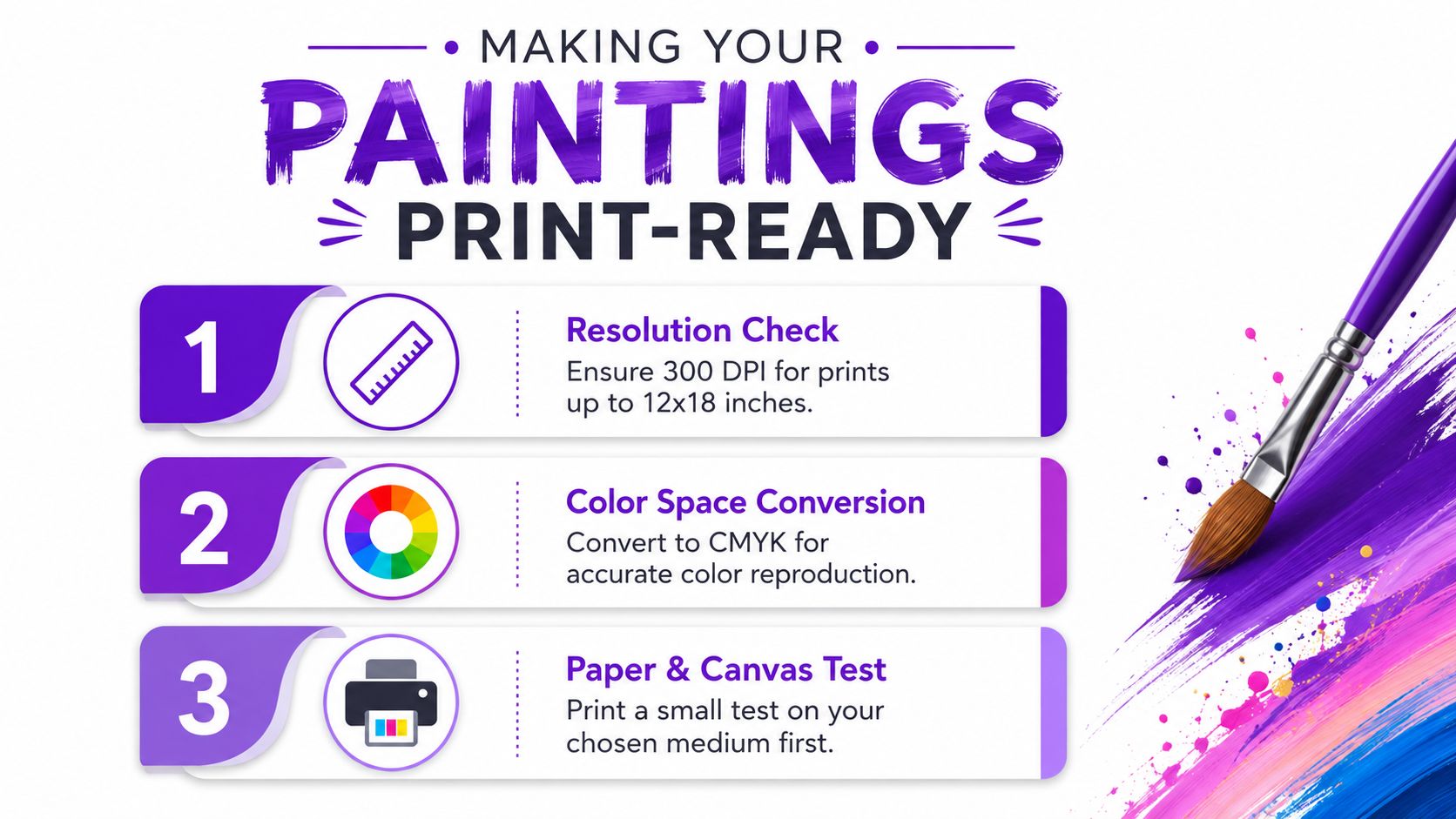
For print work, start by asking whether the image has enough detail for the intended size. If the file is too soft, no paint effect can create real information that isn't there. The file has to be judged after generation, not before, because the result that looks convincing in a preview can still break down once it is enlarged and inspected closely.
Color management matters too. Screen color and print color are not the same thing, and a painting effect can widen that gap because it often leans on saturation, shadow tone, and contrast. If you are prepping for merchandise or a cover, check whether the background needs cleanup, whether the edges are clean, and whether the file exports in the format your printer wants. For a more practical breakdown of sizing, resolution, and print preparation, see image resolution for printing.
An Etsy print needs different treatment than a t-shirt design. A poster can tolerate more texture if the composition is strong. A book cover needs legibility and controlled color. Gallery pieces demand the most restraint because viewers get close enough to notice artifacts that never show up on social apps.
Use upscaling carefully. If the result is strong but too small, upscale and inspect it at full size before printing. If the image is full of smeared details or broken anatomy, it is often faster to regenerate from a cleaner prompt or a better source photo than to rescue it in post. File format matters here too. Flattened exports, clean edges, and consistent color handling usually hold up better than files that are pushed through too many edits after the effect is applied.
The practical issue is that most tutorials stop at making the image look good. They rarely cover whether the image will hold up on a physical surface. That omission is why many creators end up disappointed when a piece that looked polished on a screen turns soft, noisy, or overworked on paper or fabric. The broader problem shows up in many desktop painting tools, including FotoSketcher, where the emphasis stays on the painterly look rather than on output standards for real-world products.
A small test print saves money and frustration. Check how skin tones, line work, and fine texture behave on the actual paper or canvas you plan to use. If the piece is for commercial use, test the final medium, not just a desk printer preview.
That one step catches more mistakes than any amount of staring at a monitor.
The most reliable workflow is simple enough to repeat and disciplined enough to improve over time. Start with image selection, then decide whether AI or traditional software fits the goal, then generate or paint, then review the image at the size it will be used. That sequence keeps the creative part connected to the production part instead of treating them as separate jobs.
For social media managers, batch processing makes sense when the style stays consistent across a campaign. For client work, version control matters more, because the first acceptable result is rarely the final one. For portfolio builders, save your prompt combinations, source-photo notes, and export settings so you can repeat the look later without rebuilding it from memory.
Consistency comes from restraint. Reuse a small number of style phrases, a familiar crop approach, and a stable editing path. If you change every variable at once, you won't know what improved the image. If you change only one thing at a time, your personal style library gets stronger with every project.
Quick social content can live with a looser process. Premium prints and commercial products can't. That's why the best creators learn to separate “interesting enough for a feed” from “clean enough for production.” Once you can make that distinction quickly, you waste less time polishing files that were never going to work.
The bigger lesson is that photo-to-painting is a creative method, not just a visual effect. The strongest results come from understanding the source image, the tool, and the end use together.
If you want a faster way to explore painterly looks without starting from scratch every time, try starryai and test a few source photos against the styles you plan to use. It's a practical place to move from idea to draft, especially when you care about how the image will look beyond the screen.


.svg)