
Written by Mo Kahn on
July 1, 2026


You've probably done some version of this already. You have a cool idea for a character, maybe for a book, a tabletop campaign, a TikTok persona, or a merch concept. You open your sketch app or image generator, type a few traits, get something flashy back, and then realize the design still feels generic.
That usually happens because the design started with surface details instead of identity. Good character design doesn't begin with hair, armor, or color effects. It begins with intent, then turns that intent into shape, costume, expression, and repeatable visual cues that work across sketches, posts, covers, and AI outputs.
If you're learning how to make a good character design, the fastest route isn't chasing complexity. It's building a character that reads clearly, holds together from multiple angles, and stays recognizable whether it appears as a full-body illustration, a profile image, or a prompt-driven variation.
The strongest character designs are built before the first sketch. That's not theory. A solid design process starts by defining personality, flaw, redeeming trait, and motivation, and CG Spectrum notes that skipping this often leads to static, unengaging work seen in up to 40% of early portfolio submissions by amateur artists.
A character without internal tension usually turns into a costume test. The clothes may be polished, but the body language won't say anything. You can spot this fast in stiff poses, neutral expressions, and props that feel pasted on.
Before drawing, answer these in plain language:
Those answers affect everything later. A guarded medic and a showy bounty hunter shouldn't stand the same way, wear gear the same way, or look at the viewer with the same energy.
Practical rule: If you can swap your character's outfit with someone else's and nothing important changes, the design isn't built on character yet.
Don't jump from words straight into rendering. Translate the personality into physical choices.
| Internal trait | Visual consequence |
|---|---|
| Controlled and disciplined | Clean posture, restrained gestures, organized costume |
| Overconfident | Open chest, chin raised, bold accessories |
| Secretive | Covered neck, hidden hands, layered silhouette |
| Compassionate but exhausted | Soft eyes, sloped shoulders, practical wear |
Many writers and visual creators often find their work overlapping. If you're designing for fiction, a strong companion resource is this guide for authors on character writing. It helps sharpen motive and contradiction, which are exactly the things artists need before deciding on pose and costume.
Use one sentence that combines role, tension, and motive. For example:
That single sentence gives you a filter. When you test hairstyles, props, or outfit details, you can ask whether they support the brief. If they don't, cut them.
Good design gets easier when the character starts feeling like a person instead of a collage.
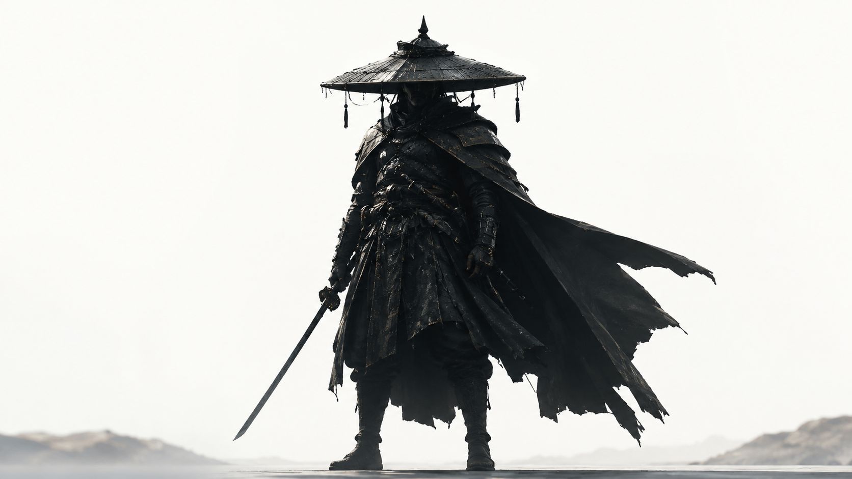
A character should work in shadow before it works in color. Motionographer states that a memorable character must be recognizable solely from its silhouette, with gesture, line of action, and emotion visible without overlapping limbs or body parts that muddy the shape.
That's the fastest readability test I know. Fill the figure with black. Shrink it down. If you can't tell who they are or what they're about, the design is still unresolved.
Basic shape language still works because people read form emotionally before they analyze details.
Most good designs don't use only one. They pick a dominant shape language and let that lead. A gentle healer might be built from rounded shoulders, curved sleeves, and soft bags. A military commander may lean into blockier armor plates and a broad stance. A rogue or assassin often benefits from angular tapering forms.
Try this checklist instead of polishing too early:
A cluttered outline usually means the artist kept adding details instead of committing to a primary read.
| Weak silhouette | Strong silhouette |
|---|---|
| Symmetrical stance | Asymmetrical weight shift |
| Details inside the form | Readable outer contour |
| Similar widths from top to bottom | Clear variation in mass |
| Props hidden against body | Props extending into silhouette |
This matters beyond illustration. On social media, your character may appear as a tiny avatar. In games and merch, people often register the outline before any small facial detail. A good silhouette survives distance, cropping, and fast scrolling.
If you're serious about how to make a good character design, don't ask whether the costume looks cool first. Ask whether the character is identifiable from the edge inward.
Once the silhouette works, color can do its job. Not before. If the form is weak, color just decorates the confusion.
A professional shortcut here is the 60-30-10 rule. Rocky Mountain College of Art + Design explains that a dominant color should cover 60% of the character, a secondary color 30%, and an accent color 10% to create a focal point and keep the palette readable.
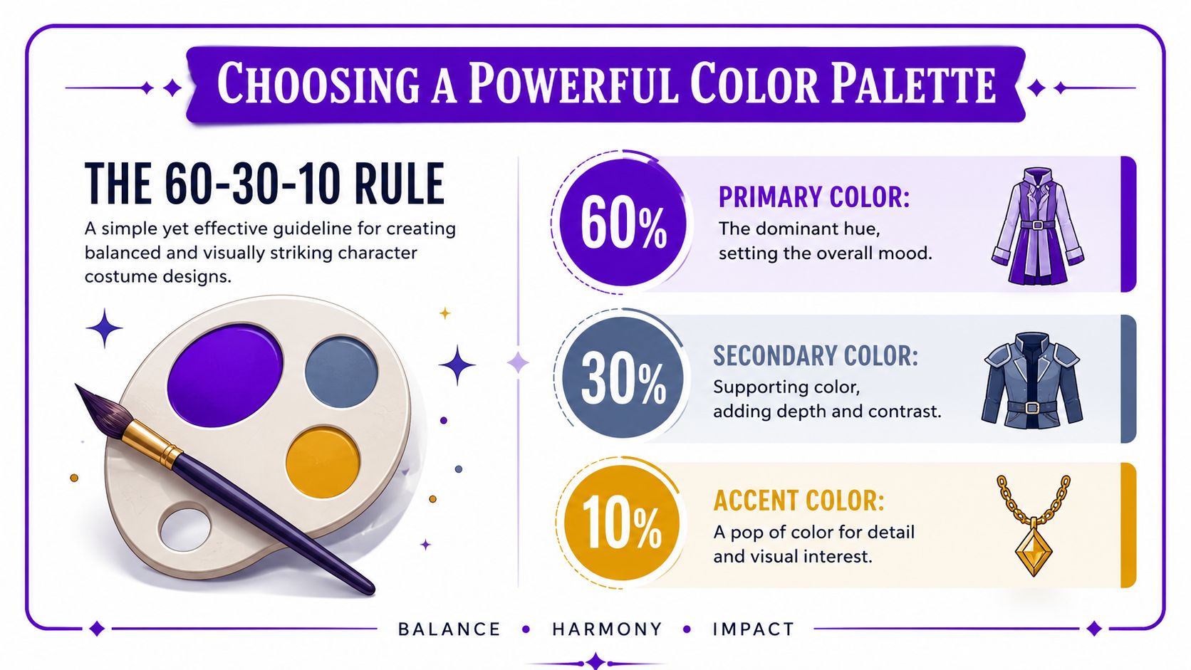
Think of the palette as a traffic system for the viewer's eye.
A shy archivist might wear muted blue-gray as the dominant tone, warm brown as the support, and a small gold accent on a brooch or lens. A brash arena fighter might flip that emotional logic entirely with a hot dominant tone, dark support, and a vivid accent around gloves or face paint.
A good costume answers questions without exposition.
Ask what the outfit says about:
| Costume choice | What it implies |
|---|---|
| Repaired seams and patched cloth | Limited money, long travel, practical survival |
| Crisp tailoring and clean metal | Status, discipline, institutional belonging |
| Layered charms and keepsakes | Sentimentality, superstition, memory |
| Heavy utility gear | Work-first personality, physical routine |
The mistake I see most often is stacking “cool” elements from different genres into one outfit. That usually breaks narrative clarity. If the character is a mechanic, scholar, ranger, idol, or knight, the costume should still function as that profession even when stylized.
For quick outfit exploration, tools like the AI outfit changer are useful for testing silhouette-friendly clothing directions before you commit to a final look. The key is to judge the output by role clarity, not novelty.
Use this simple filter before locking the costume:
Color test: If every part of the design competes equally, none of it becomes memorable.
Good color choices don't just make the character prettier. They make the design easier to read, easier to reuse, and easier to recognize in every format from a book cover thumbnail to a sticker pack.
Faces carry the emotional load. Even in a heavily costumed design, viewers search the face first for intent, attitude, and vulnerability. That's why generic symmetry falls flat.
21 Draw explains that exaggeration is a critical design mechanic. Specific parts should be emphasized to convey personality while other parts are simplified, because generic symmetry doesn't create distinct appeal.
Exaggeration doesn't mean turning every face into a caricature. It means choosing one or two features to push on purpose.
A few examples:
The trick is restraint. If you enlarge the eyes, sharpen the jaw, widen the grin, add dramatic brows, and pile on unusual accessories, the face loses hierarchy.
Perfect balance is rarely interesting. Small imbalances create life.
Try choices like these:
These aren't random quirks. They should connect to personality. A smug noble, a sleep-deprived inventor, and a battle-worn captain shouldn't all get the same “cool asymmetry.”
Keep one side of the face from mirroring the other too neatly. That's often where appeal starts.
Instead of designing eyes, nose, and mouth separately, design the relationship between them.
Consider these pairings:
| Feature relationship | Emotional effect |
|---|---|
| Heavy brows with a small mouth | Contained intensity |
| Large eyes with a low-set brow line | Innocence or concern |
| Sharp nose with broad grin | Mischief, confidence |
| Thin eyes with downturned mouth | Weariness, distrust |
A strong facial design also respects the character's broader visual logic. If the body is built on square forms and dense costume shapes, a tiny delicate face may feel disconnected unless that contrast is intentional.
For creators using AI-assisted workflows, this matters even more. Distinct facial cues help later prompt refinement because the design has actual anchors. “Stoic woman with armor” is vague. “Stoic woman with a broad brow, tired eyes, and one broken fang charm at the collar” is design.
A static pose can hide a weak character for a moment. A turnaround sheet exposes every unresolved decision. That's why it's such a useful tool.
This part trips up a lot of beginners. This discussion on turnaround consistency points out that 78% of beginner artists struggle with perspective consistency in character turnaround sheets, especially when tutorials skip the rotational logic needed for multi-angle assets.
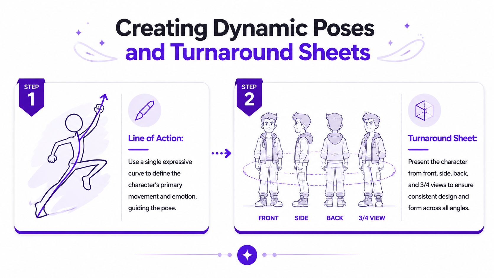
A character isn't just a front view. The way they carry weight tells you whether they're arrogant, cautious, disciplined, playful, or exhausted.
Start with a line of action. One strong curve or directional sweep is enough to unify the pose. Without it, many designs look like clothing hung on a figure rather than a body making a choice.
Compare the two approaches:
| Static pose habit | Dynamic pose choice |
|---|---|
| Equal weight on both feet | Weight clearly favors one side |
| Arms pressed close to body | Limbs create rhythm and spacing |
| Straight spine with neutral tilt | Torso and hips counter each other |
| Expression disconnected from pose | Face, hands, and stance support one mood |
A useful turnaround isn't fancy. It needs to make the character repeatable.
Include consistent versions of:
Horizontal guides are more helpful than commonly recognized. Keep eyes, shoulders, elbows, hips, knees, and major costume seams aligned unless the character's pose intentionally shifts them.
If you make comics, book art, game tokens, social content, or merch, consistency is business, not just craft. The same character may need a profile image, a dramatic key visual, a sticker, and a cropped cover asset. Without a turnaround, every version drifts.
For pose exploration, an AI pose generator can speed up ideation, especially when you're testing mood, balance, and camera angle. But the best results still come from knowing what must stay fixed: head shape, limb length, prop placement, and posture logic.
A turnaround sheet is where your character stops being a one-off image and starts becoming a reusable design system.
Classic character design principles still matter when you use AI. In fact, they matter more. If the source design is muddy, AI usually amplifies the confusion instead of solving it.
That's the gap many creators run into. A 2025 industry survey discussed in this video found that 63% of users of AI image generators fail to get consistent results because their source designs lack clear signifiers, and the fix is using three iconic signifiers tied to the character's archetype.
When people write prompts, they often over-rely on mood words. “Cool, epic, mysterious, cinematic” doesn't give the model much structure. Signifiers do.
For a character archetype, choose three visual anchors that repeatedly identify them. For example:
That doesn't mean stuffing the design with props. It means picking the few elements the viewer, and the model, can lock onto.
A better prompt structure looks like this:
Example:
“Reckless desert courier, wiry and alert, long scarf, cracked goggles, messenger satchel, forward-leaning posture, sun-faded utility layers, three-quarter portrait.”
That's clearer than a pile of aesthetic adjectives.
One of the most practical AI workflows is starting from something concrete. A selfie gives you bone structure, expression, and camera angle. A rough sketch gives you costume and proportion logic.
If you want a more detailed walkthrough, this article on how to design a character using AI is a solid companion for structuring the process from concept to finished image.
Use this sequence:
AI responds better to decisive visual hierarchy than to long descriptive paragraphs.
After your first generation, compare the result to your design intent. Did the signifiers land? Did the pose match the personality? Did the costume drift into a different genre? Tighten one thing at a time.
The fastest creators don't generate endlessly. They build constraints.
A useful review filter looks like this:
| Check | Question |
|---|---|
| Identity | Would I recognize this as the same character again? |
| Signifiers | Are the three core cues present and readable? |
| Silhouette | Does the outline still make sense at small size? |
| Face | Does the expression match the written personality? |
| Reuse | Could this design work for posts, covers, and merch? |
Here's a useful visual walkthrough of AI-assisted character creation in motion:
For indie authors, gamers, and social creators, this workflow is fast because it doesn't replace design thinking. It compresses the rendering and iteration stage. You still need the fundamentals. You just reach a polished, reusable character much sooner.
A finished character only becomes useful when it's prepared for the places people will see it. That means cropping, exporting, and presenting it based on context, not just saving the prettiest version.
For social media, prioritize the face and silhouette. Profile images need a strong head-and-shoulders crop, clear contrast, and one focal expression. If the design relies on tiny costume details, those will disappear in feed thumbnails.
For book covers, leave room for typography and keep the character readable at reduced size. A dramatic full-body pose can work, but many covers perform better when the character's face, gesture, or a single prop carries the emotional hook. Test the image small before committing.
The best final designs have a small asset family:
| Asset type | Best use |
|---|---|
| Clean portrait | Profile images, posters, promo posts |
| Full-body reference | Covers, commissions, character sheets |
| Transparent cutout | Merch mockups, thumbnails, overlays |
| Expression set | Social posts, storytelling, audience engagement |
If you plan to monetize or collaborate, it also helps to understand where creator-facing work gets distributed. This roundup of leading user content platforms is useful if your character art ties into brand content, creator packages, or platform-specific campaigns.
A good character design isn't finished when the image looks nice. It's finished when the design stays clear across formats, crops, and repeated use.
If you want to turn rough ideas, selfies, and prompts into polished character visuals quickly, try starryai. It's a practical way to explore concepts, refine looks, and create character art for social posts, books, avatars, and merch without getting stuck in a slow workflow.