

Written by Mo Kahn on
July 1, 2026


You've finished the songs. The masters are back. The tracklist is locked. Then you hit the part many artists underestimate: the cover.
That single square has to carry a lot. It needs to suggest the sound before anyone presses play, look convincing beside major releases, and still read as you when it appears on a phone screen for a split second. If it misses the mood, the music starts with the wrong introduction.
That pressure isn't new. Album art became a serious commercial tool in the shift from the 1930s into the 1940s, when labels stopped treating sleeves like generic packaging and started using them to drive sales and shape artist identity, as noted in Vinyl's history of album cover design. The formats changed. The job didn't.
A strong cover doesn't need a huge budget. It needs a clear concept, disciplined design choices, and technical delivery that won't get rejected by distributors. That's where most first-time album art projects either become sharp and memorable or collapse into a collage of half-good ideas.
A first album cover usually fails for one of two reasons. Either the artist treats it like an afterthought and grabs something “good enough,” or they try to cram every lyric, influence, symbol, and inside joke into one image. Both approaches weaken the work.
The better approach is simpler. Decide what the listener should feel at first glance. Not the full story. Not every theme. Just the dominant emotional signal.
If the record is intimate, the artwork should create focus and closeness. If it's chaotic, the cover can hold tension or friction. If it's polished pop, the visual language should feel intentional and controlled. The cover doesn't have to explain the music. It has to frame it.
A memorable album cover works like an opening chord. It establishes tone before language catches up.
Indie artists often assume they need expensive photography, a famous designer, or some impossibly original concept. You don't. You need choices that agree with each other. Image, type, color, texture, and spacing should all point in the same direction.
Streaming changed the way covers are seen, but not their importance. In many cases, the cover reaches listeners before the bio, before the press photos, and before the second chorus. It's your smallest billboard and your most repeated visual asset.
That makes album art a branding tool as much as a package. A good cover can shape the look of your singles, teaser posts, lyric videos, merch mockups, and release announcements. A weak cover forces you to redesign your identity every time you need a new asset.
Here's the trade-off most beginners face:
| Approach | What works | What fails |
|---|---|---|
| Literal storytelling | One strong symbol tied to the record | Scenes overloaded with unrelated references |
| Minimal design | Clear focal point and confidence | Empty layouts with no emotional charge |
| Bold typography | Distinct type that matches the genre | Decorative fonts nobody can read |
| Experimental imagery | Controlled strangeness with intent | Random effects used because they look “artsy” |
If you're learning how to design album covers, think less like a decorator and more like a translator. Your job is to convert sound into a visual promise.
Open a blank canvas too early and you usually get a cover built from disconnected preferences. A nice texture. A font you saved months ago. A photo treatment that worked for someone else. None of that gives the record a clear visual identity.
Start by listening for patterns.
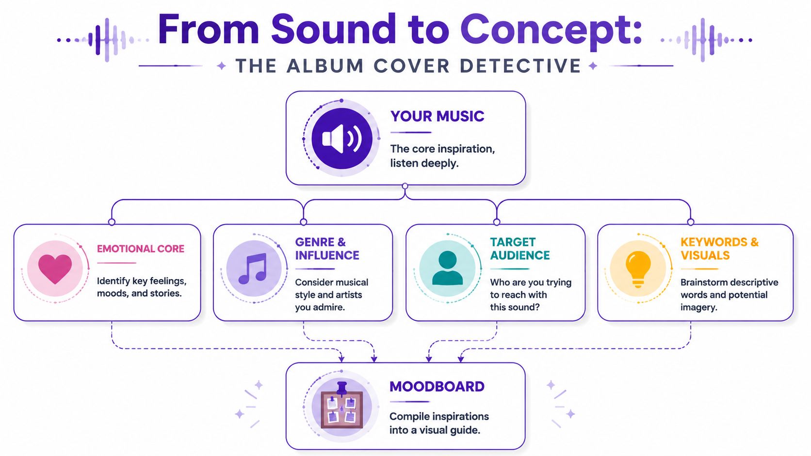
Play the record and write down reactions that describe feeling, surface, environment, and movement. Avoid music-review language. “Great production” or “strong lyrics” will not help you choose an image system. Words like damp, brittle, fluorescent, airless, devotional, or restless will.
Use prompts like these:
The first pass should stay loose. The second pass should cut hard.
If ten tracks all suggest isolation, blur, and artificial light, that cluster matters more than one lyric that mentions a rose garden. New artists often overvalue literal references because they feel safe. Covers usually get stronger when they translate the emotional center of the music instead of illustrating a line from verse two.
A few common directions:
A moodboard should reduce options, not multiply them. Every image on it needs a job. It should clarify tone, image style, color behavior, typography, or texture.
Use Pinterest, Milanote, Are.na, Figma, or a simple folder of screenshots. I usually split boards into lanes: imagery, type, color, materials, and references to avoid. That last category helps more than beginners expect. If the record is intimate and handmade, glossy fashion photography might belong in the reject column even if the image is beautiful.
One practical rule works every time: if two references suggest different emotional worlds, remove one. A good board has internal agreement.
It also helps to study artists who built a strong visual language over time. For a sharp example of concept and persona working together, see the art behind Kate Bush's covers. The lesson is not to copy the styling. The lesson is to notice how consistently the artwork supports the mythology of the music.
A useful moodboard usually includes:
That concept sentence becomes your filter. If a typeface, image, or color choice does not support it, cut it.
If you plan to use AI in the process, the moodboard becomes even more important. Tools like starryai can generate strong concept art fast, but the output only gets useful when you already know the mood, materials, framing, and visual references you want. A loose prompt gives you generic results. A tight board gives you direction. These album cover art tips from starryai are a solid reference for shaping that early visual brief before you generate concepts or move into layout.
A cover usually succeeds or fails in two seconds. The listener sees a tiny square on a phone, makes a snap judgment, and either taps or keeps scrolling. That is why composition, type, and color need to work as a system, not as separate style choices.
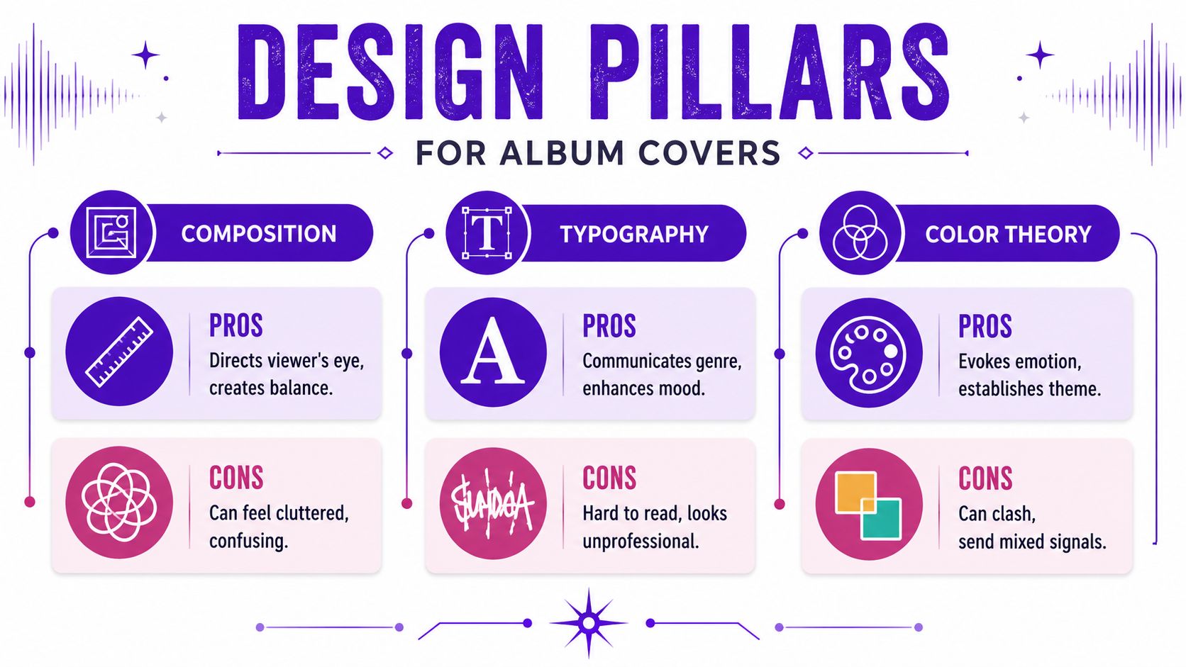
Composition controls the reading order. First focal point, then title, then supporting detail. If the eye wanders without landing, the cover feels amateur even when the individual parts are good.
Start by choosing one job for the image. A portrait can carry identity. An object can carry symbolism. An abstract frame can carry mood. Trying to make one square do all three usually creates clutter.
These composition approaches hold up well on album covers:
The common mistake is overfilling the canvas. New designers see open space and treat it like something to repair. In practice, empty space gives the focal point authority. It also gives typography room to breathe.
This is also where AI workflows need discipline. If you are bringing concept art from starryai's album cover art tips into a layout, do not force the entire generated image onto the cover just because it looks impressive at full size. Crop it. Push the subject higher or lower. Mask areas that compete with the title. AI can generate visual richness fast, but composition decides whether that richness reads clearly.
Shrink the cover early. Then judge the type.
A large majority of streaming plays happen on mobile, so your cover is often seen first as a small thumbnail, not a full-resolution artwork file. That changes what counts as good typography. Fine-line scripts, low-contrast text, and distressed display faces often collapse at small sizes.
Strong album typography usually follows a few practical rules:
| Better choice | Weaker choice |
|---|---|
| One display font with one quiet supporting font | Three fonts competing for attention |
| High contrast between type and background | Text sitting on top of busy detail |
| Consistent spacing and alignment | Title and artist name drifting independently |
| Type that matches genre and tone | Trendy fonts with no connection to the music |
The trade-off is simple. Decorative type adds personality, but readability pays the bills. If the artist name disappears on Spotify, the design has failed one of its main jobs.
For artists sketching layouts on a tablet, a Stylus Pen helps when testing title placement, kerning adjustments, or quick alternate lockups before you commit in Photoshop, Illustrator, or Canva.
Color usually lands before the viewer has even processed the image. It signals danger, intimacy, distance, grief, heat, gloss, or nostalgia in an instant. If the palette fights the music, the cover feels off even when the listener cannot explain why.
Keep the palette under control. One dominant color family, one supporting tone, and one accent is enough for many covers. That limit forces decisions. It also helps the artwork stay recognizable across streaming tiles, social posts, posters, and vinyl mockups.
A few reliable patterns:
Use color grading with intent. If your AI-generated concept has five competing hues, simplify it in your design software before final layout. A narrower palette usually looks more confident and reproduces more consistently across screens and print.
One final check helps. Convert the cover to grayscale for a moment. If the hierarchy still works, the composition is doing its job. If everything collapses into one value range, fix the contrast before polishing details.
The image is usually the emotional center of the cover. For many indie artists, that's also the hardest part. You may not have a photographer, an illustrator, or a budget for a custom shoot. That doesn't mean you're stuck with generic stock.
AI image generation is useful at this stage because it helps you explore visual territory quickly. It's most effective when you treat it as a concept and asset workflow, not a magic button.
A weak prompt lists objects. A better prompt builds atmosphere.
Instead of:
Try:
That structure works because it combines subject, mood, lighting, texture, and visual treatment.
A practical workflow in the starryai quick start guide shows how text prompts can become usable art concepts without requiring advanced editing skills.
Useful prompt ingredients by genre:
Ambient and electronic
Focus on atmosphere, scale, fog, glow, abstraction, and soft gradients.
Hip-hop and R&B
Think portrait strength, location detail, street lighting, texture, fashion cues, and controlled contrast.
Indie and folk
Use tactile terms like paper, dust, field, window light, faded color, analog, worn fabric.
Metal and hard rock
Push shape, shadow, harsh light, decay, stark environment, limited palette, symbolic objects.
Don't chase a final image on the first try. Generate variations in one visual lane, compare them against your moodboard, and choose the direction with the strongest emotional read. Then refine.
What to evaluate:
For artists who sketch ideas by hand before moving into AI or digital cleanup, even a simple tablet and Stylus Pen can help when testing compositions, drawing over generations, or mapping type placement before opening Photoshop or Canva.
Treat the first generations like thumbnail sketches. The point isn't perfection. The point is finding the right visual argument.
One caution matters here. AI imagery often produces attractive nonsense: extra fingers, unreadable signs, accidental symbols, or visual clutter that looks dramatic until you inspect it. Zoom in. Check edges. Simplify.
If you're learning how to design album covers with AI, the skill isn't generating more images. It's recognizing which one supports the music and which one is only technically impressive.
At this stage, the work becomes less romantic and more editorial. You have the image direction, a type idea, and a concept sentence. Now the job is to build a file that feels deliberate.
Canva works for straightforward layouts and quick experimentation. Adobe Photoshop gives you stronger image control. Affinity Designer is useful if you want a one-time purchase alternative with solid layout tools. The software matters less than the decisions inside it.
Start with the final square format from the beginning. Don't design in a random rectangle and crop later. Cropping late usually damages the composition because the important edges haven't been considered.
Your first build order should be simple:
Many covers improve by subtraction. If the image already carries identity and mood, the title may not need to dominate. If the project is from a new artist, text may need to work harder because the name recognition isn't doing that job yet.
Think in layers, not decorations. Background first. Then subject. Then texture if needed. Then type. Then small corrections.
A clean layer strategy helps you answer practical questions fast:
Use alignment tools. Use guides. Turn elements on and off. Nudge by small amounts. Professional-looking covers often come from restrained adjustments, not dramatic effects.
A cover usually looks amateur for very ordinary reasons: uneven spacing, weak alignment, awkward cropping, or type that doesn't belong to the image.
When I review first drafts from new artists, I usually cut at least one layer they were emotionally attached to. A texture, a subtitle, a symbol, a glow effect. It almost always improves the piece. If two details are doing the same job, remove one.
Before export, test three views: full screen, thumbnail, and grayscale. If the cover only works in one of those states, keep refining.
A strong cover still fails if the exported file is wrong. I've seen artists approve the design, upload it that night, and wake up to a distributor rejection because the file was too small, the format was off, or the text on the art did not match the release metadata.
For streaming platforms, build the final digital master as a square RGB file at 3000 x 3000 pixels. That size gives you a clean baseline for Spotify, Apple Music, and most distributors, and it holds up better when the artwork gets resized across apps and devices. 99designs' album cover guidance is a useful reference point here.
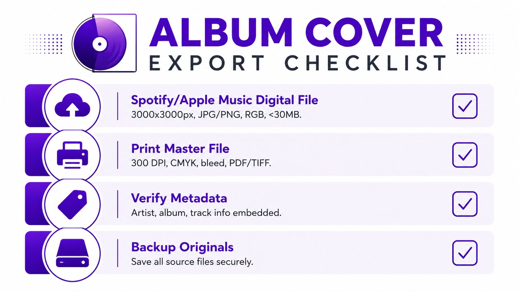
Run this check before you upload anything:
If your concept started in AI and the source file is smaller than your final target, fix that before layout export. Use starryai's AI image upscaler for higher-resolution cover art instead of scaling a low-res image up inside Photoshop, Canva, or Affinity and hoping compression hides the damage. It usually doesn't. Soft edges, broken texture, and muddy type become obvious fast at platform size.
Keep the artwork itself clean. Distributors often reject covers with extra marketing copy, store URLs, pricing, platform logos, or badge-style clutter. The cover should identify the release, not act like an ad.
Print is a separate production file, not a renamed digital export. Screen artwork can look balanced and still print too dark, too flat, or too tight to the trim.
Set up a dedicated print master for CDs, vinyl jackets, inserts, or posters, and check these production points:
| Print concern | Why it matters |
|---|---|
| 300 DPI | Preserves detail in physical output |
| CMYK version | Printed color shifts from what you see on screen |
| Bleed and safe area | Protects edges and keeps text away from the trim |
| PDF or TIFF master | Gives your printer a higher-quality production file |
Keep the layered source file after export. You will need it if the distributor asks for a correction, the printer changes specs, or you decide to reuse the artwork for a cassette run, lyric booklet, or larger merch print later.
Release day has a way of exposing weak spots fast. A distributor flags the cover. A photographer asks where their credit is. You need a story crop, a banner, and a press image in the same afternoon, but the only file on hand is a flattened square JPEG.
Clean that up before the music goes live.
Every visual ingredient needs a clear paper trail. That includes stock photos, scanned textures, brushes, fonts, AI-generated images, and anything a collaborator contributed. Keep licenses, receipts, approval emails, and the final source files in one organized folder so you can verify usage without digging through old messages.
This matters for practical reasons. Rights issues can stall distribution, block paid ads, complicate merch, or force a reprint after you already announced the release. If someone else made part of the cover, confirm who owns the final art and what use is allowed across streaming, physical packaging, promo, and merchandise.
AI artwork needs the same scrutiny. If you used starryai for concept generation or image development, save the prompts, exported versions, and notes on how the image was edited afterward. That gives you a cleaner record of authorship and makes revisions easier if a platform, printer, or collaborator asks questions later.
A strong cover should carry the rest of the campaign without forcing you to redesign everything from scratch. Once the square artwork is approved, turn it into a compact asset system:
Consistency does two jobs at once. People recognize the release faster, and you spend less time improvising graphics for every announcement.
I usually recommend saving these as editable templates, not just exports. In Photoshop, Affinity Designer, or Canva, that means one organized master file with named artboards, locked type styles, and reusable color swatches. If the release date changes or a platform needs a new size, you update the system once instead of rebuilding five separate graphics.
The goal is simple. One cover, many uses, no surprises.
If you have the songs and a rough visual direction but need help shaping ideas into workable artwork, starryai can support the process from concept exploration through image refinement before final layout.