

Written by Mo Kahn on
August 31, 2026


December 31st has a way of turning decent creators into frantic ones. You've got half-finished cards in Canva, a folder of fireworks clips you already used last year, and a caption draft that still sounds generic at 11:40 PM. The feed fills up fast, and another gold-text greeting won't stop anyone from scrolling.
The better move is to treat happy new year AI as a visual decision problem, not a prompt dump. Pick the format first, choose a style that fits the platform, then generate with enough structure that the result feels intentional instead of templated. That's where a tool like starryai fits into the workflow, because the advantage isn't just speed, it's making faster decisions about what should be posted.
The worst New Year posts all fail in the same way, they look like they were made after midnight by someone who was already tired. You can feel the rush in the image itself, too much glitter, too much symmetry, the same champagne sparkle every other account posted. That's usually what happens when creators skip the decision layer and go straight to generation.
A strong holiday post usually wins before the caption ever matters. If the image feels fresh, the caption can stay simple. If the image looks like recycled wallpaper, no amount of copy polish will save it.
That's why the smarter path is to decide three things first, the visual style, the aspect ratio, and the scene. Then the prompt becomes a control tool, not a creative lottery ticket. The result is less frantic, more usable, and much easier to adapt for different feeds.
Practical rule: if you wouldn't repost the image on its own, don't build the whole New Year post around it.
The quickest way to get there is to think like an editor. One image might need to feel cinematic, another might need to read as a clean graphic, and another might need to feel like a candid selfie pulled from a real night out. Different goals need different looks, and the feed punishes anything that feels like it was generated without a point of view.
Open a fresh project folder and label it something obvious, like NY 2025 Visuals, so you can keep variants together without hunting through old outputs. Choose the aspect ratio before you write the prompt, because the frame changes what the model prioritizes. 9:16 fits TikTok and Reels, 1:1 works for square feed posts, and 16:9 gives you room for Twitter timelines and YouTube thumbnails.
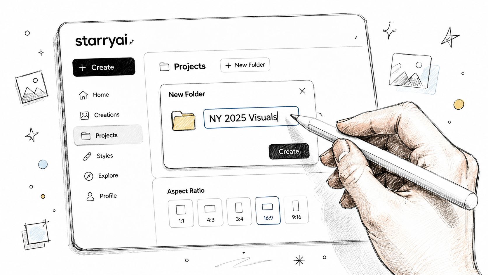
Pick the style preset before you describe the scene. For festive graphics, Anime v2 and Flux are useful when you want clean illustration, while V3 + Flat works better for polished card-like layouts that need room for overlaid text. If you're moving quickly, keep a reusable prompt block that starts with the scene and ends with any optional text overlay, so small swaps take seconds instead of retyping everything.
Choose the frame like a publisher, not a hobbyist. A prompt that looks good in one ratio can fall apart in another.
A scene-first structure keeps the output consistent. Start with the subject, then the setting, then lighting, then mood, and only after that add a text overlay if the design really needs it. Keep prompts tight, ideally under 60 words, so the composition has room to breathe instead of getting crowded with style noise.
For a clean primer on the app flow, the quick start guide for starryai is useful before you build a batch of seasonal visuals.
The fastest way to make happy new year AI images feel deliberate is to write prompts that act like art direction, not like keyword soup. The model needs a subject, a scene, and a visual cue that tells it what kind of energy to carry. Once that structure is stable, you can swap the person, the location, or the mood without breaking the composition.
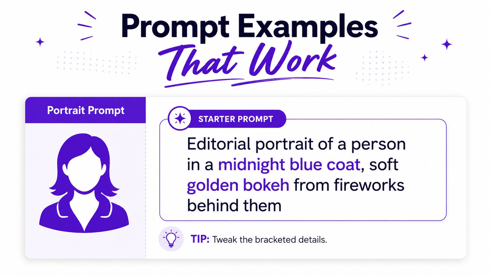
Use this when you want something social-first and editorial.
“Editorial portrait of a person in a midnight blue coat, soft golden bokeh from fireworks behind them, cinematic rim lighting, joyful expression, shallow depth of field, festive but not cheesy, 85mm lens feel.”
The useful part here is the order. It starts with the person, then places them in a scene, then controls the lighting, then sets the emotional tone. Swap the coat color, the background, or the lens feel if you want a different result, but keep the structure intact. If the image comes back too slick, soften the polish by removing the most glamorous phrase first.
Use this when the post needs atmosphere more than a face.
“Empty city rooftop at 11:59 PM, single figure looking up at the first fireworks, warm amber streetlights below, cold blue sky above, cinematic 2.39:1 framing, melancholic hopeful mood.”
This one works because the contrast between warm and cold gives the frame tension. It feels like a real moment instead of a stock New Year scene. If the image starts looking overdesigned, strip back the adjectives before changing the subject.
Use this when you want the image to feel like it came from a real phone camera.
“Close-up smartphone selfie of a young person holding sparklers, soft warm glow on face, cozy sweater, blurred living room party behind them, realistic phone-camera grain, candid New Year energy.”
That grain detail matters because it keeps the image from looking too glossy. If you want more personality, add one concrete prop, one room detail, or one expression cue. The more ordinary the detail, the more believable the result often feels.
For more prompt structure examples, the starryai prompt guide is a helpful companion while you test variants.
You can also compare the generated output against a short video reference before choosing the final frame.
A single New Year image rarely fits every platform well. The same design can feel alive in one feed and cramped in another, especially once captions, buttons, and cropping enter the frame. If you want the post to travel, match the output to the feed instead of forcing one render everywhere.
TikTok wants vertical composition and immediate readability, which means 9:16 with a clear subject and space for captions is the safest default. Instagram splits cleanly between Reels and feed posts, so the same prompt often deserves two renders, one vertical and one cropped for the grid. Twitter tends to reward cleaner typographic moments, especially when the image can carry the message with minimal caption support.
The Raccoon Transfers social media guide is useful here because it reinforces a simple point, the best post format depends on where it's being seen, not just how polished it looks.
| Platform | Aspect Ratio | Resolution | Best Visual Style | Export Format |
|---|---|---|---|---|
| TikTok | 9:16 | 1080x1920 | Motion-friendly vertical scene | PNG for static, high bitrate for video |
| Instagram Feed | 4:5 or 1:1 | 1080x1350 or square equivalent | Clean editorial or graphic card | PNG |
| Instagram Reels | 9:16 | 1080x1920 | Fast-read portrait or selfie style | PNG for cover, video for motion |
| 16:9 or 1:1 | 1600x900 or square equivalent | Typographic visual with strong focal point | PNG |
If you're posting the same idea in multiple places, generate it twice instead of cropping one file down. That usually gives you a stronger composition and cleaner subject placement. The aspect ratio guide for social media is handy if you want to sanity-check framing before you export.
The line between thoughtful and forgettable usually comes down to what the prompt names. Generic holiday images all share the same tells, centered glowing text, perfect symmetry, and glitter that looks pasted on after the fact. Once you notice those patterns, they're easy to avoid.
A personal New Year image doesn't need to be complicated. It needs one detail that feels like it belongs to a real person or place, a worn couch, a specific skyline, a favorite drink, a dog on someone's lap, a friend's apartment at midnight. That one detail forces the image away from the default holiday template.
If the prompt could belong to any account, the output will probably look like it belongs to no one.
The easiest way to break the generic look is to make the frame less perfect. Use off-center subjects, natural light from candles or streetlights, and casual gestures instead of posed celebration. The image should feel like it was noticed, not manufactured.
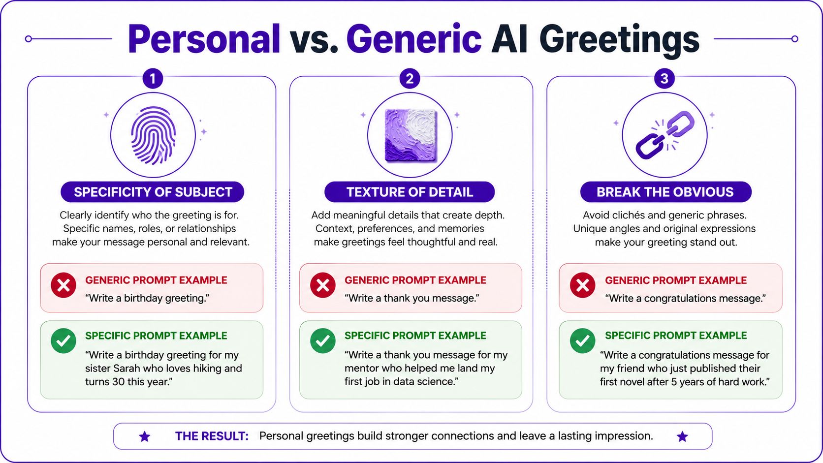
A simple branded visual can outperform a cinematic one if the goal is clarity, not spectacle. That's especially true for creator brands, indie shops, or social accounts that need the message to register instantly. A greeting that names one true detail reads as care, while a greeting that names nothing reads as mass post.
The only real test is whether the visual feels specific enough that you'd trust it as part of your own feed. If it doesn't, add texture before adding more sparkle. More detail can help, but only when the detail feels lived in.
A good New Year visual can still fail on upload if the file is soft, compressed, or overprocessed. Small-screen sharing exposes every weak edge, especially around text, highlights, and thin graphic elements. The fix is simple, export cleanly, sharpen lightly, and don't let the platform do the first real quality check for you.
Use the highest available resolution in the generator and choose PNG for static visuals so compression artifacts don't chew up your gradients. If the image is below 1080px on its longest edge, upscale it before you add type. That keeps the text layer from fighting a blurry base image.
A lightweight post-process usually goes further than heavy editing. Add a touch of sharpening, not enough to create halos, and use subtle film grain if the surface looks too smooth. Color temperature matters too, because festive gold can drift into ugly yellow if you don't warm the balance carefully.
For teams comparing tools that handle output cleanup, SynthID removal with Simple Unmark is one reference point when watermark-related cleanup becomes part of the export workflow.
Keep typography on a separate layer and export a fresh final PNG after you place it. Compress only after the final render, never on the raw AI file. Then open the image on a phone at actual size, because a visual that looks sharp on desktop can still read muddy in a social preview.
The final review is usually what separates a forgettable greeting from one people save or share. The generation step matters, but most weak posts fail because someone skipped the boring checks. A fast checklist catches those misses before the file goes live.
First, read the prompt like an editor would. Does it name a real subject, a real setting, and a clear mood, or is it just fireworks and gold? If the prompt is vague, the output will usually be vague too.
Check the aspect ratio before the first generation runs. A vertical TikTok asset and a square Instagram card are not the same file with different cropping, they're different compositions. That tiny choice changes where the eye lands.
Look at the render at full size, then at phone size. If the image loses its focal point when shrunk, regenerate or simplify the frame. Confirm the resolution is strong enough for the final use, and upscale if needed before any overlay text goes on.
Also verify that the image doesn't feel like a template. If the fireworks are too symmetrical, the glow is too centered, or every figure has the same polished aura, go back and add one awkwardly human detail. That usually improves the read more than adding another style phrase.
Strip unnecessary metadata before public posting when that's part of your workflow, and check the crop safe zone so captions don't cover the main subject. If you're posting an Instagram carousel, add alt text where it makes sense. On TikTok, make sure the first frame carries the idea without waiting for motion to rescue it.
Use this one-line rule as your screenshot note:
Specific prompt, correct frame, clean export, phone check, then publish.
starryai gives creators a fast way to turn a New Year idea into a visual that feels made for the feed instead of recycled from last year's templates. If you want to make your next Happy New Year AI post look sharper, more specific, and easier to post across platforms, visit starryai and build the frame before the midnight rush starts.


.svg)