


Written by Mo Kahn on
July 22, 2026


You know the feeling. A character has been living in your head for weeks, maybe months. You know how they speak, what they fear, the weapon they carry, the scar they hide, and the exact mood they bring into a scene. But the moment you try to turn that into an image, the gap shows. The result either looks generic, overdecorated, or disconnected from the story that made the character interesting in the first place.
That gap is where most fantasy character concept art projects stall.
For indie authors, tabletop players, and solo creators, the good news is that the process is more accessible than it used to be. The concept art field runs heavily on project work, with 72% of concept artists working on a freelance or contract basis at some point in their career, which makes professional help easier to access when you need it and easier to prepare for before you hire according to this industry overview. The strongest outcomes usually come from a hybrid workflow. Build the idea with solid design logic first, then use AI tools to explore, iterate, and refine faster.
Strong fantasy character concept art doesn't begin with rendering. It begins with decisions.
A lot of beginners assume the hard part is drawing skill. Usually it isn't. The hard part is choosing what matters about the character and stripping away what only looks flashy. If your character is a ruined knight who survived a failed oath, that should affect stance, armor condition, color choices, and even how much ornament they still keep. If those choices aren't clear, the image drifts.
That's why a hybrid process works so well for modern creators. Traditional concept design gives you structure. AI gives you speed. Put together, they let you test ideas before you commit to a final direction or pay for polished production art.
Practical rule: Use AI for exploration, not for replacing judgment.
That matters even more if you're an indie creator working alone. The market is full of freelance talent, and that can help when you're ready to commission a final piece. But you'll get better results, spend less time in revision, and communicate more clearly if you arrive with a real concept instead of a vague mood board.
A useful starting point is to separate your process into three simple layers:
Those layers keep your decisions honest. They also stop a common mistake. New artists often chase a polished face too early. The image may look attractive, but the design underneath stays weak.
Fantasy thrives on imagination, but memorable design still needs discipline. The fastest route to a convincing result isn't random generation. It's a clean concept, a few deliberate constraints, and enough iteration to discover what the character wants to look like.
The strongest character sheets usually start before any sketch or prompt. Professionals often use a 4 Ds pipeline: Discover, Develop, Design, Deliver, and the key lesson is simple. Discover comes first. The same process also uses an 80/20 Rule, grounding a character in 80% familiar reality and 20% fantasy so the design stays engaging instead of unreadable, as outlined in this character design guide.
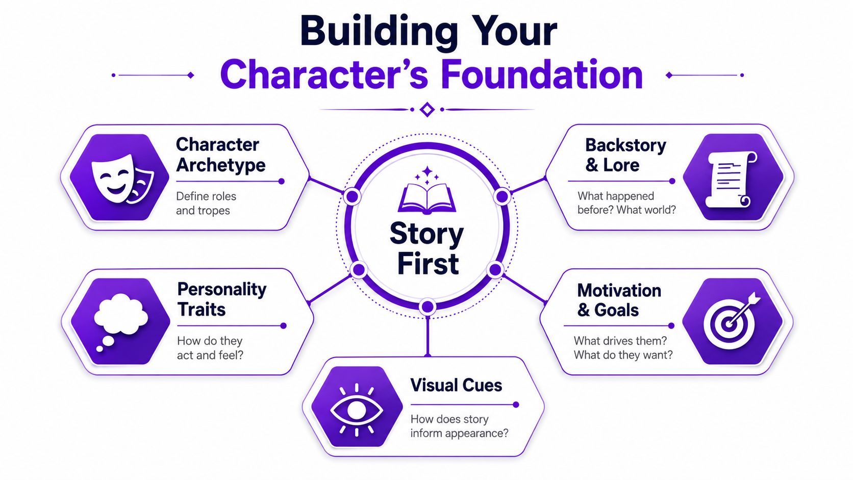
When a design feels flat, the issue usually isn't the costume. It's the missing point of view behind it.
A battlemage and a court astrologer may both wear layered robes, metal fasteners, and symbolic jewelry. Their designs separate when you ask better questions. Which one expects violence? Which one performs status? Which one hides tools in plain sight? Story answers those questions before style does.
The 80/20 rule helps here. Keep most of the design rooted in recognizable function. A cloak still needs to hang like cloth. Boots still need a reason to exist. Armor still needs weight and attachment points. Then reserve the fantasy layer for the one or two features that define the world. A glowing sigil stitched into a cuff. Antler-like crown forms. Blackened steel that reflects purple fire.
If everything is magical, nothing reads as special.
A character brief doesn't need to be long. It needs to be specific enough to guide choices. I like using six prompts:
Role in the story
Not a class label. Their actual dramatic role.
Primary motive
Revenge, duty, curiosity, survival, devotion.
Temperament
Controlled, severe, impulsive, soft-spoken, theatrical.
Social position
Royal, outlaw, mercenary, scholar, pilgrim.
Visual contradiction
Gentle healer in war gear. Noble lineage with improvised clothing.
Signature element
One thing people remember first.
Names can help lock the tone early. If you're stuck, a tool for author character names can be useful for testing whether the sound of a name matches the culture and mood of the design.
For a practical companion piece on shaping those choices visually, this character design article from starryai is a helpful reference.
A silhouette tells the truth faster than details do.
Before anyone notices embroidery, scars, or belt buckles, they read the outer shape. Broad shoulders suggest force. A tapered frame suggests speed or stealth. A tall vertical silhouette can feel ceremonial, severe, or unnatural depending on how rigid the lines are.

Try this test. Fill the figure completely in black and zoom out. If the character still reads, the design is carrying its weight. If it collapses into a generic human outline, the concept needs stronger structure.
Three silhouette levers do most of the work:
Pose matters just as much. A guard who plants both feet evenly feels formal. A rogue with weight on the back leg feels ready to vanish. A prophet with open palms feels inviting or dangerous depending on the facial treatment and costume.
Design the body language before you worry about the face.
Prompting gets better when you stop describing only objects and start describing form.
Instead of writing "fantasy assassin in dark clothes," write the pose and silhouette into the request. Use phrases like "lean angular silhouette," "forward-tilted posture," "compact stance," "cloak creating triangular shape," or "upright ceremonial pose with symmetrical frame." Those terms direct composition more effectively than a pile of aesthetic keywords.
A useful workflow looks like this:
If you want help testing posture ideas quickly, an AI pose generator workflow can help you compare body language options before you settle on one direction.
The mistake to avoid is forcing too many actions into one image. A concept pose isn't a movie still. Its job is clarity. Pick one readable emotional signal and let the rest of the design support it.
Costume design is where beginners often overwork the image.
They add straps, buckles, glowing runes, extra blades, extra pouches, decorative trim, and three unrelated symbols from the world's lore. The result feels busy but not convincing. Good costume design doesn't ask, "What else can I add?" It asks, "What would this person choose, inherit, repair, carry, or refuse?"
Think of clothing and gear as evidence.
A frontier ranger's coat may have weather damage at the hem, reinforced stitching near the shoulders, and practical closures they can open with gloves on. A palace duelist might wear cleaner lines, curated ornament, and a weapon hilt designed to be seen as much as used. A necromancer who travels alone may protect books more carefully than armor.
Those choices become even more important when the character is central. In professional production, hero-level characters cost 2 to 3 times more than background NPCs because they need more revision and more detailed turnarounds for downstream work, as explained in this concept art pricing guide. That isn't just a budget note. It's a design note. The more important the character, the more every detail needs to justify itself.
Don't decorate everything at once. Layer the design.
Start with the base garment and ask what it communicates on its own. Then add one functional layer, one social layer, and one personal layer. For example:
That stack tells more story than "ornate fantasy clothing."
You can use the same logic with props:
| Prop | What it should reveal |
|---|---|
| Sword | Training, status, era, maintenance habits |
| Staff | Belief system, craft tradition, ritual use |
| Satchel | Profession, travel pattern, daily tools |
| Jewelry | Kinship, vows, grief, rank |
A useful self-check is to remove one detail at a time. If deleting it changes nothing about the character, it probably wasn't doing a job.
Ornament works when it supports identity, not when it tries to replace it.
Most AI character art breaks in one of two places. The prompt is too vague, or the user changes too many variables between generations. That's why one image may look promising while the next image no longer feels like the same person.
That problem matters a lot for fiction work. 68% of self-published fantasy authors report struggling with costly, inconsistent character art, which is why consistency matters more than one attractive image in this discussion of character continuity needs.
One workable approach is to build your prompt in fixed layers and only change one layer at a time.
Use this order:
Identity anchor
Age impression, gender presentation, role, temperament.
Silhouette and pose
Broad, wiry, upright, coiled, ceremonial, defensive.
Costume logic
Material, condition, culture, rank, weathering.
Signature details
Scar placement, eye color, amulet, hair treatment, weapon type.
Scene context
Studio-style concept sheet, neutral background, full body, three-quarter view, or scene-based environment.
That approach keeps the character stable while still letting you experiment.
If you're learning the interface from scratch, the quick start guide for the app is a practical place to begin. starryai turns text prompts into generated artwork, and if you use its Enhance feature, remember that enhanced images are only stored for 7 days unless you download them, as noted in the Enhance feature FAQ.
For creators thinking beyond one-off images, I also like Busylike's take on AI production because it frames AI as a production workflow issue, not just a novelty effect.
Consistency starts with a locked character anchor. Write one master description and reuse it with minimal edits.
A good anchor includes the features that must not move: face shape, hair silhouette, age range, core outfit structure, signature prop, and emotional tone. Then create variants by changing only the pose, camera distance, or scene. Don't rewrite the whole prompt every time.
Use a repeatable naming structure in your notes:
That note discipline matters more than expected.
The video below is useful if you want to see the generation process in motion before building your own prompt stack.
| Archetype | Prompt Example |
|---|---|
| Exiled knight | weathered exiled knight, broad silhouette, upright restrained posture, dented plate armor over faded tabard, oath symbol scratched from chest piece, short dark hair, scar across left cheek, full body character concept art, neutral background |
| Forest witch | solitary forest witch, lean silhouette, calm grounded stance, layered wool and leather garments, herb satchel, antler-inspired headpiece, pale hands stained with ink and soil, moody fantasy character concept art, full body |
| Desert rogue | agile desert rogue, narrow angular silhouette, weight shifted back, wrapped scarf and layered light armor, curved dagger, sun-faded fabrics, alert expression, three-quarter view fantasy character concept art |
| Royal battlemage | royal battlemage, tall ceremonial silhouette, poised stance, structured robe with metal fasteners and arcane embroidery, jeweled focus staff, controlled expression, polished fantasy character concept art, full body |
A character concept becomes more useful when you design with the final format in mind.
Art for a novel cover isn't framed the same way as art for a profile image. A merch graphic isn't composed the same way as a reference sheet for a 3D artist. The visual may be the same character, but the crop, spacing, and emphasis need to change.
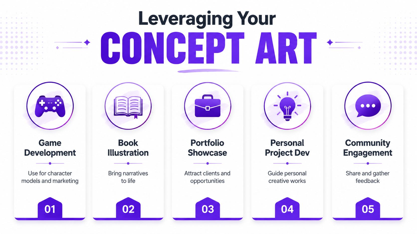
For book covers, leave breathing room around the character. Title and author name need space, and crowded compositions become hard to use. If the character is front-facing, make sure the focal point doesn't sit exactly where cover text needs to land.
For avatars, simplify. The face, hair shape, and one signature accessory usually matter more than the full costume. Crop tighter than you think and check legibility at small sizes.
For pitch decks, game docs, or commissions, clarity wins. Use a front view, a three-quarter view, and at least one expression or pose variation. If the piece may feed a 3D pipeline later, cleaner presentation helps more than dramatic lighting.
A single strong design can support multiple outputs if you plan for that from the beginning:
The practical lesson is simple. Don't judge your fantasy character concept art only by how beautiful it looks in one frame. Judge it by whether it can travel. Can it become a cover, a profile image, a pitch asset, or a commission brief without losing its identity? If it can, you've built something durable.
If you're ready to turn a character brief into usable visuals, starryai is a straightforward place to start experimenting with prompts, variations, and polished fantasy character concepts.


.svg)