

Written by Mo Kahn on


You've generated a character you like, but it stops working the moment you try to use it. The face disappears in a TikTok carousel preview, the background crowds your book-cover title, and the delicate shading looks muddy on an Etsy sticker. You don't necessarily need a better image. You need a style whose visual choices survive the job.
Understanding different digital art styles means learning what to preserve, what to simplify, and what to ask an AI image tool to produce. Start with the destination, then choose the look.
Say your project follows a moonlit courier carrying a mysterious parcel. You need a social teaser, a cover concept, and a sticker featuring the same character. A detailed cyberpunk street might establish the story on social media, while a simplified anime portrait makes a clearer sticker.
The table below is a quick reference, not a ranking. Defining traits tell you what must remain visible for the style to read. Strongest use identifies an everyday application where those traits are useful.
| Style | Defining traits | Strongest use |
|---|---|---|
| Anime | Clean linework, large expressive eyes, flat cel shading | Character art, avatars, fan illustration |
| Realism | Accurate light, texture and proportion | Portraits, product mockups, book covers |
| Painterly | Visible brush strokes, soft blended edges, rich color | Fine-art prints, landscapes, editorial art |
| Vaporwave | Pastel gradients, retro computing icons, dreamy haze | Nostalgic posters, music artwork, lo-fi social posts |
| Cyberpunk | Neon color, rain-soaked night streets, high contrast | Game concept art, sci-fi covers, tabletop settings |
| Glitch art | Visible data errors, RGB channel offsets, scan-line tearing | Music videos, experimental posters, tech-themed branding |
| Pixel art | Fixed grid, limited palette, hard edges | Game sprites, avatars, retro merchandise |
| Vector art | Clean paths, flat color, scalable geometry | Logos, stickers, icons, print merchandise |
| Generative art | Rule-based systems create the variations | Patterns, data visuals, procedural backgrounds |
Treat these uses as starting points. An anime book cover can work beautifully, but it still needs space for typography and a composition that communicates the genre. A painterly sticker can work too, provided its silhouette remains clear after the background is removed.
Platform fit matters because viewers encounter artwork in more than a gallery-like presentation. ArtDaily's coverage of TikTok and digital artists reports that more than 16.4 million TikTok users created content monthly in 2025. For a creator, that makes a recognizable visual process worth planning alongside the finished image.
Ask what you could show in a making-of clip: a palette change, a character transformation, a developing pattern, or a before-and-after composition. Choose changes that viewers can understand without reading a long caption.
Use the style families to identify your visual language, the prompt recipes to describe it, and the final checks to decide whether it's ready for a complete image set.
A filter is an ingredient. A style is the recipe that keeps producing related results, even when the subject changes. Adding grain to an ordinary portrait changes its surface, but it doesn't automatically give the portrait a coherent artistic identity.
To describe that identity, separate what the image depicts from how you've chosen to depict it. A courier, a café, and a spaceship can belong to the same visual world without sharing any objects.
These layers don't need equal emphasis. Vaporwave can remain recognizable when you replace a classical statue with a shopping arcade because its dreamy atmosphere and nostalgic color treatment persist. Generative art may have no consistent palette at all, yet still belong to a coherent practice because its maker uses a system to determine the result.
Computer-based generative art emerged in the early 1960s, with Georg Nees exhibiting in Stuttgart and A. Michael Noll and Bela Julesz exhibiting in New York in 1965, according to Layer's history of generative art. Its defining feature is the material contribution of rules or algorithms, not just that someone used a computer.
A style should remain recognizable when you change the subject, not just when you repeat the same picture.
Take an image you admire and replace its central subject in your description. If the original shows a person, describe a bicycle instead, keeping the linework, palette, texture, and lighting unchanged.
Would the bicycle still feel as though it belongs beside that portrait? If not, you may have described the subject's costume or setting rather than the style.
This distinction helps when finding your style of art. Record choices you can repeat, such as heavy outer contours, muted shadows, and angular shapes, rather than relying on broad adjectives like beautiful or cinematic.
Keep the courier's pose unchanged: shoulders turned, parcel tucked under an arm, eyes looking toward a doorway. To choose a figurative style, compare how much detail you include, how far you exaggerate shapes, and how visibly you show the medium.
Those decisions matter more than whether the image contains a person. The same approaches can shape animals, fantasy creatures, scenery, and everyday objects.
An anime version simplifies the courier's face into readable shapes. Large expressive eyes carry the emotion, clean linework defines the silhouette, and flat cel shading separates illuminated areas from shadow. Keep the line-weight system consistent, even if outer contours are heavier than interior details.
That clarity suits avatars, character sheets, and fan illustration. For a tabletop character, a distinctive fringe or collar can help players recognize the portrait immediately. Fan illustration, however, isn't automatically cleared for commercial merchandise, so don't confuse a useful visual category with permission to sell a recognizable character.
A realistic version follows anatomy, physical lighting, plausible perspective, and camera-like depth. Skin should respond differently from fabric, metal, and hair. The viewer should understand where the light comes from rather than seeing unrelated highlights scattered across the face.
Realism is useful for headshots, product mockups, and book-cover concepts, but close inspection is unforgiving. Plastic skin often appears when smoothing removes pores and subtle changes in light across the face. Adding random sharpness won't fix it; restore believable texture and less uniform transitions.
A painterly version lets the viewer notice the marks. Brush direction can describe the cheekbone, broader strokes can simplify clothing, and warm highlights can sit against cooler shadows. Not every edge needs equal definition.
That makes painterly work useful for fine-art prints, natural scenes, and editorial images where interpretation matters more than photographic precision. At small sizes, however, delicate strokes may disappear, so preserve the larger light-and-dark shapes.
Combining approaches can work when each has a clear role. You might use anime proportions for the character and painted atmosphere for the background. Trouble starts when the face has delicate realistic rendering but the surrounding contours switch unpredictably between heavy and faint.
Use these checks before accepting a hybrid:
Art-direction rule: The more you want viewers to notice the hand or the medium, the more painterly your treatment should be.
Temporarily convert your image to grayscale. If its atmosphere disappears, color was doing most of the stylistic work. That isn't automatically a failure, but it tells you what must survive a print conversion, a dim phone screen, or a change in palette.
Compare the visual cues before judging the subject.
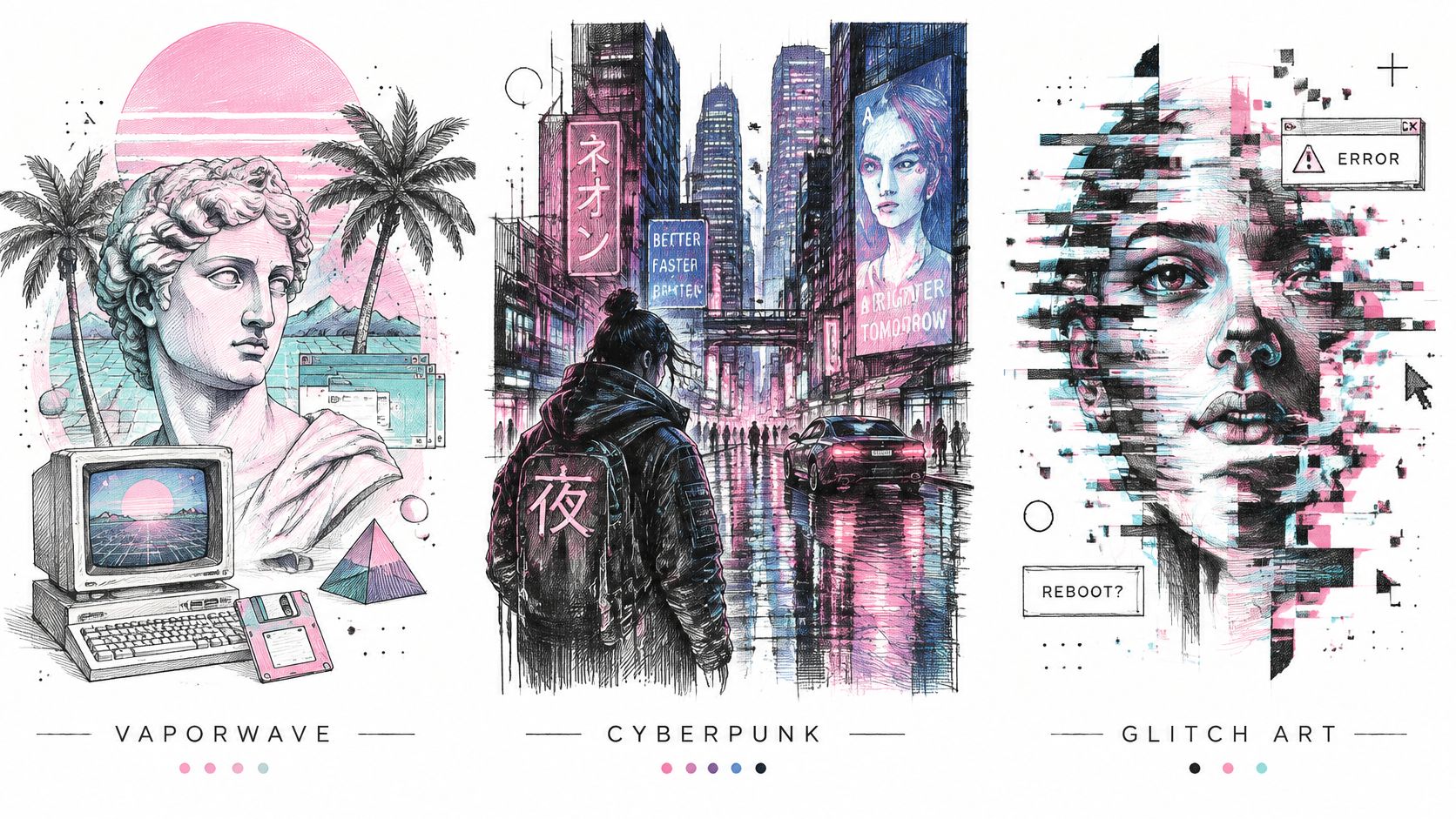
Vaporwave often combines pastel pink and teal gradients, retro computing icons, classical statues, palm trees, and slow, dreamy haze. The effect is less about a convincing place than a nostalgic, slightly displaced atmosphere.
For music artwork or lo-fi social posts, choose a dominant motif and leave breathing room around it. A statue, interface window, and tiled floor can establish the vocabulary without filling every corner. Vaporwave becomes harder to use for explanatory graphics when haze and low contrast obscure necessary information.
Cyberpunk uses neon signage, rain reflections, dense urban layers, exposed technology, and worn surfaces. The tension comes from high-tech equipment meeting grime and human activity, not from making everything glow.
For a sci-fi cover, separate the character from the city with a controlled pool of light. Reserve the strongest saturation for selected signs or reflections, leaving other surfaces relatively restrained. Otherwise, the viewer can't tell which glowing object matters.
The grayscale check reveals another distinction: a strong cyberpunk composition can retain its threatening scale and dramatic lighting without its neon palette. A vaporwave image may rely more heavily on color relationships, so test its destination early.
Glitch art deliberately uses digital or analog errors. An academic discussion of glitch-art methods distinguishes pure glitches, caused by actual technical disruption, from glitch-a-likes, which imitate the appearance without a genuine malfunction.
The named techniques describe different interventions:
For a controlled glitch-a-like, duplicate the image in Photoshop or GIMP, separate and offset color channels, add scan lines, and displace selected horizontal rows. Keep an untouched master so you can restore the subject or prepare a clean version for another platform.
Use the embedded video as a separate moving-image reference while considering how disruption changes over time.
Protect essential information during finishing. Tear the background around a musician's face rather than obscuring the face entirely, and add event details or brand typography on a clean layer afterward.
When every image uses an identical channel offset, the set can look like a default filter. Vary the location and intensity of disruption deliberately while preserving a common visual hierarchy.
Pixel art starts with a grid. Vector art starts with geometry. Their edges may both look clean, but their underlying construction changes how you should resize, edit, and deliver them.
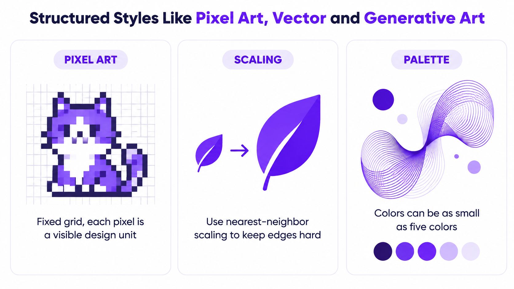
In pixel art, each visible pixel is a design decision. A small change can alter a smile or break a silhouette. Use nearest-neighbor enlargement to preserve the stepped edges rather than introducing intermediate colors through smoothing.
The infographic separates the key production choices.
Vector art stores mathematically described points, paths, and shapes rather than a fixed grid of color values. Adobe's print-art guide explains the production distinction and identifies 300 pixels per inch as a common raster print target.
| Aspect | Pixel art | Vector art |
|---|---|---|
| Encoding | Color values on a fixed pixel grid | Points, paths and shapes defined mathematically |
| Scaling | Enlarging shows blocks, so use nearest-neighbor scaling | Scales to any size without blur |
| Print target | Plan the logical grid first, then prepare the raster delivery at the intended print size | Output at the required final dimensions |
| Palette | Deliberately limited color set | Solid flat fills are useful, though vectors can also contain gradients |
| Best uses | Game sprites, avatars, retro merchandise | Logos, stickers, icons, typography |
The logical resolution is the grid where you design the pixel image, not necessarily the dimensions of the delivered file. Enlarging a sprite cleanly for merchandise shouldn't invent new facial detail.
There's also an important AI distinction: an image that looks vector-like isn't necessarily a vector file. A generated illustration with flat fills may still be a raster image. Rebuild or trace its shapes in Illustrator or Inkscape when you need editable paths and genuine geometric scalability.
Keep screen and print requirements separate. Screens use RGB, while conventional print workflows use CMYK; highly saturated colors need conversion and proofing rather than an assumption that the screen preview will match.
A practical production sequence is:
Generative art adds another kind of structure: rules that determine relationships and variation. A pattern might change petal angles while keeping spacing consistent, or a procedural background might vary line curvature within a defined boundary.
For a deeper understanding of what generative art is, distinguish an image resembling an algorithmic pattern from a system you can rerun. If you need coordinated packaging patterns or editable data visuals, that underlying control matters more than the appearance of complexity.
Write your prompt as an art-direction note, not a collection of attractive labels. Keep the subject and action stable while you test stylistic choices, so you can tell which change helped.
Use this visual checklist while setting up the prompt.
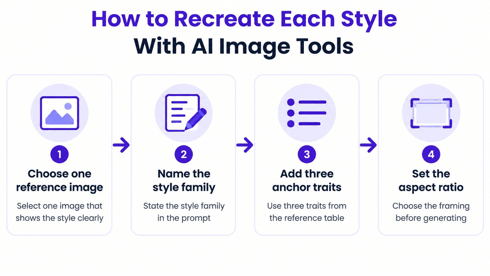
The settings below are things to inspect or request, not controls every image generator necessarily provides. If a setting isn't available, express the requirement in the prompt or handle it during editing.
| Style | Prompt anchors | Settings to check | Common failure |
|---|---|---|---|
| Anime | Cel shading, clean linework, large expressive eyes | Medium-high stylization, flat lighting | Eyes become too realistic and the face loses its stylized shape |
| Realism | Natural skin texture, soft window light, portrait-lens look | Low stylization, detailed texture | Plastic skin from over-smoothing |
| Painterly | Visible brush strokes, impasto texture, warm palette | Medium texture, soft edges | Airbrushed finish with no brush direction |
| Vaporwave | Pastel pink and teal gradient, retro computer icons, haze | Soft contrast, grain added after generation | Mood disappears when the palette turns neutral |
| Cyberpunk | Neon signage, rain reflections, dense night city | High contrast, controlled saturation | Neon color bleeds into every surface |
| Glitch art | RGB channel offset, scan lines, torn rows | Low smoothing, errors added in post-processing | Clean output without convincing disruption |
| Pixel art | Pixel sprite, restricted palette, hard edges | Target logical resolution, nearest-neighbor enlargement | Anti-aliasing blurs the edges |
| Vector art | Flat vector illustration, solid fills, clean shapes | No gradients, simple background, actual file format | Soft edges or raster output mistaken for scalable paths |
| Generative art | Repeated motif, symmetrical grid, rule-based pattern | High repetition, controlled variation | Random chaos instead of a visible rule |
For example, try a courier carrying a silver parcel, anime character illustration, clean linework, cel shading, large expressive eyes, isolated silhouette, plain background. If the pose works but the face doesn't, change the facial treatment without rewriting the parcel, costume, and setting.
The same principle applies when writing AI prompts: revise the specific attribute that failed. Replacing the entire description makes comparisons harder.
For pixel art, create or transform the image at the target logical resolution, specifying pixel density, palette limits, a sprite-like silhouette, and an era or platform aesthetic. A 2024 ACM study of pixel-art generation includes examples constrained to palettes as small as five colors, illustrating how deliberate that restriction can be.
Don't add anti-aliasing unless you intentionally want a softened hybrid. Inspect individual pixel clusters after transformation, especially around eyes and diagonal edges.
For generative-looking work, describe the repeated motif, symmetry, spacing, and permitted variation. If you require a genuinely repeatable system, translate those relationships into code rather than relying on an image prompt alone.
Pair glitch prompts with post-processing because a generated depiction of corruption isn't necessarily a damaged signal. Keep your main stylistic anchors to three or four as a practical starting rule; long lists of competing styles make it harder to identify which instruction shaped the result.
Choose a style you can direct repeatedly, not just one that produces an impressive isolated image. A usable set needs recognizable relationships between its pictures and a clear path to the final deliverable.
Shrink the result to a phone-size preview and apply the actual platform crop. Check whether the subject separates from the background, whether necessary details survive, and whether the mood matches your audience's expectations.
In starryai, describe your idea, pick a style, select a canvas size suited to the platform where you'll share it, and click Generate. Daily free AI images without watermarks let you compare styles before committing.
For your first test, generate three prompt variations in one chosen style. Compare them at thumbnail size, keep the strongest, and refine the traits that didn't repeat. Change one weak attribute at a time so your next decision has a clear reason.
starryai offers daily free AI images without watermarks for trying different digital art styles on your own subject. Visit starryai, choose a canvas for your intended platform, and test a focused set of prompt variations before building the full collection.


