

Written by Mo Kahn on
July 1, 2026


You've probably seen it happen. A fantasy author needs a house sigil, a gamer wants a faction emblem, a seller wants a mark for packaging, or someone wants a symbol that feels more personal than another circle-and-initials logo. The idea is easy to love. The execution is where the process often stalls.
A coat of arms solves a very modern problem with a very old design system. It gives you a compact way to show identity, values, style, and story in one image. Better yet, you don't need to be a trained illustrator or a heraldry scholar to create one that feels intentional. You need a few design rules, a clear personal brief, and a practical way to turn that brief into a polished digital asset.
A coat of arms isn't just decorative. It's a visual shorthand for who you are and what you want people to remember. That's why the format still feels useful today, even outside formal heraldry. Creators use it for book branding, guild identities, merch, maker marks, wedding stationery, podcast art, and social avatars.
Historically, coats of arms began taking shape in medieval Europe around the 12th century, when recognizable heraldic symbols were used to identify individuals and families in battle and formal display. That gives the practice roughly 800 years of recorded history, as outlined in this history of coats of arms. The appeal hasn't disappeared. The context has changed.
What worked then still works now because the underlying job is the same. A strong emblem has to be recognized quickly. It has to hold together at a glance. It has to suggest meaning before anyone reads a word of explanation.
A coat of arms is one of the oldest examples of identity design. The good ones still behave like good logos.
That's also why this format fits so well with digital culture. A creator doesn't just need a nice illustration. They need an asset that can appear on a profile, a banner, a sticker, a storefront, or a shirt without losing its character. A detailed medieval-looking crest might feel impressive in a large print, but if it collapses into visual mush as an avatar, it's doing only half the job.
The useful way to approach this is not “How do I imitate a museum piece?” It's “How do I build a symbol with enough heraldic structure to feel grounded, and enough visual discipline to work online?”
A good custom emblem does both. It borrows the logic of heraldry, then adapts that logic for modern use. That means choosing symbols with intent, keeping the composition readable, and using AI as a finishing tool instead of a random idea machine.
Heraldry works because it isn't freeform. It has a visual grammar. Once you understand the parts, designing becomes less intimidating and much more fun.
English Heritage presents coat-of-arms design as a structured system built from four core components: shield, supporters, helmet and crest, and motto, which is why so many modern templates still follow the same layout in simplified form. You can see that structure in English Heritage's coat-of-arms design guide.
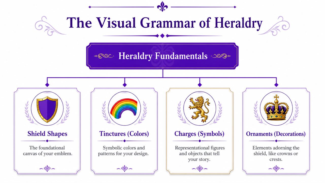
The shield is the main field. It carries the primary story. If your design has one symbol people should remember, it belongs here.
The crest sits above and often adds personality or rank in traditional compositions. In modern creative work, it can act like a secondary mark. Think of it as the element you might isolate for an icon or stamp.
Supporters sit at the sides. They add drama, balance, and worldbuilding. They also add complexity fast. If your emblem is meant for small digital use, supporters are often the first thing to simplify or remove.
The motto anchors the piece verbally. It can be solemn, playful, aspirational, or blunt. A short motto usually works better than a clever long sentence, especially if you'll use the design in compact formats.
Practical rule: If the shield doesn't work on its own, the full coat of arms won't save it.
Two more pieces matter if you want your design to feel coherent: tinctures and charges.
Tinctures are heraldic colors. Charges are the symbols placed on the shield, such as animals, stars, tools, books, trees, moons, or geometric forms. You don't need to memorize historic vocabulary to use them well. You do need to make clear choices.
A practical rule from heraldic thinking is contrast. Dark on dark disappears. Light on light blurs. Strong contrast keeps a symbol readable at a glance, which matters even more on screens.
Here's a simple symbolism table you can use as a starting point:
| Tincture (Color) | Heraldic Name | Common Symbolism |
|---|---|---|
| Gold | Or | generosity, elevation, honor |
| Silver or white | Argent | peace, sincerity, clarity |
| Red | Gules | courage, action, resolve |
| Blue | Azure | loyalty, truth, steadiness |
| Green | Vert | hope, growth, renewal |
| Black | Sable | constancy, gravity, discipline |
| Purple | Purpure | dignity, ambition, imagination |
These meanings aren't a rigid code. They're creative prompts. A writer might choose blue and silver for clarity and memory. A game streamer might choose black and gold for authority and spectacle. An herbal brand might choose green and silver for growth and simplicity.
Charges work the same way. Pick symbols people can identify quickly. A raven, key, mountain, torch, quill, bee, oak leaf, compass, or wolf all read fast. A crowded collage of five tiny symbols usually doesn't.
What doesn't work is mixing too many messages into one shield. If your emblem tries to say “family, ambition, travel, scholarship, resilience, music, mysticism, and cats” all at once, it stops saying anything clearly.
The most effective way to create your own coat of arms is to treat it like a design brief, not an art prompt. You're not starting with decoration. You're starting with identity.

Before choosing a lion or crown because it looks cool, answer a few harder questions.
Those answers shape the design more than style keywords do.
If you want a practical starting point for rough concept exploration, an AI logo generator can help you pressure-test directions before you commit to a full heraldic composition. The key is to use it after you've defined the story, not before.
Once your direction is clear, reduce it to a few core choices.
Choose a shield shape
A classic heater shield feels traditional and grounded. A more angular or minimal shield feels modern. Rounded forms feel softer. Pointed forms feel martial.
Pick one primary charge
Start with one symbol that carries the central idea. If your emblem is about guidance, use a compass or star. If it's about craft, use a hammer, needle, anvil, or pen. If it's about vigilance, use an owl, wolf, or tower.
Add one supporting motif
This could be a border pattern, a smaller secondary symbol, or a division of the shield. Don't overbuild. The support should deepen the theme, not compete with the main symbol.
Set a restrained palette
Two main colors plus one accent is usually enough. More colors create more opportunities for confusion.
Write a motto
Short beats ornate. A motto should sound like a principle, not a paragraph.
A sketch helps, even if it's crude. Boxes, arrows, labels, stick animals, and color notes are enough. AI responds better when you already know the hierarchy of the design.
A short demonstration can help if you think visually:
One mistake shows up constantly in beginner heraldic design. People choose symbols by personal attachment alone, then realize those symbols don't compose well together. A fox, fountain pen, moon, mountain, and rose may all matter to you, but they may not produce a strong shield.
Choose symbols for meaning first, then test them for silhouette. If the silhouette is weak, the symbolism won't rescue the design.
A better approach is to rank symbols by importance. Keep the strongest visual idea in the center. Move the others into texture, border, crest, or motto language.
AI image tools work best when you stop treating the prompt like a wish and start treating it like art direction. A clear coat-of-arms prompt has structure, hierarchy, and constraints.

Start with the subject. Then define the composition. Then lock in the symbols. Then specify color and finish.
A practical formula looks like this:
Subject + shield shape + main charge + secondary elements + palette + style + background constraints
For example:
A heraldic coat of arms, classic heater shield, central silver raven with spread wings, small gold key beneath, deep blue field, clean symmetrical composition, crisp vector logo style, high contrast, plain background
That's already stronger than “make me a family crest with a raven.”
The next layer is aesthetic control. If you want a particular look, say so directly:
For sharper prompt writing habits, this guide to AI art prompts is useful because it reinforces the habit of being explicit about style, composition, and output.
Here are three templates that produce very different results.
Minimal digital emblem
A personal coat of arms, simple shield shape, gold compass rose on dark green field, no supporters, short ribbon motto, modern heraldic design, clean vector logo, centered composition, sharp edges, transparent background look
Fantasy house crest
Ornate coat of arms for a fictional noble house, black shield with silver wolf head, red moon above, crossed branches below, elaborate crest and mantling, dramatic engraved illustration, medieval manuscript style, symmetrical, aged parchment mood
Creator brand mark
Heraldic emblem for an author brand, blue and silver shield, open book as central charge, star above, minimal crest, elegant linework, high contrast, refined editorial logo aesthetic, readable at small size
Notice what these prompts do not do. They don't dump every idea into one sentence. They also don't rely on vague words like “cool,” “epic,” or “beautiful.” AI can't do much with subjective enthusiasm unless you convert it into visible instructions.
A technical design mindset helps here too. Vector-focused tutorials recommend building the shield geometry first, mirroring shapes for symmetry, editing nodes and Bézier paths for custom forms, clipping overlaps, and adjusting stroke weight so thin details stay coherent at small sizes, as shown in this vector tutorial on coat-of-arms construction. Even if AI generates the image, those principles still matter. Symmetry, edge control, and legibility are what separate a decorative image from a usable emblem.
The first generation is usually not the final design. That's normal. AI is good at giving you options quickly. It's less reliable at reading your mind.
A typical workflow starts with a text prompt based on your design brief. Then you review the outputs for three things: composition, symbol accuracy, and small-size readability. If one output has the right shield shape but the wrong charge, keep the composition language and tighten the symbol language. If another gets the symbol right but adds too much ornament, reduce decorative wording and ask for a cleaner layout.
In practice, AI coat-of-arms generations often drift in predictable ways.
That last issue matters more than many tutorials admit. Existing design content still focuses heavily on traditional shield layouts and manual illustration, while the bigger modern challenge is making the emblem work as a tiny profile image, merch graphic, or mobile-first asset. This gap is visible in the current tutorial ecosystem discussed in this coat-of-arms video context. For practical use, simplification often beats strict completeness.
Strip the design down until the shield reads instantly at small size. Then add complexity only if it survives reduction.
One effective method is to move in passes.
First pass: generate broad options from your prompt.
Second pass: pick the output with the best silhouette.
Third pass: revise the prompt to correct a single issue at a time.
Fourth pass: use an image or sketch input if the tool supports it.
That last step is where a rough layout becomes powerful. If you upload a simple sketch and combine it with text instructions, you give the model composition guidance that text alone often can't provide. A quick walkthrough of the process is available in this quick-start guide for the starryai app.
If you plan to turn your crest into a physical object later, it helps to think beyond screen use early. For example, designers exploring AI jewelry tools often face a similar challenge. Fine detail that looks rich on a render can fail when translated into metal, engraving, or tiny surfaces. The same principle applies to a coat of arms. Clear shapes travel better across formats.
Used well, starryai can generate a coat of arms from text prompts and image guidance, which makes it suitable for taking a written heraldic concept and developing visual variations without needing to draw every version by hand. The practical benefit isn't magic. It's speed with iteration.
Once the design is resolved, export it for the way you'll use it. A PNG with a transparent background is usually the most flexible for websites, profile images, overlays, and product mockups. If you want to print it large or hand it off for cleanup, keep a high-resolution version and, if possible, a vector redraw of the final form.
Think about production early. A crest that looks good on a website may still need simplification for embroidery, engraving, or stitched patches. If hats or apparel are part of the plan, this guide to logo digitizing for custom headwear is useful because it shows why dense detail and thin lines often need adjustment before embroidery.
The point of learning file formats and production limits isn't technical fussiness. It's what turns a cool image into a durable asset. When you create your own coat of arms with modern tools, you're not just making artwork. You're making a symbol you can keep using across identities, projects, products, and platforms.
If you've got the story and a rough design in mind, starryai is a practical place to turn that concept into visual drafts, refine the composition, and develop a coat of arms you can use.