
Written by Mo Kahn on
July 1, 2026


You've got an image in your head. The AI gives you something polished, but it's wrong in the most frustrating way. The mood is off. The angle says nothing. The subject looks like it wandered into a stock background.
That usually happens because the prompt describes objects, not intent.
To create a scene that feels deliberate, you have to think less like a person filling a text box and more like a director giving shot notes. The AI can assemble patterns it has learned from images. It can't decide what your scene means unless you decide first. That's the shift that turns random generations into images with point of view.
Most weak AI images aren't failures of imagination. They're failures of direction.
An image model doesn't “see” your scene the way you do. It works from learned regularities. In visual perception research, a major scene database contained 3,499 full-color photographs across 16 basic-level categories, split into 8 indoor and 8 outdoor categories, which made it possible to study scenes as statistical patterns rather than a few isolated examples (high-level scene context research). That matters for AI image creation because the model is matching patterns of what tends to belong in a forest, office, kitchen, alley, or skyline.
So when you type “cinematic woman in city at night,” the system doesn't know what story you mean. It predicts a plausible version of that category. Plausible is not the same as memorable.
Practical rule: If your prompt can describe ten different images equally well, the output will probably feel generic.
The fix isn't stuffing in more adjectives. It's deciding what the shot is doing. Is the scene supposed to make the character feel powerful, isolated, watched, relieved, trapped, enchanted? Once that answer is clear, prompt writing gets easier because you're no longer collecting keywords. You're giving instructions.
If you also work in motion, the same directorial thinking carries over cleanly to video tools. A useful companion read is everything about AI video generators, especially if you want to extend a still scene into a sequence later.
A strong scene usually exists before the prompt does. On paper, in a note app, or as a rough sketch, it helps to make a few decisions that the AI cannot make for you.
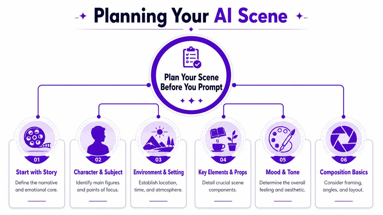
One of the cleanest workflows is to define the peak action first, then backfill the setup and aftermath. A structured scene method frames this as Establish, Initiate, Peak, and Release, and recommends starting from the Peak when a scene feels difficult to build (scene structure workflow).
That approach works well in AI image generation because blank-page paralysis usually comes from trying to invent everything at once. Pick the decisive beat first.
For example:
Not focused enough
“A knight in a castle hall”
Peak-first thinking
“A knight dropping to one knee as the queen turns away after rejecting his plea”
The second version gives you tension, posture, eyeline, likely props, and emotional temperature before you've even chosen style.
Use a quick planning pass like this:
Beginners often treat camera angle as decoration. It isn't. It changes meaning.
Composition experts stress that viewpoint choice is a core narrative decision, and that low angles, aerial views, wide shots, and over-the-shoulder framing signal different story meanings (viewpoint and narrative intent). That's the gap in a lot of prompt advice. “Cool angle” isn't direction.
Try assigning each viewpoint a purpose:
If the angle could be swapped without changing the scene's meaning, you haven't chosen a viewpoint yet. You've only chosen coverage.
A junior designer's common mistake is adding angle terms at the end of the prompt as an afterthought. Reverse that habit. Decide the viewpoint early, because it affects crop, subject size, prop visibility, and emotional read.
A simple pre-prompt brief might look like this:
| Decision | Bad note | Better note |
|---|---|---|
| Subject | wizard | exhausted wizard hiding fear |
| Action | standing | gripping a cracked staff after a failed spell |
| Viewpoint | dynamic angle | low angle to preserve authority despite failure |
| Setting | fantasy ruins | rain-soaked temple with broken stained glass |
| Mood | dark | solemn, tense, faintly sacred |
That's enough to create a scene with intent before you write a single polished prompt.
Once the scene is planned, the prompt stops being a wish list. It becomes production language.
A practical way to write prompts is to move from the center outward. Start with the subject and peak action. Then add the environmental context that supports that moment. Finish with composition and style cues. This keeps the prompt from bloating into disconnected descriptors.
I use a five-part structure for most scene work:
Subject
Name the main figure or focal object clearly.
Action or emotion
Describe what the subject is doing, or what emotional state should be visible.
Setting
Give the environment enough detail to support the story.
Composition
Specify framing, distance, angle, and what should be emphasized.
Style
Add the visual finish only after the shot works narratively.
That order matters because it mirrors how a scene is built around its decisive event. If you need more prompt examples and wording ideas, the AI art prompt guide from starryai is a useful reference for phrasing and iteration.
Write prompts so each phrase earns its place. If a detail doesn't change the shot, remove it.
Here's the difference in practice.
Weak prompt:
“A beautiful sci-fi market, neon, lots of people, cinematic, detailed, cool lighting”
Directed prompt:
“A street food vendor handing a glowing bowl to a tired courier in a crowded sci-fi market, steam rising between them, dense signage and hanging cables in the background, medium shot, over-the-shoulder perspective from behind the courier, emphasis on human exchange amid urban chaos, moody neon color palette”
The second one gives the model a relationship, a focal exchange, and a camera position. That's why it tends to produce something with story.
| Component | What to Include | Example |
|---|---|---|
| Subject | Main person, creature, object, or focal element | “A young botanist” |
| Action | Peak behavior, gesture, or emotional state | “carefully opening a bioluminescent flower with trembling hands” |
| Setting | Location, time, weather, atmosphere, supporting details | “inside a flooded greenhouse at dusk, broken glass reflecting pale blue light” |
| Composition | Shot type, angle, depth, placement, perspective | “close medium shot, slight low angle, shallow depth, subject off-center” |
| Style | Medium, rendering intent, surface finish, mood language | “dreamlike fantasy illustration with soft painterly textures” |
Use the table like scaffolding, not a rigid formula. Some scenes need a stronger action phrase. Others need tighter composition language.
Three fast examples:
Character portrait
“An aging detective sitting alone in a diner booth, staring at a folded photograph, early morning rain outside the window, close shot from table height, reflections on chrome surfaces, subdued noir mood”
Fantasy scene
“A lone traveler reaching the ridge just as twin moons rise over a frozen valley, wind pulling at a long cloak, wide cinematic framing, high horizon line, painterly epic fantasy style”
Sci-fi crowd scene
“A mechanic arguing with a security drone beside a market checkpoint, pedestrians blurring behind them, chest-level framing, slight Dutch tilt, electric signage and haze, gritty futuristic realism”
If the first generation misses, don't rewrite everything. Keep the subject and peak action stable. Adjust one layer.
The same scene can read like a romance, a thriller, or concept art depending on the style and frame you choose.
If you're comparing style options inside a tool such as starryai, treat them like lenses on the same directorial decision, not as random filters. A good starting point for visual references and naming conventions is the AI art styles overview.
Take this base concept: a teenager standing on a rooftop at sunrise after a long night.
Rendered as photorealistic, it can feel immediate and documentary.
Rendered as anime, it often feels emotionally legible and heightened.
Rendered as painterly or artistic, it can shift toward memory, melancholy, or myth.
That's why “realistic” isn't automatically more persuasive. Research on natural-scene geometry shows that human perception of angles and oriented lines is shaped by statistical regularities in the environment, which means a composition can feel more convincing emotionally even when it doesn't obey perfect linear perspective (natural-scene geometry research).
So if a stylized angle feels better, trust that reaction and test it.
For lighting-heavy scenes, it also helps to borrow discipline from product photography. Even if you're generating rather than shooting, guides like these lighting setup tips for Shopify store products are useful for thinking about highlight control, shadow direction, and subject separation.
Aspect ratio changes the story because it changes what gets included and what gets sacrificed.
A wide frame gives your subject room to exist inside a world. A vertical frame tends to intensify the subject's presence. Square compositions often feel graphic and controlled.
A quick visual explainer helps here:
When you create a scene, choose the ratio based on where the viewer's eye should travel. Left to right suggests journey. Top to bottom suggests stature, descent, revelation, or pressure.
The first image is a draft. Professionals expect that.
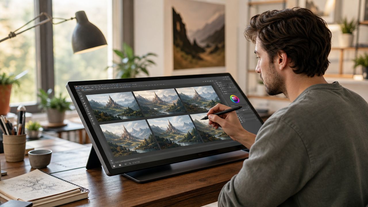
Refinement gets easier when you stop judging the whole image at once. Separate problems. Is the composition weak? Is the subject expression wrong? Is the environment crowding the focal point? Is the style fighting the scene?
If you're working inside a tool with variation and edit controls, a practical reference is this guide on using iteration images to improve your art.
A lot of creators sabotage iteration by changing five things per round. Then they can't tell what improved the image.
Use this troubleshooting pattern instead:
If the scene feels busy
Reduce secondary props, simplify the background, or tighten the shot.
If the subject disappears
Increase subject scale, improve contrast against the environment, or clarify the pose.
If the image feels emotionally flat
Rewrite the action phrase, not just the style words. “Standing in a room” is rarely enough. “Holding a letter she hasn't opened” gives the scene pressure.
If unwanted elements keep appearing
Use negative prompting or exclusion language if your tool supports it, then keep the rest of the prompt stable.
Strong iteration is controlled experimentation, not panic-editing.
A practical sequence is: lock the concept, test composition, then tune style. Don't polish a shot whose story still isn't readable.
Single images get stronger when they imply change. That's where narrative structure helps.
A durable scene model is Goal → Conflict → Disaster, which creates a clear causal chain and avoids static, eventless scenes (Goal, Conflict, Disaster scene model). In image work, you can translate that into visual terms.
Try it like this:
| Narrative beat | Visual question |
|---|---|
| Goal | What does the subject want right now? |
| Conflict | What in the frame prevents that? |
| Disaster | What detail suggests the moment is turning against them? |
Example:
A thief reaching for a jewel is only half a scene.
Add conflict: a guard's shadow crosses the floor.
Add disaster: the display case is already cracked, alarms beginning to flare.
Now the image has momentum.
This framework also helps when you're creating a series of related visuals for a book, campaign, or social post carousel. Each scene can carry a different stage of pressure without repeating the same composition.
A finished image still needs an audience-appropriate handoff.
Save with the platform in mind. Social posts usually reward clean framing and readable focal points at small sizes. Print products need extra attention to edge detail, crop safety, and whether the image still holds up when enlarged. Book-related art needs room for text if it might become cover inspiration later.
Keep a simple export checklist:
For social feeds
Check whether the focal point survives thumbnail size. Tiny faces and subtle gestures often vanish.
For vertical platforms
Make sure the subject isn't trapped too close to the top or bottom edge.
For print or merch mockups
Watch hands, typography areas, and border elements. Those are the first things to break under cropping.
One well-directed scene can produce more than one deliverable.
An indie author can turn it into character art, mood-board material, or cover concept exploration. An Etsy seller can adapt it into digital prints, themed bundles, or niche merch artwork. A social creator can crop the same master image into a teaser, a reveal, and a before-and-after prompt breakdown.
Keep the original prompt, your best variation, and a short note about why that version worked. That gives you a repeatable process instead of a one-off lucky result.
The best scenes don't look “AI-generated.” They look chosen.
If you're ready to put this into practice, starryai lets you generate images from text prompts, explore visual variations, and develop scene ideas into usable creative assets without needing a traditional illustration workflow.