


Written by Mo Kahn on
July 22, 2026


You've got a strong AI image, but it still feels off. The face is clean, the colors are polished, and the style is doing its job, yet the picture doesn't hold your attention. That's usually a composition problem, not a prompt-length problem.
A good composition guide gives you more than photography theory. It gives you a way to tell the model where the eye should go, what should feel dominant, and what should stay quiet. For AI art, that matters because the difference between a random generation and a deliberate visual often comes down to a few words placed with intention.
Starting with subject matter often leads to a flat-looking result. A prompt like “female portrait, neon lighting, cinematic” can produce something attractive, but it still leaves composition to chance. The missing layer is structure, the part that decides whether the image feels like a poster, a selfie, a book cover, or just a nice render.
Most composition advice rarely answers the practical question AI users have, which keywords improve portraits, posters, or book covers. AI prompt guides now recommend phrases like “three-quarter view,” “medium close-up,” and “rule of thirds placement” to create a repeatable base for better images. That shift matters because you're not only describing content, you're directing framing.
Practical rule: if the first version of your prompt produces a technically decent image, the next upgrade should usually be composition, not more style words.
That represents a gap in many classic guides. They talk to photographers holding a camera, not to prompt engineers trying to shape a synthetic image. A composition guide for starryai has to translate visual intent into language the model can use, which means thinking in terms of placement, angle, distance, and negative space.
When you do that, your prompts stop behaving like loose ideas and start behaving like art direction. A selfie prompt becomes a controlled portrait. A character prompt becomes storytelling. A social post becomes something built for instant recognition instead of generic symmetry.
make dating app photos professional is a useful reference if you want a practical reminder of how framing and posture change the feel of a portrait without changing the person. For a broader framework on composition language, starryai's guide to the rule of thirds pairs well with this approach.
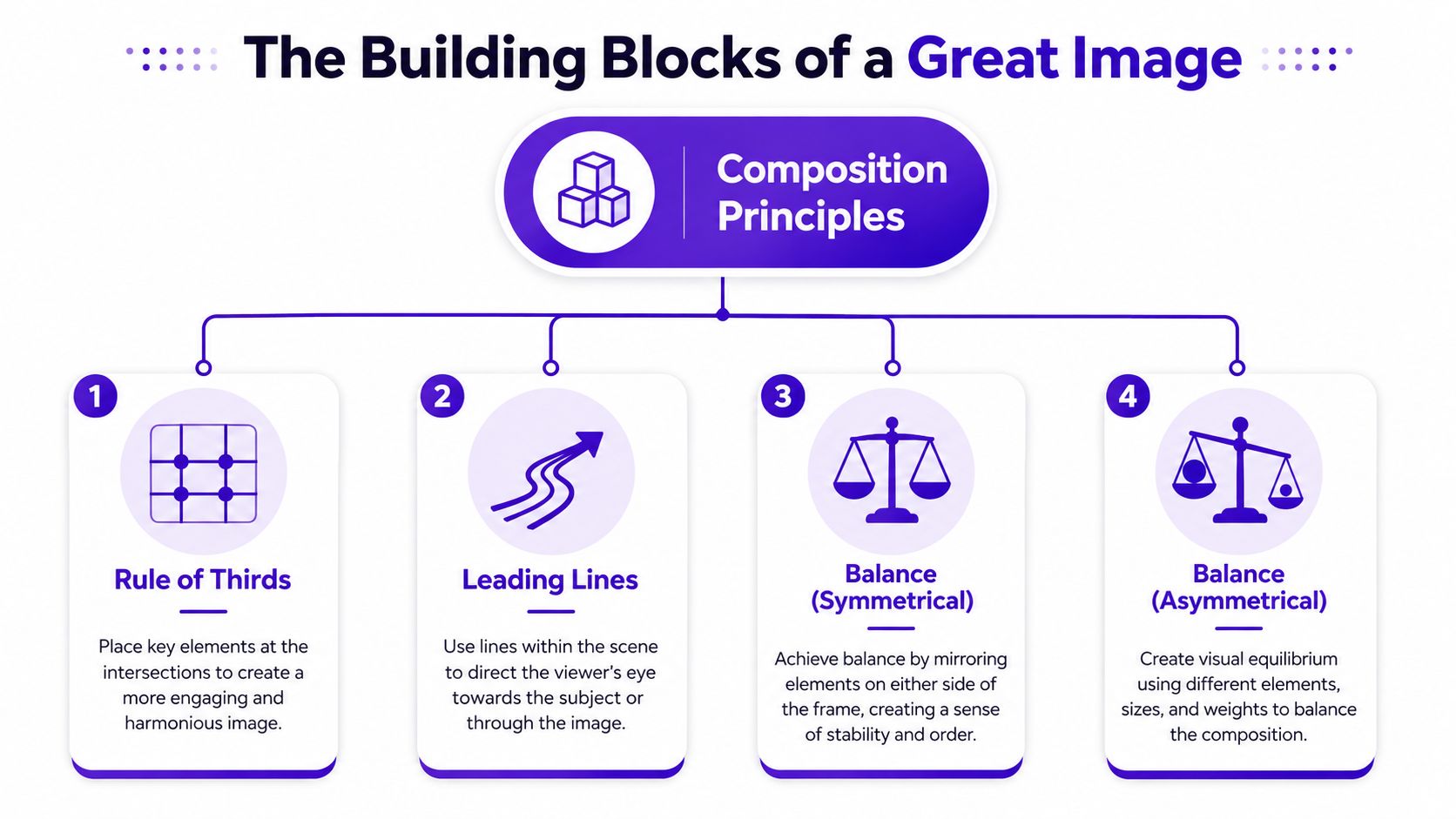
A strong image usually starts with a simple question, where should the viewer look first? In academic writing, a strong historical argument is often supported by at least three distinct pieces of evidence, and visual composition works the same way in practice, because it uses a few stable principles to create clarity and impact UTA historical writing standards. You don't need a dozen rules. You need a small set of reliable ones.
The rule of thirds is the easiest way to move away from a dead-center, static frame. Place the subject near an intersection or along an outer third, and the image usually feels more active and more naturally balanced. That works especially well for portraits where you want the face to feel present without swallowing the whole frame.
Leading lines are the visual paths that pull attention toward the subject. Roads, rails, edges, shadows, and architecture can all do this job. In AI prompts, “leading lines” is useful because it tells the model to build a frame with direction, not just decoration.
Symmetrical balance creates calm and order. It works when you want a centered, formal, or iconic feel. Asymmetrical balance is looser, but it still feels stable because one strong element is counterweighted by another, even if the two sides don't match.
Negative space is the empty area around the subject. It gives the eye room to breathe, and it makes the focal point feel more intentional. In social visuals, this can also leave space for text, icons, or overlays without crowding the image.
A practical way to think about all four is simple. Thirds create motion, lines create direction, balance creates stability, and negative space creates emphasis. If you're trying to shape a polished profile image or a clean character poster, those four ideas do most of the heavy lifting.
A broader visual discussion of when to lean into simplicity also appears in this breakdown of image composition basics. It's especially useful if you're trying to decide whether your image needs more structure or less.

The fastest way to use composition in starryai is to treat it like an art direction layer. You start with the subject, then add framing language, then add camera language, then add mood. That's much stronger than stacking style words and hoping the model invents structure on its own.
A good prompt often reads like a direction sheet, not a shopping list. starryai's prompt-writing guide is a useful companion here because it reinforces the idea that clear descriptive language helps shape the result. Once you understand that, composition keywords become simple levers you can pull.
A basic prompt might look like this, “young woman, studio lighting, elegant portrait.”
A composition-aware version might be, “young woman, medium close-up, three-quarter view, soft studio lighting, rule of thirds placement, shallow depth of field.”
The difference is not just technical. The second prompt tells the model how close the camera is, where the subject sits, and how much the background should matter. That's why the image usually feels more deliberate.
Use the same pattern for other subjects.
Practical rule: if the image needs to work at thumbnail size, say so in the prompt with terms that force a clear focal point and a simpler frame.
You can also layer composition words with subject-specific intent. “Athletic runner at sunrise” feels generic. “Athletic runner at sunrise, low-angle shot, road leading into the horizon, asymmetrical balance” gives the model more structure to work with. The result usually feels less like a random stock image and more like a designed visual.
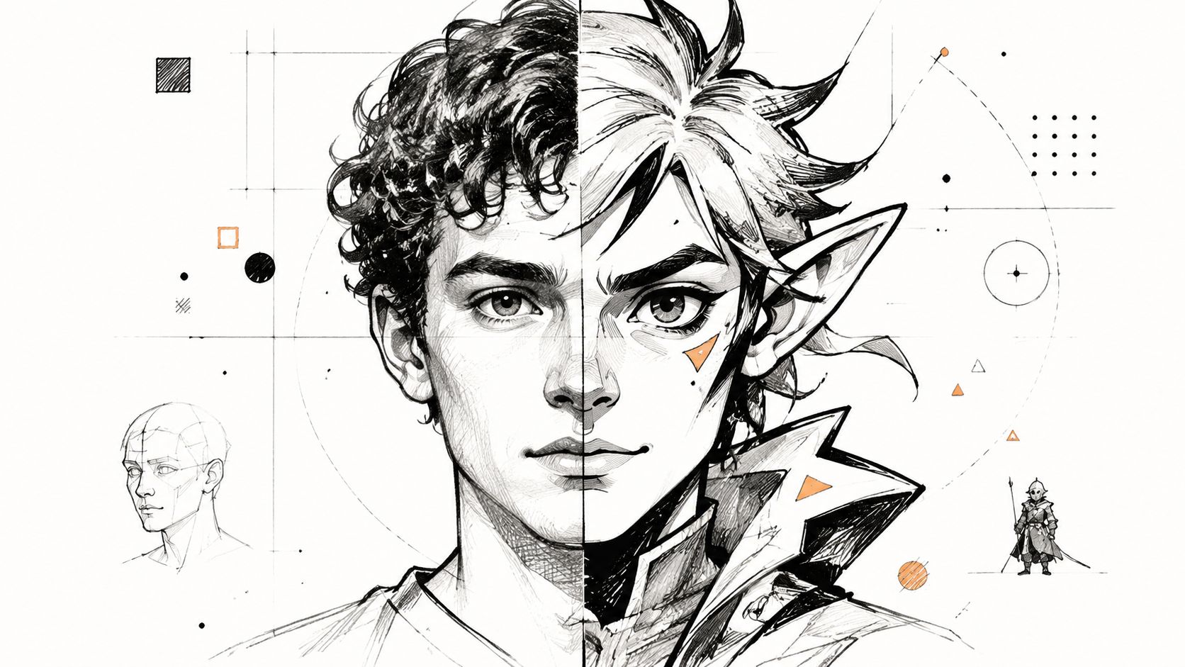
Portraits are where composition becomes personal fast. A selfie prompt can make someone look polished, but the framing decides whether the result feels casual, aspirational, vulnerable, or confident. For social avatars and profile images, medium close-up and three-quarter view are especially useful because they show the face clearly without flattening it.
A prompt like “man, portrait, soft light” is too open. “Man, medium close-up, three-quarter view, soft light, shallow depth of field, clean background” gives the model a much better visual brief. You can do the same for a female selfie, a creator headshot, or a brand profile image without changing the core subject.
Character art works the same way, but the goal shifts from beauty to storytelling. A low-angle shot can make a warrior feel powerful. An intimate close-up can make a mage, rogue, or comic character feel emotionally exposed. If you're building a D&D character, the camera angle often matters as much as the costume details.
Use the image prompt like a personality test. Ask what the frame should say before the viewer reads any lore. A centered, front-facing pose feels direct and formal. A turned shoulder, side glance, or cropped foreground can make the same character feel secretive or alive.
A simple set of prompt moves helps a lot:
For a more visual walkthrough of portrait handling, the embedded reference below helps show how character-driven framing changes tone in practice.
The key is to stop thinking of composition as decoration. It's a storytelling tool. If the pose, crop, and camera position all support the same feeling, the image reads faster and lands harder.
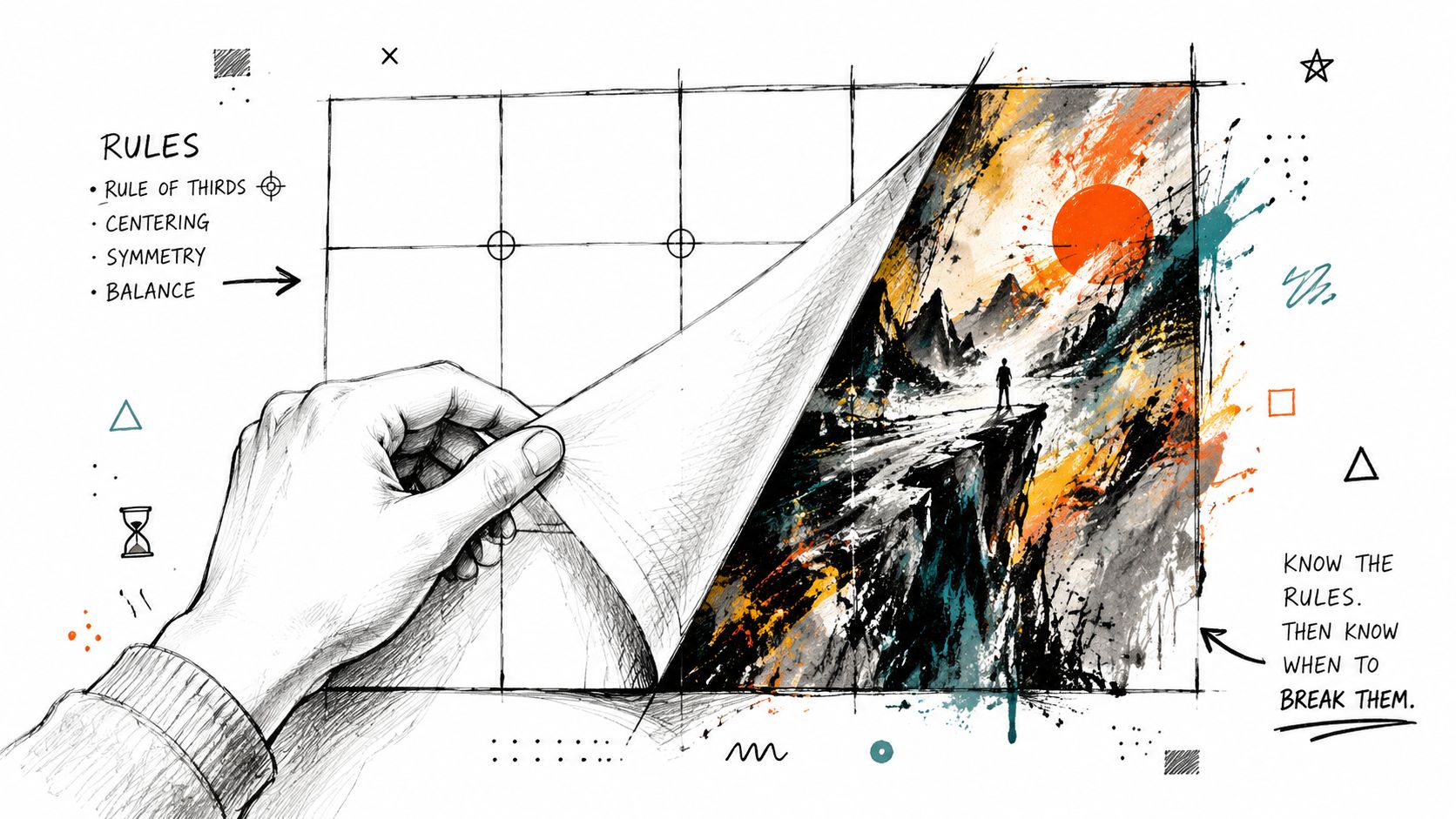
The strongest-looking image is not always the one that follows the classic rule set. Many guides stop short of explaining when symmetry or centered framing outperforms “good composition,” and that matters in mobile and short-form content where people decide in an instant whether to stop scrolling Fred Bohm on framing and composition trade-offs. In those contexts, clarity can beat sophistication.
A centered subject often feels more immediate. It removes hesitation from the viewer's eye, which is useful when the image needs to read quickly on a phone screen. If you're making a profile image, product-style visual, or bold concept piece, the center can be the most efficient place to put attention.
Symmetry works for a similar reason. It creates instant order, and that order can feel powerful, calm, or ceremonial. In AI art, symmetry also pairs well with stylized fantasy, architectural scenes, and iconic poster layouts.
Crowded compositions can be interesting, but they can also bury the subject. If the image has too many competing details, the viewer spends energy decoding instead of feeling the impact. That's why a simplified frame often works better for mobile posts, where the image has to make sense before the user keeps scrolling.
The pertinent question is not “What is the rule?” It's “When does the rule reduce impact?” If rule-of-thirds placement weakens the subject, move it. If negative space makes the image feel empty instead of elegant, tighten the crop. If asymmetry adds clutter, simplify.
Confident prompt writing matters most. Add symmetry when you want formal impact. Add a centered crop when you want directness. Break the rule when the image becomes more legible, more memorable, or more honest that way.
The cleanest workflow is straightforward. First, define the goal. Then choose one composition principle that fits that goal. Finally, write the prompt so the model can use it. That sequence keeps you from stuffing every prompt with every trick at once.
If you want to practice without worrying about cost, the App Store listing says starryai is completely free to use with up to 5 artworks for free every day without watermarks starryai App Store listing. That makes it easy to test how small changes in wording affect framing, balance, and subject emphasis. For aspect and crop decisions, starryai's aspect ratio converter guide is a smart companion.
| Desired Effect | Prompt Keywords to Add |
|---|---|
| Strong portrait focus | medium close-up, three-quarter view, shallow depth of field |
| Dynamic movement | rule of thirds placement, leading lines, off-center framing |
| Calm, formal feel | centered composition, symmetry, balanced layout |
| Open, minimal image | negative space, clean background, simple composition |
| Heroic character art | low-angle shot, strong silhouette, dramatic framing |
| Fast social readability | clear focal point, uncluttered background, vertical framing |
Use the table as a starting point, then adjust based on the job of the image. A selfie that needs polish does not need the same structure as a fantasy cover. The more specific the visual goal, the more useful the composition language becomes.
If you want more control over your next generation, open starryai and test one prompt with a simple subject, then rewrite it with a framing keyword, a camera angle, and a clear balance choice. You'll see very quickly which composition phrases sharpen the image and which ones leave it wandering.


.svg)