

Written by Mo Kahn on
August 6, 2026


You already have the concept. The problem is the color. The mockup looks close, but the palette feels slightly off, the merch sample looks louder than the sketch, and the TikTok cover just doesn't carry the mood you had in mind. That's where a color palette generator saves time, because it turns a messy guessing process into a repeatable workflow you can use across posts, prints, and AI visuals.
A creator can spend an hour nudging swatches around and still end up with a palette that looks right in one place and wrong everywhere else. I've seen that happen with TikTok overlays, ebook covers, sticker sheets, and product mockups, because context changes color fast. A color palette generator cuts that drift by giving you a structured starting point instead of a subjective guess.
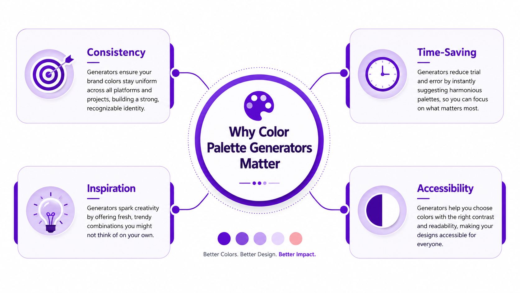
The biggest win is consistency. If you're building a TikTok aesthetic, a merch line, and a cover image, the same palette can anchor all three without forcing you to rebuild the look from scratch each time. That matters even more when you need a stable brand voice across platforms and file types.
The second win is speed. Instead of cycling through color guesses, generators use harmony rules, image extraction, and export-ready values so you can move from concept to a usable palette faster. The payoff shows up when you need to hand off exact hex values to design tools or code.
Accessibility is the part many creators skip until a post flops because the text disappears into the background. The World Health Organization estimates that at least 2.2 billion people worldwide have a vision impairment, and guidance commonly cited in accessibility tools notes that around 1 in 12 men and 1 in 200 women have color vision deficiency. That scale makes accessibility a core requirement, and it is why generators now emphasize WCAG-friendly contrast and colorblind-safe combinations in charts, dashboards, and social graphics. For a deeper look at how broader image workflows connect to palette-driven creative work, the discussion in benefits of using AI image generators for creatives and designers fits naturally here.
A palette that looks beautiful to the designer can still fail the audience if it collapses into near-identical tones on a phone screen.
If you also need data collection around visual trends, best web scraping APIs can help you gather large volumes of inspiration sources before you even open a palette tool. The point is not to automate taste, it is to feed the generator better inputs so your output starts closer to the project brief.
The palette is only as good as the thing you feed into it. A brand photo gives you a different result than a mood board, and a seed hex value gives you more control than both. I choose the input based on the decision I need to make, not on what feels easiest in the moment.
If you already have a clear visual reference, use an uploaded image. That works well for TikTok aesthetics pulled from a photo, a campaign still, or a product shot, because the generator can extract undertones you might not notice by eye. It's especially useful when the source already contains the mood you want, such as muted pastels, neon accents, or earthy neutrals.
If you're still building the visual direction, start with a mood board. A mood board is less about precision and more about pattern recognition. It tends to work best when you're shaping a merch drop, an author brand, or a cover concept where the goal is to capture a feeling rather than match a literal photograph.
If you know the exact color you want, begin with a hex value. That gives the tightest control, and it's the route I use when a client already approved a brand color or when I'm building a palette around one anchor tone. You're not asking the generator to discover the base, you're asking it to extend it into a usable family.
A TikTok creator often gets the fastest results from a reference image, because the visual trend is already baked into the source. An Etsy seller may do better with a mood board, since merch often needs a broader emotional range than a single photo can provide. An indie author or designer working on cover art usually benefits from a seed color when the title, genre, and shelf presence already point toward one core hue.
| Input Source | Best For | Control Level |
|---|---|---|
| Uploaded image | TikTok aesthetics, product photos, visual references | Medium |
| Mood board | Merch concepts, cover art, brand direction | Medium to low |
| Hex value | Brand systems, precise campaigns, design handoff | High |
Practical rule: use the least ambiguous source that still matches the brief. The more vague the input, the more cleanup you'll do later.
For a quick workflow check, tools like Adobe Express can start from a base color, an uploaded image, or the interactive color wheel, while Coolors-style workflows are better when you want rapid exploration rather than strict matching. Adobe Express also includes named harmony modes like monochromatic, complementary, analogous, and triadic, which makes it useful when you want the generator to steer the palette rather than extract it.
Raw extraction is only half the job. A palette generator can pull beautiful swatches from an image, but the result still needs cleanup before it behaves well on a screen, in print, or inside a prompt. I treat extraction like a draft, then refine it until the palette has a clear job.
A technically sound image-based generator often follows a four-step pipeline. First, it resizes the source image so the computation stays efficient, and one research implementation used 200×200 resizing for better computational time and display efficiency. Then it samples pixels into RGB vectors, converts those vectors into a perceptual color space like CIE LAB, and finally applies k-means clustering to group dominant colors. The same implementation also filtered near-duplicate colors before sorting swatches for visual appeal.
That flow matters because the generator is trying to approximate what your eye sees, not just average pixels. If you skip the perceptual step, the palette can skew toward colors that technically exist in the image but don't represent the image's actual feel.
Once the raw swatches appear, I look for three fixes. First, I check whether the palette has too many competing hues. Second, I reduce bright accents if they start shouting over the main tones. Third, I pull the lightness range into a tighter structure so the set feels coherent instead of random.
Work in a perceptual color space, not just a quick RGB edit. That's where the palette starts behaving like a system instead of a screenshot.
Expert guidance commonly recommends constructing seed-based palettes in HSL, HSB, LCH, or OKLCH, then building tonal scales of about 9 to 11 steps across roughly 95% lightness down to 10% lightness with consistent perceptual spacing. The same guidance suggests keeping hue variety to 2 to 3 hues and limiting bright accents to 3 to 4 so the palette stays readable and doesn't turn noisy. I've found that range especially useful for merch and social templates, where too many saturated options can make every layout feel overdesigned.
A good refinement pass removes repetition first. If two swatches are nearly the same, keep the one that gives you better contrast or a cleaner role in the palette. If one accent color looks exciting but doesn't support the rest of the set, cut it early rather than trying to rescue it later.
That same logic is why R-charts' generator is so practical for data work, since it frames palettes as sequential multi-hue, sequential single-hue, and diverging families and lets users copy values as an R vector. The structure matters more than the novelty, because reproducible palettes are easier to reuse across charts, posts, and mockups.
A palette can feel polished and still fail the moment text, buttons, or labels enter the layout. I test contrast before I commit to a palette, because weak pairs are easier to fix while the colors are still in the generator. Once they've been baked into a design system or a merch file, the cleanup takes longer.
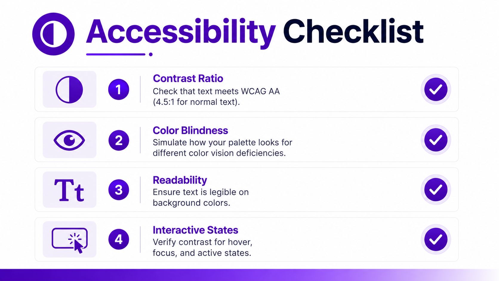
Contrast is the first test. A generator that includes contrast checking lets you compare text and background pairings before they ship, and Adobe Express explicitly offers contrast ratio checks alongside color blindness previews. That combination is valuable because it catches the palette failure modes that are easy to miss on a bright monitor but obvious on a phone or in low light.
Color blindness simulation is the second test. If two colors only work because you can distinguish them by hue, they may collapse for users with color vision deficiency. The World Health Organization and NCBI-based accessibility guidance in the earlier section make it clear why this matters at scale, and generators that preview those differences are doing real work, not cosmetic work.
When a pair fails contrast, I usually shift lightness first instead of changing the hue entirely. That keeps the palette recognizable while making the relationship readable. Changing the hue too early can break the mood, especially if the palette is tied to a brand or a cover concept.
If you're testing a UI-style palette, think about hover, focus, and active states too. Those states often disappear in creator workflows, but they matter the minute you use the palette in a link, button, or sticker pack.
Readability beats cleverness. A palette that survives in motion, in thumbnails, and in small text is more useful than a more decorative set that only works in a hero mockup.
Datawrapper's palette guidance is useful here because it pushes users toward tools built for data visualization, and it even suggests that an LLM can help extend a palette when the base set needs more range. Its Coolors workflow, where you press the space bar to cycle colors and lock the one you want to keep, is a simple way to generate options quickly, but the value comes from testing the output against the audience's actual viewing conditions. For a parallel workflow in image matching, starryai's color match tool can also help extract dominant colors and turn them into a palette inspired by the source image.
Once the palette passes contrast, the work is translation. The same set of colors behaves differently on a TikTok overlay, a screen-printed shirt, and a book cover, so I stop asking whether the palette is “good” and start asking whether it fits the medium. That shift saves a lot of rework.
For TikTok, I usually reduce the palette to a sharper set of roles. One color becomes the background, one becomes the text anchor, and one or two act as accents for stickers, captions, or UI-like overlays. If the palette is too soft, the frame loses energy, but if it's too saturated, the video starts feeling loud before the viewer even reads the caption.
Trending visuals often lean on a strong contrast between a clean base and a vivid highlight. That's where a generator's export-ready hex values are useful, because you can move them directly into thumbnail text, clip overlays, or editing templates without second-guessing the exact shade.
Merch design is less forgiving. Screen printing, embroidery, and packaging all punish palettes that rely on tiny shifts in tone, because the medium compresses nuance fast. I simplify aggressively here, keeping only the colors that survive on fabric, paper, or vinyl.
If you're designing for apparel or product mockups, try the palette on both light and dark garment colors before finalizing it. A shade that looks strong on white can disappear on cream, and a dark accent that reads beautifully on-screen may go muddy in print. For movement-based promotion and background-driven content, top green screen clips can also give you a stronger environment for testing how a palette performs inside a real TikTok frame.
Book covers and other cover art need the palette to do two jobs at once. It has to signal genre or tone, and it has to stand out in a crowded grid or shelf view. That's why I often keep one bold anchor color and let the rest of the palette support hierarchy rather than compete for attention.
The best cover palettes usually feel simpler than they look in the generator. You want enough variation to create depth, but not so much that the title gets lost in a decorative haze. A palette built from a seed color can outperform a purely extracted one, because the base tone keeps the composition pointed in one direction.
A palette only matters if it survives the jump into generation. That's the point where a lot of creators lose control, because they describe the mood but forget the actual colors. I get better results in starryai when I write the palette into the prompt as specific color intent, not just as an abstract vibe.
The easiest workflow is to move from palette generator to prompt with the core colors named clearly. If your palette includes a deep violet, a pale lilac, and a warm neutral, write that directly into the prompt so the model has a color structure to follow. The more specific the color references, the less the output drifts into generic aesthetic territory.
A useful pattern looks like this, though the exact wording should match your brief:
The same palette can produce very different results depending on whether you're generating a selfie transformation, a character concept, or a merch mockup. That's why I separate “palette language” from “subject language.” The subject stays stable, but the palette shifts the atmosphere.
If you want a deeper refresher on prompt control, the workflow guidance in how to use an AI image generator pairs well with color-driven prompting. For apparel or merch visuals, an AI clothing model generator can be useful when you need the palette to appear on a garment rather than in a flat mockup.
When I'm moving from extraction to generation, I save the exact hex values alongside a short color description. That makes it easier to reuse the palette across posts, print files, and prompt iterations without reinterpreting the colors every time. If the palette started from a photo, the output often feels more atmospheric. If it started from a seed color, the output usually feels more controlled. If it came from a mood board, it tends to land somewhere in between.
The practical advantage of starryai here is simple, it can use those color references as part of a creative prompt instead of treating the palette as an afterthought. Once you've built a palette you trust, test it in a few prompt variants, then keep the one that holds the color intent most cleanly.
If you're ready to turn a palette into visuals that match your brand, visit starryai and try building from a palette you've already refined. It's a fast way to carry your colors from inspiration into finished imagery without losing the look you planned.


.svg)