


Written by Mo Kahn on
September 21, 2026


A color grade isn't a finishing touch. It changes the story people think they're seeing. The same selfie can read dreamy, energetic, nostalgic, dramatic, or sharply professional depending on the palette, contrast, and shadow behavior, which is why modern color grading samples work best as creative references instead of one-size-fits-all presets. That idea lines up with how color evaluation evolved from the CIE's 1931 XYZ color space through CIE Lab in 1976, then later ICC color workflows and the ΔE00 formula, all of which helped make color comparison more repeatable across imaging workflows in the first place (history of standardized color measurement).
This before-and-after guide treats seven looks as choices with consequences. Each one includes mood tags, visual behavior, best-fit content, source-photo requirements, likely drawbacks, and a quick way to apply the look in starryai when that makes sense.
If you also care about how color holds up beyond social posting, it's worth understanding ICC profiles for DTF printing, because the same “looks great on my phone” problem shows up fast once you move into physical output.
Mood tags: soft, wistful, airy, fantasy, intimate.
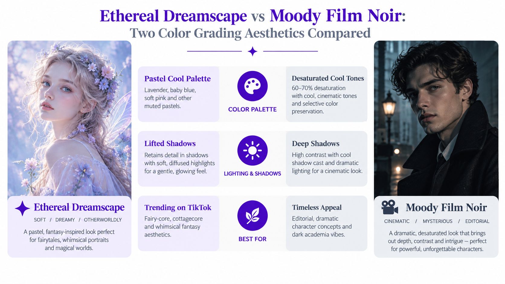
This look works by relaxing contrast instead of chasing punch. Blacks lift, cool hues drift toward pale blue and lavender, and skin takes on a soft bloom that makes an ordinary front-camera selfie feel more styled than captured. If your feed leans wellness, poetry, romance, indie fantasy, or gentle transformation content, this is one of the easiest color grading samples to repeat without making every post look identical.
The strongest source images are simple. Open shade, window light, cloudy outdoor light, and uncluttered backgrounds all help. Busy interiors usually fight the haze, because soft grades don't hide visual clutter. They spread it.
The emotional trick here is lowered visual friction. Hard edges feel less aggressive, shadows stop competing with the face, and pastel drift creates distance from reality without going fully surreal. For TikTok fairy edits, soft character portraits, and dreamy beauty content, that's exactly the point.
Soft grades flatter emotion before they flatter detail.
When I use this kind of look on selfies, I avoid heavy texture in clothing and high-contrast backgrounds. Denim seams, patterned wallpaper, and mixed household lighting tend to break the illusion.
A practical starryai move is to start with a clean selfie, then nudge the mood with light fantasy prompt language or subtle emoji cues rather than piling on effects. The more restrained the prompt, the more usable the result stays for recurring social posts.
Mood tags: electric, bold, nightlife, digital, confrontational.
Some looks ask viewers to slow down. This one interrupts scrolling. Neon Cyber Pulse pushes magentas, blues, and shadow depth until the face becomes part portrait, part poster. For gaming creators, alt-style selfies, cyber merch promos, and profile graphics, it creates instant feed separation.
Start with the visual comparison first.
This grade depends on contrast discipline. Dark backgrounds help the neon read as intentional. Pale indoor walls often turn muddy because the color has nowhere dramatic to land. Angled light across the face also helps, since flat frontal lighting can make high saturation feel cheap instead of cinematic.
Neon grading compresses subtlety. It makes a simple expression feel sharper, more performative, and more current. That's useful when the goal is visibility, not realism.
A recent benchmark on video color grading argues that pixel-perfect matching to a single expert reference isn't the right main test for grading quality, and instead judges looks with perceptual and grading-specific criteria like color harmony, tonal range, and skin-tone naturalness on a 1 to 10 scale (grading quality beyond simple image difference). That's exactly why this look should be judged by whether it feels convincing, not whether it preserves every original color relationship.
Here's a useful walkthrough if you want more visual context before applying a cyber look.
Mood tags: inviting, flattering, sunny, optimistic, personal.
Golden Hour Warmth wins on repeatability. It is less a preset than a positioning choice. Use it when the goal is trust, ease, and visual consistency across selfies, reels covers, and casual brand posts.
It shifts a photo in three useful ways at once. Skin reads healthier. Midtones feel friendlier. Background clutter softens because warm highlights and gentler contrast pull attention back to the face. That combination works well for coaches, skincare creators, travel posts, founders, and anyone building a personal brand that needs polish without distance.

The trade-off is softness. Golden warmth can make an image more likable, but less sharp in attitude. If the post needs edge, luxury tension, or high-fashion cool, this look can feel too agreeable.
Best use: Choose this grade when you want the audience to feel close to you within a second of seeing the image.
A good source photo still matters. Window light, open shade, late-afternoon outdoor light, beige interiors, wood, plants, and neutral clothing all give this look room to breathe. Mixed office lighting, green cast from cheap fluorescents, or heavy blue bounce usually fight it. In those files, warming the image often makes skin go orange before the scene feels sunlit.
For selfies, the application is simple but not mindless:
In starryai, outdoor language and sunset-adjacent prompts usually produce cleaner results than dramatic fantasy wording. The target is believable warmth, not spectacle.
Mood tags: cinematic, tense, editorial, mysterious.
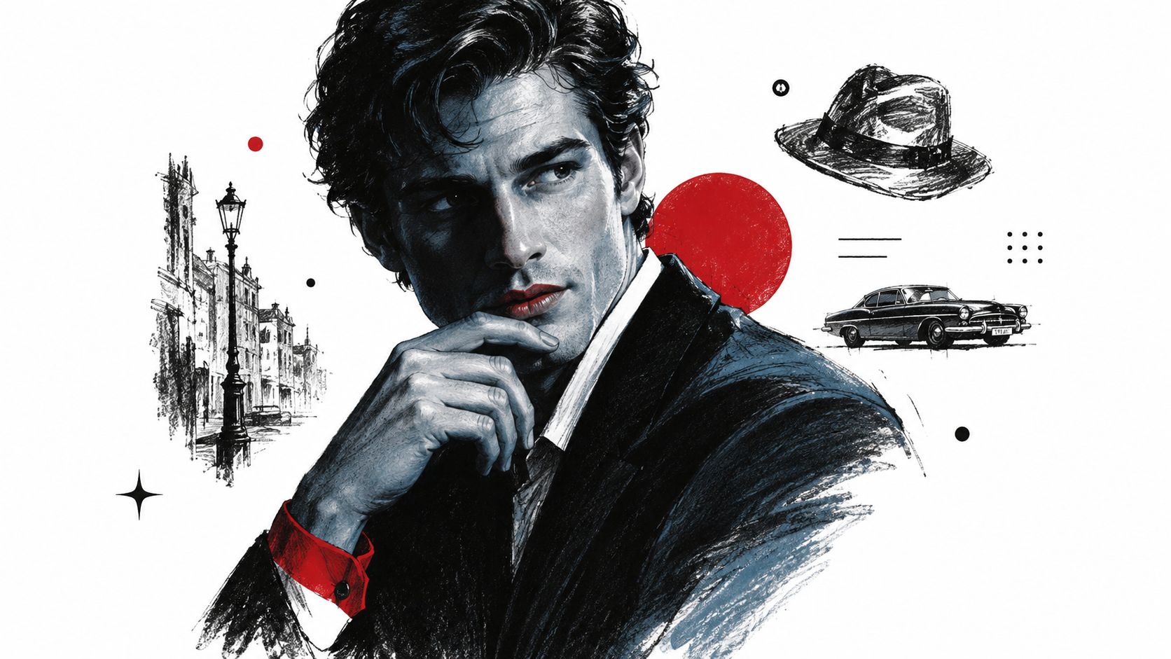
Moody Film Noir strips away friendliness and replaces it with intent. Saturation drops, shadows deepen, and the face gains sharper narrative weight. For thriller authors, gothic creators, dark academia accounts, and dramatic promo art, it can turn a plain portrait into something with implied backstory.
The source image matters more here than with warm looks. Flat light won't magically become noir. You want directional light, visible shadow shape, and a face that already has some contour before the grade starts.
Noir works because it edits attention. The eye goes to highlight placement and expression first, not color richness. That means clothing, pose, and negative space become part of the grade's success.
An image-grading benchmark for conditional color grading notes that established grading datasets often span only 50 to 200 samples, and uses CIEDE2000 color difference alongside other measures to judge closeness to a target look (benchmark discussion of grading datasets and ΔE use). In practice, that's a reminder that strong color grading samples aren't about random experimentation. They're about getting repeatably close to an intended mood.
If the original selfie has a color cast or uneven balance, clean that before pushing style. starryai's AI Color Correction Tool is relevant here because noir falls apart fast when the base image is already fighting mixed lighting.
A dramatic grade should hide distractions, not hide the subject.
Mood tags: playful, sweet, polished, trend-forward, youthful.
Pastel Pop Candy changes the social read of an image fast. Faces feel friendlier, products feel lighter, and the whole frame starts to signal curation rather than realism. That makes it less of a preset choice and more of a branding decision.
It sits between Ethereal Dreamscape and Neon Cyber Pulse in a useful way. Dreamscape softens reality into haze. Neon pushes contrast and synthetic color. Pastel Pop keeps edges readable, keeps the mood upbeat, and shifts the palette toward pinks, peaches, mint, lilac, and powder blue. For selfies, that usually means clearer eye contact and a softer first impression. For social posts, it makes carousels, thumbnails, and story graphics feel coordinated without looking flat.
Source quality matters more here than creators expect. Pastels show color contamination quickly. Green from a nearby wall, orange from tungsten bulbs, or blue window spill can turn a clean candy palette into dull gray. Soft daylight, even exposure, and simple backgrounds give this look room to work. Busy patterns usually fight it.
A second trade-off is skin. Push the grade too far and skin loses blood flow, especially on cheeks and lips. Pull it back and the image can drift into plain bright editing with no identity.
A good pastel grade makes color look chosen. A bad one makes skin look powdered out.
Use this look when the subject already supports it. Cute outfit selfies, beauty content, stationery, soft-launch product shots, spring drops, birthday posts, and YA-coded character visuals all benefit. It is weaker for gritty street scenes, heavily shadowed interiors, or any portrait relying on strong texture and edge contrast.
For repeatability, start before the edit. Pick one dominant pastel, one support color, and one neutral. Wardrobe should carry at least one of them, and the background should avoid competing saturation. If you need help planning those combinations, starryai's color palette generator for matching wardrobe and background choices is useful before you grade.
Three habits keep this look consistent:
Pastel Pop works best as a controlled system. Once the palette, lighting, and skin treatment are stable, it becomes one of the easier looks to repeat across selfies and feed posts without every image feeling copied.
Mood tags: nostalgic, earthy, mellow, analog, grounded.
Desert Dust Vintage works best when the goal is permanence. It lowers color noise, shifts the frame toward ochre, clay, tan, and faded brown, and makes a post feel collected rather than posted on impulse. Among color grading samples, this is the look I'd pick for creators who want a feed to age well instead of chasing short-cycle trend color.
What changes first is tonal behavior. Highlights soften instead of glowing. Midtones carry most of the mood. Shadows usually stay open enough to preserve fabric grain, wall texture, dust, wood, and skin detail. That balance is why the look reads as worn-in instead of artificially “retro.”
A strong desert vintage grade makes the frame feel sun-aged, not filter-coated.
It suits source photos that already have dry warmth in them. Late afternoon selfies, travel portraits, denim, leather, linen, stucco walls, roadside scenes, faded storefronts, and low-sheen interiors all respond well. It is much weaker on blue-heavy city nights, glossy beauty close-ups, and cool LED rooms where the brown shift can turn dull fast.
For social posts, the trade-off is speed versus control. This grade is forgiving across a carousel because muted colors clash less from image to image. It is less forgiving on skin than people expect. Push too much yellow into the mids and faces go sallow. Crush contrast too hard and the “vintage” feel turns heavy.
Here's the repeatable part I use for selfies and lifestyle posts:
Start with the source, not the preset. Warm neutrals in clothing help more than strong accent colors. Beige, rust, cream, faded blue, olive, and worn black usually grade cleanly. Bright magenta, saturated aqua, and sharp LED greens fight the look.
Then shape the image in this order:
Creators who want a faster starting point can test a vintage-style filter for dusty, analog color direction, then refine the warmth and contrast so every frame doesn't collapse into the same brown wash.
This grade earns its place on evergreen assets. Profile photos, travel recaps, artisan product shots, café content, bookish portraits, and retro-leaning brand posts all benefit from the settled mood. It is less useful when the image needs crisp modern energy, clean whites, or high-chroma product accuracy.
Mood tags: modern, sleek, detached, editorial, tech-forward.
Icy Cool Minimalist is the opposite of golden hour comfort. It brightens whites, leans into cyan and silver, and trims emotional warmth on purpose. That controlled coolness works for fashion, SaaS branding, design creators, minimalist interiors, and polished professional portraits that need a contemporary edge.
The look is clean, but it isn't universally flattering. It can make skin appear tired if the source image already lacks warmth or if overhead light creates under-eye shadows. Good exposure and simple composition matter more than dramatic styling.
This grade is strong when the content itself should feel precise. Product-focused posts, modern portfolio shots, founder portraits for clean brands, and editorial-style selfies all benefit from the slight emotional distance. It tells viewers the image is curated, not casual.
A useful real-world concern here is cross-platform consistency. Independent coverage of projected 2026 corporate and ad workflows highlights the need to match mixed sensors first, then check brand colors against hex values or vectorscope references, with deliverables often expected to hold across HDR10, P3-D65, Rec.709, and sRGB variants (projected mixed-format workflow guidance). That's especially relevant for cool minimalist grading, where small hue shifts can make whites and brand accents drift noticeably.
| Preset | 🔄 Implementation Complexity | ⚡ Resource Requirements | ⭐ Expected Outcome | 📊 Ideal Use Cases | 💡 Key Advantages |
|---|---|---|---|---|---|
| Ethereal Dreamscape | Low–Moderate; soft haze & selective color lifts | Low; works on single selfies; natural lighting preferred | ⭐⭐⭐ Dreamy, editorial polish with softened details | TikTok fairy‑core, fantasy portraits, wellness/beauty socials | Flattering skin tones; whimsical/fantasy mood; editorial feel |
| Neon Cyber Pulse | High; heavy saturation and shadow color shifts | Medium–High; benefits from dark backgrounds and preview testing | ⭐⭐⭐⭐ Bold, high‑impact visuals that grab attention | Gaming/cyberpunk art, viral TikTok, merchandise visuals | Maximum color pop; viral/standout aesthetic; strong visual contrast |
| Golden Hour Warmth | Low; warm cast and subtle shadow lifts | Low; broadly forgiving across lighting conditions | ⭐⭐⭐ Natural, sun‑kissed warmth and flattering tones | Lifestyle, beauty, travel, professional headshots | Universally flattering; organic, approachable energy |
| Moody Film Noir | Moderate–High; contrast and selective desaturation | Medium; best with high‑contrast source images | ⭐⭐⭐⭐ Cinematic, mysterious, editorial quality | Noir/thriller book covers, dramatic character concepts, indie games | Timeless cinematic mood; sophisticated and dramatic |
| Pastel Pop Candy | Low–Moderate; balanced pastel saturation | Low; ideal for casual selfies and playful comps | ⭐⭐⭐ Trendy, shareable, cute aesthetic with preserved skin warmth | TikTok cute/cottagecore, Gen‑Z merch, YA covers | Highly shareable; cohesive pastel harmony; youth appeal |
| Desert Dust Vintage | Low; muted earth tones and slight vignette | Low; minimal tuning for vintage look | ⭐⭐⭐ Nostalgic, retro warmth with faded authenticity | Retro fashion, travel, vintage‑style prints, period pieces | Authentic vintage feel; timeless for nostalgic content |
| Icy Cool Minimalist | Moderate; cool cast and high‑contrast control | Medium; requires testing across skin tones | ⭐⭐⭐ Clean, modern, clinical minimalist aesthetic | Tech/SaaS branding, high‑fashion editorials, contemporary art | Professional, tech‑forward identity; crisp minimalist clarity |
The strongest color grading samples start with intent, not with a filter menu. Use Ethereal Dreamscape or Pastel Pop Candy when the post should feel soft, playful, or lightly fantastical. Use Golden Hour Warmth when you want people to trust the face on screen quickly. Go with Neon Cyber Pulse when attention matters more than realism, Moody Film Noir when the image needs tension and narrative weight, Desert Dust Vintage when you want staying power, and Icy Cool Minimalist when the brand should feel precise and contemporary.
A simple review pass keeps most mistakes out of your feed:
That consistency question isn't theoretical. In other grading systems, representative sampling and comparison standards are built directly into the workflow. USDA cotton classification rules require a sample to be freshly drawn and representative, with two portions, one from each side of the bale, each at least 6 inches wide and about 12 inches long, and only one sample per bale may be submitted except for review classification (USDA cotton classification rules). Different field, same discipline. You need a dependable reference if you want dependable judgments.
Before publishing, compare your before-and-after versions side by side in starryai. That small pause usually catches the two biggest problems. A mood that's stronger than the content, and a style that doesn't repeat well across the next post. If you want extra help shaping the overall feel around wardrobe and setting, you can also explore charcoal grey pairings for lifestyle.
starryai gives you a practical way to turn selfies, text prompts, and simple aesthetic ideas into finished visuals without building every grade by hand. If you want to test dreamy, warm, noir, vintage, or tech-cool directions on your own photos, visit starryai and compare a few looks before you post.


.svg)