

Written by Mo Kahn on
August 2, 2026


You open the prompt box, type something like “female ranger, fantasy style,” and the first result looks good enough to keep. Then you ask for a second angle, a cleaner outfit, and a version for a book cover, and suddenly the face changes, the boots shrink, and the silhouette no longer matches. That's the pain point with a character concept art generator, not making one nice image, but keeping the same character alive across dozens of outputs without drifting into a new person every time.
A character concept art generator only stays useful when the brief does some of the heavy lifting first. Otherwise, the first pass may look promising, but later variations start drifting, the jaw changes shape, the armor reads differently, or the color balance shifts enough that the character feels like a cousin instead of the same person. I treat the planning stage as the part that protects consistency across a whole set of outputs, especially when the goal is a reference that can survive dozens of iterations without becoming a new design every time.
Write the anchor before you open the generator. Put the character name, role, age range, facial structure, silhouette, key materials, and a fixed palette into a short brief, then decide what has to stay visible no matter how the pose or camera angle changes. If the character is for a book cover, game avatar, or merch art, that use case changes how busy the design can be, how readable the silhouette needs to be, and how much detail still works at small size.
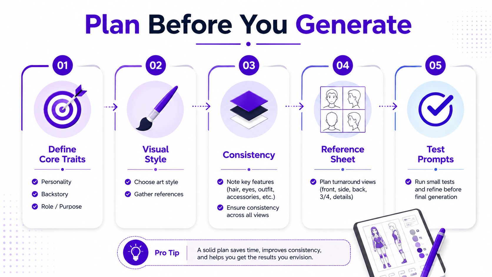
A simple template keeps the work grounded:
That list is basic on purpose. It gives the generator fewer chances to improvise on the parts that matter most, and it saves cleanup later when you need the same character to hold together across a sequence. A small sponsor note that fits here is World Anvil brand sponsors, since worldbuilding tools often help creators stabilize character details before they generate anything.
Practical rule: if you can't describe the character in five lines, the generator is going to fill the gaps for you, and it won't always make the same choice twice.
I also check the planned visual rhythm before generating. A reference like starryai's fantasy character concept art guide helps keep the brief tied to the final use case instead of drifting into random aesthetics, which matters more when the character needs to hold up through revisions, alternate outfits, and angle changes.
A strong prompt doesn't read like a pile of adjectives. It reads like a compact art direction note, where each phrase controls one part of the image and doesn't fight the others. The difference shows up immediately when you compare a vague prompt like “cool warrior in fantasy armor” with a prompt that pins down expression, stance, materials, lighting, and style direction.
Start with the subject and personality, because that's the part most likely to drift if you leave it abstract. Then add pose and body language, clothing and accessories, lighting and mood, and finally the art style. The order matters because the model tends to anchor on the earliest useful description, then use later modifiers as finishing instructions.
A practical structure looks like this:
Weak prompt: “Female warrior, epic fantasy, detailed, cool lighting.”
Stronger prompt: “A disciplined shield-bearer with a tired face, squared shoulders, worn leather armor, a short cloak, and a chipped round shield, standing in three-quarter view under cold side light, painterly fantasy concept art, clean silhouette, muted earth tones.”

Contradictory instructions are where a lot of prompts collapse. If you ask for “minimalist” and then stuff in seven accessories, the model usually ignores the restraint, not the clutter. The cleaner move is to describe the one or two things that must dominate, then leave out the rest.
Negative prompting helps too, especially for common artifact cleanup. Excluding extra limbs, merged clothing layers, duplicate eyes, mismatched iris colors, and broken hands keeps the generator from wasting outputs on technically impressive but unusable renders. If a prompt result looks dramatic but breaks identity, discard it. The image has to serve the character, not the other way around.
For a more detailed prompt breakdown, the internal guide at starryai's character art prompt generator is a useful companion, because it emphasizes the same parts that tend to survive repeated generation: identity details, signature traits, pose, lighting, and style.
For character work, start by choosing the model that stays consistent under revision. Gallery samples can look impressive, but production use depends on whether the model keeps facial structure, costume details, and body proportions stable across repeated generations. A model that gives you a striking first frame but shifts the character every time you adjust the prompt creates more cleanup than value.
A book cover can tolerate more painterly rendering and stronger mood. A game asset or avatar usually needs cleaner linework, clearer shape separation, and fewer decorative flourishes that blur the silhouette. Photorealism can still fit social media content, but it raises the bar for skin, hands, and facial symmetry, so the output has to be tighter before it feels usable.
A comparison point that matters for character design is the 2026 benchmark that scored models across 19 prompts. It reported GPT Image 1.5 at 4.61, Nano Banana Pro at 4.42, and FLUX.2 Pro at 4.40, while noting FLUX.2 Pro at $0.035 per image and describing it as 74% cheaper than GPT while staying within 5% of its score. The same benchmark also reported that GPT Image 1.5 refused 4 of the 19 prompts involving combat or weapons, which is a reminder that content rules can determine whether a model fits fantasy or game art at all, not just how polished the result looks. The benchmark is from VibeDex's 2026 character design review.
Resolution and aspect ratio shape the design decisions that survive into production. A tall frame can exaggerate height and posture, while a square crop often hides lower-body choices you need for a full character sheet. Style presets help when speed and repeatability matter, but freeform prompts give more control when the character needs a distinct visual identity.
| Model | Average Score | Cost per Image | Combat/Weapon Prompt Refusals |
|---|---|---|---|
| GPT Image 1.5 | 4.61 | Not stated in verified data | 4 of 19 prompts refused |
| Nano Banana Pro | 4.42 | Not stated in verified data | Not stated in verified data |
| FLUX.2 Pro | 4.40 | $0.035 | Not stated in verified data |
The right model is the one that fails in the least disruptive way for your project. If you need weapons, armor, or other sensitive fantasy elements, test that first instead of discovering the refusal after the whole prompt system is already built.
For character workflow design in starryai, the practical move is to test one settings combination for portrait work and another for full-body sheets, then keep the setting that preserves proportions best. A lot of creators also benefit from prompt refinement tools like the ones Krea describes, because they push you to specify age, style, outfit, mood, setting, camera angle, materials, palette, and lighting direction in a more disciplined way. starryai can sit in that same workflow as a prompt-driven character generator, but the win still comes from the clarity of the brief and the consistency checks around it, not from the button you click.
Teams looking for practical workflow optimization guides can use the same mindset here. Test one model for face stability, another for costume fidelity, then keep the setup that survives repeated edits without drifting. For consistency checks, starryai's character consistency AI is a useful reference point for how to hold onto identity details while you vary pose, framing, and styling.
The first image is rarely the keeper. Good character design usually comes from comparing a batch of outputs, choosing the ones that stay faithful to the identity, then using those as the new reference set. That takes more time than chasing a single perfect render, but it gives you a character that holds together across later passes.
A useful benchmark for this workflow is the recommendation to make 8 to 12 variations per iteration, then select 2 to 3 winners that preserve face and silhouette before generating 4 to 8 variations for each asset category. The goal is to separate identity stability from surface polish, not to generate volume. A flashy image can still be the wrong character.

My own curation rule is simple. If the face shape, hair mass, and body silhouette match the brief, the image stays in the running. If the render looks exciting but the nose bridge changed, the costume added the wrong collar, or the stance contradicted the character's established posture, I drop it immediately.
Practical rule: choose the boring image that still looks like your character over the exciting image that looks like somebody else.
That branch-and-compare mentality lines up with the workflow advice in practical workflow optimization guides, because the bottleneck is usually not generation speed, it's decision quality. If your review pass is sloppy, the whole reference chain gets noisier with each round.
The embedded demo below is worth watching with that lens, since the skill lies in making an image, comparing it, refining it, and repeating.
Upscaling too early just makes the wrong details sharper. I wait until the character's face, clothing relationship, and silhouette are stable, then upscale the version that already earned its place. That's the one you want for social media assets, print-ready merch, or a polished concept sheet.
The difference between a temporary concept and a reusable asset is usually in the last pass, not the first. If the generator keeps losing a belt layer or changing the neckline, fix the prompt before you spend time increasing resolution. For a consistency-focused reference, starryai's character consistency guide pairs well with this method because the challenge is keeping the same design legible across repeated generations.
Even a solid character image usually needs cleanup before it can move into a real workflow. Concept art for 3D reconstruction, storyboard handoff, or merch production has to survive more than one context, and that means the image needs to stay readable when it's cropped, scaled, or separated into layers. A pretty render with messy boundaries isn't enough.
For 3D pipelines, shape cues matter a lot. The CharNeRF paper shows a concept-art image can be turned into a usable 3D character representation by estimating geometry from the artwork and then optimizing an appearance field, and it reports better results than prior baselines on rendered 2D images of characters, with participants preferring its reconstructions over the comparison methods. The technical takeaway is straightforward, if the concept art has a clean silhouette, separated materials, and a readable front-facing structure, it gives the reconstruction stage much better information to work with. You can read the paper directly in CharNeRF's PDF.
Busy accessories and merged clothing layers cause trouble later. A cloak that melts into the torso, a belt that disappears into armor, or a hairstyle that obscures the skull outline can all make the character harder to rebuild, repaint, or separate into layers. I always check the thumbnail view first, because if the silhouette isn't legible there, it's already too noisy for serious production use.
File hygiene matters more than many creators admit. Save a clean master, a flattened presentation version, and any transparent-background assets separately so you're not re-cutting the same character every time a new project starts. Basic color correction also helps, because AI renders often benefit from a final unification pass that keeps the palette consistent across a series.
Character generation products are also starting to package more than a single image. CharacterGen, for example, says it can produce turnarounds with front, side, and back views, expression sheets with 6 to 8 expressions, and pose references with 5 to 10 common poses, with timing estimates of about 30 seconds for text or image input, 2 to 3 minutes for generated turnarounds and reference sheets, and about 1 minute for export to PNG, JPG, or PDF. Those timings are from CharacterGen's product page, and they show how production-oriented these tools are becoming.
A final note for handoff. If the output is meant for animation, 3D modeling, or print, don't treat the generator as the finish line. Treat it as the source image that needs a clean archive, because later revisions are much easier when you can find the exact version that established the character.
A beautiful character concept is not automatically a safe asset to sell. That's the gap most tutorials skip, and it matters whether you're publishing a book, printing merch, or delivering files to a client. Generation speed solves one problem, but it doesn't solve ownership clarity, revision control, or provenance.
Different platforms handle commercial use differently, and the terms can change, so the first habit is to read the tool's current usage policy before you build a business process around it. Some tools allow commercial use broadly, some tie it to a paid plan, and some make generated images public by default on free tiers. That affects whether your work is usable in private client pipelines, storefront listings, or branded campaigns.
The bigger issue is distinctiveness. If a character looks too close to an existing franchise, celebrity likeness, or recognizable style package, commercial risk rises fast. That's why I keep provenance notes for each project, including the prompt version, reference set, revision path, and final selection rationale. Those notes don't eliminate risk, but they do give you a paper trail when a client asks how the asset came together.
A lot of creators assume that if they can generate a strong image quickly, the file is ready for resale. That assumption doesn't hold up. What matters is whether the character stays stable across edits, whether the source material is documented, and whether you can explain what changed between the first draft and the final asset.
Fast generation is not the same as production-ready IP.
That's especially true for indie authors, Etsy sellers, and game makers, because the same character often needs to appear on a cover, a banner, a mockup, and a social post. If you can't prove which version was approved, the project gets messy fast. Keep a dated folder structure, store reference images with the prompt text, and avoid overwriting the master files.
The other practical takeaway is simple. Before you sell anything, confirm the tool's commercial-use language, save your prompt history, and keep your edit trail clean enough that another human could reconstruct the decision path if needed.
The fastest way to make a character system useful is to adapt it to the job. A book cover character needs different lighting and framing than a tabletop RPG avatar, and a merch-friendly mascot needs a cleaner silhouette than either of them. The same core structure still works, but the emphasis changes with the audience.
Use this when the character has to sell genre and mood at a glance.
Prompt: “A weary swordmage with a guarded expression, elegant but weathered coat, narrow shoulders, subtle arcane markings, three-quarter view, dramatic rim light, stormy background, painterly fantasy concept art, strong silhouette, cinematic book cover composition.”
Suggested settings: portrait framing, higher contrast, restrained background detail, and a style preset that leans painterly rather than photoreal.
Use this when the design has to survive multiple sheets and action poses.
Prompt: “A confident rogue with a compact athletic build, asymmetrical leather armor, short cape, visible dagger harness, sharp eyes, dynamic stance, neutral studio-like lighting, fantasy concept art, clear facial structure, readable full-body silhouette.”
Suggested settings: full-body framing, moderate detail, and prompt emphasis on consistency over atmosphere.
Use this when printability matters more than drama.
Prompt: “A cheerful fox mascot in a simple jacket, clean outline, limited color palette, centered composition, front-facing pose, graphic character art, crisp silhouette, minimal background, merch-ready design.”
Suggested settings: square framing, simplified props, and fewer competing textures.
Use this when the figure has to repeat across formats.
Prompt: “A friendly brand mascot with a distinct hairstyle, bright but limited palette, approachable expression, clean shapes, vector-inspired character art, adaptable to post graphics, story frames, and profile assets.”
Suggested settings: consistent aspect ratio, simple backgrounds, and a fixed prompt template that only swaps season, pose, or accessory.
If you want a direct place to start, starryai can generate and customize AI characters from text descriptions, which makes it a practical fit for quick concept passes when you already know what the character has to be.
If you're building a character system for a book, game, or merch line, start with one locked brief and turn it into a repeatable prompt set instead of chasing one-off images. Try starryai on a single character this week, then push that design through multiple angles and uses so you can see where your consistency breaks first.


.svg)