
Written by Mo Kahn on
July 1, 2026


You got a great character render. The face is right, the outfit clicks, the mood fits your project, and for a moment it feels solved. Then you try to make the same character turn sideways, smile instead of glare, or appear in a book-cover layout, and the whole thing falls apart.
That's where most character art prompt generator advice stops being useful. It helps you get a cool image, not a dependable character. If you're building assets for social posts, indie publishing, RPG campaigns, or a mascot system, you need something repeatable. You need a workflow that survives the second image, the fifth image, and the revision round after that.
The first image is easy compared with the rest of the project. A random prompt can produce something striking. What usually breaks is identity. The jawline shifts, the eye shape changes, the costume mutates, and the character starts looking like a cousin instead of the same person.
That problem keeps showing up because most character art prompt generator content is built around idea speed. It helps you mix traits, randomize concepts, and land on a fresh design quickly. A tutorial on maintaining consistent characters across generations points out the primary gap: creators can generate ideas fast, but they still struggle to make those ideas usable across multiple images.
A generator is useful when you're staring at a blank prompt box. It can give you a starting point for era, personality, silhouette, or costume direction. That's valuable. I use that stage to discover shapes and moods I wouldn't have typed from scratch.
But a project asset needs more than discovery. It needs a repeatable identity package. That means a stable name, a short visual brief, a pose strategy, and a reference set you can keep returning to.
Practical rule: If you can't describe the character in the same way twice, the model probably won't draw them the same way twice either.
A lot of creators confuse a successful output with a solved design. They're not the same thing. A solved design can survive a headshot, a full-body shot, a profile view, an action pose, and a simplified social avatar.
When I want a character I can reuse, I stop thinking like a prompt writer and start thinking like a production artist. I lock down a few things early:
That's the difference between generating art and designing a character pipeline. If you need more on keeping a recurring subject stable across outputs, starryai's guide to consistent character generation techniques is a useful companion read.
The tools themselves have matured quickly. YourArtPath describes a character prompt generator as a structured prompt engine, and its walkthrough shows a modular setup with around nine selectable trait categories that users can randomize independently or generate all at once in a batch-style workflow, which reflects the broader move from generic prompt writing toward trait-based systems in the early 2020s as outlined here.
That modular approach is useful. It reduces ideation friction. But the output becomes much stronger when you treat the generator as the front end of a longer workflow, not the whole workflow.
A strong character prompt isn't one brilliant sentence. It's a stack of decisions. When a prompt underperforms, the problem usually isn't "the AI is bad." The problem is that one part of the prompt is doing too much work, while another part is missing.
A practical workflow is to build from modular traits and adjust one attribute at a time. A video walkthrough of a character generator shows that kind of structure clearly, and notes that some concept tools span categories like era, being type, and personality, while one commercial generator advertises over 20,000 underlying words for variation in this prompt workflow discussion. The lesson isn't the word count. The lesson is that variation works better when the prompt is broken into parts you can control.
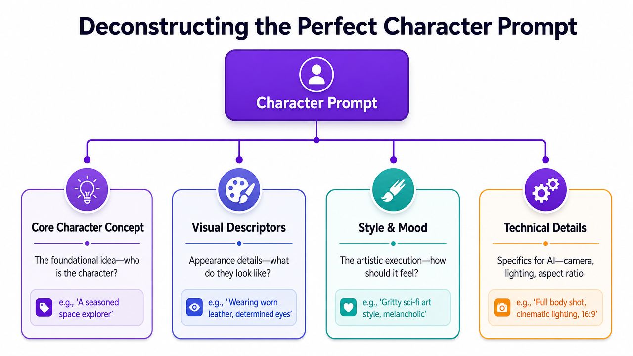
I build prompts with four components. Not because it sounds tidy, but because it makes troubleshooting easier.
| Component | What it controls | Example language |
|---|---|---|
| Character | Who the subject is | scarred royal guard, cheerful mushroom courier, exhausted necromancer |
| Clothing and Context | What they wear, hold, or signal | weathered leather coat, silver insignia, travel satchel, cracked wand |
| Composition | How the viewer sees them | full body, three-quarter view, looking over shoulder, dramatic low angle |
| Color and Climate | Mood, palette, lighting | cool moonlight, warm earth tones, stormy atmosphere, muted palette |
A lot of weak prompts skip the first component and overstuff the last one. They pile on "cinematic," "masterpiece," "hyper detailed," and "epic lighting" without ever making the character specific. Style can't rescue an undefined subject.
The center of the prompt is the identity. Start there. Then add the visual cues that make the character recognizable. Only after that should you add camera and mood language.
A simple build might look like this:
Subject first
"A veteran desert ranger"
Identity details next
"sun-darkened skin, braided gray hair, narrow amber eyes, weathered scarf"
Signature props or wardrobe
"patched sand cloak, brass compass, curved dagger at the hip"
Shot and pose
"three-quarter portrait, standing upright, hand resting on compass"
Mood and finish
"dusty golden light, muted ochre palette, painterly fantasy illustration"
That sequencing matters. When you front-load the identity, the rest of the prompt supports the person instead of replacing them.
The best prompts usually read like a character sheet filtered through an art director, not a pile of adjectives.
When an output misses, don't rewrite everything. Change one layer.
I also avoid over-constraining too early. When style, camera, era, rendering medium, and emotion all conflict, coherence drops fast. A cleaner prompt with fewer competing instructions usually produces a stronger base image you can iterate from.
Try this as a working template:
[character identifier or archetype], [age or presence], [face and hair traits], [signature outfit or accessory], [pose or action], [camera framing], [environment or background cue], [lighting], [style or medium]
Example:
Mara Voss, hardened smuggler, cropped black hair, sharp cheekbones, red utility jacket with worn brass clasps, leaning against a cargo crate, half-body portrait, dim dockside backdrop, cool industrial light, gritty sci-fi concept art
A character art prompt generator becomes useful. Not as a magic box, but as a structured way to fill each slot with intent.
Archetypes save time because they carry built-in signals. You don't have to explain everything from zero when the silhouette, posture, and attitude already suggest a role. What matters is choosing modifiers that communicate the right version of that role for your project.
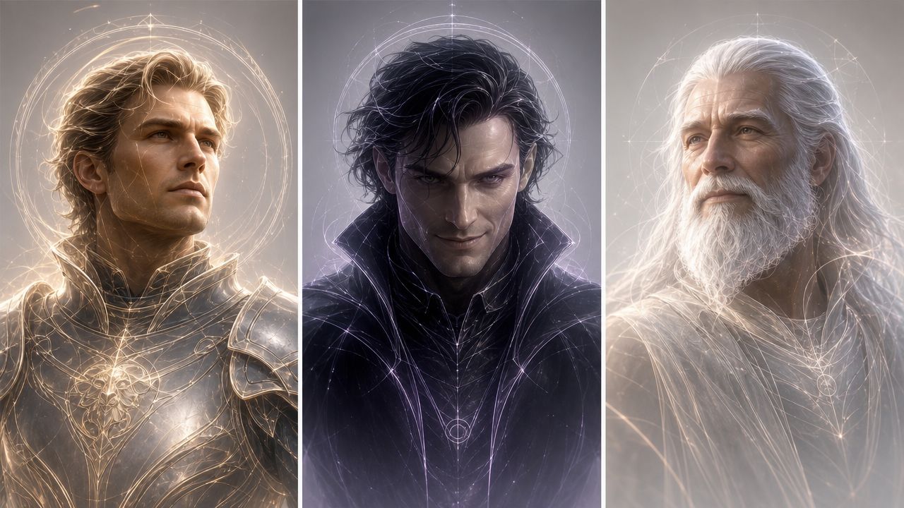
Prompt design is becoming more style- and use-case-specific, not just more descriptive. Promptomania now separates character-design workflows across models such as Midjourney v6.1, Midjourney Niji 6, FLUX 1.1 Pro, DALL·E 3, GPT Image 1, SDXL 1.0, and Leonardo Phoenix, which shows how much output goals shape prompt structure in its character prompt toolset. A TikTok avatar, a book cover figure, and an RPG token may all use the same archetype, but they shouldn't use the same prompt.
| Archetype | Core Prompt Template | Example Modifiers |
|---|---|---|
| Hero | determined protagonist, practical outfit, upright posture, focused gaze | worn cape, scuffed boots, sunrise lighting, windblown hair |
| Villain | commanding antagonist, sharp silhouette, controlled expression, imposing stance | dark tailored coat, jeweled ring, cold rim light, throne room backdrop |
| Wise Elder | aged mentor, calm presence, layered robes, thoughtful eyes | carved staff, soft wrinkles, library setting, warm candlelight |
| Trickster | agile mischief-maker, playful posture, sly smile, asymmetrical styling | fingerless gloves, bright accent color, market alley, tilted framing |
| Reluctant Hero | conflicted lead, guarded expression, functional gear, tense shoulders | dented armor, storm clouds, hand half-raised, muted palette |
| Royal Figure | poised ruler, regal bearing, refined garments, direct eye contact | embroidered cloak, crown or circlet, marble hall, rich jewel tones |
| Outcast Wanderer | solitary traveler, layered clothing, weathered face, distant look | patched satchel, mountain road, gray sky, rough hands |
| Comic Sidekick | expressive companion, exaggerated gesture, approachable styling | oversized scarf, bright smile, energetic pose, playful color scheme |
The archetype label alone isn't enough. The body language does most of the heavy lifting. A queen reads as a queen because of posture, symmetry, and controlled styling. A reluctant hero reads differently because the shoulders sag, the gaze turns away, and the gear looks used rather than ceremonial.
Use modifiers to answer three questions:
For example, "regal posture" and "direct eye contact" create authority. "Slumped shoulders" and "dented armor" create reluctance or fatigue. Those aren't decorative tokens. They shape the story in a single frame.
A prompt for an RPG token should emphasize readability. Keep the silhouette clean, the accessories recognizable, and the background simple. A book-cover character can handle more atmosphere and narrative symbolism. A social avatar needs a face-first crop and strong contrast.
Use-case check: If the image will end up tiny on a screen, prioritize face shape, hair silhouette, and one standout accessory over intricate costume detail.
That's why I keep archetype prompts as starting frameworks, not finished prompts. The character art prompt generator gives me a launchpad. The project decides how far I simplify or enrich it.
Style changes the character faster than is often anticipated. Keep the same face, same outfit structure, and same pose, then swap only the aesthetic language. You get a different world, a different audience, and often a different emotional read.
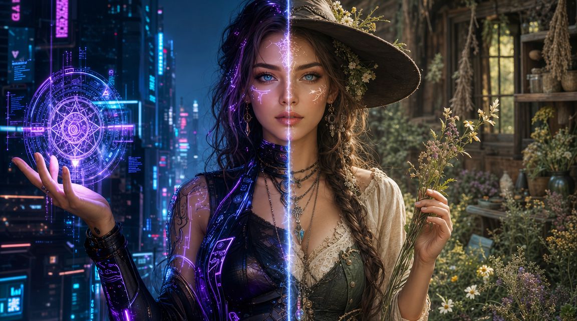
Take a base character like this:
young woman with short black hair, alert eyes, fitted jacket, satchel, standing in a three-quarter pose
That prompt is neutral. It doesn't belong anywhere yet.
For a cyberpunk version, I'd push materials, light sources, and urban cues:
That becomes something like:
young woman with short black hair, alert eyes, fitted techwear jacket, utility satchel, three-quarter pose, neon-lit alley, chrome details, reflective rain, high-contrast cyberpunk concept art
For cottagecore, I strip out the synthetic language and replace it with softness and handmade texture:
That version might read:
young woman with short black hair, alert eyes, linen jacket, herb satchel, three-quarter pose, cottage garden, soft morning light, earth tones, hand-painted storybook illustration
The identity can stay intact while the world changes around it.
Some style words carry more weight than others. I treat these as high-impact controls:
| Style direction | Strong tokens |
|---|---|
| Cyberpunk | neon, chrome, holographic, rain-soaked, dystopian, electric glow |
| Cottagecore | linen, moss, handmade, wildflower, soft light, watercolor |
| Dark fantasy | ritual, weathered, ash, candlelit, ancient stone, ominous |
| Anime-inspired | cel shaded, expressive eyes, clean linework, vibrant palette |
| Editorial fashion | studio lighting, tailored silhouette, high detail fabric, polished pose |
If you want a deeper look at how aesthetic direction changes outputs across models and genres, starryai has a useful overview of different AI art styles.
A quick visual walkthrough helps here:
The most common mistake is mixing incompatible style signals. "Cozy watercolor cottagecore" and "ultra-real chrome cybernetic armor" can fight each other unless you're intentionally designing a hybrid.
I also avoid leaning too hard on artist-name shortcuts. Medium, lighting, and material language usually give cleaner control. If the image keeps inheriting textures or moods you don't want, cut the style stack down and rebuild it with fewer, stronger terms.
When style control feels slippery, remove half your aesthetic tokens and keep only the ones that affect material, lighting, and mood.
A prompt gives you a direction. Iteration gives you control. If you're trying to turn one good result into a reliable character set, the workflow matters more than the first render.
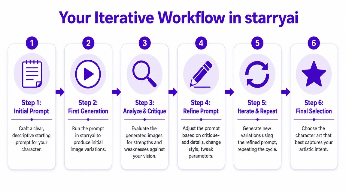
For consistency, the strongest technical method is multi-image conditioning with 4+ reference images, including different angles and framing types, while keeping the character name at the start of every prompt. The same workflow notes that text-only prompting is the weakest starting point, single-image reference is a middle ground, and 4+ images provides the most control in this character consistency tutorial.
When I'm refining a character, I don't chase polish first. I chase recognition.
Start with a base identity prompt
Put the character name first. Then lock in the facial structure, hair, outfit signature, and one accessory you want repeated.
Generate a first batch
Don't judge composition and tiny costume details yet. Look for the version that gets the identity closest.
Save candidate references
Keep the outputs that agree on the face and silhouette. Ignore images that are flashy but inconsistent.
If you want a dedicated text-to-image entry point for character work, starryai's character generator flow is one example of a prompt-based setup that lets you describe the character and select styles before generating.
Once I have a promising base image, I get stricter.
Seed control
Use a fixed seed when you want nearby variations. That's useful after you've found the right face and want to test pose, expression, or costume tweaks without throwing the identity away.
Aspect ratio decisions
Pick aspect ratio based on destination, not habit. Vertical framing works better for social portraits and mobile-first posts. Wider framing helps when you're designing a cover layout or banner scene where the character has to share space with title text.
Upscaling timing
Upscale late. If you upscale too soon, you may spend time polishing an image with the wrong face. I only upscale after the identity, pose, and framing are doing the right job.
My working loop looks like this:
| Stage | What I'm checking |
|---|---|
| Base prompt | Is the character identifiable without style overload |
| Early variations | Which image repeats the face most reliably |
| Reference pack | Do I have enough usable angles and crops |
| Refined prompt | Are changes limited to one issue at a time |
| Final upscale | Does added detail preserve the character |
Workflow note: Consistency improves when you treat successful generations as raw material for the next round, not as final art.
Don't rewrite the prompt from scratch every time the output annoys you. That resets too many variables. Don't change pose, costume, style, and framing all in one revision either. You won't know what fixed the problem.
When identity drift starts creeping in, I reduce the prompt to the stable core, reuse the saved references, and put the character identifier first again. That disciplined repetition feels boring. It also works.
A finished generation still isn't a finished asset. It becomes useful only after you prep it for the place it's going to live. That's the part many creators skip, and it's why good-looking images often perform poorly once they leave the generator.
By the mid-2020s, character prompt workflows had become part of a broader commercial AI-creation stack: describe the character, generate the image, and download the output, with choices like style and aspect ratio built into the process. ImagineArt presents that flow directly, and frames it as part of a broader one prompt, many outputs model that supports fast creation for uses like TikTok visuals, Etsy graphics, and game avatars on its AI character generator page.
A production-ready asset usually needs a little cleanup. Not a full repaint. Just enough correction to remove distractions.
That can mean:
A nice render can fail on social because the face is too small. A strong fantasy portrait can fail as merch because tiny details collapse when printed or reduced. The generator doesn't solve that for you. You solve it by preparing the asset for its job.
The prompt is only the first draft of the deliverable. Once you start thinking in deliverables, your choices get sharper.
Ask these questions before you call the work done:
A usable character asset isn't just attractive. It's legible, adaptable, and easy to deploy.
That mindset is what separates random generation from a working creative pipeline. If you're building a mascot, a series protagonist, or a recurring campaign character, the output needs to survive reuse. That's the standard.
If you want a simpler way to turn prompts into character visuals for social content, indie projects, or personal experiments, starryai gives you a text-to-image workflow built around describing your character, choosing styles, and generating variations you can refine into usable assets.
Written with the Outrank tool