
Written by Mo Kahn on
July 1, 2026


You've probably done this already. You open a blank canvas, type “cool fantasy character,” get something visually fine, and then realize it still doesn't feel like a real character. It doesn't look like someone an indie reader would remember, a TikTok audience would stop for, or a customer would buy on a sticker, shirt, or print.
That gap is where most character art ideas fall apart. Inspiration is easy. A usable concept is harder. The strongest characters don't just look good in one image. They communicate role, personality, and tone at a glance, which is exactly why character design became a formal pre-production discipline in film and games. Standard training still starts with research, audience analysis, rough sketching, palette choices, and repeated iteration before a final design locks in according to CG Spectrum's overview of character design workflows.
Strong ideas also need clarity. One industry guide recommends building with 2 or 3 consistent shape languages, and a common color framework uses the 60-30-10 rule so a character keeps a clear focal point instead of turning into visual noise as explained in this character design guide from RMCAD.
That matters whether you're making a BookTok protagonist, a TikTok trend persona, an RPG party, or an Etsy merch series. starryai can speed up the image-making part, but the prompt works better when the idea already has structure.
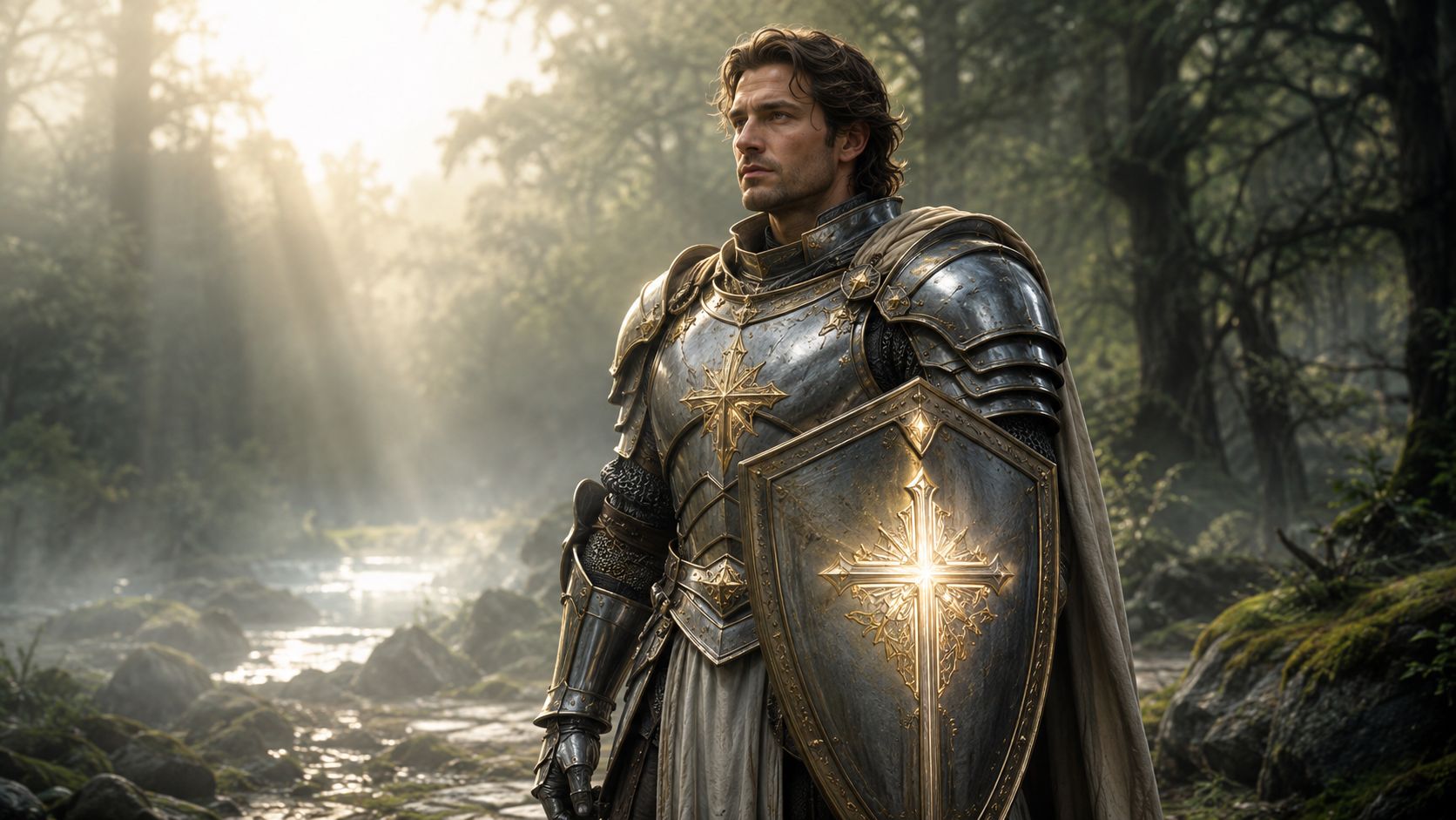
Fantasy still works because people understand it instantly. A paladin, rogue, mage, ranger, or necromancer gives you built-in visual shorthand. That's useful for TikTok slideshows, tabletop campaign art, indie game mockups, and Etsy pin designs because the audience can identify the role before they read a caption.
The mistake is stopping at the class label. “Rogue” is thin. “Cyberpunk rogue with neon katanas, streetwise grin, rain-soaked alley lighting” gives the model something usable. Adding morality, attitude, or a contradiction helps even more. “Chaotic good wizard with a spoiled cat familiar” is already more memorable than “wizard in blue robes.”
A fantasy class idea gets stronger when you pair something familiar with one unexpected twist. Steampunk paladin. Cosmic druid. Desert bard with ceremonial armor. Those combinations feel fresh without losing readability.
Start with the job your character does, then add the style shell. That order tends to produce cleaner designs than starting with random visual flourishes.
Practical rule: If the class disappears when you remove the props, the design wasn't strong enough.
For mythical races and creature hybrids, starryai users can also pull ideas from the mythical creature generator. That's especially useful when your party needs something beyond standard elf-orc-human combinations.
Try a structure like this in starryai:
[class] + [aesthetic twist] + [signature gear] + [facial attitude] + [lighting] + [environment]
Example:
“Paladin, cathedral-inspired armor with weathered gold trim, oversized shield, kind but severe expression, dawn light through forest mist, high-fantasy illustration”
If you're turning the result into short-form storytelling, a companion asset like a text-to-video fairy tale maker can help you animate the concept into a narrative teaser.
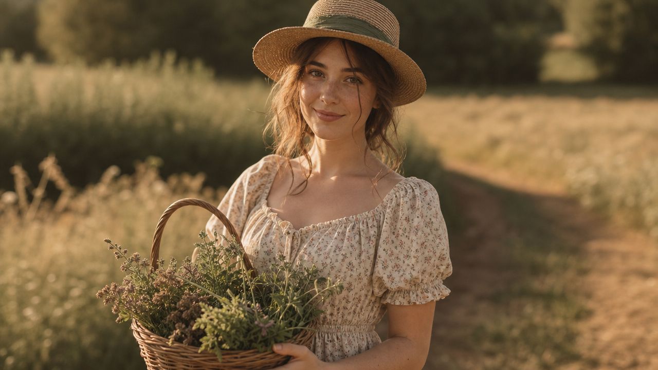
Not every audience wants lore. A lot of viral character art ideas win because they deliver a mood fast. Cottagecore, dark academia, solarpunk, Y2K, fairy grunge, clean-girl futurism. These aren't character classes. They're social aesthetics, and they're invaluable when your goal is trend participation instead of worldbuilding.
For TikTok, the vibe often matters before the backstory. A “mysterious library witch” lands faster than a paragraph of exposition. A “solar engineer in soft utopian streetwear” tells viewers what emotional world they're entering.
Aesthetic-led characters work best when you commit to sensory direction. Think fabrics, weather, palette, posture, and setting.
A useful shortcut is to build your palette before the full prompt. If you want a clearer visual hierarchy, use one dominant color family, one support family, and a small accent rather than spraying every trend color into one design. If you need help choosing combinations, an online color generator can speed that up.
Use this format:
[aesthetic] + [character type] + [wardrobe] + [color mood] + [environment] + [camera feel]
Example:
“Dark academia archivist, long wool coat and brass spectacles, muted brown and oxblood palette with soft gold accents, candlelit library stacks, painterly portrait”
What usually fails here is over-styling. If you stack cottagecore, Y2K, cyberpunk, fairycore, maximalist decor, and anime sparkle effects into one prompt, the result often looks like trend soup. Pick one lead aesthetic and one supporting one.
A trend character should still read as a person, not a Pinterest board with a face.
Self-insert characters work because people care about themselves first. That's not shallow. It's practical. If you turn your own face into a fantasy hero, villain, magical student, or anime antihero, the result becomes more shareable, more emotionally sticky, and easier to turn into a recurring series.
For starryai users, this category is especially useful because selfie-based transformation is already part of the platform workflow. If you want the platform's own guidance on that process, use the guide to generating AI images of yourself.
A strong selfie transformation doesn't erase identity. It preserves recognizable features, then changes genre signals around them. Keep the face structure, expression style, hair silhouette, or signature accessory. Shift the costume, world, lighting, and role.
That's why “turn me into a fantasy character” often underperforms. It's too broad. “Transform my selfie into a dark academia duelist with plum velvet coat, silver rings, candlelit storm-window background” is much easier to control.
A quick visual example helps before you build your own prompt series:
Use this structure with your uploaded selfie:
transform my selfie into [character role] with [style/aesthetic], keep my facial features recognizable, add [hair/makeup/accessory changes], [lighting], [background], [emotion]
Examples:
What works best is running one base selfie through several identities instead of chasing one perfect render. Hero, villain, scholar, warrior, futuristic idol. That gives you a series, not just a one-off image.
Indie authors usually don't need random inspiration. They need visual consistency. The protagonist on a teaser graphic, Pinterest board, preorder post, or character card should still feel like the same person from the manuscript.
That's where many character art ideas for books go wrong. Writers often prompt surface traits only. Hair color, eye color, clothes. That's not enough. A character becomes easier to render when the prompt includes role, emotional pressure, social status, and genre tone.
Think less like an artist hunting for cool details and more like a casting director trying to describe who this person is in one paragraph. Include the visible facts, but also what those facts suggest.
For example, “cozy mystery baker” and “dark paranormal romance heroine” need completely different posture, styling, lighting, and facial energy even if both are young women in boots with dark hair. Genre changes the read.
Editorial reality: Readers forgive variation in details. They don't forgive a character who feels like a different person every time.
If you're commissioning final art later, a proper reference sheet reduces confusion. Practical tutorial guidance recommends including a full-body front view, a close-up facial view, and when needed, extra head angles, expressions, accessories, movement notes, and color variations. Short written notes on personality and story also help other artists stay accurate as explained in this character reference sheet tutorial.
Try:
[genre] protagonist, [age/build], [distinctive features], [wardrobe], [emotional tone], [setting], [illustration style]
Example:
“Paranormal romance heroine, tall with a healed cheek scar and dark curls, fitted black coat and antique silver pendant, stern but compassionate, moonlit city street, cinematic painted style”
For series fiction, save your best prompt language outside the app. Reusing descriptive anchors matters more than inventing new wording every time.
An OC starts getting strong when visual design and psychology support each other. If the personality says “timid archivist who wants courage,” the clothes, posture, props, and color choices should help tell that story. If the prompt says “rebellious prince hiding exhaustion,” polished armor alone won't carry it.
A lot of online OC culture rewards novelty, but novelty without internal logic fades fast. Distinct OCs usually have a few stable identity markers that survive outfit changes, alternate universes, and fan redraws.
The best OCs aren't designed for one front-facing portrait. They're designed for reuse across profile, three-quarter, action view, and expression changes. That production mindset matters more than people think.
One useful industry angle is to design for rotation, not just display. Tutorials that focus on multiple angles call out recurring problems like ear placement, hair-to-eye relationships, and keeping proportions consistent as the head turns. The same guidance also argues that clearer, simpler shapes hold up better than cluttered detail, especially when small, medium, and large shapes remain separated and negative space stays readable as discussed in this multi-angle character design tutorial.
For making and iterating OCs directly in starryai, the dedicated AI character generator is the natural place to start.
Build your OC prompt in layers:
Example:
“Original character, anxious royal cartographer, narrow silhouette with oversized travel coat, wind-tangled hair, brass compass necklace, muted teal and parchment palette, intelligent but tired expression, cliffside observatory”
A practical test is simple. If you removed the costume details, would the face shape, body language, and silhouette still feel specific? If not, the OC probably needs stronger anchors.
Merch characters have a job that gallery art doesn't. They must read quickly, reproduce cleanly, and still look appealing on a shirt, mug, sticker, bookmark, or art print. What works in a detailed poster often collapses on a small die-cut sticker.
Simpler character art ideas often outperform “more impressive” ones. A clean silhouette, one focal expression, and controlled color choices usually sell better across formats than a hyper-detailed figure loaded with tiny ornaments.
For product work, think about distance first. Can the character still make sense from a phone screen thumbnail or from across a craft fair table? If the answer is no, reduce detail and increase contrast.
A useful budgeting point matters here too. If you outsource 2D character art, 2026 pricing can range from $100 to $300 for minimal freelance designs, $300 to $900 for stylized or cartoon freelancer work, and $1,000 to $5,000+ for photorealistic studio-level work. Full character sheets are also reported in the $1,000 to $5,000 range, with hourly benchmarks around $25 to $50 per hour for mid-level artists in Europe or North America and $60 to $100+ per hour for senior talent or studio work according to RocketBrush's 2026 pricing breakdown.
That range changes how you plan. If you're testing an Etsy niche, it often makes sense to validate simpler concepts first, then invest in a polished sheet once the character proves useful across multiple products.
Use product-aware wording:
[character concept] + [clear pose] + [simple background or transparent look] + [strong outline] + [limited palette] + [product use]
Examples:
What doesn't work is asking for “epic cinematic realism” when the final asset needs to become a small vinyl sticker. Design for the product, not your mood board.
Streamer avatars and gaming personas live at tiny sizes for a lot of their life. Profile circles, Twitch panels, Discord icons, chat overlays, emotes. If the design only works when it's huge, it won't do its job.
That's why silhouette matters so much here. Distinct hair shape, headset shape, horn shape, hood shape, glasses, mask, or shoulder line can do more for recognition than ornate armor or complicated costume texturing.
A good gaming persona feels branded. It reflects the creator's tone. Competitive, cozy, chaotic, deadpan, horror-focused, speedrunner energy, retro nostalgia. The visual language should reinforce that.
If you're designing a streamer identity, make expressions part of the core character early. A neutral portrait isn't enough. You'll probably want surprise, rage, smugness, panic, victory, and “I can't believe chat saw that” baked into the face design.
Keep one memorable silhouette feature. Remove two unnecessary decorative ones.
A useful avatar formula is:
[streamer persona] + [readable silhouette feature] + [expression] + [color identity] + [gaming setup or abstract backdrop] + [style]
Example:
“Competitive but friendly gaming avatar, sharp silver fringe and oversized headphones, confident grin, black and electric green palette, neon interface backdrop, stylized anime portrait”
For VTuber-style concepts, push the identity markers slightly harder than you think you need. Small audiences notice consistency before they notice detail.
Representation improves when prompts get more specific, not more polite. “Diverse fantasy hero” usually produces bland results because it avoids the actual decisions that make a character feel real. Better prompts name body type, age, mobility, cultural influence, gender expression, and personality without reducing the character to one label.
This isn't just a values issue. It's a design issue. More human specificity creates stronger, less interchangeable characters.
A plus-size knight, an elderly swordswoman, a wheelchair-using mage, a non-binary archivist with formal tailoring, a deaf sci-fi mechanic with tool-adapted gloves. These are more visually grounded than generic “strong female lead” or “cool hero.”
An underserved design angle here is originality under visual saturation. Guidance from Stephen Silver, as discussed in a recent tutorial, points toward shape contrast, negative space, and readable silhouette as the true source of character strength, not piling on details. The same angle also highlights stylized distortions, like adjusting facial placement in cartoon styles, to keep a character memorable and expressive across repeated use covered in this tutorial on originality and stylized character identity.
Use respectful, descriptive language:
Elderly warrior woman, broad build, lined face, ceremonial braids, practical armor adapted for mobility, fierce and disciplined expression, windswept mountain pass, painterly fantasy style
What usually fails is token layering. Don't stuff every representation marker into one prompt just to signal inclusivity. Give each character room to be an individual.
Seasonal variants are useful because they let you reuse a strong base character without starting from zero. A winter version, spooky version, spring festival version, beach version, harvest version, or back-to-school version keeps content fresh while preserving recognition.
This works especially well for TikTok series, Etsy drops, Patreon rewards, author promo art, and fandom communities that already know the character. Audiences enjoy seeing a familiar design translated into new circumstances.
The mistake is changing everything at once. If the hairstyle, face shape, palette logic, clothing language, and personality cues all shift, the variant stops feeling like the same character.
Keep a few essential features. Maybe it's the silhouette, one signature color, a specific necklace, eyebrow shape, or the way the character stands. Then layer the season on top.
Seasonal design works best when the costume changes, but the identity doesn't.
Try this:
[existing character identity] + [season or holiday] + [updated wardrobe] + [seasonal prop] + [environment] + [mood]
Examples:
If you're building a content calendar, seasonal variants are one of the easiest ways to turn one strong character into many publishable assets.
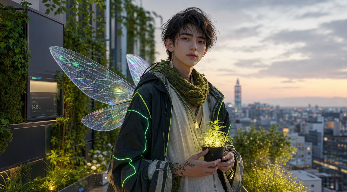
Mashups work when two ideas collide cleanly. They fail when five ideas pile up without hierarchy. If you want memorable fusion characters, choose one dominant concept, one secondary concept, and one twist. That's enough tension to feel original without turning unreadable.
This category performs well on social media because the hook is built into the concept. Cottagecore cyberpunk witch. Space pirate librarian. Corporate fairy villain. Granny gladiator. Soft healer with monster armor. The contrast creates curiosity before anyone even sees the image.
Start by asking what each half contributes. One concept should shape silhouette or wardrobe. The other should shape behavior, setting, or material language. That division helps the design stay legible.
A good mashup also benefits from restraint. If “tech CEO fairy” is the premise, you don't need every possible fantasy and business symbol crammed in. Wings, immaculate tailoring, one premium device, one botanical accent, and a commanding expression will usually land better.
Use a simple formula:
[primary concept] + [secondary concept] + [twist] + [signature visual anchors] + [environment] + [style]
Examples:
The strongest mashups still obey basic design clarity. If the silhouette is messy and the accents fight for attention, the concept will feel less original, not more.
| Item | Implementation Complexity 🔄 | Resource Requirements ⚡ | Expected Outcomes ⭐ | Ideal Use Cases 📊 | Key Advantages & Tips 💡 |
|---|---|---|---|---|---|
| Fantasy Character Classes & Archetypes | Medium, template-friendly but needs class detail | Medium, armor/weapons, specific prompts | ⭐⭐⭐⭐, recognizability, scalable concepts | Tabletop RPGs, indie games, merch | Quick concept generation; customize to avoid generic results |
| Aesthetic-Driven Character Personas | Low, focus on mood and styling | Low, color palettes, trend research | ⭐⭐⭐⭐, high viral potential on socials | TikTok creators, fashion/lifestyle influencers | Highly shareable; refresh often to follow trends |
| Self-Insert & Selfie Transformation Prompts | Low, automated transform workflow | Medium, requires good-quality selfies | ⭐⭐⭐⭐⭐, extreme engagement and shareability | Personal brands, viral challenges, profile images | Very personal and viral; use high-quality, well-lit photos |
| Book Character & Author Concepts | Medium–High, needs fidelity to text | Medium, detailed descriptions, iterations | ⭐⭐⭐⭐, consistent references for covers/marketing | Indie authors, BookTok, cover design | Cost-effective for authors; extract concrete manuscript details |
| Original Character (OC) Design & Development | High, integrates backstory and personality | Medium–High, time, multiple iterations | ⭐⭐⭐⭐, deep engagement within communities | Fan fiction, worldbuilding, character-driven projects | Produces rich characters; use profile templates and document prompts |
| Merchandise & Product Design Characters | Medium, must meet product specs | High, print-ready files, mockups, licensing | ⭐⭐⭐⭐, direct monetization potential | Etsy shops, POD platforms, merch collections | Designed for resale; optimize for format, SEO, and mockup tests |
| Gaming Avatar & Streamer Personas | Medium, branding and on-screen readability | Medium, emotes, sizes, variants | ⭐⭐⭐⭐, strong brand recognition | Twitch/YouTube streamers, VTubers, esports | Builds identity; ensure silhouette readability at small sizes |
| Diversity & Representation Character Prompts | High, requires cultural sensitivity | Medium, research and careful prompting | ⭐⭐⭐⭐, meaningful impact and engaged support | Inclusive projects, educational creators, socially conscious media | Promotes inclusion; research communities and avoid stereotypes |
| Season & Holiday Variant Characters | Low–Medium, seasonal styling changes | Low, planning and timely prompts | ⭐⭐⭐⭐, boosts seasonal engagement | Content calendars, seasonal merch, holiday campaigns | Keeps content fresh year-round; plan 4–6 weeks ahead |
| Mashup & Fusion Character Concepts | Medium–High, balance multiple concepts | Low–Medium, creative prompt crafting | ⭐⭐⭐⭐⭐, high novelty and viral potential | Trend content, creative experiments, fandom crossovers | Extremely unique; limit to 2–3 strong concepts to avoid chaos |
Good character art ideas rarely come from waiting for inspiration to strike. They come from choosing a clear job for the character and then making design decisions that support that job. A fantasy party member needs instant role recognition. A TikTok trend persona needs mood and speed. A book protagonist needs consistency across posts and covers. A merch mascot needs clarity at small sizes. A streamer avatar needs recognition before detail.
That shift matters. It moves you out of “generate something cool” and into “build something usable.” Once you think that way, prompts get sharper fast. You stop stuffing in random adjectives and start selecting role, silhouette, palette, attitude, setting, and audience on purpose.
The biggest practical habit is iteration. Character design training still treats iteration as a trial-and-error process for a reason. Early shape exploration, clothing passes, color variations, and character sheets exist because the first idea usually isn't the clearest one. The memorable version often appears after you simplify, combine, and refine.
If you're creating for repeat use, keep a reference mindset from the start. Save the exact phrases that define your character. Preserve the key silhouette feature. Keep your palette controlled. Test whether the concept still works in a profile view, a three-quarter view, and a more dynamic pose. A beautiful one-off image can still be a weak character if it falls apart the moment you rotate it or restyle it.
It also helps to be honest about the trade-off between complexity and readability. More accessories, more textures, and more micro-details don't automatically make a stronger design. In practice, cleaner characters are often easier to remember, easier to reproduce, and easier to adapt into product art, social content, story visuals, and fan-facing assets. That's especially true if you want your design to survive across avatars, thumbnails, stickers, and recurring posts.
If you're using starryai, the platform fits best when you already know what kind of character you're trying to make. Start with one of the frameworks above, generate a few structured variations, then compare them for silhouette, mood, and recognizability. Keep the version that still feels like itself even when you imagine it in another outfit, another pose, or another format.
Pick one category. Build one prompt that has real structure. Then make three variations instead of chasing one perfect image. That's usually when a vague idea turns into a character worth keeping.
If you're ready to turn these character art ideas into actual visuals, start experimenting in starryai with one clear prompt framework and a defined use case. A TikTok persona, book character, RPG class, or merch mascot gets easier to build when you decide the audience first, then generate variations until the design feels consistent and recognizable.