

Written by Mo Kahn on


Adding “cel shading” to a prompt won't reliably give you the Borderlands look. It often gives you smooth cartoon skin, flat colors, and a dark outline around an otherwise generic character. Borderlands cel shading works better as a layered art direction, with deliberate proportions, painted surface marks, selective inking, and clearly separated shadows.
For AI images, build those ingredients independently. That makes it easier to preserve a selfie's likeness, keep an RPG character readable, or prepare a composition that still works on a small cover or sticker.
Borderlands isn't a conventional cel-shading preset. Gearbox describes a hybrid of hand-painted materials, realistic lighting, and custom rendering, rather than a uniform flat-color shader, as discussed in GameBanshee's Borderlands interviews.
The distinction matters when choosing AI art styles. Toon shading describes how you simplify light. Inking describes where you place lines. Neither automatically supplies the worn surfaces or exaggerated anatomy.
Borderlands ingredients and the prompt wording that triggers them
| Ingredient | What it does on screen | Prompt wording |
|---|---|---|
| Flat toon shading | Limits the image to a few solid tones | hard tonal separation, flat color blocks |
| Comic-book inking | Draws dark contours around characters and props | bold black ink outlines around forms |
| Hand-painted texture | Adds graphic-novel marks and crosshatching | inked hand-painted surface detail, visible crosshatching |
| Exaggerated proportions | Makes figures read like a comic panel in motion | exaggerated proportions, dynamic pose |
| Sharpened shadows | Keeps shadow shapes crisp and separated from color | hard shadow edges, sharp shadow shapes |
Treat the table as a diagnostic checklist, not a demand to maximize every effect. Preserve enough lighting to describe cheekbones and armor volume. Add crosshatching where it explains a surface, not across every patch of skin.
Gearbox's explanation also includes exaggerated models, sharpened shadows, and additional drawn lines across terrain, according to Destructoid's account of the art style. Those authored details matter more than making every contour thicker.
If your draft has flat color but no ink or painted texture, it's closer to generic cartoon illustration than the intended graphic-novel treatment.
Start with what must remain recognizable, then describe how it should be drawn. A face, shoulder shape, and separated prop give the generator a clearer composition than a long style description followed by an unspecified character.
Use this order:
A readable silhouette is especially useful when banding removes subtle transitions. Keep a weapon away from the jaw, separate an arm from the torso, and avoid tangles of straps near the face. For more control over wording, use the same subject-first approach when writing AI prompts.
Subject and silhouette: Transform the reference person into a waist-up wasteland explorer, preserving facial structure, hairstyle, and expression, head clearly separated from the background. Pose and proportion: Confident turned shoulders, slightly exaggerated jacket collar, natural facial proportions. Ink and texture: Selective black comic-book contours, inked hand-painted surface detail, crosshatching on clothing, scuffed fabric. Tone and lighting: Limited ochre and teal palette, hard shadow edges, directional side lighting, readable eyes. Style anchors: Gritty graphic-novel illustration, Borderlands-inspired character art, dimensional rather than flat.
Subject and silhouette: A desert mechanic carrying an oversized salvage rifle, full figure against a simple pale backdrop. Pose and proportion: Wide planted stance, angular shoulder armor, elongated boots, weapon held clear of the torso. Ink and texture: Bold silhouette ink, finer interior lines, hand-painted metal scratches, localized crosshatching. Tone and lighting: Hard tonal separation, warm highlights, cool shadow blocks, crisp cast shadows. Style anchors: Rough science-fiction comic illustration, Borderlands-inspired art direction.
Negative prompt: soft airbrush, anime eyes, glossy plastic, photographic blur.
If your tool has no negative-prompt field, remove contradictory positive terms instead. Don't request photographic pores or smooth beauty-retouching alongside a simplified painted face.
Prompt rule: Change the subject or aspect ratio, then check the silhouette again. A successful portrait prompt isn't automatically a successful full-body prompt.
Tonal bands and shadow darkness affect the result before texture does. A practical starting range is three to five bands, but that's an artistic choice, not a validated performance guarantee, as the Borderlands-style rendering guide cautions.
Fewer bands produce broader graphic shapes. More bands can preserve facial volume, but they can also leave the image looking softly shaded. Keep the darkest fill visibly lighter than the ink so a jaw contour doesn't disappear into its own shadow.
Starter values for tone, line and threshold controls
| Control | Starting range | Raise it when | Lower it when |
|---|---|---|---|
| Tonal band count | Three to five bands as an artistic starting point | Broad areas need more tonal description | Excess transitions weaken the graphic separation |
| Darkest band value | Kept above pure black | Outlines merge into shadows | Shadows look grey and washed out |
| Line width | Scaled to output size | The image is shown as a thumbnail | Detailed faces get crowded |
| Edge threshold | Moderate, set until grain stays unlined | Texture noise gets outlined | Contours go missing on faces |
| Denoise or img2img strength | Low to moderate, calibrated against the reference | The source resists the intended texture change | Likeness drifts from the source |
For a hypothetical first test on a normalized strength slider, try 0.3 to 0.5, then compare facial landmarks rather than trusting the number. Different tools interpret strength differently. A low setting can preserve an unwanted photographic surface; a high setting can redesign the person.
Threshold direction matters: in a conventional edge detector, raising the threshold rejects weaker edges. Lowering it admits more detail. If your editor labels its slider “sensitivity,” the direction may be reversed.
Keep grain restrained until the image works without it. Texture should describe leather, metal, or cloth, not disguise poor shadow shapes.
If local editing stalls with large layered files, diagnose the hardware bottleneck before upgrading. Steel City IT's guide can help you choose RAM and SSD upgrades; neither upgrade will fix weak inking or an unsuitable prompt.
Separate the color treatment from the ink. That gives you an editable illustration instead of a flattened effect you have to regenerate whenever the outline looks wrong.
The technical reference is useful here: Igor'sLAB's rendering explanation describes a lit base using a one-dimensional grayscale lighting map, followed by a separate black wireframe treatment with hidden edges culled and the results overlaid. For a still image, the equivalent is a controlled base, simplified tones, and an independently editable line layer.
The workflow below adapts that separation to image editing.
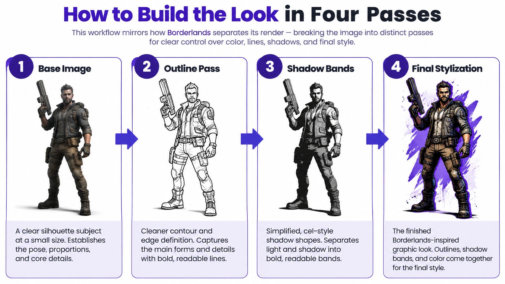
Generate the base image. Use the subject-first formula and choose a composition that reads when reduced, with visible separation between the head, shoulders, and major props. Don't accept a weak pose just because the surface detail looks impressive; later passes won't untangle overlapping anatomy.
Apply tonal banding. In Photoshop, GIMP, or another layered editor, simplify the value structure with Posterize, a stepped gradient map, or manually painted shadow selections, while keeping shadow fills lighter than the contour ink. The common mistake is applying global posterization without masking the face, which can turn a cheek or nose into an arbitrary patch.
Create the ink layer. Detect edges from a clean base or generate a dedicated line pass, reject weak marks with a threshold, expand the remaining contours to the intended width, and composite dark ink over the color. Keep it separate so you can erase a doubled nose line or lighten a crowded collar without repainting the entire image.
Restore detail and inspect the output. Recover eye shape, mouth corners, and distinctive facial marks before upscaling, then check the export at thumbnail size. Don't sharpen everything equally, because sharpening painted scratches can make them compete with the silhouette.
The infographic separates outlines and shadow bands conceptually. In the editor, finalize the banded color before committing the ink composite so the lines support the actual shadow shapes.
Keep a clean, uninked base. If the contours fail, rebuild the line layer rather than stacking another edge filter over the finished image.
A convincing result has a readable face, a few deliberate shadow shapes, clear contours on the silhouette and important props, and no accidental airbrushed transitions. Leave quieter areas between the marks. Without that breathing room, the character becomes a collection of scratches rather than a coherent drawing.
An anime-like result usually needs a different description of the surface, not stronger saturation. Remove the anime anchor and specify painted wear, selective inking, and angular design. Otherwise, another generation may reproduce the same smooth cartoon treatment with slightly different colors.
Manual authorship is central to the franchise's production approach. Side's account of its art pipeline describes artists preparing models and texture bakes before painted texture work, rather than relying on a single engine switch. For an AI workflow, that translates into targeted editing instead of expecting one style label to solve every defect.
Symptoms, likely causes and fixes
| Symptom | Likely cause | Fix |
|---|---|---|
| Looks like anime, not Borderlands | Prompt names anime or cartoon but no inking or texture | Generation retry: Add comic-book inking and hand-painted texture terms, remove anime |
| Smooth gradients on skin | Too many tonal bands or unmodified soft lighting | Tone rework: Simplify the bands and keep a hard shadow edge |
| Outlines missing on faces | Edge threshold too high or line too thin | Ink rebuild: Lower the threshold or slightly thicken the line |
| Likeness drifts from the selfie | Denoise or img2img strength too high | Generation retry: Lower strength and keep the face reference |
| Outlines over fabric or walls | Grain read as edges | Ink rebuild: Raise the threshold or soften texture before inking |
| Muddy at thumbnail size | Too much line density | Ink rework: Cut line density; regenerate if the silhouette itself needs enlarging |
Retry the generation when the underlying identity, anatomy, or pose is wrong. Edit locally when the composition works but the treatment doesn't. Rebuilding a line layer is usually more controlled than asking a generator to preserve an entire good image while changing only its contours.
For faces, inspect the eyelids, nostrils, and mouth separately. A continuous dark outline around every feature can make a recognizable person look masked. Use selective marks and let adjacent shadow shapes describe the rest.
A dedicated cartoon outline workflow is useful for isolating contour decisions from color decisions. Before rebuilding, hide the existing ink: if the face becomes readable immediately, the problem is line placement, not missing detail.
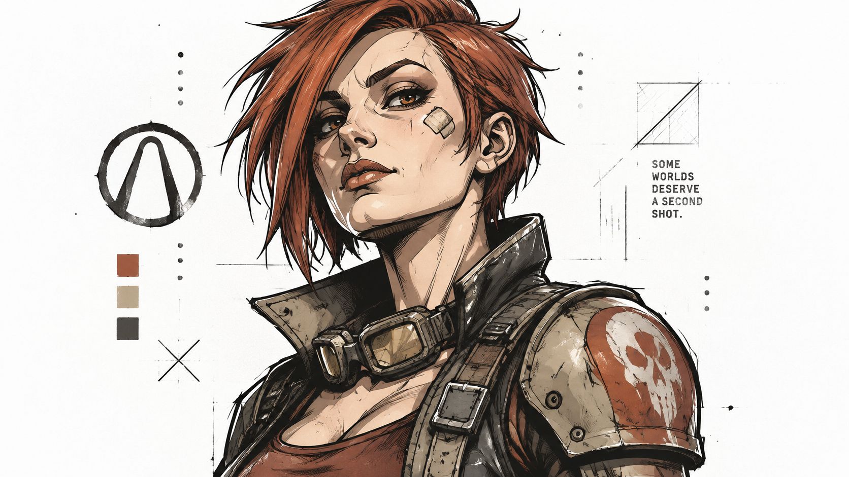
Character avatars and game portraits need recognition before surface complexity. Keep the outer silhouette strong, use moderate inking on armor, and reserve finer marks for clothing rather than skin. For a stylized-realistic interpretation, preserve material highlights and facial lighting while reducing outline weight: IGN's Borderlands 4 review discusses the series' move toward higher-fidelity materials and dynamic inking. The character example below is a useful prompt for judging where strong contours help the design.
Book covers need a hierarchy between title, figure, and setting. Use bolder tonal separation on the main character, but leave quiet negative space behind the typography. Don't fill the title area with crosshatching or high-contrast machinery. Build a rough cover layout early so you can judge the illustration with actual lettering rather than as an isolated poster.
Preserve detail where the viewer needs information. Remove it where the viewer needs separation.
Merchandise, stickers, and prints benefit from decisive boundaries and fewer fragile interior marks. Increase line weight for small stickers, simplify scratches, and inspect the cut silhouette against both light and dark backgrounds. A large print can support finer painted detail, but don't assume the same export will work across every product. Use original characters and avoid franchise logos when developing your own merchandise.
Use the embedded video as an additional visual reference while comparing treatments.
Short-form video thumbnails and social posts need the clearest value separation and the least incidental texture. Crop close enough that the expression remains visible on a phone, simplify the background, and avoid an outline so heavy that it closes the eyes. Choose a strong focal accent rather than saturating every object equally.
Test every version at its real display size before publishing. If the face, prop, or title disappears, simplify the composition before adding detail.
Choose a single selfie with clear lighting, or an RPG character with a simple pose. Run the base pass in starryai using the labelled prompt formula, then do the banding and ink work in your preferred editor. Keep the source image unchanged so every comparison starts from the same reference.
Make a small comparison set rather than generating unrelated alternatives:
This isolates what each treatment contributes. If you regenerate a different face for every version, you can't tell whether you prefer the rendering or just the new expression.
Use the progression below as a reminder to assess structure before polish.
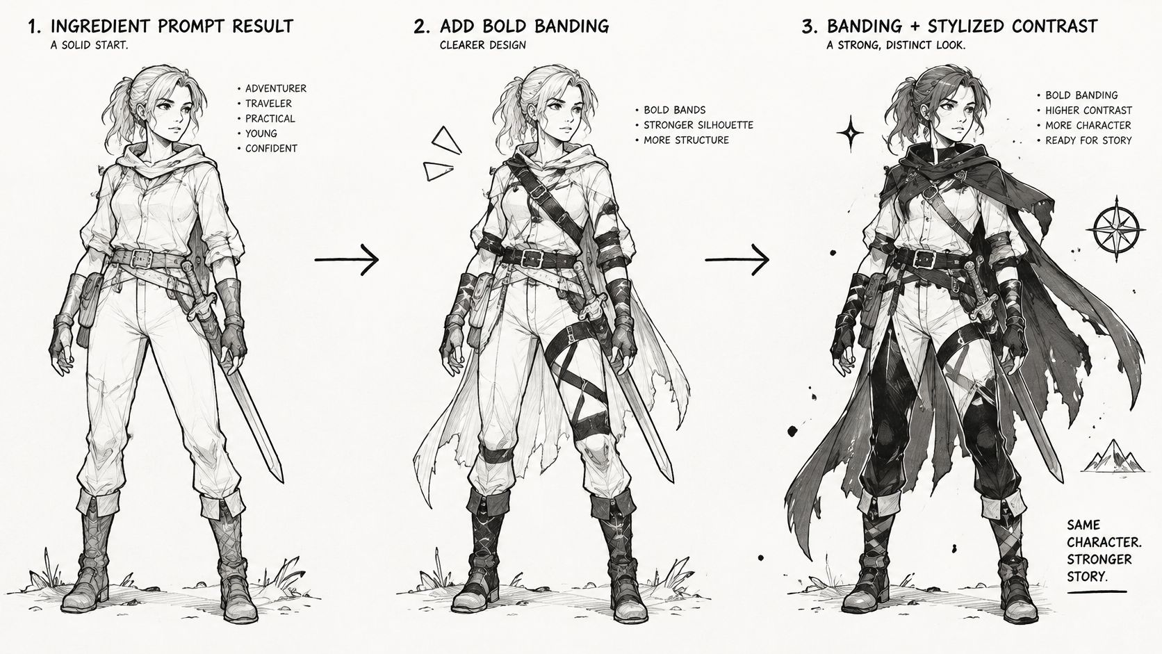
Compare the images at full size and as thumbnails. Check the eye spacing, jaw shape, hairline, and expression against the source. Then inspect whether the contour remains visible without swallowing the face.
Keep the version that reads as a gritty comic-book illustration first, rather than the version with the most effects. A restrained painted surface with confident contours is more useful than dense crosshatching over a weak character design.
Save the prompt, source reference, tonal adjustment, and editable ink layer as a reusable template. Name the settings by destination, such as portrait or sticker, so you don't accidentally apply print-level detail to a tiny avatar.
If the first run looks generic, return to the ingredient checklist and add inking and hand-painted texture before changing any other setting.
Our tools cover text-to-image generation, avatars, characters, and illustrations, alongside image reimagining, enhancement, upscaling, and background removal. Visit starryai to generate your base character, then build a Borderlands-inspired finish with the separate tone and ink passes above.


