

Written by Mo Kahn on
September 8, 2026


The most expensive fiction cover category is fantasy, with a median design cost of $910 and an average of $1,760, according to Reedsy's fantasy cover pricing data. That premium makes sense. A fantasy cover has to sell a world, a mood, a magic system, and a promise of scale, often in the tiny image a reader sees while scrolling.
The strongest book cover ideas fantasy authors can use don't add dragons, glowing particles, or ornate borders. They choose one clear reader signal and build every decision around it. A character-led cover promises emotional intimacy. A landscape-led design promises expansive world-building. A symbolic object suggests mystery and thematic depth. Cosmic imagery implies vast stakes, while texture-driven art can make a digital composition feel handcrafted.
The eight directions below pair each signal with a usable palette, typography approach, composition guidance, and a practical starryai prompt. Use them to explore a concept, not to skip the design work. Your final title placement, author hierarchy, series branding, and print setup still need deliberate decisions. A cover that communicates clearly can help a book earn attention during browsing, including the kind of discovery that leads readers toward a Long Island book selection.
Soft radiance works best when the story promises wonder, romance, or hidden magic. A central sorceress, enchanted artifact, or luminous creature gives the reader an immediate focal point, while floating orbs and particles create the sense that magic is active beyond the edges of the image.
For paranormal romance, use a palette of ethereal blue, violet, lavender, and restrained gold. Urban fantasy can handle darker navy or charcoal behind the glow. A magical adventure may benefit from warmer turquoise and amber, especially if the central object needs to feel powerful rather than delicate.
Place the brightest light behind or beside the focal subject, not everywhere at once. A backlit figure with a golden rim light reads more clearly than a character surrounded by equal-strength effects. Keep the upper or lower third quieter if you need room for the title.
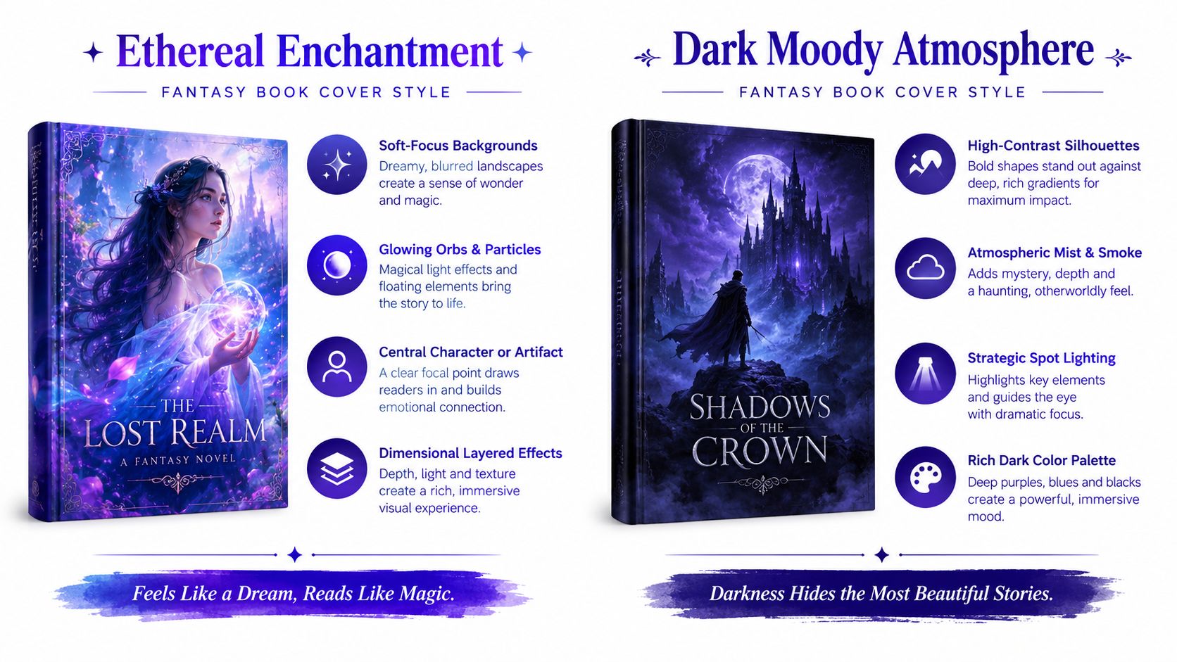
Generate the background, character, and effects as separate explorations when possible. That gives you more control than asking for an entire finished cover in one prompt. Use phrases such as “dreamy depth of field,” “digital painting,” “luminous,” and “mystical” to keep the image focused instead of turning every surface into visual noise.
A prompt to test in starryai:
Ethereal blue and purple glowing particles around a sorceress, backlighting with golden rim light and magical aura, dreamy depth of field, digital painting, luminous, mystical, portrait composition, clear dark space for title
Sarah J. Maas's magical atmospheres and Leigh Bardugo's Grishaverse visual language show how light can signal fantasy without requiring a literal castle or sword. The trade-off is clarity. Too many sparks make the cover look like a generic effects image, while a single luminous subject gives readers something to remember.
For prompt development, starryai's AI image generator prompt guidance can help you turn broad ideas into more specific visual instructions. Add the book's emotional promise, not just its ingredients.
A silhouette turns missing information into the hook. A cloaked figure on a ridge, a warrior dissolving into mist, or a lone figure beneath a damaged moon can make a dark fantasy cover feel tense without revealing the character's face or the plot's answers.
Begin with a deep charcoal, black, storm-purple, or midnight-blue field. Add one controlled accent, such as blood red, cold silver, ember orange, or electric violet. The accent should identify the magical threat or emotional pressure. If everything glows, nothing feels dangerous.
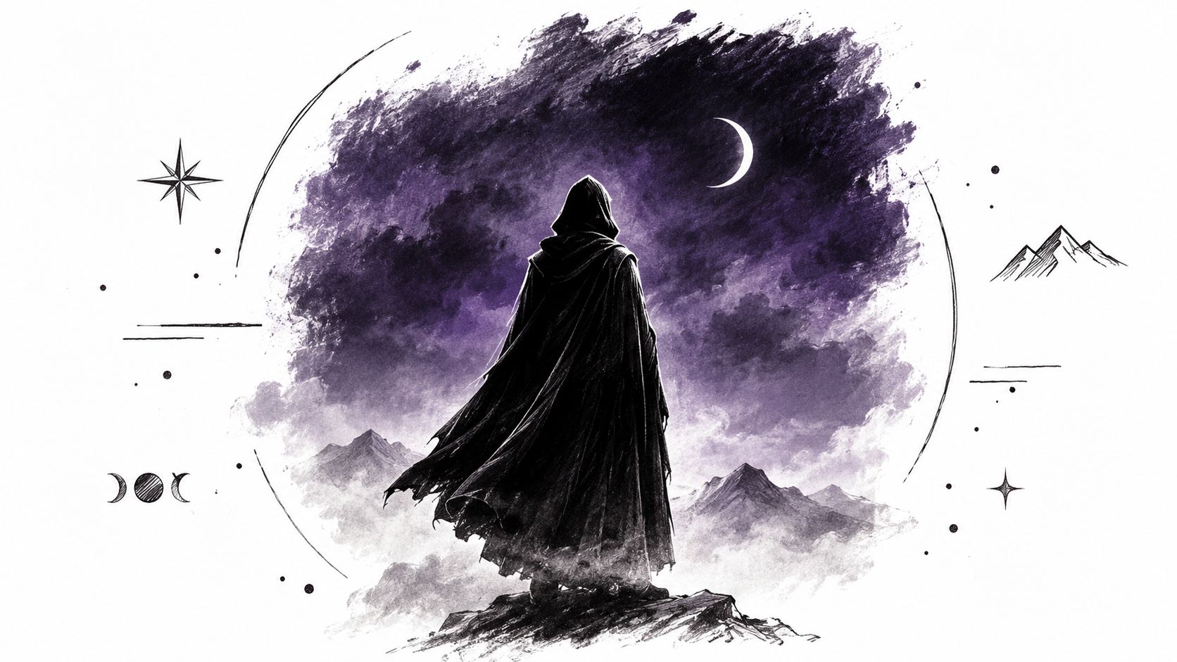
Use a centered subject for a direct, iconic read, or place the figure low in the frame beneath a large threatening sky. A side light can reveal only a shoulder, weapon edge, or eye. For gothic romance, keep the silhouette elegant and atmospheric. For psychological dark fantasy, let the figure dissolve into mist and shadows so the reader questions where the person ends and the threat begins.
Try this starryai prompt:
Silhouette of a cloaked figure against a stormy purple and black sky, figure dissolving into mist and shadows, moody, ominous, gothic atmosphere, high contrast, glowing eyes only, portrait orientation, centered subject, dramatic side lighting, generous negative space for title
The typography should carry authority without becoming ornate decoration. A tall serif in pale gray or muted silver can feel literary and severe. A distressed display face may suit horror-leaning fantasy, but test it at thumbnail size. If the letterforms blur into the background, the mood has become more important than the book's identity.
This direction suits dark fantasy, gothic romance, and supernatural thrillers. It also works for releases with a BookTok-style moody aesthetic, but copying a trend too closely can flatten the book into a visual category rather than a distinct promise. Give the silhouette one story-specific detail, such as a crown, antler shape, broken halo, or unusual weapon.
Cosmic imagery tells readers that the story extends beyond one kingdom, city, or battlefield. Nebulae, star fields, galaxies, auroras, and portals can suggest divine powers, space fantasy, ancient prophecy, or a romance shaped by fate.
Use a palette that contrasts a deep indigo or black foundation with one luminous family, such as violet and gold or cobalt and rose. Keep the stars smaller than the central form. A cover made entirely of equally bright stars loses hierarchy, especially after reduction to a mobile thumbnail.
Place a character or artifact against the cosmic field rather than filling the frame with unrelated celestial objects. A small figure inside a vast expanse promises epic scale. A larger figure floating through a star field makes the story feel more character-driven and intimate.
Scale is a story signal: a tiny figure suggests a world larger than the protagonist, while a close figure suggests that the reader should attach to the person first.
A useful prompt direction is:
Swirling nebula in purples and golds with a distant character silhouette, aurora borealis swirling around a cosmic portal, painted cosmic landscape, character small against vast cosmic expanse, cinematic depth, portrait book cover composition, clear title space
You can generate the stars, nebula, and character as separate visual studies. That approach makes it easier to control whether the final image feels like a photorealistic galaxy, a painted cosmic view, or an illustrated mythic realm.
This concept suits space fantasy, epic world-building, and paranormal romance with celestial themes. It can also support a series system by assigning each volume a different accent color while retaining the same star-field structure. The risk is genre confusion. Without a recognizable magical object, character, or portal, the cover may read as science fiction rather than fantasy.
For a tactile celestial reference, the Badlands Cloak celestial trellis design shows how stars and celestial motifs can feel ornamental rather than purely astronomical. Borrow the sense of pattern, not the exact design.
Rune-led covers work when the magic system itself is part of the reader appeal. Interlocking glyphs, sacred geometry, sigils, and tattoo-like linework can tell an urban fantasy or paranormal romance reader that the story has rules, marks, secrets, and initiation.
Choose one dominant line color against a dark base. Sapphire blue on black feels arcane and controlled. Copper on parchment suggests antiquity. Acid green or violet can push the design toward contemporary supernatural fiction. Keep the symbols large enough to survive thumbnail reduction. Fine linework that looks impressive full-size may collapse into an indistinct texture online.
Research real rune systems before using them, especially if your story references Celtic, Norse, or other historical traditions. Invented symbols can work well, but they should still follow a visual grammar. Repeat a stroke, angle, or circular construction so the reader sees a system rather than decorative clutter.
A prompt to test:
Glowing sacred geometry and interlocking runes forming a mandala pattern, Celtic knots and modern geometric fusion, ancient mystical symbols, luminous sapphire-blue runes with intricate linework, dark textured background, centered magical seal, portrait composition, title space above
You can use a magical circle surrounding a central figure, or let the marks appear as tattoos across the character's shoulders and arms. The first approach emphasizes the system. The second emphasizes personal cost and transformation.
For authors developing character concepts alongside a cover, starryai's free AI tattoo generator offers a focused way to explore tattoo placement, linework, and symbol density. Treat the result as concept art, then inspect every symbol before publication. AI-generated lettering and rune-like marks often need correction or replacement in layout software.
Typography should stay clean. A restrained serif or geometric display face gives the runes room to operate. Avoid pairing an ornate medieval title with equally ornate symbols, because the two systems compete for attention.
A setting-led cover sells the place before it sells the protagonist. That makes it a strong choice for epic fantasy, quest narratives, environmental magic, and books where the setting has its own identity.
Start with one navigable visual path. A winding river can lead from the foreground through a misty valley. A road can pull the eye toward a distant fortress. A line of trees can frame a floating island or dragon without making the scene feel like a catalogue of fantasy objects.
Use natural greens, mist gray, deep blue, and earth brown as the foundation. Add one impossible color, such as crystal cyan, moonlit violet, or warm magical gold. That contrast tells readers where reality ends.
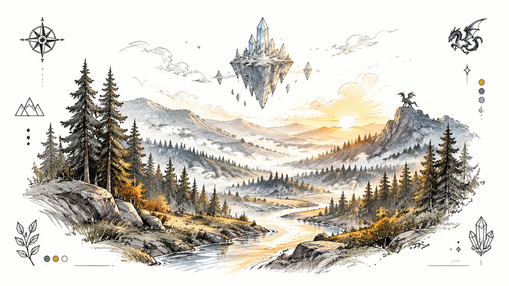
Generate the environmental foundation first. Then explore creatures, crystals, portals, or floating structures as additions. If you ask for every element in one image, starryai may distribute attention too evenly and create a busy scene that loses its strongest landmark.
Try:
Misty ancient forest with floating crystal islands and dragon silhouette, golden hour sunset light filtering through ancient trees, oil painting style, detailed fantasy landscape, naturalistic, winding river leading viewer's eye through misty valley, portrait composition, open title space
A Tolkien-inspired setting promises classic adventure, while a more painterly or surreal environment can signal contemporary mythic fantasy. The trade-off is emotional distance. Readers may admire a beautiful world without forming an immediate attachment to the story. Add one small figure, a distinctive tower, or a story-specific object if the setting alone feels anonymous.
For environmental concept exploration, starryai's free AI landscape generator can help you test forests, mountains, waterways, and impossible geography before you commit to a final composition. Keep the finished cover's focal point simple, even if the world behind it is complex.
A close portrait makes the protagonist the promise. This direction suits paranormal romance, contemporary fantasy, vampire fiction, werewolf stories, and any novel where readers choose the book because they want to know the person behind the power.
The palette should reinforce the character's supernatural identity. Pale skin against indigo can create a nocturnal vampire mood. Amber eyes and warm bronze light can suggest a predatory fae or shapeshifter. Silver, icy blue, or translucent white can support an ethereal paranormal aesthetic.
Use a close portrait facing forward when the character should feel confrontational and magnetic. A three-quarter view creates more narrative distance and leaves room for a title running down one side. Make the supernatural feature unmistakable but limited. Glowing eyes, translucent wings, a silver aura, or a controlled thread of magical energy is usually stronger than combining all of them.
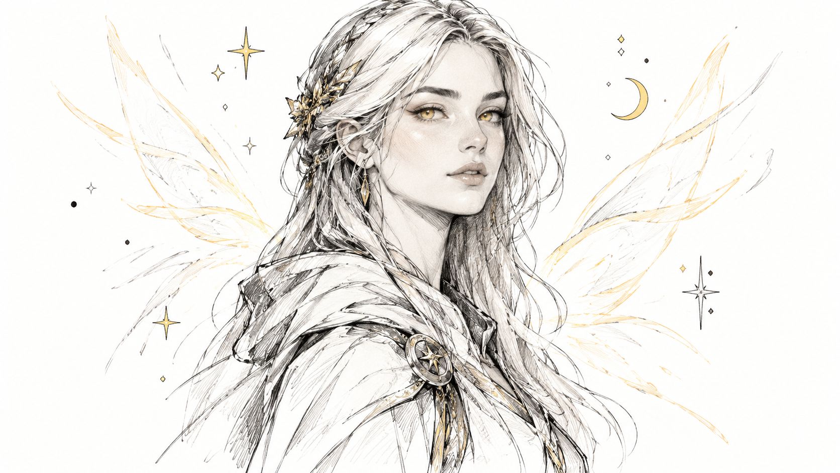
A prompt can be specific without becoming overloaded:
Beautiful paranormal woman with glowing amber eyes and ethereal silver aura, dramatic side lighting emphasizing paranormal otherworldliness, detailed digital portrait, close portrait facing forward, refined expression, dark atmospheric background, clean space for title
Generate multiple facial variations and compare them at small size. A beautiful face can attract attention, but an expression that contradicts the book's tone will mislead the reader. A tender romantasy should not look like an aggressive horror novel unless that tension is intentional.
Typography needs to frame the face rather than cut through it. Place the title above the hairline, below the shoulders, or in a side column. Use an ornate serif only if its counters remain open. Fantasy typography guidance commonly favors ornate serif, slab, and medieval-style display fonts, but this typography guide for fantasy covers emphasizes hierarchy and legibility, with the title more prominent than the subtitle or author name.
A single object can carry more meaning than a crowded scene. A silver key, broken crown, black flower, ancient coin, or solitary tree gives readers a question to answer. The gradient establishes the emotional register, while the object supplies the fantasy signal.
This approach is ideal for literary fantasy, mythic fiction, quiet fantasy, and romantasy with a strong thematic object. It can also help a series stand apart from illustration-heavy competitors, provided the symbol is distinctive and the typography has enough presence.
Build the palette around a transition. Deep indigo to rose gold can move from melancholy toward hope. Blue-gray to tarnished gold can suggest grief and recovery. Forest green to bone white can imply an old natural magic. Keep the gradient smooth if you want polish, or add soft grain if you want a handmade, archival feeling.
Center the object and leave generous negative space around it. A title in a contrasting color can become a second focal point, but it must remain subordinate to the symbol if the object is the story's visual hook. Use a simple serif, a confident sans serif, or a carefully selected display face. The design has less imagery to distract from weak typography, so letter spacing and alignment matter.
Prompt direction:
Smooth gradient from deep indigo to rose gold, single silver key floating in center, melancholic blue-gray transitioning to hopeful gold, centered minimal object with vast negative space, soft grainy texture, sophisticated fantasy book cover, portrait composition
The main trade-off is recognizability. A key may suggest mystery, but it may not tell readers whether the book is fantasy, romance, or a general mystery. Add a subtle magical cue, such as a faint halo, impossible shadow, runic engraving, or tiny star field. Avoid adding several objects to compensate. Once the cover contains a key, crown, sword, moon, and raven, it has stopped being minimalist and started competing with a scene-based design.
A mixed-media cover can give generated imagery a more tactile personality. Watercolor blooms, visible brushstrokes, paper grain, collage edges, ink lines, and controlled imperfections make a digital composition feel less polished in the generic sense and more connected to an individual book.
Use the medium to match the story. Watercolor and translucent washes suit lyrical fantasy, nature magic, and romantic myth. Oil textures can support epic grandeur. Ink, collage, and rough brushwork can fit dark fantasy or folklore. Choose one dominant treatment and let the other elements support it.
Generate a clean base image first, then experiment with texture separately. Add grain, brushwork, or paper overlays in design software rather than asking starryai to solve every stage at once. This keeps the focal subject clearer and makes it easier to create matching textures for later books in the series.
Production insight: texture should soften the image's surface, not erase the title, author name, or central symbol.
A prompt to test:
Fantasy scene with watercolor texture and digital elements, oil painting combined with digital art, dreamy and textured, grainy brushstroke effect, artistic imperfections, atmospheric enchanted forest, elegant magical focal point, portrait book cover composition, clear title space
This approach suits indie fantasy covers that want handcrafted authenticity without abandoning the speed of digital exploration. It's also useful when a clean AI image feels too generic. Layering several starryai outputs can produce richer depth, but too many textures can create muddy edges and inconsistent lighting. Keep one light direction and one dominant color family throughout.
For a practical demonstration of the image-making process, use the embedded video below as a visual reference before you begin experimenting.
| Style | 🔄 Implementation complexity | ⚡ Resource requirements | 📊 Expected outcomes | Best use cases / 💡 Tips | ⭐ Key advantages |
|---|---|---|---|---|---|
| Ethereal Enchantment with Glowing Elements | Moderate–High: layered effects, careful balance | Moderate: multiple AI generations; prompt tuning | Highly eye-catching thumbnails; strong magical mood | Paranormal romance, YA, urban fantasy, specify palette & rim lighting | ⭐⭐⭐⭐, Strong focal depth; versatile across subgenres |
| Dark Moody Atmosphere with Silhouettes | Moderate: composition & dramatic lighting focus | Low–Moderate: fewer elements, easier AI consistency | Immediate mystery and sophistication; excellent readability | Dark fantasy, gothic romance, thrillers, use negative space for text | ⭐⭐⭐⭐, Timeless, high contrast, very readable |
| Celestial and Cosmic Fantasy Realm | High: complex scale and layered cosmic elements | High: many passes, precise compositing & edits | Epic, grand scale; highly shareable and cinematic | Space fantasy, epic openings, balance character scale vs cosmos | ⭐⭐⭐⭐, Instant grandeur; cross-genre appeal |
| Intricate Magical Tattoo and Rune Design | High: precise linework and symmetry required | High: multiple iterations; cultural research advised | Distinctive branding; conveys complex magic systems | Urban fantasy, series with magic systems, test legibility at thumbnail | ⭐⭐⭐, Unique identity; strong series branding |
| Lush Natural Landscape with Fantasy Elements | High: layered terrain + creature integration | High: several generations and compositing steps | Immersive worldbuilding; immediate genre signaling | Epic/adventure fantasy, use leading lines and golden hour light | ⭐⭐⭐⭐, Strong escapism; broad fantasy appeal |
| Character-Focused Portrait with Supernatural Aura | Moderate: consistent facial features & effects | Moderate: portrait-focused iterations; fine detail | Strong emotional connection; high social engagement | Paranormal romance, character-driven tales, refine facial consistency | ⭐⭐⭐⭐, Personal, marketable, high engagement |
| Atmospheric Color Gradient with Symbolic Object | Low–Moderate: confident minimal design choices | Low: quick generation; depends on typography | High legibility; sophisticated, literary perception | Literary fantasy, crossover paranormal, choose color psychology | ⭐⭐⭐⭐, Timeless, highly legible, brandable |
| Hybrid Digital-Painterly Blend with Mixed Media Elements | High: fusion of styles and planned imperfections | High: multiple AI outputs + post-processing edits | Distinctive artistic identity; stands out algorithmically | Indie/literary fantasy, plan post-processing workflow | ⭐⭐⭐⭐, Handcrafted feel; unique and shareable |
The most elaborate image isn't automatically the strongest cover. Choose the direction that matches your subgenre, protagonist emphasis, and series promise. A romantasy centered on emotional tension may need a character portrait or luminous aura. An epic quest may need a scenery with one unmistakable landmark. A quiet mythic novel may benefit from a symbolic object and a disciplined gradient.
Fantasy cover art has changed without abandoning genre language. An analysis of fantasy covers comparing 2008 and 2009 reported a 50% reduction in castles, along with downward trends in other familiar staples such as glowing magic and swords, as documented in this history of fantasy cover evolution. Yet a 2020 thesis analyzing 100 young adult fantasy covers found that 88% included one or more fantasy colours, 62% featured one or more human figures, and 82% contained symbolism. The lesson is practical. Readers still need recognizable signals, but those signals can appear through cleaner composition, controlled color, or a single meaningful object rather than a literal catalogue of fantasy clichés.
Thumbnail testing should happen before you polish details. A 2026 UK survey reported that 49% of readers aged 18 to 24 considered a book cover an important purchase factor, compared with 27% of readers over 55, according to recent fantasy cover guidance on thumbnail legibility. That age difference doesn't mean older readers ignore covers. It does mean mobile discovery makes clarity especially important for younger browsing audiences.
Use this workflow:
Canva remains a practical low-friction option for assembling concepts and adapting assets. A 2026 author-tool guide identifies Canva as the most popular choice among the tools it ranks and lists its Pro tier at $13 per month for print-quality export, as reported by this book cover design tools guide. Use a template for exploration if it helps you move quickly, then inspect the final layout with the same care you'd give a commissioned design.
Pick the concept that says the right thing fastest. Generate the art, test the thumbnail, refine the typography, and repeat the structure across the series before you spend time on decorative detail.
starryai turns text prompts into fantasy visuals you can explore for character concepts, magical symbols, settings, and book cover directions. Visit starryai to test the eight approaches above, iterate on variations, and develop a cover concept with a clear series promise.


.svg)