

Written by Mo Kahn on
September 17, 2026


You've spent hours refining a fantasy scene, futuristic skyline, or romantic character portrait. On your monitor, the details look sharp, the colors feel rich, and the thumbnail catches attention. Then the first physical sample arrives, and the shadows look muddy, the type sits too close to the trim, or the artwork feels more like a poster than a collectible object.
That gap between digital book-cover design and a sellable physical print is where many creators lose money. A file that works on Etsy, a publishing platform, or a social feed still needs different decisions for paper, color, licensing, packaging, and customer expectations. The strongest book cover art prints are designed for the wall from the beginning, not exported as an afterthought.
A book cover once had to sell a story from a shelf. Today, it often has to do that as a tiny online image and then survive a second test as a physical object. Those are different jobs. Thumbnail design rewards immediate contrast, readable typography, and a clear genre signal. A premium print rewards composition, texture, tonal detail, and an image that remains interesting after the buyer has lived with it.
The opportunity comes from treating cover art as more than packaging. Print formats represented 71.1% of global book revenue in 2026, while hardcover sales rose 9.1% year over year, according to recent book-cover trend reporting. Those figures describe the broader book market, not a guaranteed print-sales result for an individual artist, but they support a practical observation: readers still value physical formats, and premium presentation has room beside ordinary digital merchandise.
Book-cover art also belongs to a long tradition of commercial visual culture. Mechanical bookbinding in the 1820s made cloth and paper covers cheaper and printable, while multicolour lithography and later half-tone illustration helped turn covers into commercial art. By the 1920s, dust jackets had become a standard promotional device, and fully illustrated jackets became common after 1900 as pictorial cloth bindings declined, as documented in The Art of Book Covers.
A digital thumbnail can hide weak edges, compression artifacts, and repetitive detail. A wall print exposes them. It also gives you more room to create a visual hierarchy that doesn't depend on a title block or a tiny marketplace preview.
Consider what a buyer may want.
The publishing industry's scale has always supported this kind of visual demand. One historical account describes Europe moving from about 15 million printed books at the dawn of Gutenberg's invention to more than 200 million a century later, and then to roughly 1 billion printed books in the 18th century. The same history places chromolithography around 1840, a development that enabled richer colour visuals and influenced the visual language of printed covers, as explained by Grapheine's history of book covers.
Practical rule: If the artwork only works when reduced to a thumbnail, it isn't ready to be sold as a premium print.
Tools such as starryai can help establish a visual direction from a text prompt, but generation is only the beginning. The commercial product comes from selecting a strong composition, correcting anatomy or architecture, expanding the image for its intended size, preparing the file correctly, and choosing a material that supports the mood. A misty scene may benefit from matte paper and restrained contrast. A neon city may need a surface that preserves saturated colour without turning dark areas flat.
A print-ready file starts with the physical product, not the screen preview. Decide the final trim size first, then build the artwork at that size rather than enlarging a small export at the end. Major print-preparation guidance uses 300 DPI at final size, one consistent colour space, full trim and bleed coverage, and a safe zone for critical text, as outlined in the KDP file-preparation requirements.
Use this production sequence:
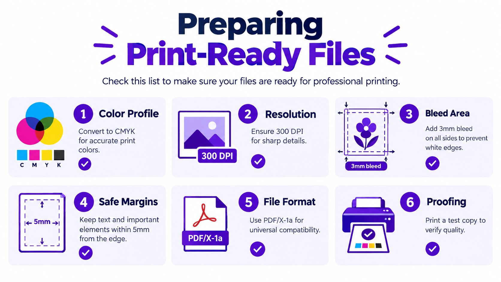
The supplied infographic references CMYK conversion, 3 mm bleed, 5 mm safe margins, PDF/X-1a, and test proofing. Follow the printer's own template when its measurements differ, because trim tolerances and colour requirements vary by production system. The principle stays constant: critical content stays protected, while edge artwork extends far enough to cover the trimming process.
For a focused explanation of how resolution affects physical output, use this guide to image resolution for printing. Don't judge sharpness only at screen zoom. Open the file at its intended physical dimensions, inspect small type and high-contrast edges, and print a test before listing the product.
Dark fantasy and sci-fi designs often fail through excess ink, not lack of drama. A file can contain attractive black gradients on screen but reproduce as a dense block when several colour channels overlap. One print-industry source reports that, on a 2,000-copy run, the first and last hundred copies can differ by about 3 to 5 Delta E units, a visible variation to trained eyes, as explained in Origin Books' discussion of hidden print failure modes.
Proof at least once, then check how the printer handles standard black, rich black, gradients, and embedded image profiles. One print guide recommends keeping total area coverage below 270% for rich-black builds and avoiding very light colour builds below 20% to reduce weak or unstable reproduction. These are production benchmarks, not universal settings, so confirm the printer's stated limits before exporting.
Paper determines whether a buyer experiences the artwork as a disposable poster or a considered art object. A thin sheet can make an image feel inexpensive, while a heavy coated stock gives the print structure before the customer has studied the composition.
For book-related art prints, compare gloss and matte by subject rather than by assuming one finish is always premium. Gloss can increase visual punch in luminous skies, metallic details, and saturated colour. Matte reduces glare and often suits charcoal palettes, painterly scenes, and typography that needs a quieter surface. A soft-touch treatment can add a velvety feel, but it may also change how dark areas appear and can show handling marks, so order a sample before making it your default.
The following guide uses specifications from a book and art-book printing guide, which recommends heavy coated papers for covers and lists common large-format dimensions.
| Paper Weight (gsm) | Finish Type | Best Use Case | Framing Requirement |
|---|---|---|---|
| 250 to 350 gsm | Gloss art paper | Colour-rich fantasy, romance, and cinematic illustration | Optional frame, recommended for long-term display |
| 250 to 350 gsm | Matte art paper | Dark scenes, fine gradients, literary or painterly artwork | Optional, depending on presentation |
| 157 gsm over 2 mm to 3 mm greyboard | Coated hardcover construction | Rigid premium presentation or book-object display | Usually displayed as a bound object rather than a loose print |
| Heavy coated stock | Soft-touch or protective laminate | Collector editions and tactile premium releases | Frame or mount according to the finished surface |
A loose print needs to arrive flat or well protected. Heavy stock feels better, but it also increases shipping weight and may require stronger packaging. Large formats such as 8.5 by 11 inches, 9 by 12 inches, 12 by 12 inches, or up to 13 by 10 inches can work well because they correspond to familiar frame proportions, though you should verify the exact frame availability in the markets you serve.
Don't launch with every paper and finish combination. Choose one dependable matte option and one more dramatic gloss or coated option, then use samples to photograph the difference. Show close-ups of the surface, a framed room view, and an unframed image so buyers understand what they're ordering.
The best finish is the one that preserves the visual intention. A glossy surface won't rescue a low-resolution file, and heavy stock won't fix poor colour conversion. Material adds value only after the artwork and production file can withstand close inspection.
The most expensive licensing mistake is assuming that owning a finished JPEG means owning every right needed to sell it. Copyright in a book cover generally arises automatically when the cover is created, and the creator owns it unless a contract says otherwise. However, a reproduction of an existing artwork receives derivative-work protection only when it adds new authorship beyond the source image, as discussed in this overview of book-cover design copyright.
That distinction matters when your composition includes stock art, fonts, textures, photographs, commissioned elements, or generated imagery. You need to know which parts you created, which parts you licensed, and whether the licence covers physical art prints, promotional merchandise, book covers, or only limited personal use.
A commercial licence gives you permission under defined conditions. It doesn't necessarily transfer copyright. One marketplace licence permits use for up to 5,000 lifetime physical or e-book covers under its commercial tier, while an extended commercial licence raises the threshold to 250,000 lifetime covers, according to Creative Market's published-works licensing terms. Those limits concern the licensed marketplace asset, not your entire finished print business.
Another publishing-related model reserves ownership with the licensor and grants the buyer a use right for personal book-related promotional materials only. The Swoonies licence terms illustrate why “commercial” alone isn't enough. Read the permitted purpose, audience, distribution method, product type, duration, territory, and copy limit.
Licensing checkpoint: Save the licence page, receipt, asset name, and version used in every commercial design folder.
For AI-assisted work, review the generator's current commercial-use terms before selling. Don't assume that an output licence covers every input, reference image, trademark, character, or borrowed visual style in your workflow. You remain responsible for removing recognisable third-party logos, protected characters, unauthorised portraits, and stock elements whose licence doesn't extend to merchandise.
The practical workflow is simple. Keep an asset ledger, store proof of purchase, record any copy-count cap, and obtain written permission when a contract is unclear. For a deeper explanation of commercial permissions in an AI workflow, consult this guide to commercial use rights. Legal review is sensible when an author, publisher, illustrator, or marketplace licence creates ambiguity.
A premium listing must make the physical object obvious within seconds. Buyers should see the artwork, its scale in a real room, the paper or finish, and the fulfilment method without having to infer those details from a title.
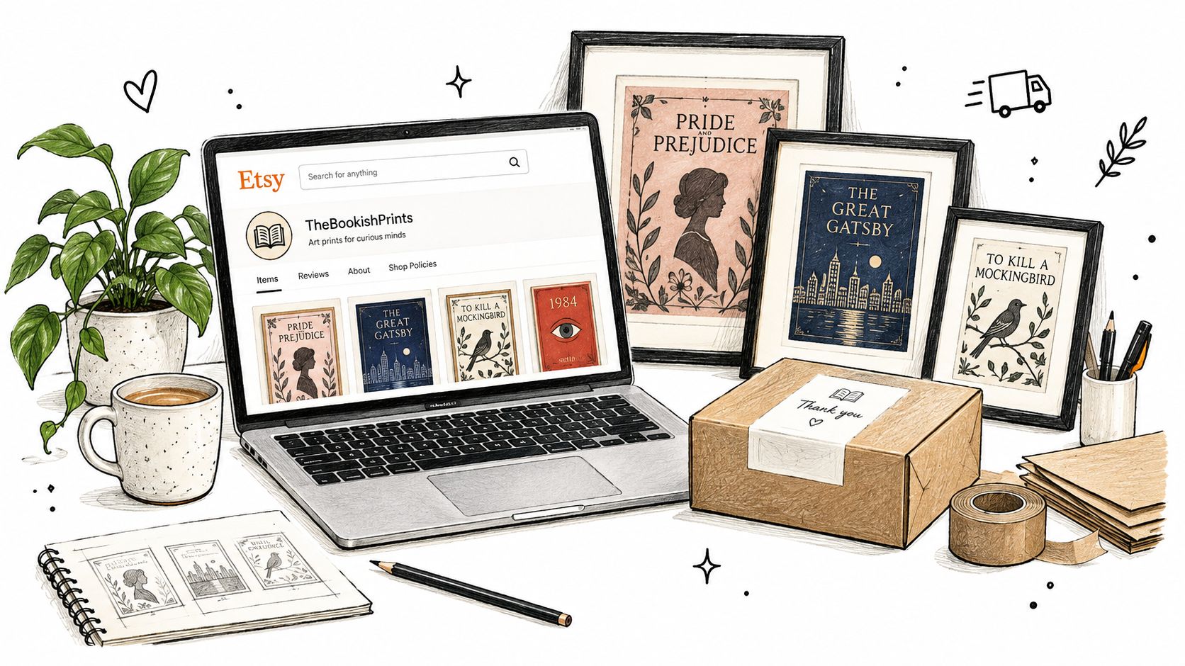
Start with the product promise, then write the listing around buyer language. A title might combine the visual genre, object type, and display intent, such as “Dark Academia Library Art Print” or “Cyberpunk City Literary Wall Art.” Avoid stuffing every possible genre into one listing. A buyer looking for romantasy artwork should understand the mood immediately.
Use the description to clarify:
Use mockups carefully. A room scene helps the customer understand scale, but include at least one flat product image and one close-up so the mockup doesn't hide cropping or surface detail. If your print-on-demand partner fulfils orders, request a physical sample before publishing the listing and check the actual packaging, not only the supplier's digital preview.
For shipping materials, a specialist discussion such as What is the best packaging for posting books? can help you compare protective formats. Book wraps aren't automatically suitable for art prints, but the underlying lesson applies: packaging must prevent bending, corner damage, and surface scuffing without making the dispatch process impractical.
Use production tools only where they support a consistent workflow. This AI image generator for Etsy can inform concept development, but your listing still needs human quality control, a print proof, and accurate rights documentation.
Place the video after the core listing advice so it supplements, rather than interrupts, the product setup:
Indie marketplaces and direct storefronts give you more room to explain edition details and connect a print to a specific book or author community. Etsy can provide discovery, but a distinctive product page, strong photography, and reliable fulfilment will do more for repeat sales than broad, generic tagging.
Premium pricing starts with a product that has visible reasons to cost more. Buyers can compare a digital image instantly, but they can't compare your paper, proofing discipline, packaging, and edition story unless you show them. Price the complete object, including production, packaging, platform fees, fulfilment, replacements, and the time required to prepare or approve each order.
A useful range of products can protect the brand without forcing every customer into the highest specification:
Don't manufacture scarcity you can't substantiate. If an edition is limited, document the quantity and keep the numbering consistent. If it's open, sell the value through image quality, material choice, and dependable presentation.
Colour communication deserves a place in your marketing, not only your production notes. Correct files can still show variation across a print run. The cited industry guidance reports about 3 to 5 Delta E units between the first and last hundred copies in a 2,000-copy run, so avoid promising that every sheet will match a glowing monitor exactly. Show a photographed sample, describe screen-to-print differences plainly, and replace genuine production defects rather than hiding behind vague disclaimers.
Launch content should reveal the decisions buyers can't see in a flat product image:
The strongest brand position isn't “AI art printed on paper.” It's a carefully prepared visual object with a clear literary mood, controlled production, and documented rights. That standard gives you a reason to charge for craft instead of competing with low-cost poster listings.
starryai helps creators turn text prompts into book-cover concepts and other high-resolution visuals, with style and canvas-size options that can support a print-focused workflow. Visit starryai to develop your next cover artwork, then take it through resolution checks, licensing review, proofing, and material selection before offering it as a premium print.


.svg)