
Written by Mo Kahn on
July 1, 2026


You've probably been there. The campaign brief is simple enough, the deadline is not, and the request sounds harmless: “Can you make a quick social banner?” Then problems show up. The message doesn't land in-feed, the text gets cropped on mobile, and the final design looks technically correct but easy to ignore.
This is the core challenge with banner social media creative in 2026. Fit matters, but attention matters more. A banner that matches platform dimensions and still disappears into the scroll hasn't done its job. The better workflow starts earlier, with strategy, and moves faster, with AI helping you explore more directions before you commit to one.
If you manage social channels, build assets for clients, or run your own brand, the win isn't just making banners faster. It's making sharper decisions about what the banner should communicate, when a banner is the right format, and how to generate more viable concepts without burning hours on manual comps.
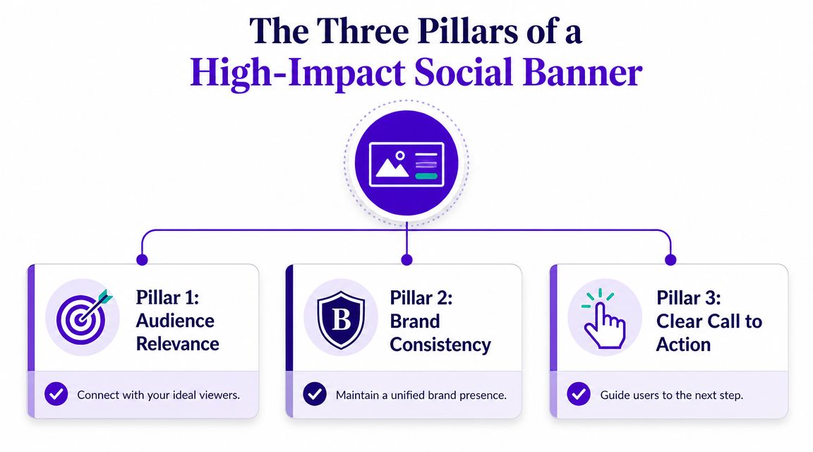
A social banner works when it solves one clear communication problem. That could mean driving clicks, reinforcing a launch, introducing an offer, or supporting a profile header that signals who you are in seconds. The strongest workflow is to define one primary campaign goal, then match the creative to platform specs, audience context, and placement, as outlined in The Bannermen's guidance on social media banners.
Before you touch prompts or design tools, lock the role of the asset. Is this banner supposed to attract, reassure, or convert? If you ask it to do all three, it usually becomes cluttered.
Most weak banner social media assets fail before the first draft. The team starts with dimensions, throws in a headline, adds extra product claims, and hopes design polish will rescue the message.
It rarely does.
Practical rule: If a banner needs a paragraph to explain itself, the concept is doing too much.
A better planning sequence looks like this:
Visual hierarchy decides what the eye lands on first, second, and third. That could be a product silhouette, a bold phrase, or a face with a strong directional gaze. Hierarchy isn't decoration. It's reading order. If everything is loud, nothing leads.
Brand consistency is what makes the banner feel connected to the rest of your ecosystem. That doesn't mean dropping your logo everywhere or repeating the same template until it goes stale. It means using recognizable color behavior, image style, tone, and spacing so the banner feels like it belongs to your brand even before someone reads it.
A single call to action gives the banner a job. “Learn more,” “Shop the drop,” “Watch the trailer,” or “Book a consult” all create different design decisions. If you include multiple calls to action, users often choose none.
Here's what tends to work better than expected:
What usually underperforms:
A high-impact banner isn't just attractive. It's organized, intentional, and built for a specific decision.
Getting dimensions right still matters because poor cropping can ruin even a strong concept. But dimensions are the starting line, not the finish line. The practical question is whether your most important visual information survives across desktop, mobile, and profile variations.
Use this as a working production sheet for common banner social media placements. Platform requirements change, so always verify before publishing.
| Platform | Banner/Cover Photo Size | Notes |
|---|---|---|
| Varies by placement | Keep key text and logos centered. Mobile and desktop crops can differ. For a current reference, see these optimal Facebook ad sizes. | |
| X (Twitter) | Varies by profile/header use | Wide layouts can crop aggressively at the edges. Avoid placing important text in corners. |
| Varies by personal page, company page, and ad format | Use extra breathing room around logos and faces. LinkedIn often rewards cleaner, less crowded compositions. | |
| YouTube | Varies by channel art display across devices | Build for the center safe area first. TVs, desktop, and mobile can all show the banner differently. |
| Etsy | Varies by shop banner type | Prioritize branding and product category cues over dense messaging. |
One easy fix for production friction is to create a master asset, then resize platform variants from that base file instead of rebuilding each version manually. If you need a quick way to adapt artwork, the starryai image resizer is useful for generating alternate dimensions without restarting the design.
The most common mistake isn't choosing the wrong canvas. It's treating the full canvas as usable text space.
Keep critical copy, logos, and faces away from the outer edges, even when the template says the full size is available.
For YouTube, this matters a lot because channel art displays differently depending on device. A banner can look perfectly balanced in one preview and feel broken on another if the center doesn't carry the main message. Facebook profile and cover contexts can create similar headaches, especially when interface elements overlap the image.
A few habits help:
When teams obsess over exact dimensions and ignore safe zones, they end up with technically compliant banners that still feel fragile. Strong banners are resilient across crops.
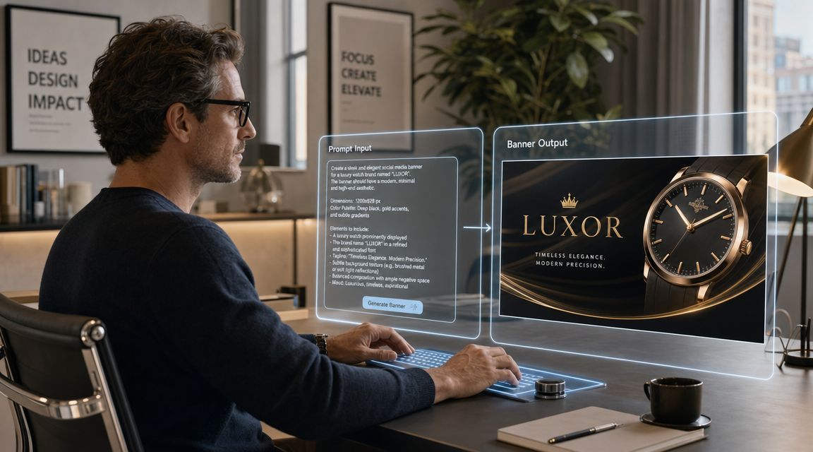
The difference between a weak AI result and a useful one usually isn't the model. It's the brief. “Make me a podcast banner” gives the system almost nothing to work with. It doesn't define mood, composition, audience, or the emotional role of the image.
That's why prompt writing works better when you think like a creative director. You're not describing an object. You're describing a visual decision.
Take a common brief: “I need a banner for my podcast.”
That sounds clear until you try to generate it. Is the show serious or playful? Interview-led or story-led? Minimal or loud? Text-focused or image-focused? Without those details, AI fills the gaps with average visual assumptions.
A more useful prompt usually includes:
If you want a stronger feel for prompt structure, this guide to AI art prompt ideas and techniques is a helpful reference point for building more specific instructions.
Here's how one generic goal can branch into distinct creative routes.
1. Minimalist podcast banner
Prompt:
A wide minimalist podcast banner, calm editorial aesthetic, clean studio desk, single microphone, soft neutral background, subtle shadows, muted beige and charcoal palette, modern typography space on the right, professional and thoughtful mood, high contrast focal point, uncluttered composition
This works when the show needs credibility and restraint. The open space supports later text overlays and the limited palette keeps the banner from fighting the title.
2. Retro culture-show banner
Prompt:
A retro-inspired podcast banner, bold color blocking, analog microphone, grain texture, warm orange, faded red, cream and black palette, playful collage composition, vintage print poster influence, energetic and conversational tone, wide horizontal layout with room for show title
This suits personality-driven content. It's less polished in the corporate sense, but more memorable if the audience responds to style and attitude.
AI gets more useful when the prompt describes tension. Clean but expressive. Bold but readable. Nostalgic but not messy.
3. Futuristic tech podcast banner
Prompt:
A cinematic futuristic podcast banner, glowing audio waveform elements, sleek dark studio environment, blue and violet lighting, premium tech aesthetic, sharp reflections, wide panoramic composition, host silhouette on the left, negative space for headline on the right, polished and high-energy atmosphere
This direction can work for startup, gaming, or AI content where the banner needs a stronger visual hook.
The key lesson isn't that one prompt is correct. It's that AI becomes dramatically more practical when you generate multiple strategic interpretations of the same brief. That's how you beat generic outputs and reach better creative options faster.
Banner social media work moves fast, which is why a good tool needs to help you explore, reject, refine, and export without dragging you into a full design-suite workflow for every idea. Social is now a measurable acquisition channel. 58% of consumers report discovering new businesses via social media, 83% of marketers say social media has become their primary customer acquisition channel, and brands allocating more than 20% of their marketing budget to social reported a 33% higher ROI, according to Sprinklr's social media marketing statistics roundup. That makes speed useful, but direction still matters more than speed alone.
Use one concrete example: a LinkedIn banner for a freelance consultant who helps B2B teams simplify messy marketing operations. The banner doesn't need to explain every service. It needs to communicate competence, clarity, and a modern point of view.
A practical concept might include a clean abstract workspace, subtle data-inspired geometry, and open space for a short positioning line. No clutter. No fake dashboard overload. No five-message pileup.
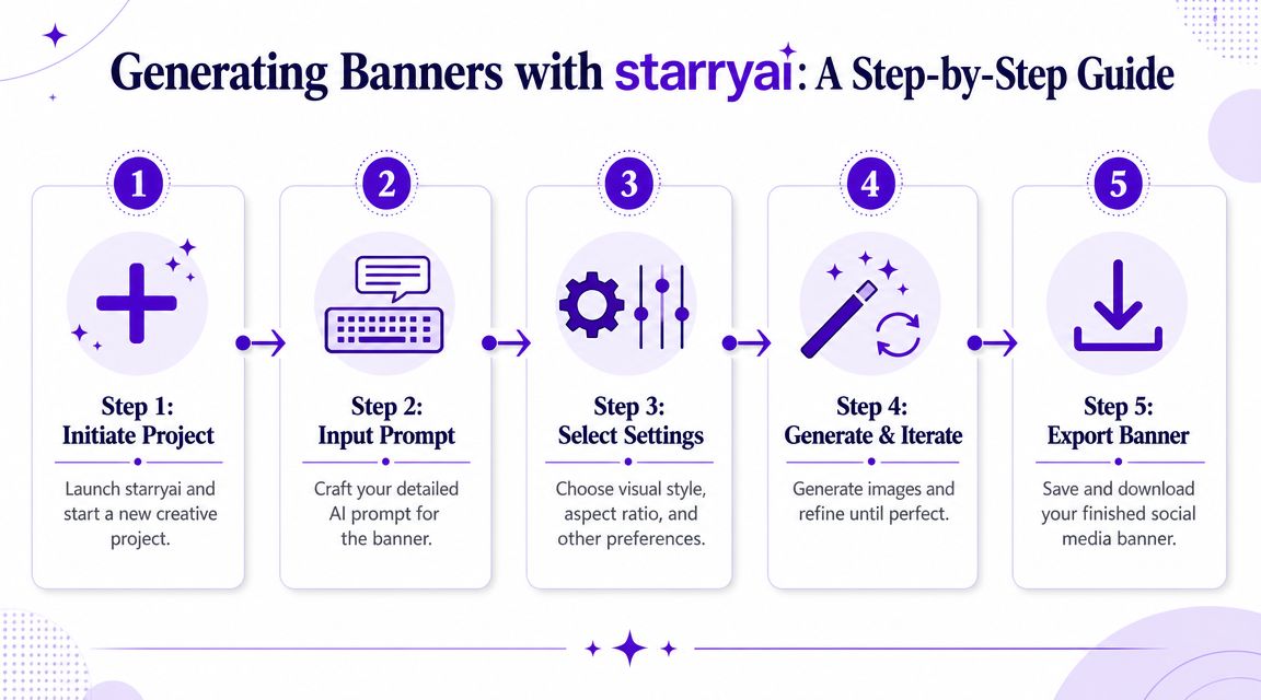
For first-pass ideation, you can use a straightforward creation workflow like the one outlined in this quick start guide for using the AI art generating app.
Start with a prompt that reflects the role of the asset, not just the topic.
Example prompt:
Wide LinkedIn banner for a freelance B2B marketing consultant, clean modern editorial style, abstract workflow shapes, subtle document and analytics motifs, white and deep violet palette, premium but approachable mood, negative space for short headline, horizontal composition, sharp details, minimal clutter
Then move through the workflow in order:
Generate broad concepts first
Don't chase perfection on the first round. Generate enough variation to see how the style behaves across composition, lighting, and spacing.
Eliminate the obvious misses quickly
Remove anything with cramped framing, confused focal points, or decorative detail that competes with future text.
Choose one route and refine it
Pick the version that best supports the banner's job. Not the prettiest image in isolation. The one with the strongest reading path and usable negative space.
Use editing tools for placement adjustments
AI is practical for social media content. Shift balance, clean background distractions, and refine the region where your headline or logo will sit.
Prepare variants for different placements
The same concept may need a tighter crop for one context and a wider one for another.
If your campaign mix includes motion-first creative or testing against short-form ad concepts, a tool like the ShortGenius AI ad creative tool can also help when you're comparing static banner ideas against more native-feeling ad directions.
A lot of teams choose the most detailed image because it looks expensive. In practice, that often hurts performance once copy, logos, and platform UI enter the frame.
Use this review lens instead:
The right banner isn't the one with the most flair. It's the one that still communicates after cropping, compression, and a fast scroll.
One more thing matters here. AI shouldn't only shorten production time. It should expand ideation. If you use it only to generate a finished asset, you're underusing it. The bigger advantage is testing several strategic visual directions before your team invests in polishing one.
That's where a lot of social managers level up. They stop asking, “Can AI make this banner?” and start asking, “Can AI help me compare three stronger concepts before lunch?”
A banner can look great in your workspace and still fail in the wild. Compression softens detail, platform previews crop unexpectedly, and text that felt balanced at full scale can turn muddy on smaller screens. Export settings are the last creative decision, not just a technical chore.
Use PNG when the banner depends on crisp edges, flat graphic shapes, transparency, or text that needs to stay clean. Use JPG when the image is more photographic and you need a lighter file with acceptable compression.
Those aren't rigid rules, but they're useful defaults.
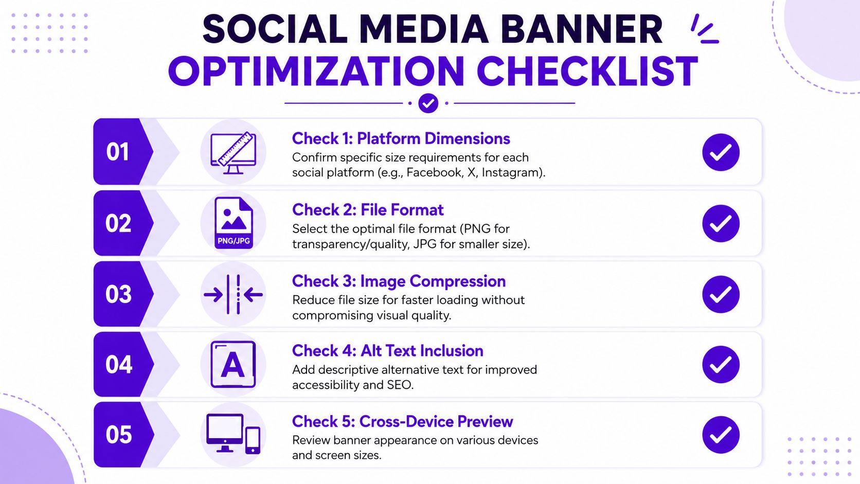
Compression matters too. Heavy files can slow page experiences and create friction, while aggressive compression can make gradients band and text edges break down. Export a test version, inspect it at actual use size, and compare quality before publishing.
The best reporting setup for social banners is to track reach or impressions, engagement rate, CTR, and conversion rate, then compare trends over time. Supermetrics also recommends keeping visual reports simple, with only 3 to 5 data points per visualization, so teams can turn metrics into clear recommendations instead of dumping raw numbers into a dashboard, as noted in its guide to social media reporting.
That kind of measurement only helps if the asset ships cleanly. Use a short final checklist:
A strong banner isn't finished when it looks good in a mockup. It's finished when it survives the actual platform.
The teams that improve fastest usually keep this final stage simple. They export, preview, publish, then measure only the signals that help them decide what to change next.
The biggest shift in banner social media work isn't visual polish. It's decision quality. Independent coverage notes that banner ads still face banner blindness, ad-blockers, and declining click-through rates, while also arguing that the more useful question for 2026 is when a banner is a better choice than native creative, motion, or short-form video, as discussed in Hyros' analysis of whether banner ads still work.
That changes the role of the marketer and the designer.
You're not just producing headers and ad units anymore. You're choosing the right visual format for the job, then using AI to explore more serious options in less time. Sometimes the answer will be a static banner with clear branding and one direct call to action. Sometimes it won't. A native-style post, creator-led asset, or short motion piece may carry the message better.
That's why the core value of AI sits upstream from production. It helps you test concepts early, compare styles quickly, and avoid overcommitting to the wrong format. In practice, that means fewer generic assets, faster iteration, and better alignment between creative and channel behavior.
The teams that stand out won't be the ones making more banners. They'll be the ones making smarter creative choices.
If you want a faster way to turn rough ideas into usable social visuals, starryai can help you generate banner concepts from text prompts, explore different visual directions, and build assets you can refine for specific platforms.