
Written by Mo Kahn on
July 1, 2026


You made the post. You picked the colors. You finally got the face, text, and background balance right. Then you uploaded it and the platform chopped off the forehead, hid the headline behind buttons, or squeezed the whole thing into a shape that made it feel awkward.
That's usually the moment people start searching for aspect ratio for social media. Not because they want a math lesson. Because they want their work to look the way they intended.
The good news is that aspect ratio isn't a fiddly technical setting once you understand what it's doing. It's the frame your story lives inside. Pick the right frame, and your image feels natural in the feed. Pick the wrong one, and the platform starts making decisions for you.
You export a polished image for Instagram. In your camera roll, it looks balanced. The subject has breathing room. The text sits neatly near the edge. Then the upload preview appears and suddenly the composition feels off. The top gets trimmed. The caption button floats over the lower area. What felt intentional now looks accidental.
This happens all the time because social platforms don't display every image in the same shape. Feed posts, stories, reels, thumbnails, and ads all have their own frame. If your visual doesn't match that frame, the platform will crop, scale, or pad it until it does.
Your design didn't fail. The container changed.
That difference matters more than most creators expect. On social, the frame controls how much of your visual appears on screen, how readable your text stays, and whether the main subject still lands in the first second of attention.
A lot of creators try to fix the damage after the fact. They upload, spot the crop, then scramble to stretch the background or rebuild missing edges. If you're in that situation, an AI uncrop tool for expanding the frame can help recover a composition without starting over.
The annoying part isn't just losing pixels. It's losing control. You chose the focal point, but the platform chose a different one. You placed the logo carefully, but the interface covered it. You wrote a clean headline, but the crop turned it into half a sentence.
That's why aspect ratio matters so much. It lets you decide the shape before the platform does. And once you start treating ratio as part of the concept, not an export chore, your posts stop feeling like they were squeezed into place.
Aspect ratio is the relationship between an image's width and height. It doesn't tell you how many pixels the image has. It tells you the shape.
A 1:1 image is a square frame. A 4:5 image is a taller portrait frame. A 9:16 image is a full-screen vertical frame, the kind that feels native on a phone.
That's the simplest way to think about aspect ratio for social media. You're not just making an image. You're choosing the frame people will see it through.

A practical baseline is clear. 1:1, 4:5, and 9:16 are the most common ratios because they map to the main social placements. Instagram feed photos can range from 1.91:1 to 4:5, with a recommended minimum width of 1080 pixels, while Stories and Reels use 9:16 at 1080×1920 according to Instagram sizing guidance summarized by HeyOrca.
Here's what those shapes feel like in use:
Social media is predominantly experienced on a phone. That means screen space is currency. A taller image naturally occupies more of the display, so it has more visual presence while someone scrolls.
Think of a square post like a postcard held at arm's length. Think of a 4:5 post like a magazine cover brought closer. Think of 9:16 like stepping into the scene.
Practical rule: The right ratio doesn't just prevent cropping. It changes how much attention your content can physically claim in the feed.
Often, readers get confused. They ask, “What's the best aspect ratio?” But that's a little like asking, “What's the best shoe?” It depends on where you're going. Feed, story, reel, thumbnail, and ad each ask for a different shape because each lives in a different viewing environment.
If you remember one thing, remember this: the ratio is part of the message. A dramatic vertical composition feels modern and immediate on mobile. A square can feel orderly and contained. A wide frame can feel cinematic, but it often gives up screen space on social.
If you want one operating system for daily publishing, keep this in mind: 1080 px width is still the safest baseline for feed placements, and 1:1, 4:5, and 9:16 are the most reliable production ratios. Buffer's roundup notes 1080×1080 for square posts, 1080×1350 for portrait, and 1080×1920 for stories and reels, while also noting that 4:5 and 9:16 tend to outperform square on most networks because they occupy more screen space on phones, as summarized in Buffer's social media image size guide.
Here's the quick-reference table most creators need.
| Platform & Placement | Recommended Ratio | Recommended Pixels (WxH) |
|---|---|---|
| Instagram Feed | 4:5 | 1080×1350 |
| Instagram Square Feed | 1:1 | 1080×1080 |
| Instagram Stories | 9:16 | 1080×1920 |
| Instagram Reels | 9:16 | 1080×1920 |
| TikTok Post | 9:16 | 1080×1920 |
| Facebook Feed | 4:5 or 1:1 | 1080×1350 or 1080×1080 |
| Facebook Stories | 9:16 | 1080×1920 |
| X Vertical Viewing | 9:16 | 1080×1920 |
| YouTube Shorts | 9:16 | 1080×1920 |
For standard feed posts, 4:5 is the workhorse. It gives you more vertical presence than a square without pushing into full-screen territory. Use 1:1 when you want a neat, contained look or when you're adapting older assets.
For Stories and Reels, go 9:16. These placements are designed for full-screen viewing, so anything shorter feels like it's leaving space on the table.
TikTok wants vertical creative. If your visual looks like it was made for a phone first, it usually feels at home there. That means 9:16 should be your default thinking.
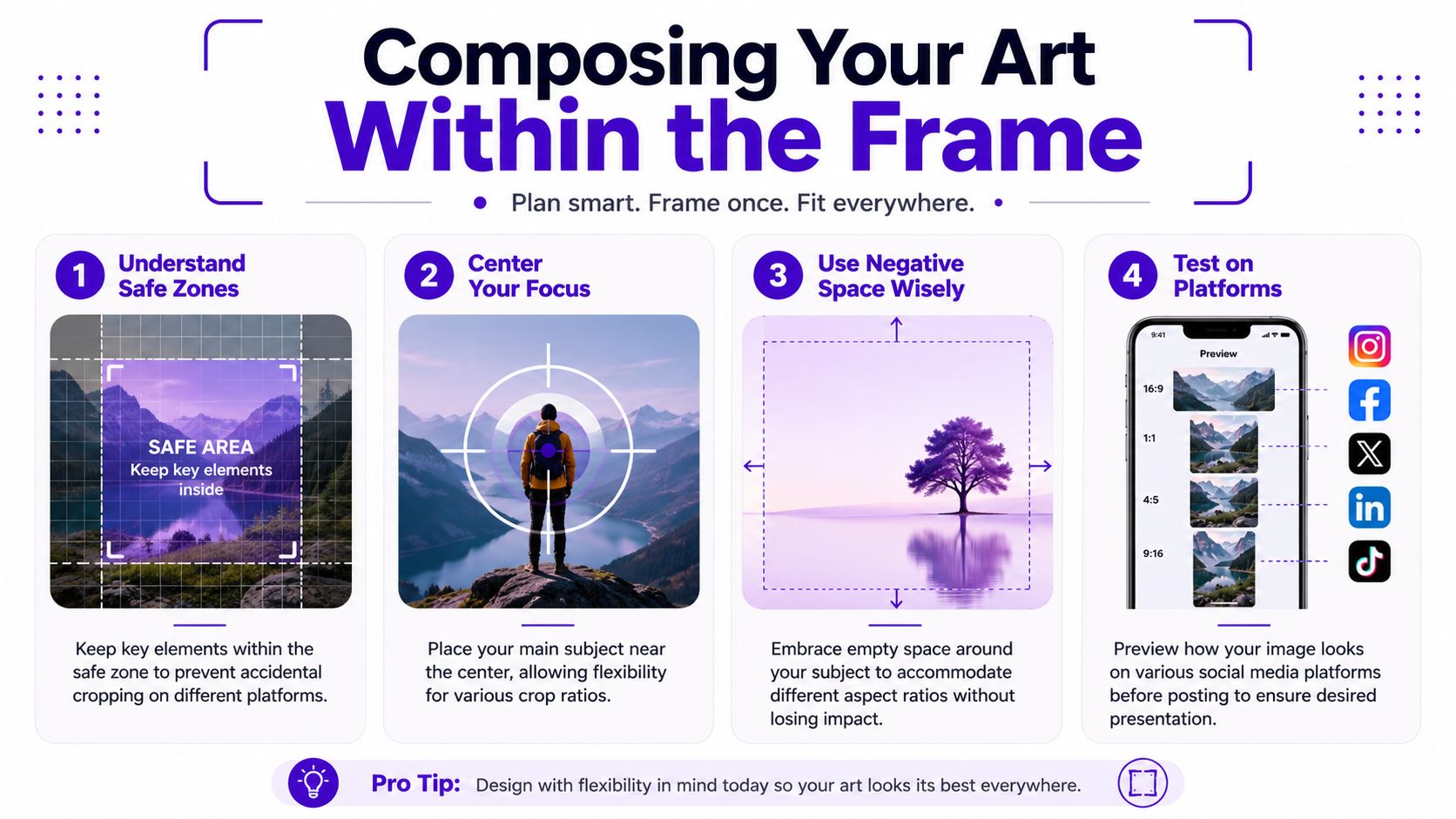
Text-heavy carousels and image posts still need breathing room. Don't treat the entire canvas as usable. The visible area and the safe area are not the same thing.
Facebook feed still supports both 1:1 and 4:5. If your goal is feed visibility on mobile, portrait usually gives you the stronger presence. For Stories and Reels-style placements, stay vertical with 9:16.
This matters especially for product brands. If you want a grounded example of how visuals shape category perception, this piece on the power of social media in bedding is useful because it shows how presentation and platform-native content affect how everyday products are perceived online.
X can handle multiple shapes, but newer vertical viewing surfaces make 9:16 increasingly relevant for immersive content. If you're publishing stills in the main feed, square and portrait often remain easier to control visually than extra-wide assets.
Shorts are simple from a framing perspective. Use 9:16 and design like every inch of the phone screen matters. Because it does.
If you already have one master asset and need platform-specific variants, a dedicated image resizer for social formats is often the fastest way to turn one concept into multiple placements without rebuilding from scratch.
Use the table as a default, not a law. The best ratio is the one that matches the placement and preserves the idea.
Getting the ratio right is only half the job. The other half is arranging the important stuff so it survives the platform interface.
A face can be technically inside the frame and still feel badly placed if buttons, captions, or profile labels crowd it. The same goes for logos, product names, and any text that you need people to read.
For AI-generated or text-heavy creative, the safe-zone problem is often the primary issue. Sprout Social's guide notes safe zones for Instagram and TikTok and recommends keeping critical content within central regions so mobile interface elements don't cover them, as described in Sprout Social's social media image sizes guide.
That changes how you should compose. Don't place the key detail right at the top edge just because it looks elegant in the raw file. Don't anchor a headline low in a vertical layout if a caption bar or action buttons may sit there later.
If you're creating visuals from scratch, these habits help:
Don't compose for the exported file alone. Compose for the final viewing surface.
For starryai users, this matters at prompt time, not just at export time. If you ask for a close-up portrait with text floating near the top edge, the generation may look great in isolation but fail on a vertical social placement. A better prompt is one that builds in margin. Ask for centered subjects, negative space, and room around important features.
A helpful mental model is stage design. The actor doesn't stand at the very lip of the stage if curtains and lighting rigs block the view. Social platforms add their own curtains. Your job is to keep the performance visible.
When you're generating or adapting visuals for social, ratio should be an early decision, not the last checkbox before export.
Here's a practical way to work inside starryai when you know the destination first.
Choose the placement before the prompt
If the image is for a Reel, Story, or Short, think vertically from the start. If it's for a feed post, decide whether you want the tidy feel of square or the stronger mobile presence of portrait.
Select the ratio in Image Studio
Use a preset that matches your intended surface, or enter a custom shape if the placement demands it. This keeps the generation aligned with the final use rather than forcing a crop later.
Prompt for composition, not just style
Add instructions like “centered subject,” “negative space around face,” “text-free margins,” or “room for headline placement.” Those words can do more for your final post than another aesthetic adjective.
If you're just getting familiar with the interface, the quick start guide for using the starryai app is a useful walkthrough.
After generation, pause and inspect the edges. Ask three questions:
That last question matters most. Social images aren't judged at full size on a desktop monitor. They're judged quickly, on a small screen, mid-scroll.
A short visual walkthrough helps if you want to see ratio selection in action:
A good habit is to generate one concept, then create a few ratio variants of the same idea. The square version might work for a profile grid. The 4:5 version might read better in feed. The 9:16 version might feel far more alive in a story sequence.
That's not busywork. It's adaptation. Social platforms don't show your image in one universal gallery frame, so you shouldn't treat every placement as if they do.
Aspect ratio is a storytelling choice disguised as a technical setting.
A square frame can feel contained and intimate. It works well when you want focus and stability. A taller portrait frame gives the subject more presence and often feels more editorial. A full-screen vertical frame feels immediate, energetic, and immersive, which is why it suits stories, reels, and shorts so well.
Cropping risk is the hidden reason this matters so much. If you reuse one master creative everywhere, anything outside the native frame can be clipped or downscaled, which can hurt legibility and weaken the visual impact, as explained in Promo's guide to video aspect ratios. That's why strong social creative starts with placement, not just artwork.
The frame changes the feeling. Not just the fit.
If you want better results, make these choices on purpose:
That's the value of understanding aspect ratio for social media. You stop reacting to platform crops and start directing the viewing experience.
If you want to turn prompts, selfies, or existing images into platform-ready visuals without wrestling with manual edits, try starryai. It gives creators a practical way to generate artwork, choose the frame that fits the placement, and build social visuals with composition in mind from the start.