
Written by Mo Kahn on
July 1, 2026


You've probably done this already today. You exported a strong image, posted it, and watched the platform ruin it. A face gets chopped at the forehead. Product packaging slides off the edge. Text that looked balanced on desktop suddenly feels cramped on mobile.
That's not a quality problem. It's an aspect ratio problem.
For social content, an aspect ratio converter isn't just a utility. It's the difference between a post that feels intentional and one that feels auto-cropped by a machine that doesn't understand your composition. That matters even more with AI-generated artwork, where hands, faces, negative space, and focal points often sit in places that break the second you force the image into a different frame.
A social media manager gets a polished campaign visual from design. It looks perfect in the original file. Then Instagram trims the top, TikTok zooms awkwardly, and a marketplace banner squeezes the whole thing into a shape it was never designed for. Suddenly, the same asset tells three different stories, and none of them are the one you approved.
That frustration is common enough that 68% of users abandon aspect ratio tools after just one failed export due to unexpected cropping or resolution loss, according to web app log data discussed in this Stack Overflow thread. The math isn't usually the hard part. The hard part is getting a result that still looks good after the conversion.
Aspect ratio is the shape of the frame. It tells you the relationship between width and height. A square post, a vertical Story, and a wide banner can all use the same image source, but they won't preserve the same composition.
That's why one-size-fits-all creative keeps failing. The image isn't broken. The frame changed.
Practical rule: Don't ask, “How do I make this image fit?” Ask, “What part of this image must survive the new frame?”
Each platform rewards a different visual shape. Social apps often prioritize vertical real estate. Storefronts and websites need cleaner horizontal layouts. Email headers want one composition, product galleries want another, and ad placements add their own constraints.
If you manage both social and commerce, it helps to keep platform-specific references close by. For example, Skup's guide to ideal Shopify image formats is useful when you need to protect product framing while still keeping your storefront consistent.
A good aspect ratio converter helps, but the primary skill is editorial. You're deciding what viewers see first, what they lose, and whether the image still feels deliberate after the resize.
Every conversion comes down to one choice. Crop the image or pad the frame.
That tension has been part of screen design for a long time. The modern 16:9 standard was proposed in 1989 as a geometric compromise between 4:3 television and 2.35:1 cinema, which is why aspect ratio conversion has always been about trade-offs rather than perfection, as outlined in this overview of the 16:9 aspect ratio.
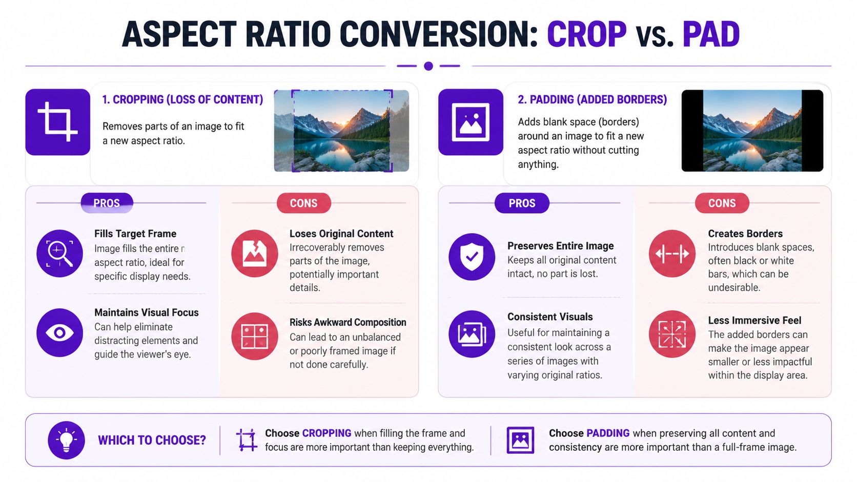
Cropping removes part of the original image so the new frame fills completely. That usually looks stronger on fast-moving social platforms because there are no borders and no dead space.
Use cropping when:
Cropping fails when the important information sits near the edge. That's common with AI portraits. The generator places a face beautifully, then hands, hair, props, or text drift into the margins. A quick crop turns “stylized editorial portrait” into “why is the chin missing?”
Padding keeps the full image and adds space around it to fit the new shape. Those borders can be black, white, blurred, branded, or color-matched.
Padding works best when:
If the edge detail carries meaning, pad first and crop second only if the result still reads cleanly.
Use this decision filter before touching any slider:
| Question | If yes | Best move |
|---|---|---|
| Is the subject safely centered? | The focal point survives a tighter frame | Crop |
| Are text, hands, or product edges near the border? | Important details risk being cut | Pad |
| Does the platform need a full-bleed look? | Borders will feel weak or dated | Crop |
| Is the original composition part of the appeal? | The framing itself matters | Pad |
If you need a tool designed around reframing instead of blunt trimming, AI cropping workflows can help you preserve the subject with more control.
If you're still resizing after the design is finished, you're already late. Strong teams pick the target frame before they build the visual.
That habit makes more sense when you remember how long aspect ratios have shaped media. The 4:3 ratio, or 1.33:1, was the universal standard for 35mm film for decades before widescreen formats like 2.39:1 pushed conversion methods into mainstream use, as noted in this Academy ratio history. Different shapes always create different compositional rules.
Here's the quick-reference version most creators need.
| Aspect Ratio | Dimensions (Typical) | Best For | Platforms |
|---|---|---|---|
| 9:16 | 1080 × 1920 | Full-screen vertical storytelling | TikTok, Instagram Reels, Stories |
| 4:5 | 1080 × 1350 | Feed posts that take up strong vertical space | Instagram feed |
| 1:1 | 1080 × 1080 | Clean, centered compositions | Grid posts, profile-linked visuals |
| 16:9 | 1920 × 1080 | Wide thumbnails and banners | YouTube thumbnails, website hero areas |
Use 9:16 when you want immersion. Vertical content fills the phone naturally, which makes it feel native instead of adapted. Faces, outfit shots, and before-and-after concepts usually belong here.
Use 4:5 when you want more feed presence without going full Story format. It's often the safest choice for social teams because it gives you height while still behaving like a standard in-feed post.
Use 1:1 when symmetry matters. Squares are forgiving for product shots, logos, quote cards, and visuals with centered subjects.
Use 16:9 when the image needs breathing room left to right. Website banners, YouTube assets, and presentation visuals usually feel more natural in a wider frame.
Don't pick a ratio because it's popular. Pick it because it supports the subject placement, text position, and platform behavior you need.
Build a “safe zone” mentally before you design. Keep faces, titles, logos, and product edges away from the outer margins. That way, if you later need a 4:5 crop from a 9:16 original, you won't be rescuing the layout at the last minute.
For everyday publishing, speed matters. You don't always have time to rebuild artwork from scratch, so your aspect ratio converter workflow needs to be fast, predictable, and easy to repeat.
Start with the simplest move first.
Open the image in your phone editor, Canva, or another familiar design tool. Choose the destination format first. If the post is for Instagram feed, test 4:5 before anything else. If it's for a profile grid or a simple promo, test 1:1.
Then make one clean decision:
For campaign work heading to vertical video placements, TikTok Ads Specs 2026 is a useful reference point when you need your posts, promos, and ads to align visually.
The best conversion is often the one you don't have to do.
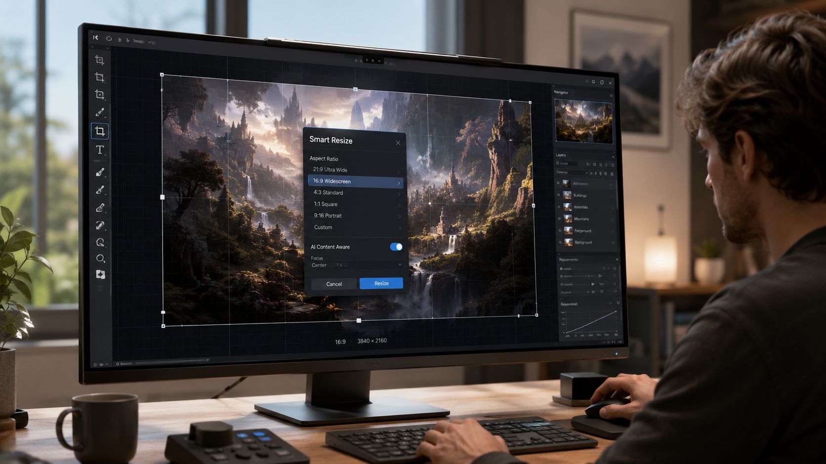
AI image generators like starryai offer standardized canvas presets such as square (1:1), portrait (9:16 or 4:5), and 16:9 during generation, which simplifies the workflow before editing even begins, according to this review of starryai presets. That changes the process completely. Instead of making an image and then forcing it into the right frame, you start inside the right frame.
If you still need to adapt an asset after the fact, a dedicated image resizing tool is useful for quick social variations.
Here's a visual walkthrough of the broader idea in motion.
Most daily resizing problems don't come from the software. They come from choosing the ratio too late.
Basic converters treat every image the same. That's fine for a plain product photo. It's a bad fit for AI art, character portraits, fantasy scenes, and selfie-based transformations where the important visual cues aren't neatly centered.
Recent analysis says 74% of mobile creators manually re-edit AI images after using an aspect ratio converter because automated crops cut off faces or key compositional elements, according to this aspect ratio analysis. That tracks with what many creative teams run into. The converter technically works. The image just stops looking intentional.
AI-generated visuals often place attention in unusual spots. A portrait may have a tilted pose, dramatic hair shape, glowing props, or asymmetric lighting that depends on the original frame. Standard auto-crop tools don't understand any of that. They center blindly, trim mechanically, and create strange results.
That's why AI-aware conversion works better as a mindset than as a feature label. You're not just resizing. You're preserving the image's logic.
A good conversion keeps the subject readable. A great conversion keeps the original feeling.
Use a smarter approach when a normal crop ruins the image:
For images that need more breathing room rather than tighter framing, AI uncrop tools are often more useful than standard crop presets.
When I'm dealing with artwork that has fragile composition, this order usually works better than a direct resize:
| Step | What to do | Why it helps |
|---|---|---|
| 1 | Duplicate the original | Protects the source composition |
| 2 | Test the target ratio with a loose crop | Shows what the frame will sacrifice |
| 3 | Expand or rebuild the background | Preserves the subject |
| 4 | Fine-tune placement manually | Restores visual balance |
This is the point where conversion stops being technical and becomes art direction. That's a good thing. It means you're making the image fit the platform without letting the platform bully the composition.
The cleanest way to think about aspect ratios is this. You're not resizing pixels. You're directing attention.
That shift changes everything. Cropping isn't just a utility setting. Padding isn't just a compromise. Each choice affects whether a face feels cinematic or cramped, whether a product feels premium or accidental, and whether an AI-generated image still looks like the piece you approved.
A good aspect ratio converter helps you move faster. A good creative process keeps you from needing rescue work in the first place. Plan the destination early, protect the focal point, and treat every platform as its own frame instead of as a generic output box.
If the image still looks intentional after conversion, you did it right.
If it merely fits, keep working.
If you want to skip a lot of the cleanup work and start with the right frame from the beginning, starryai makes that easier. You can generate visuals for social-friendly formats, experiment with creative styles, and spend more time refining ideas instead of repairing awkward crops.