

Written by Mo Kahn on
August 9, 2026


You've got a good-looking AI render on screen, a shirt mockup open in another tab, and that familiar sinking feeling when the design suddenly looks cheap. The colors are right, the concept is strong, but the file falls apart the moment you imagine it on cotton, under a heat press, or inside a marketplace thumbnail.
That gap is where most ai t shirts fail. Not at the prompt, but after it.
The first time a strong render lands on a shirt mockup and comes back with a white box around it, the lesson hits hard. The image may look polished in a gallery view, but garment printing exposes everything the generator left unresolved. Background cleanup, size, contrast, and composition matter more than the “wow” factor of the image itself.
A lot of creators treat the image as the finished product. That works for a feed post, then collapses when the file has to sit on fabric, survive compression in a marketplace preview, or print cleanly across a chest. A design can look cinematic on a screen and still read as muddy, awkward, or obviously generated on a shirt.
Practical rule: if the design only works when viewed large on a monitor, it probably isn't shirt-ready yet.
The big mistake is assuming a great image automatically becomes a great shirt. It doesn't. The shirt forces the file into a smaller visual field, a different texture, and a different production method, which means every weak edge becomes more obvious. That's why the printability-first mindset beats the prompt-first mindset.
The market isn't small anymore. The AI-powered personalized on-demand apparel market was valued at $6.8 billion in 2025 and is projected to reach $47.2 billion by 2034, with a 23.5% CAGR over the forecast period, according to market reporting on the AI-powered personalized on-demand apparel market. Within that market, T-shirts were the largest category at $3.1 billion in 2025, and North America led regional revenue with $2.4 billion. That tells you AI-generated tees sit inside a serious apparel personalization business, not a novelty lane.
Independent industry reporting points the same way. One dataset says adoption in T-shirt printing grew by 35% from 2022 to 2023, while custom AI-designed T-shirt sales increased by 28% year over year in 2023. It also estimated the global AI-powered custom T-shirt market at $500 million in 2023 and projected $2.5 billion by 2028, which is a useful reminder that demand is moving, but buyer patience for sloppy files is not.
The chain is simple. Prompt. Clean up. Upscale. Place. Print. If one step is weak, the shirt looks unfinished. If all of them are handled with production in mind, the design starts to feel intentional instead of generated.
A shirt design prompt has a different job than a general art prompt. It needs to produce a file that still reads clearly when it's reduced to chest size, placed on fabric, and seen from a few feet away. That means high contrast, bold outlines, limited palette decisions, and a clear central subject matter more than atmospheric detail.
The cleanest AI shirt prompts usually ask for something the printer can handle. Dense skies, delicate facial features, tiny text, and layered scenery tend to collapse at small scale. A better prompt leaves room for the image to breathe and keeps the focal point obvious.
Try prompts like these:
Those examples work because they tell the model what to leave out. A shirt design doesn't need cinematic depth. It needs readable shapes and a composition that still makes sense when the mockup shrinks the art down.
Inside starryai, the fastest path is usually multiple variants, not one perfect generation. Keep the subject stable, then test the visual constraints. Change the palette, tighten the contrast, and push the model away from busy backgrounds until the image feels screenable. If the output starts to look like poster art instead of apparel art, you've drifted too far.
The best support material I've found for this side of the workflow is graphics for shirt printing, because it focuses on the gap between a generated image and an actual garment graphic. The same idea shows up in the internal prompt work on prompt optimization for starryai, where tighter phrasing usually gets you closer to a usable result.
Working shorthand: if the prompt includes tiny text, glowing haze, or layered scenery, expect cleanup later.
For a practical reference on how people turn shirt ideas into production graphics, the guide from graphics for shirt printing is worth keeping open while you prompt.
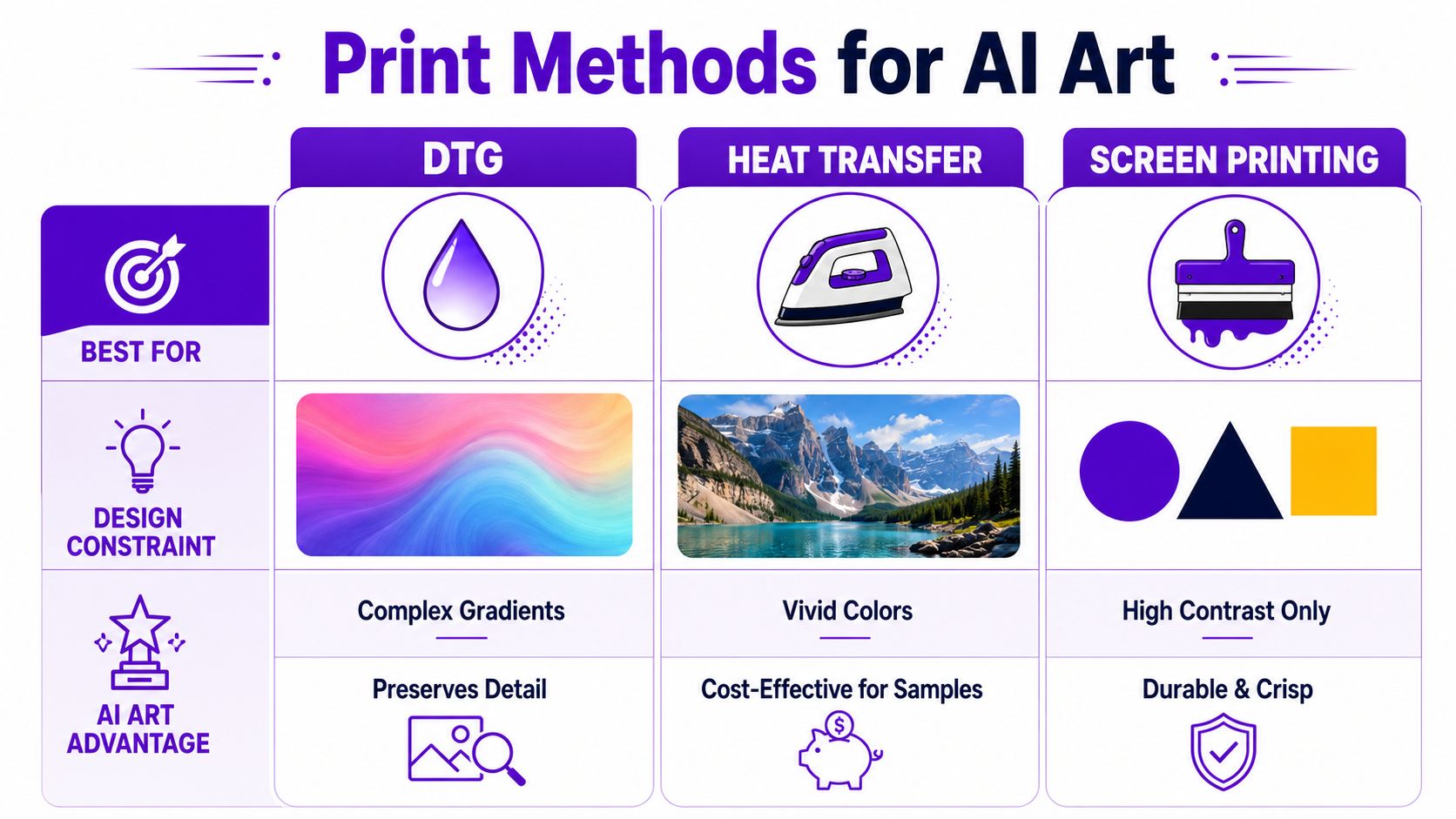
Print method is a design constraint, not just a production choice. A beautiful starryai render can be a strong DTG candidate and a terrible screen print candidate, or the reverse. The wrong match doesn't just waste money, it makes the art look like it was never meant for clothing.
DTG is the easiest fit for gradients, rich color blending, and image-heavy concepts. If your artwork leans painterly, photo-like, or full of soft transitions, DTG usually handles the visual logic better than methods that want cleaner separations. The trade-off is that the file still needs solid source quality, because DTG won't rescue weak resolution or sloppy edges.
Screen printing rewards control. It's more reliable for 1 to 4 solid inks or 1 to 6 spot colors, and it likes vector-friendly structure, strong outlines, and compositions that separate cleanly. That makes it a good match for bold graphic tees, but a bad match for diffuse gradients, microscopic details, and loose atmospheric effects.
Heat transfer sits in the middle as a practical iteration tool. It's useful when you're testing low-volume drops, sample runs, or quick design adjustments, especially if you're still validating whether buyers respond to the art. For more detail on how creators build for this workflow, the screen-printing perspective in Dirt Cheap Headwear's guide for artists is a useful complement because it keeps the focus on what prints, not just what looks good on screen.
The easiest decision rule is this. If the art depends on blending, choose DTG. If it depends on crisp shape language, choose screen print. If you're still testing demand, use heat transfer as a low-friction sample route.
The designs that fail most often are easy to spot. Thin line art with too much internal detail gets muddy. AI portraits with soft glow effects lose structure. Busy collage layouts look clever in a mockup, then turn noisy on fabric. The print method should sharpen the idea, not expose the weak parts of it.
A shirt file that looks “pretty good” on a laptop often looks amateur once it's exported badly. The difference usually comes down to background handling, resolution discipline, and whether the creator stops at the generated image instead of finishing the file for production. That's where most of the technical cleanup pays off.
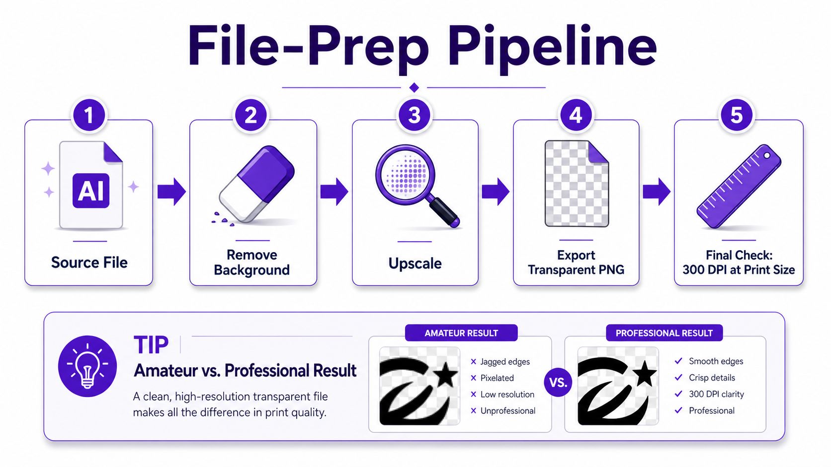
The practical workflow is straightforward. Generate multiple variants, remove the background, upscale to print size, then export a transparent PNG. If the export still carries a white field, you'll see a rectangle on the mockup and, in many cases, on the garment itself.
At final print size, 300 DPI is the standard threshold. A common front-chest target is 12×14 inches, which means about 3600×4200 pixels. The goal is simple, the file has to hold up at the size it will be printed, not just at the size it looked good in the generator.
A small free editor can close the gap between render and production. Trim stray pixels, correct the canvas, and make sure the background really is transparent, not just white-looking. The internal guide on image resolution for printing is useful here because it keeps the export conversation grounded in actual print sizing rather than vague “high-res” talk.
Two settings choices matter more than most creators expect. sRGB is usually the safer color space for digital mockups and many web-first workflows. CMYK may matter later in a printer's pipeline, but if you're exporting from a generator into marketplace listings first, the file has to look coherent in screen-based previews too.
A shirt file can fail without looking obviously broken. It's enough for it to be a little soft, slightly off-center, or a bit too close to the edge.
Add safe-area bleed so the design doesn't feel cramped on the shirt body. A front graphic that sits too tightly in the printable area looks accidental, even if the art itself is solid. I've found that the strongest files feel quiet in the edges and confident in the center, which is usually a sign that the export work was done carefully.
If you're using starryai for generation, treat the download as the starting point, not the final deliverable. The platform can produce a strong base image, but the print file still needs your finishing pass before it belongs on a product page.
Raw AI art almost never looks like a finished shirt design on its own. It often needs a wordmark, a caption, a small badge, or a supporting graphic to make the composition feel deliberate. Without that layer, the result can read like a nice image that got dropped onto apparel by accident.
Typography does more than add words. It gives the design a hierarchy. A short slogan can anchor a chaotic illustration, a clean brand name can make an abstract image feel merch-ready, and a single line of type can tell the buyer what the shirt is supposed to mean.
The trick is to match the font to the image language. A distressed block face fits a loud retro tee. A narrow sans-serif pairs better with cleaner futuristic art. A handwritten font can work, but only if the rest of the composition is restrained enough to support it. If the AI image is already busy, the type should simplify, not compete.
A chest print has a finite visual window. That means the safest approach is often a centered image with text either above it or below it, not everywhere at once. Full-front layouts can carry more complexity, but even there, the design needs negative space or the whole thing starts to look crowded.
A before-and-after pattern I see often is this. First version, a generated fox head sits alone in the center, and it feels generic. Final version, the same fox gets a small arched slogan and a tiny star marker underneath, and suddenly the shirt reads like a real product instead of a leftover render.
The most common layout mistake is still the simplest one, dropping the AI art onto a shirt as-is. That's the move that makes the piece feel unfinished, because nothing in the composition tells the eye what to do next.
Where you sell shapes the business almost as much as the design does. Etsy can surface niche aesthetics quickly, Shopify gives you brand control, and print-on-demand partners reduce operational drag. The right choice depends on whether you want discovery, control, or speed.
Marketplace-first sellers usually want quick validation. Etsy can work for that because buyers already browse niche styles and novelty gifting categories, but the trade-off is that your listing competes inside a crowded search environment and your mockups have to do more selling. If your visuals look generic, your product gets ignored.
Brand-first sellers should lean toward Shopify if they want a tighter identity around their AI-made apparel. That route gives you more control over product pages, bundles, and repeat customer experience, but it also means you're responsible for traffic. The starryai AI art generator for print-on-demand creators is relevant here because the value of the artwork is in how cleanly it can move from generation to product page.
POD-first sellers usually choose that path because they want fewer moving parts while testing concepts. That works well when the art is already production-minded and the seller wants to avoid managing stock, packing, and returns manually. The trap is assuming the POD partner will fix weak artwork. It won't.
Different platforms are also developing different expectations around disclosure and presentation. Some buyers are happy to shop AI-made apparel, others specifically look for human-made alternatives, and marketplaces are increasingly part of that conversation. The wrong setting or vague presentation can make a design feel suspicious even when the art itself is fine.
For sellers comparing methods, the practical rule is simple.
A lot of AI shirt content ignores the fact that platform fit matters as much as the render. The storefront changes how buyers interpret the same art, and the winning move is to match the business model to the design style instead of forcing one lane to do everything.
Commercial use is not the same thing as total freedom. With any AI tool, you still need to understand what the license lets you sell, what it doesn't cover, and how the marketplace you use expects you to present the work. Buyers have started to notice those distinctions too, and that has turned authenticity into part of the product.
AI-generated apparel is increasingly treated as either a commercial opportunity or “instant cringe”, depending on who's looking at it. There's also visible demand for explicitly human-made alternatives, including “No AI” shirts on marketplaces, which tells you buyers are using the garment as a signal, not just a graphic. That's why disclosure matters even when the file is technically printable.
The important nuance is that AI shirts are not only a design category, they're also a signaling category. Buyers may care about originality, artistic ethics, and whether the creator is being transparent about how the work was made. If you ignore that, you may still make sales, but you'll be selling into a trust problem you created yourself.
The best low-cost promotion often comes from showing the making, not just the final mockup. Short TikTok clips that move from prompt to render to shirt, or Reels that show the cleanup and layout pass, tend to give viewers a reason to stop scrolling. The point isn't to brag about the tool, it's to show the transformation from concept to product.
A simple content rhythm works well for indie sellers. Post a creation clip when you launch a new drop, follow it with a mockup reveal, then reuse the same artwork in a seasonal angle or aesthetic niche post later in the month. If you want to test paid promotion, start small and only boost the designs that already have strong response in organic views. That keeps the spend tied to actual interest instead of guesswork.
The clearest path is usually transparency plus taste. Say what the shirt is, show how it was made, and let the design earn the click. That approach avoids the worst backlash while still leaving room to build a brand around AI-assisted apparel.
If you want to turn prompts into shirt-ready art faster, try starryai. It's built to generate and customize high-resolution visuals you can adapt into merch, and it fits best when you treat the output as a starting point for real print production.


.svg)