
Written by Mo Kahn on
July 1, 2026


You've got a product to sell, a phone full of mediocre photos, and no appetite for paying studio rates every time you launch a new colorway, mug design, candle scent, or shirt. That's where most indie sellers hit the wall. The product might be good, but the visuals make the shop look smaller than it is.
An AI product image generator can fix a big part of that problem if you use it like a production tool, not a slot machine. The opportunity is real. The global AI product photography market is projected to reach USD 8.9 billion by 2034, growing from USD 299.2 million in 2023, and AI can reduce traditional shoot costs by up to 90%. That's a projected shift toward AI becoming core e-commerce infrastructure, not a novelty (Fortune Business Insights data summarized in the verified market research).
Most tutorials stop at “type a prompt and get a nice background.” That's the easy part. The hard part is making sure your product still looks like your product. Color, texture, proportions, logos, stitching, labels, reflective surfaces. Those details decide whether a buyer trusts you.
Small sellers usually don't need more creativity. They need repeatability. They need the tenth product image to look like it belongs beside the first one, even if those images were made weeks apart on a kitchen table instead of in a studio.
That's why the best use of an AI product image generator isn't “make something cool.” It's “build a dependable visual system.” Your catalog needs the same lighting logic, the same camera feel, the same level of polish, and the same honesty about what the buyer will receive.
The category is moving fast. The global AI product photography market is projected to reach USD 8.9 billion by 2034 from USD 299.2 million in 2023, with a projected CAGR of 15.7%, while enterprise users account for about 42% of AI image editing spending across the forecast window. The same verified market data also notes that AI can cut traditional product photography costs by up to 90%. Those are strong signals that commercial teams are adopting AI because it scales visual production, not because it's trendy.
For an indie seller, that matters in a simpler way. You can create:
The win isn't automatic. AI is excellent at extending a visual setup across many products. It's much worse when the source photo is sloppy or when the prompt is vague.
Practical rule: If the input image is soft, tinted, cluttered, or filtered, the output usually becomes more polished and less accurate at the same time.
That trade-off matters. A pretty but inaccurate image creates returns, complaints, and hesitation. A commercially viable image does three things at once:
| Requirement | What it means in practice |
|---|---|
| Accuracy | The product keeps its real shape, color, finish, and details |
| Consistency | Images across the catalog feel like they came from one brand shoot |
| Usability | Files are ready for listings, ads, thumbnails, and mockups |
Treat AI like a junior image team that's fast but unreliable without direction. When you bring a sharp reference image, a tight prompt, and a review process, the quality jumps. When you skip those steps, you get the familiar “AI look.” Smooth textures, drifted colors, warped geometry, and shiny nonsense where your actual product details should be.
Most failed AI product shoots start before the prompt. They start with a weak reference photo. If your source image is blurry, shadowy, cluttered, or overprocessed, the generator has to guess. Guessing is where product integrity falls apart.

You don't need a DSLR. A recent smartphone is enough if you control the basics.
Use a plain background first. White poster board, matte paper, or a neutral tabletop works well. Place the product near a window with indirect daylight so the form reads clearly without harsh highlights or dense shadows.
What you're chasing is simple: edges the AI can understand. A clean silhouette helps the model separate product from background and preserve the object's true proportions.
A quick pre-flight check saves time later.
A useful visual benchmark is the kind of clean setup shown in guides for marketplace photography, especially practical clothing advice like this walkthrough on how to take pictures of clothes to sell.
This is one of the easiest mistakes to miss. To preserve SKU identity and buyer trust, users must explicitly disable auto-enhance features because these tools often invent unrequested details that compromise brand fidelity (Kraflayer's reference-image workflow notes).
That applies to your phone camera, gallery app, and any quick-edit tool you use before upload. If the software “improves” color, skin, shine, sharpness, or texture automatically, it can subtly rewrite the product.
Auto-enhance is fine for artistic output. It's a bad idea for commerce.
Use this as your minimum standard before generating anything:
Sharp focus on the product
Logos, seams, buttons, labels, or printed areas should look readable at normal zoom.
Neutral color balance
If the product is cream, charcoal, olive, or navy, the photo should reflect that without warm or cool color cast.
Simple separation from background
The AI needs to know what object it's working with. Busy environments create false edges.
Even exposure
Protect highlights on glossy packaging and preserve shadow detail on dark products.
A good source photo won't guarantee a perfect output. It does something more important. It limits how much the AI has permission to improvise.
A seller uploads a solid reference photo, types “luxury product shot,” and gets back a stylish image with the wrong cap shape, softer label text, and a bottle color that no longer matches the SKU. The background looks expensive. The product looks risky.
That happens because product prompting is closer to art direction than idea generation. A good prompt sets boundaries. It tells the model what the item is, which details must stay true, and what kind of photo treatment supports the brand without rewriting the product.
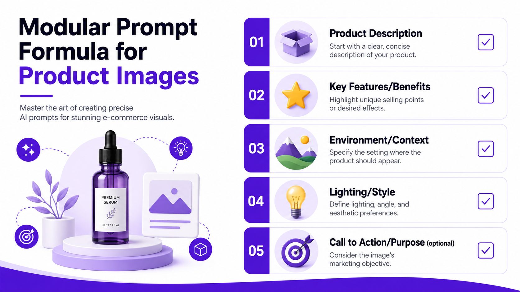
Reliable prompts usually follow the same structure:
[Product details] + [Placement or surface] + [Background] + [Lighting] + [Style cues]
That formula works because each part does a specific job. Product details protect identity. Surface and background control context. Lighting shapes realism. Style cues keep the output aligned with your catalog instead of drifting into ad-concept territory.
A few examples:
Specific words beat flattering words. “Visible stitching” gives the model a job. “Beautiful” does not.
Catalog consistency usually comes from a fixed style template, then controlled variation inside that template. I use the same approach on real product shoots because it reduces review time and keeps the storefront from looking patched together.
Set your default decisions once:
| Style element | Example decision |
|---|---|
| Lighting | Soft side light with gentle shadow |
| Background tone | Warm off-white or light beige |
| Camera feel | Straight-on, slightly raised, minimal distortion |
| Color treatment | Natural, restrained contrast, no dramatic grading |
| Mood | Modern, minimal, commercially clean |
This gives you a house style. New products can slot into it without changing the brand mood every time.
The best prompt reads like a photographer's brief with clear constraints, not a wishlist of effects.
Here's a short demo to sharpen your prompting instincts:
Many tutorials focus on dramatic sets and trendy backgrounds. Commercial work has a stricter priority. The product has to remain believable at both thumbnail size and zoomed-in inspection.
Add instructions that protect the details buyers notice:
These phrases matter most for packaging, apparel, jewelry, and anything reflective. Those categories fail fast when the model starts inventing cleaner surfaces, sharper symmetry, or more “perfect” geometry than the actual item has.
A messy prompt often mixes product identity with styling preferences in one long sentence. That makes troubleshooting harder. Split the job into layers instead.
Start with the fixed truth of the product. Then add the environment. Add lighting after that. Finish with the brand style.
A layered prompt might look like this:
Product: amber glass dropper bottle, white label, black cap, preserve bottle proportions and label placement
Setting: centered on beige stone surface
Background: soft warm off-white studio backdrop
Lighting: gentle side light, realistic shadow, controlled reflections on glass
Style: clean premium e-commerce photography, natural color, minimal retouching
This structure makes edits cleaner. If the image feels too flat, adjust the lighting layer. If it feels off-brand, adjust the style layer. The product description stays stable.
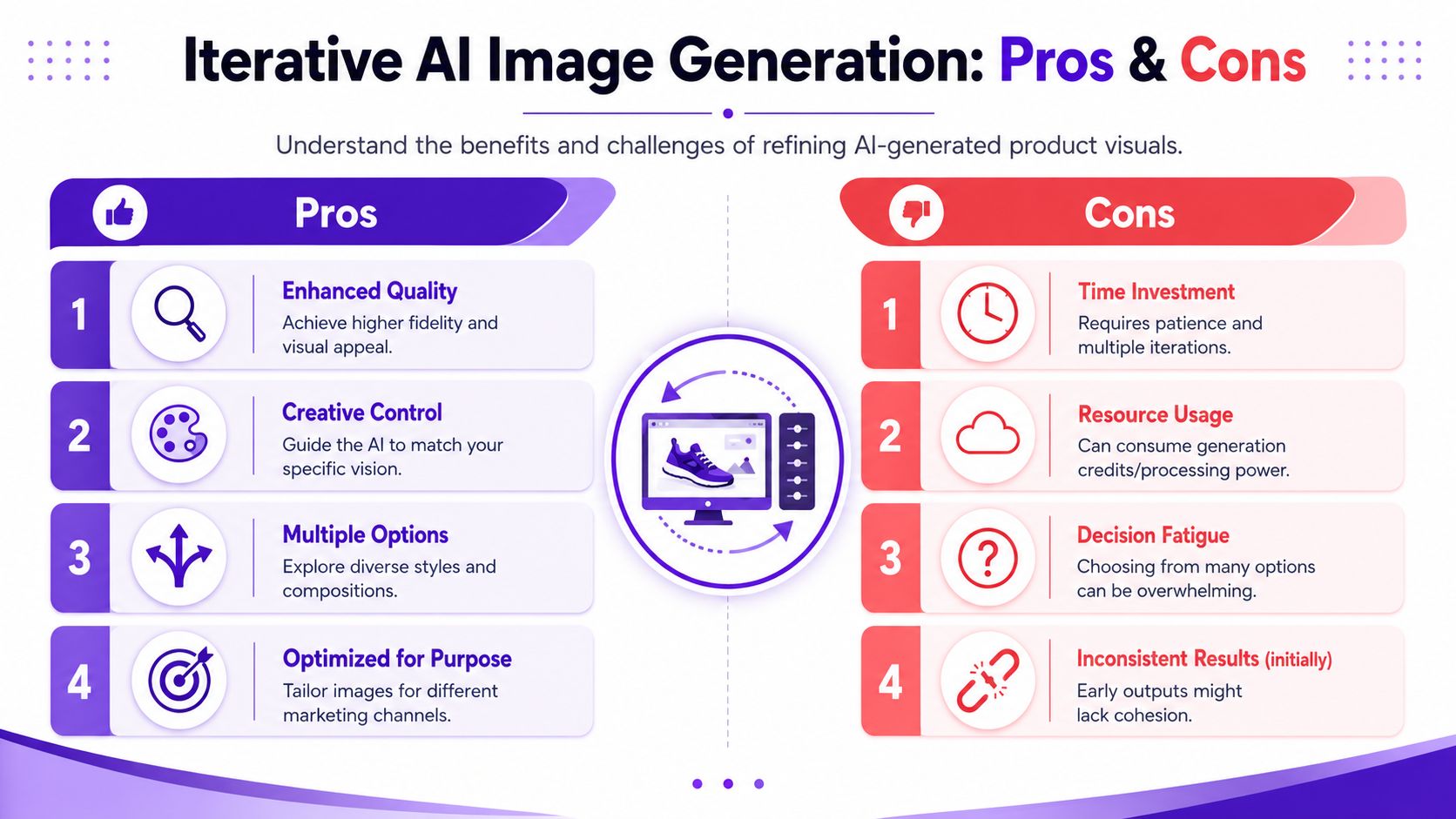
Prompting gets better when each revision has a clear purpose. Change one variable, generate a small batch, compare results, then keep or reject that change. A practical iteration workflow for improving images makes it much easier to spot which instruction improved the output.
For example:
That process is slower than random prompt rewriting, but it produces cleaner decisions. More important, it protects product truth while you refine the look. That is the difference between a creative image and a commercially usable one.
You generate a promising hero shot, then zoom in and catch the problem. The cap is slightly warped. The label text has softened. The glass looks glossier than the actual bottle. That is the stage where commercial image making starts.
A strong first output is useful, but it is rarely ready to publish. AI is good at mood and composition. It is less reliable with product truth. For store images, that gap matters more than creative flair because buyers use photos to judge color, finish, and build quality before they ever read the description.
The primary conversion issue is not that AI images look artificial. It is that they often look plausible while subtly changing the product.
That shows up in familiar ways:
These errors are easy to miss if you only judge the image by style. They become obvious once the customer receives the item and compares it to the listing photo. That is where trust erodes.
Start small. Look at the image at thumbnail size and ask a simple question: would this feel credible on a product grid beside established brands?
Then zoom in.
The close review is where you protect your brand. Put the original reference image next to the AI variation and scan top to bottom. Compare cap, corners, seams, edges, labels, shadows, and reflections in the same order every time. Side by side review catches drift that memory tends to forgive.
I recommend keeping a fixed scorecard:
| Check | Keep or reject question |
|---|---|
| Color | Does it match the real product under neutral light? |
| Shape | Are proportions unchanged? |
| Surface | Does the material still read correctly? |
| Branding | Are logos, labels, and text clean enough to use? |
| Catalog fit | Would this image sit naturally beside your other listings? |
If one of those fails, the shot usually fails as a selling asset, even if the overall composition looks great.
One batch is rarely enough. Good teams generate a small set, review hard, then refine from the closest match. That keeps the process efficient and reduces the temptation to keep a beautiful image that misrepresents the product.
A practical target is five to ten variations from the same reference, then a second round based on the strongest one. The point is not volume for its own sake. The point is to give yourself options without changing so many variables that quality control becomes guesswork.
For a practical look at this workflow, study iteration images for improving generated visuals.
If a flaw needs an explanation, reject the image.
Minor cleanup is normal production work. Dust removal, small edge fixes, and background tidying are fine. So are tiny reflection adjustments if they do not alter the product itself.
Do not waste time trying to repair core product errors. Wrong color, warped geometry, fake stitching, softened print, and distorted packaging usually need regeneration. Manual fixes on those problems take longer and often create a second layer of inconsistency.
That line matters for mockups too. Apparel sellers run into this constantly. A shirt graphic may look centered in one variation and stretched in another. In cases like that, Raccoon Transfers' mockup tips are useful because they reinforce the same principle: presentation matters, but product accuracy matters more.
The best shot is not the most dramatic one. It is the one a customer can trust when the package arrives.
Once you've got a strong hero image, the next step is making it useful across storefronts, ads, and social assets. During this process, production polish matters more than visual flair.
A transparent or plain background gives you more control over marketplaces, banners, and composite graphics. It also helps when different channels want different aspect ratios or background colors.
For that job, use a tool designed for precise isolation rather than trying to prompt every background variation from scratch. A dedicated background remover is usually faster and cleaner for listing prep.
The key check after removal is edge quality. Look closely at fuzzy materials, transparent containers, reflective edges, and thin product parts. If the cutout looks brittle or haloed, it'll look cheap once placed on a colored card or homepage tile.
Lifestyle mockups work when they answer a buyer's question: where does this product live, and how does it feel in context? They fail when the scene overpowers the product or introduces scale confusion.
Good mockups usually keep three things under control:
For apparel, transfers, and merch, some of the most practical staging advice comes from specialists who think in terms of sellable mockups rather than pure aesthetics. Raccoon Transfers' mockup tips are useful for judging placement, garment presentation, and when a mockup starts to look too synthetic.
After the image looks right, export choices decide how it performs online.
| Format | Best use | Trade-off |
|---|---|---|
| JPEG | Product photos on plain backgrounds | Smaller files, but lossy compression |
| PNG | Transparent backgrounds and graphics | Cleaner edges, but larger files |
| WebP | Modern web storefronts | Good compression and quality, but workflow compatibility varies |
If your platform supports WebP well, it's often the practical default for storefront speed. If you need transparency, PNG still earns its place. JPEG remains useful for standard listing photos where transparency isn't needed.
Before export, run a final visual audit:
Fast-loading images help user experience, but product detail is still the priority. If compression makes your label mushy or your fabric look waxy, you've optimized the wrong thing.
The business side of AI visuals matters as much as the art direction. If your images look polished but create confusion, legal uncertainty, or customer suspicion, they're working against the brand.
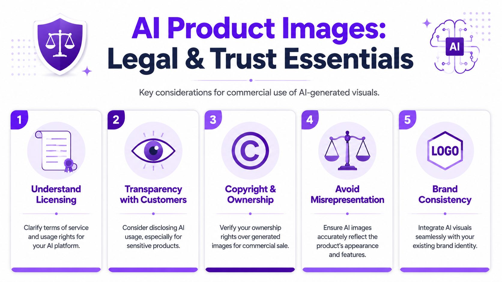
Every AI platform handles commercial use a little differently. Before you build a store around generated visuals, read the terms that govern licensing, ownership, and business use.
That's not glamorous work, but it's basic operational hygiene. You don't want a hero image performing well in ads while you're still unclear on whether the platform permits your exact commercial use case.
Consumer hesitation around AI imagery is substantial. A Clutch study found that 95% of consumers have concerns about AI image usage, with 71% citing deception and 65% citing lack of authenticity (reported in Squareshot's analysis of AI product images).
That doesn't mean you shouldn't use AI. It means you should use it in a way that doesn't trigger those concerns.
Buyers don't care whether your workflow is modern. They care whether the product arrives looking like the photo.
The most durable approach is hybrid. Let AI handle speed, scene generation, and variation. Let a human make the final call on accuracy, clarity, and honesty.
That means:
For categories like jewelry, technical gear, cosmetics, packaged goods, and apparel, trust breaks on tiny visual mismatches. A shopper may not say “the specular reflection is wrong.” They'll say “this doesn't look like what I ordered.”
Not every store needs a large label announcing AI involvement. But some products benefit from plain transparency, especially where fit, finish, or material detail affects buyer decisions.
A simple standard works well: if the generated image could create a mistaken expectation about color, texture, scale, or included components, use a more literal product image instead or pair the AI visual with a straightforward reference shot.
That's the bigger point. AI images should support buying confidence, not replace it.
If you want a simple place to experiment with prompts, concepts, and fast visual variations before you commit to a full product workflow, starryai is an accessible starting point for creators, indie sellers, and marketers who need quick image generation without a complicated setup.