

Written by Mo Kahn on
October 2, 2026


You start with a simple idea: a woman holding a coffee cup near a sunlit window. The first result looks promising at a glance. Then you zoom in and notice that her fingers blend into the handle, the light falls in two different directions, and the skin looks more like polished wax than skin.
That experience is common with an AI image generator realistic workflow. Photorealism doesn't come from adding “make it real” to a prompt and hoping for the best. It comes from combining model behavior, precise language, lighting logic, camera cues, references, and careful review. The same principles apply whether you're creating a portrait, an Etsy product image, a book cover, a character concept, or a social post in starryai.
You're looking at an almost-perfect portrait. The expression feels natural, the café behind her has convincing depth, and the morning light gives the scene a warm photographic quality. Then your eye catches the hairline. One section seems to dissolve into the forehead. The earring disappears into the jaw, a watch hand floats above the dial, and the shadow beneath the cup points in a different direction from the window light.
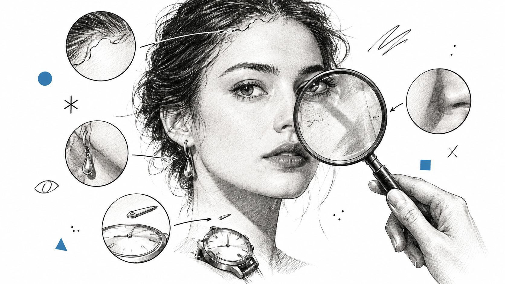
These details matter because people don't judge realism by resolution alone. They look for relationships. Does the light agree with the shadow? Do the fingers connect correctly? Does glass reflect the room, and does metal behave like metal? A single contradiction can turn an image that looks photographic into an image that feels synthetic.
Generative models can produce convincing broad structure while struggling with small, connected objects. A portrait may have excellent composition but inconsistent pupils. A product image may have accurate color but a label with warped lettering. A full-body scene may show realistic clothing while the hands remain anatomically uncertain.
Audiences are also becoming more sensitive to overly polished imagery. Adobe's coverage of AI image generation trends describes a movement toward natural skin texture, film grain, light leaks, and genuine expressions rather than sterile perfection. That shift explains why a technically sharp image can still feel false.
Practical rule: Realism isn't the absence of style. It's the presence of believable visual decisions.
The gap between almost-real and convincing usually comes from a small group of controllable ingredients. Model choice sets the potential quality. Prompt language defines the subject and materials. Lighting gives the scene physical logic. Camera vocabulary adds optical behavior. References anchor the result. Once you treat those elements as separate controls, realistic generation becomes a craft problem, not a magic-prompt problem.
A diffusion model begins with something that resembles visual static. It gradually removes noise until shapes emerge, surfaces develop texture, and small details become clearer. The process doesn't pull a finished photograph from a hidden filing cabinet. It learns how visual patterns tend to form and then reconstructs a plausible image through repeated refinement.
A useful analogy is a sculptor working through marble. At first, the sculptor establishes the rough block and the position of the figure. Next comes the shape of the face, the curve of the clothing, and the relationship between the limbs. Only later do the pores, fabric weave, eyelashes, and sharp edges receive attention. A diffusion model follows a comparable path, moving from broad visual structure toward fine-grained detail.
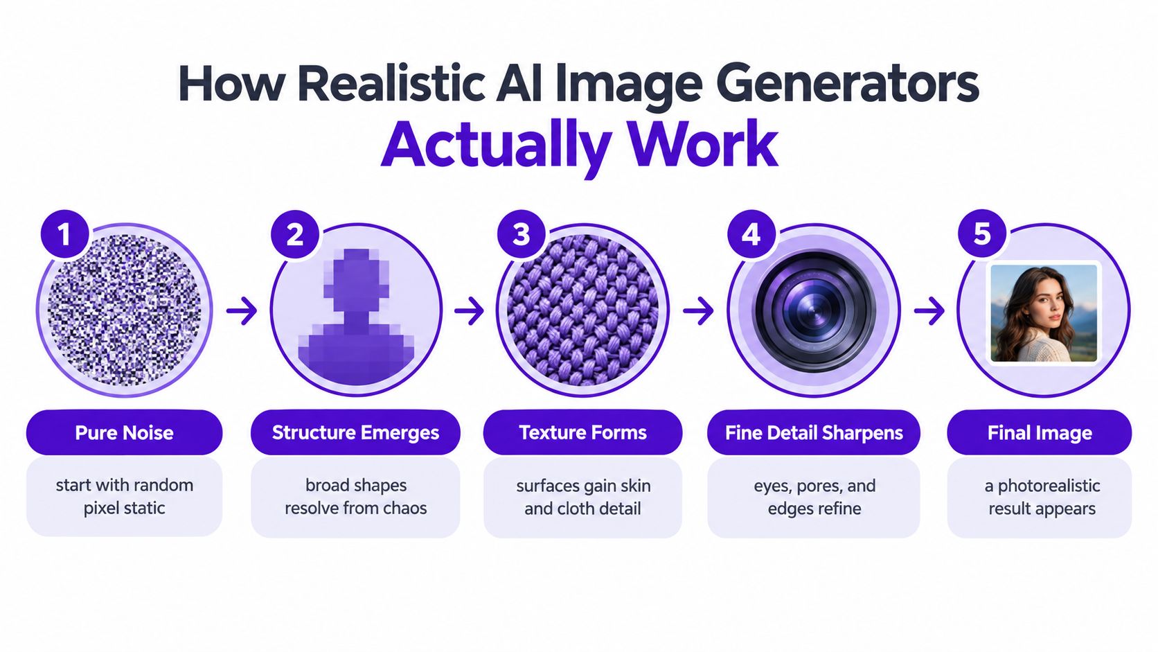
The forward process used during training adds noise until an image approaches random Gaussian noise. The reverse process learns to remove that noise step by step. This technical overview of diffusion-based image generation explains why better noise schedules, broader training data, and stronger conditioning can improve texture fidelity, edge stability, and overall coherence.
That mechanism affects what you see in practice:
Two models can receive the same prompt and produce very different results. One may preserve facial structure and natural skin variation, while another creates smoother skin, weaker hands, or less stable edges. Training coverage and architecture choices influence what each model has learned to represent.
Inside starryai, choosing a model is like choosing a sculptor's hands. Start with a model or style intended for realistic output when your goal is a believable photograph. If the image needs a distinctive mood, choose a realistic style with an aesthetic fingerprint rather than forcing a neutral studio look to carry all the creative direction.
For a plain-language explanation of the underlying process, see how AI artwork works. The important takeaway is practical: prompt quality matters, but it can't fully compensate for a model that struggles with the type of image you're making.
A realistic result comes from a recipe, not a single phrase. Begin with the model, then describe the subject, establish the light, add camera behavior, and use a reference when text alone can't anchor the result.
| Ingredient | What It Controls | Starter Phrase |
|---|---|---|
| Model selection | Detail ceiling, anatomy, texture, and coherence | “photorealistic portrait model” |
| Prompt language | Subject, materials, setting, and action | “natural skin texture, brushed cotton shirt” |
| Lighting direction | Depth, mood, highlights, and shadows | “soft window light from camera left” |
| Camera vocabulary | Perspective, focus, and optical character | “85mm lens, shallow depth of field” |
| Reference images | Composition, identity, pose, or visual direction | “match the reference pose and lighting” |
The model determines how much realism the rest of your instructions can achieve. A model designed for expressive illustration may produce a beautiful face but interpret “photograph” as a glossy, painterly surface. A model aimed at realistic renders may preserve more ordinary details, such as uneven skin, fabric tension, and natural reflections.
Try a prompt that makes the intended output unambiguous:
“Photorealistic editorial portrait of a middle-aged woman, natural skin texture, subtle under-eye detail, loose dark hair, neutral expression, realistic fabric folds, documentary photography.”
Don't switch models and rewrite every other variable at the same time. If you want to understand what changed, keep the subject and lighting stable while comparing the model output.
“Beautiful woman in a café” describes a concept, not a photograph. Add the surfaces that make the scene believable: ceramic glaze, brushed steel, worn wood, cotton, condensation, or fine hair.
For example:
“A ceramic espresso cup with a slightly uneven handmade glaze on a scratched walnut table, small reflections on the metal spoon.”
Specific materials give the generator visual work to perform. They also make errors easier to spot.
Lighting direction creates the scene's internal logic. Use one dominant source before adding atmosphere:
“Early morning sunlight enters through a window on camera left, creating a soft highlight along the cheek and a muted shadow on the table.”
Words such as “soft,” “diffused,” “hard,” “overcast,” and “backlit” shape the quality of the light. If your image feels flat, add direction and contrast before adding more adjectives.
Camera terms can suggest perspective, focus, and depth:
“35mm documentary photograph, eye-level perspective, moderate depth of field, natural lens distortion.”
Use an 85mm portrait look when you want flattering compression and subject separation. Use a wider lens for environmental context, but expect more perspective distortion near the edges. Camera language works best when it supports the scene rather than becoming a pile of technical keywords.
A reference image can communicate pose, framing, color relationships, or a visual direction more reliably than a long paragraph. Match the reference to the lighting you want. A bright outdoor reference may pull the result away from a dim studio prompt, even when the text is carefully written.
In starryai, treat these ingredients as separate dials. Change one when the output feels wrong. If the face is good but the scene is flat, adjust the light. If the composition works but the person drifts, strengthen the reference. If every surface looks plastic, change the model or add material-specific language.
Start with the creation screen and decide what must remain stable. Is it a person's identity, a product silhouette, a pose, or the location? That priority determines whether you should begin with text alone or add a reference image.
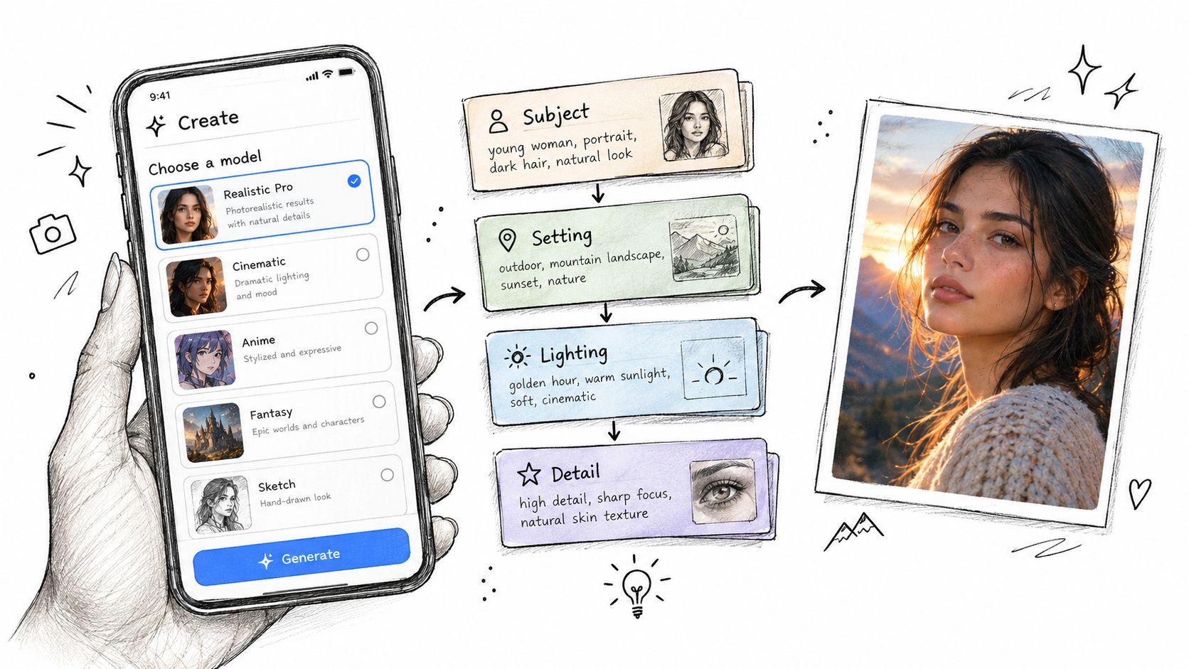
Pick a realistic model or style that matches the intended image. For a product mockup, prioritize clean edges and material accuracy. For a portrait, prioritize facial structure, skin variation, and natural eyes. For a book cover, decide whether the character should look like a literal photograph or a cinematic interpretation.
You can review this beginner's guide to AI image generation if the creation controls are unfamiliar. The goal isn't to find one permanent setting. It's to select a suitable starting point for the visual problem in front of you.
Write the prompt in a consistent order:
A rough idea such as “woman in a coffee shop, morning light” can become:
“Photorealistic portrait of a woman in her early thirties seated beside a café window, cream knit sweater, hands wrapped around a ceramic coffee cup, quiet morning atmosphere, soft sunlight from camera left, realistic skin texture and individual hair strands, 50mm lens, eye-level perspective, shallow depth of field, natural warm color, candid editorial photography.”
This order prevents mood words from overpowering the physical details. It also gives you a clear place to edit when the image misses.
Use text alone when the subject is flexible and you want variation. Attach a reference when you need a particular pose, composition, outfit relationship, or facial direction. Set the reference strength high enough to preserve the essential structure, but not so high that the new lighting and setting can't influence the result.
A first generation rarely solves every problem. Review the four-up grid and choose the version with the strongest structure, not necessarily the prettiest thumbnail. Then reroll with a targeted change:
Don't replace the entire prompt after one flawed result. Lock the strongest composition and alter one variable at a time. Lens choice, aperture language, and light direction belong in the prompt because they affect how the scene reads, not just its decoration.
The most productive workflow is a conversation with the image. Each generation answers one question. Does the face hold? Does the shadow agree? Does the material read correctly? Keep the successful decisions and repair the weakest checkpoint.
A photograph can be believable without being neutral. Styled realism keeps recognizable photographic behavior while adding a clear creative fingerprint, such as film grain, warm grading, restrained halation, or deliberate shallow focus.
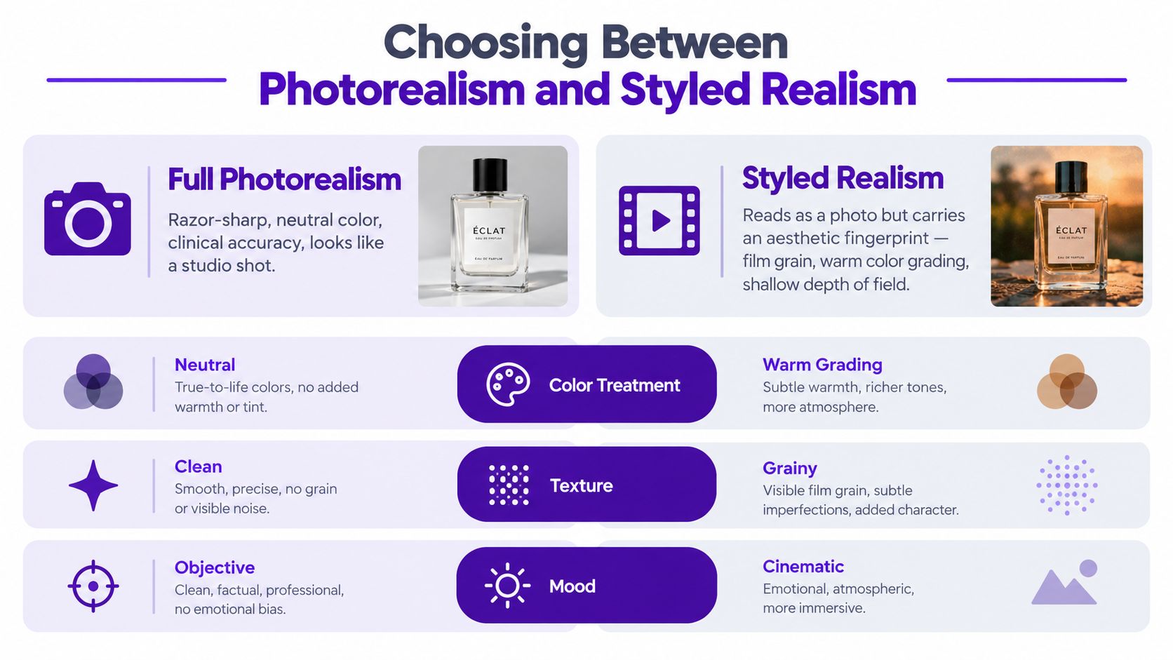
Full photorealism suits a design reference that needs to communicate a product, space, or person with minimal visual interpretation. Styled realism can work better for an indie book cover, an Etsy print, or a TikTok visual where mood helps the image belong to a recognizable aesthetic.
Ask three questions before choosing a style:
For full photorealism, try:
“Neutral studio photograph, accurate color, clean background, realistic product proportions, controlled softbox lighting, sharp material detail.”
For styled realism, change only the aesthetic layer:
“Art-directed editorial photograph, warm film color grade, subtle 35mm grain, gentle halation, natural expression, believable skin texture.”
That small shift can move the image from a product catalog toward a cinematic visual without abandoning physical credibility. In starryai, use the style choice and prompt wording together. Don't ask for “clinical accuracy” and “dreamy painterly glow” unless you want those instructions to compete.
An intentionally imperfect image may feel more authentic than a flawless one. Slight grain, uneven light, an ordinary expression, or a lived-in setting can signal that the image belongs to a human visual world. The decision isn't whether photorealism is good. It's whether the audience needs photographic neutrality or a believable point of view.
The more convincing an image becomes, the easier it is for viewers to mistake it for a photograph of a real person, place, event, or product. That creates practical risk. A creator may unintentionally imply that a person endorsed something, that a location looked a certain way, or that a product exists exactly as shown.
Research already shows that people worry about this boundary. One study found that 50% of participants cited copyright concerns and 46% cited similarity concerns, while 66% used image tools for realistic scenes. The study and its findings are available here. Better realism can therefore increase commercial usefulness and increase the need for review at the same time.
A fantastical creature, imaginary city, or clearly invented character usually carries a different trust burden from an image depicting an identifiable person or real brand. Realistic advertising concepts, testimonials, property images, and product demonstrations deserve closer scrutiny because viewers may treat them as evidence.
Platform rules and commercial terms can change, so check the current requirements for the place where you'll publish or sell. Review starryai's commercial-use rights information before using an image in a paid project, and verify any separate marketplace, client, or licensing conditions.
Don't judge a realistic image only by asking whether it looks attractive. Judge it by the cues that people use to decide whether a scene is physically and socially believable.
Skin texture: Real skin has variation. Look for subtle pores, fine lines, tonal changes, and natural transitions around the nose, lips, and eyes. A smooth, evenly colored face may signal overprocessing. If it looks waxy, reduce beauty language and add “natural skin texture” or a reference with softer, less retouched lighting.
Hands and fingers: Check every joint, fingertip, nail, and contact point. Hands often fail when the prompt asks for a complex gesture, so simplify the action, describe the grip, or use a pose reference. Make sure fingers wrap around the object they appear to hold.
Eyes: Look for aligned pupils, coherent iris detail, and reflections that agree with the light source. A beautiful face can still feel artificial if one eye catches a highlight that the other eye couldn't physically receive.
Light and shadows: Trace the main light from source to subject to cast shadow. If the window is on the left, highlights and shadows should respond to that direction. Add a specific light source rather than piling on words such as “dramatic,” “soft,” and “cinematic.”
Materials: Fabric should show weave, folds, and tension. Glass should reveal reflections or refractions. Metal should carry sharper highlights than matte paper. If every surface has the same softness, name the material and describe how it interacts with light.
Human-preference benchmarks compare generated images through judgments about whether an output appears real. In one large visual Turing-style benchmark, leading systems clustered around the high-40s to low-50s percent range for human votes judging outputs as real. The benchmark overview shows why semantic details matter more than a simple pixel comparison.
A separate peer-reviewed study found that participants correctly identified real images 79.87% of the time, but identified AI-generated images correctly only 61.58% of the time, with overall referenceless accuracy at 65.24%. Read the study on human recognition of AI art.
Test your output twice. View it at full size and inspect the details, then shrink it to thumbnail size and ask whether a stranger would flag anything immediately. If the image fails at full size, repair the anatomy or material. If it fails as a thumbnail, repair the silhouette, expression, contrast, or lighting hierarchy.
Before generating, run through this short list:
The most impactful habit is checking the thumbnail first. An image that survives the shrink test usually has a strong composition, while an image that only works under close inspection often reveals its artificiality as soon as it appears in a feed. Ship only what survives both the zoom test and the shrink test.
Use starryai to test the workflow with a text prompt, image reference, or sketch, then refine the model, lighting, camera language, and realism level around the weakest visual cue. Visit starryai to turn your next concept into a realistic or styled image and judge the result with the same careful eye before you publish it.


.svg)