
Written by Mo Kahn on
July 1, 2026


You launch a display campaign. The banners look polished. The colors match the brand book. The product shot is clean. Then the results come in, and almost nobody clicks.
That's the reality of advertisement banner design now. Looking good isn't enough. The first widely recognized web banner ad, run by AT&T on HotWired in 1994, reportedly achieved a 44% click-through rate, while average display CTR today is cited around 0.05% to 0.06% in modern guides and summaries such as this banner ad design analysis. The gap isn't just a trivia point. It explains why banners fail when they rely on decoration instead of message, hierarchy, and audience fit.
Most underperforming banners break in predictable places. The offer isn't clear. The layout asks the eye to process too much at once. The CTA blends into the rest of the unit. Or the visual feels generic enough that the ad gets ignored before the copy even has a chance.
Good banner work starts earlier than is commonly assumed. It starts before Photoshop, Figma, or an ad platform upload. It starts with intent. What single action should this banner drive, who should care, and what can you show in one fast glance that feels specific rather than disposable?
This guide is the playbook I'd use to build banners for live campaigns today. It covers strategy, sizing, hierarchy, copy, AI-assisted visual production, launch prep, and testing. It also takes a modern angle most banner advice still underplays: generating original assets instead of defaulting to tired stock photos, including how to use tools like starryai as part of the creative workflow.
Most banner problems aren't design problems first. They're strategy problems.
A team says it wants “better performance,” but that can mean very different things. If the banner is for a new product category, the job may be awareness and message recall. If it's for a limited-time offer, the job is direct response. Those two banners shouldn't look or read the same, even when the brand is identical.
Before making anything, decide the banner's single mission. Pick one primary outcome and let the layout support that. A banner trying to build credibility, explain features, introduce a category, and force an immediate click usually fails at all four.
Use a simple filter:
That decision shapes everything else. It affects image choice, headline length, CTA wording, and even whether animation helps or distracts.
You don't need a full persona deck. You need a usable snapshot of the person scanning past your banner.
Ask:
A banner designed for everyone usually looks like an ad for no one.
The strongest advertisement banner design work is selective. It chooses a narrow message, a specific audience cue, and one clear action. Everything else gets cut.
Teams often jump from campaign brief to mockup too fast. That's how you end up debating gradients and button colors before anyone has agreed on what the banner is supposed to do.
A useful banner brief fits on one page. If it needs a slide deck to explain the concept, the banner itself will probably be too complex.
A working brief should answer these points:
That last point matters more than many teams realize. Banner performance drops when the click creates friction. If the ad promises one thing and the landing page opens with another, trust evaporates.
Awareness creative and performance creative shouldn't be forced into the same template.
An awareness banner usually benefits from:
A direct response banner usually needs:
Demographic labels alone don't produce strong creative. “Small business owners” is too broad. “Operations lead at a growing ecommerce brand who needs cleaner reporting” is usable.
Build the banner around three inputs:
| Input | What to define | Why it matters |
|---|---|---|
| Pain point | The immediate frustration or need | Shapes the headline |
| Desired outcome | What success looks like to them | Shapes the promise |
| Decision trigger | What makes them pause and care | Shapes the visual and CTA |
A persona for display ads should also include attention context. Someone half-scrolling a news site behaves differently from someone actively researching software.
Practical rule: If you can swap your banner copy into a competitor's ad and it still works, the message is too generic.
Not every banner should feel urgent. Some should feel reassuring, credible, exclusive, or refreshingly simple.
In practice, effective emotional triggers often fall into a few categories:
Many banners make a mistake here. They try to “pop” by shouting visually, when the audience needs confidence and quick comprehension.
A banner can have the right offer and still underperform because it was built for the wrong slot. I see this often with teams that start in a roomy canvas, then squeeze the same layout into every placement and hope the network does the rest. It rarely does.
Google Ads documentation points advertisers toward a small group of display sizes that consistently matter across inventory, including 300×250, 728×90, 300×600, and mobile formats such as 320×100, in its display ad size guidance. Those are the formats to prioritize first because they cover the placements you are likely to win.
Use these sizes as the starting set for production:
| Size (pixels) | Common Name | Primary Use Case |
|---|---|---|
| 300×250 | Medium Rectangle | In-content display, desktop and mobile placements |
| 728×90 | Leaderboard | Top-of-page desktop inventory |
| 336×280 | Large Rectangle | Content-heavy pages where a larger message block can work |
| 300×600 | Half Page | High-visibility display placements with more vertical room |
| 320×100 | Large Mobile Banner | Mobile-first inventory where legibility is critical |
Each format changes what the creative can do.
A leaderboard gives you width but very little storytelling room. A 300×600 unit can carry a stronger product visual, but it also invites clutter if the team tries to use every spare inch. The 320×100 mobile banner is the harshest test of discipline. If the message, brand cue, and CTA cannot survive there, the concept usually needs work before launch.
This matters even more when AI-generated imagery is part of the workflow. If you create visuals in starryai, do not generate one polished hero image and force it everywhere. Generate with crop behavior in mind. Vertical compositions often adapt well to 300×600, while simpler, tighter scenes hold up better in 300×250 and mobile units.
If you're adapting assets across channels, review adjacent platform requirements too. This guide to Proven SaaS for Instagram ad specs is useful because it shows how fast composition breaks when one creative gets shrunk instead of redesigned.
Resizing is production. Redesigning is performance work.
The same headline can feel sharp in a medium rectangle and unreadable in a mobile banner. A product shot with background detail may look premium at 300×600 and turn muddy at smaller sizes. AI imagery adds another trade-off here. It gives you originality, but only if you generate or edit for the placement instead of treating every banner as a crop of the same source file.
A practical workflow is to build one parent concept, then make asset variants by shape. For example, create a wider scene for leaderboard inventory, a focused subject crop for rectangles, and a simplified version for mobile. If you need a fast production step, this image resize workflow for banner variants helps with output prep, but the final check still needs human judgment. Each size has to communicate cleanly on its own.
File format affects load speed, sharpness, and how polished the ad feels in the placement.
Static banners still do a lot of work. They load quickly, force tighter decisions, and often beat weak animation because the message is understood faster. Motion earns its place when it explains the product, reveals a benefit, or directs attention with restraint. If it only adds noise, it hurts the ad.
Banners aren't read in order. They scan, judge, and ignore. That's why hierarchy does the heavy lifting.
GrowthSRC cites a 2013 study reporting that 86% of consumers experience banner blindness, and that the average banner ad CTR is only 0.06%, which is exactly why hierarchy isn't decorative. It's functional in these banner blindness findings and design implications.
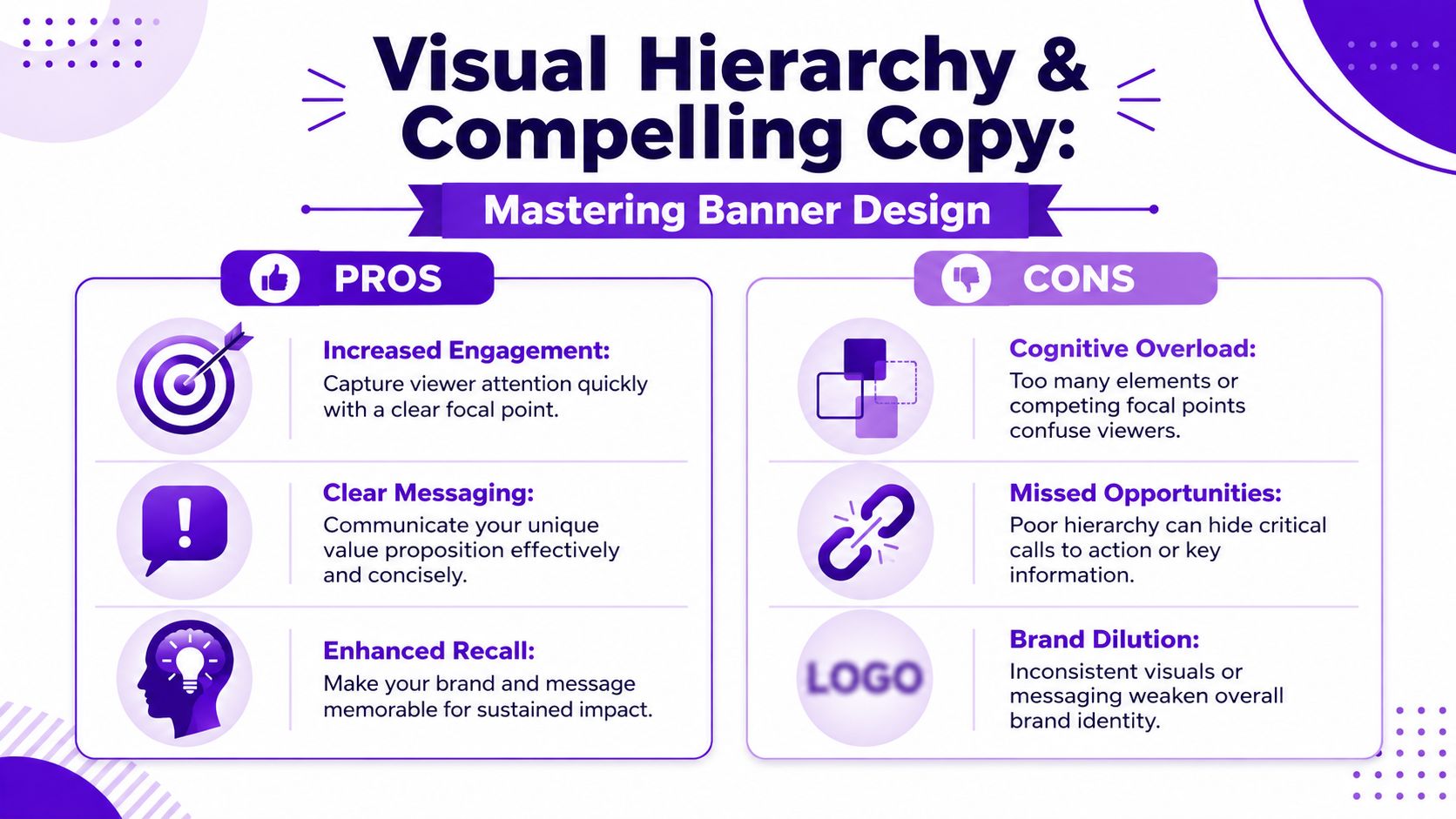
Every high-performing banner needs three visible jobs:
That order matters. If the user can't tell what the offer is, the CTA has no force. If the visual dominates but doesn't clarify the message, it becomes wallpaper.
I usually look for these signs in a draft:
Two marketers promote similar software.
The first uses a familiar stock image: smiling coworkers around a laptop, soft blue overlay, generic headline, tiny CTA. Nothing in the unit tells the viewer why this product is different. The image fills space, but it doesn't carry meaning.
The second builds the concept around a custom visual generated from a prompt. Instead of “team at laptop,” the image shows a clean abstract command center with a strong brand-color environment and one clear focal object tied to the product promise. The headline is shorter. The CTA is isolated with whitespace. The ad feels specific.
The difference isn't that custom imagery is automatically better. It's that unique imagery can support message clarity when it's designed around the promise instead of around what stock libraries happen to have.
Banner copy should read like interface text, not like body copy.
Useful rules in practice:
This also applies when you're adapting principles from paid social. If you're running campaigns across display and Meta, it's worth reviewing mastering Facebook advertising best practices because the same lesson keeps showing up: creative has to communicate before the user decides to keep scrolling.
Strong banners don't ask for attention. They make the message obvious enough that attention costs less.
For large-format banner readability, the 10-feet rule is a practical benchmark: use about 1 inch of letter height for every 10 feet of viewing distance, according to SpeedPro's banner legibility guidance. The same guidance recommends bold sans-serif fonts, limiting yourself to one or two font styles, and using high contrast.
Even for digital banners, the lesson holds. Decorative fonts, thin type, weak contrast, and busy backgrounds all increase processing time. In display advertising, more processing time usually means no action.
Stock photos still have a place. They're fast, familiar, and sometimes good enough. They're also one of the quickest ways to make a campaign look interchangeable.
Original imagery gives a banner a better chance of feeling specific. That doesn't mean every ad needs an illustrated masterpiece. It means the visual should reinforce the offer instead of acting as generic filler.
AI image generation is most useful when you know what the image has to do.
Good use cases include:
Bad use cases are just as important to recognize. Don't ask AI to rescue a weak offer. Don't generate overly detailed images that compete with the copy. And don't accept outputs that look flashy but say nothing.
A weak prompt produces a weak asset. For banners, the prompt should define function, not just aesthetics.
A practical banner prompt usually includes:
Example prompt structure:
If you want a direct tool for this workflow, starryai's AI banner generator is built for creating banner-style visuals from prompts with controllable canvas choices.
AI generation is only the first pass. Production teams still need to crop, simplify, and sometimes regenerate.
A good review checklist:
This walkthrough gives a useful sense of how AI-assisted creative fits into production decisions:
The core advantage isn't novelty for its own sake. It's control. AI imagery lets marketers create assets around the message they need, rather than forcing the message to fit whatever stock image happens to be available.
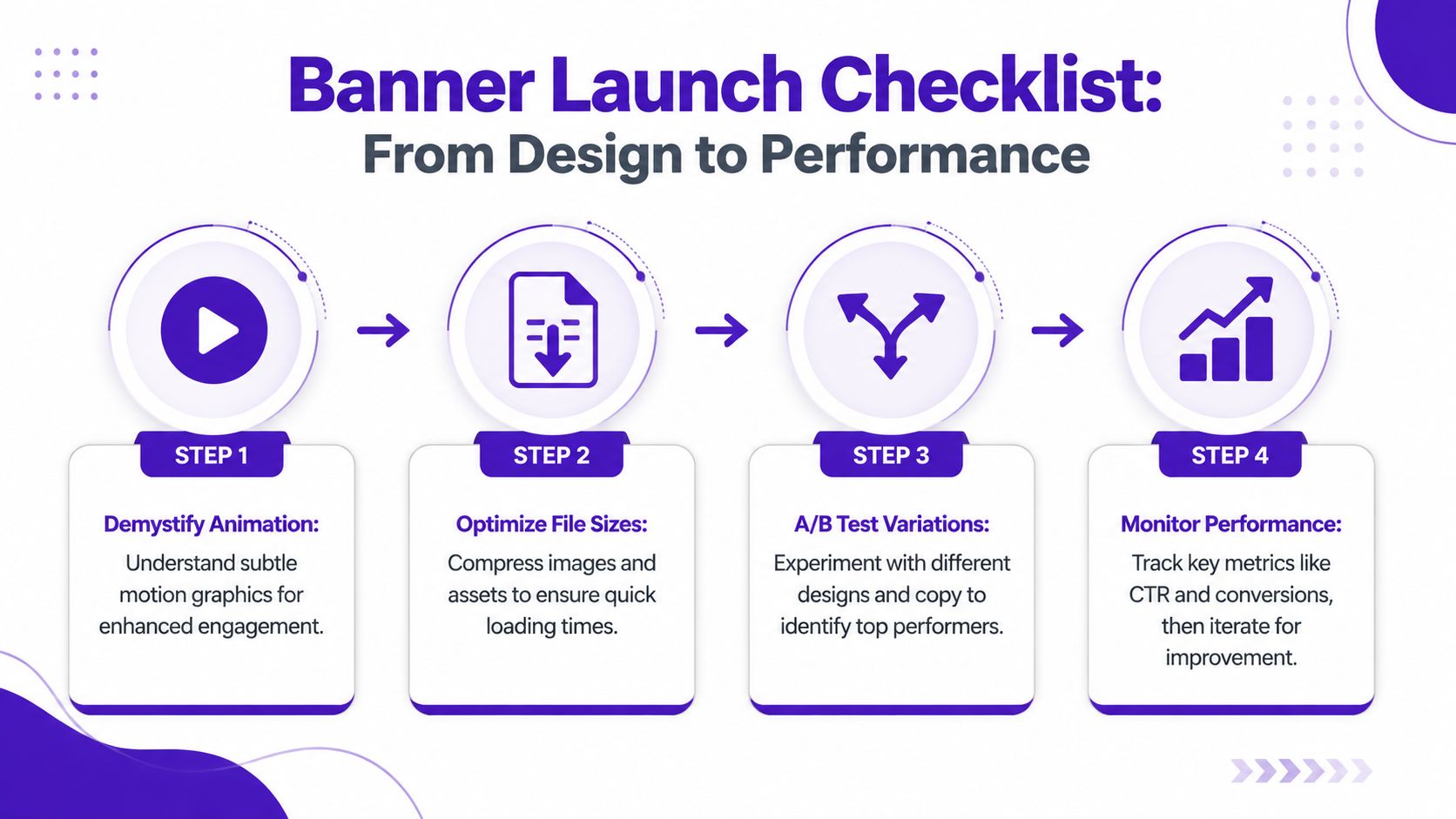
A banner can look sharp in the design file and still fail the moment it goes live.
That usually happens in the last mile. The image softens after export. The small sizes lose the CTA. Motion adds delay instead of clarity. An AI-generated visual that looked strong at concept stage turns muddy once it gets resized across placements. Launch prep is where clean creative either holds up or falls apart.
Animation earns its place when it helps the viewer process the ad faster. If motion slows understanding, the banner is doing extra work for no gain.
Google Ads creative guidance for display ads recommends keeping animation short, clear, and easy to follow, especially on smaller placements where timing and legibility break down fast. Use motion with one job in mind, then stop.
Good uses of motion:
If the static version already communicates in one glance, ship the static version. I treat animation as a performance choice, not a decoration choice.
Before upload, check the banner in its actual environment, not just on a large artboard.
This matters even more with AI-assisted creative. starryai can give you a distinct visual direction that avoids stock-photo sameness, but launch files still need production discipline. A strong concept image is not automatically a strong 300 by 250.
Banner testing gets messy fast when the team changes headline, image, CTA, and layout in the same round.
Isolate one variable:
Keep the audience, placement, offer, and landing page steady wherever possible. That is how you learn which design decision changed performance.
Watch post-click behavior too. A curiosity click from a flashy banner can look good in a dashboard and still waste budget if the landing page does not continue the same promise.
Banners that are easy to scan usually perform better because they ask less from the viewer.
Nielsen Norman Group found that users often ignore content that appears ad-like, and that even legitimate content can be skipped when it uses those same visual cues, in their findings on banner blindness. That has direct design implications.
Use that finding in practical ways:
Clean beats busy. Clear beats clever. The banners that survive launch are the ones that still communicate after compression, resizing, animation settings, and a real audience gives them half a second of attention.
A static banner has one frame and one job. It needs immediate clarity.
An animated banner can sequence attention. That helps when you need to reveal a short story, separate a headline from a support point, or direct the eye toward the CTA. But if the first frame is weak or the motion delays comprehension, animation becomes a liability.
CTR matters when the campaign objective is response, but it isn't the only signal worth watching. Look at what happens after the click. Does the landing page hold attention? Do visitors take the intended action? Does one banner bring better-fit traffic than another?
For awareness campaigns, focus on message clarity, audience fit, and downstream engagement quality rather than treating clicks as the only valid outcome.
You can use one concept across platforms. You shouldn't use one untouched design file everywhere.
Different placements crop differently, compress hierarchy differently, and give text different amounts of room. A good campaign uses a shared visual system, then adapts the composition to each environment.
Three things show up constantly: generic visuals, unclear offers, and crowded layouts.
A banner doesn't have long to explain itself. If the user can't tell what it is, why it matters, and what to do next, the design is already in trouble.
If the copy forces reading instead of scanning, it's too much.
Most banners improve when the message is reduced to a clear headline, a short support line if needed, and a CTA. If you need a paragraph to persuade the user, move that persuasion to the landing page.
It should be visible and intentional, but not always dominant.
For awareness campaigns, brand presence may need more weight. For direct response campaigns, the offer and CTA usually deserve stronger emphasis. The logo should support recognition without stealing space from the message that drives action.
Yes, when they solve a real creative problem.
They're useful for creating original campaign imagery, building consistent visual families, and avoiding stale stock-photo patterns. They're less useful when the prompt is vague or when the generated image adds visual complexity without improving understanding.
If you need original visuals for display ads, social promos, or campaign variants, starryai gives marketers a practical way to generate banner-ready imagery from prompts instead of relying on generic stock. Used well, it fits neatly into an advertisement banner design workflow that values clarity, speed, and creative differentiation.